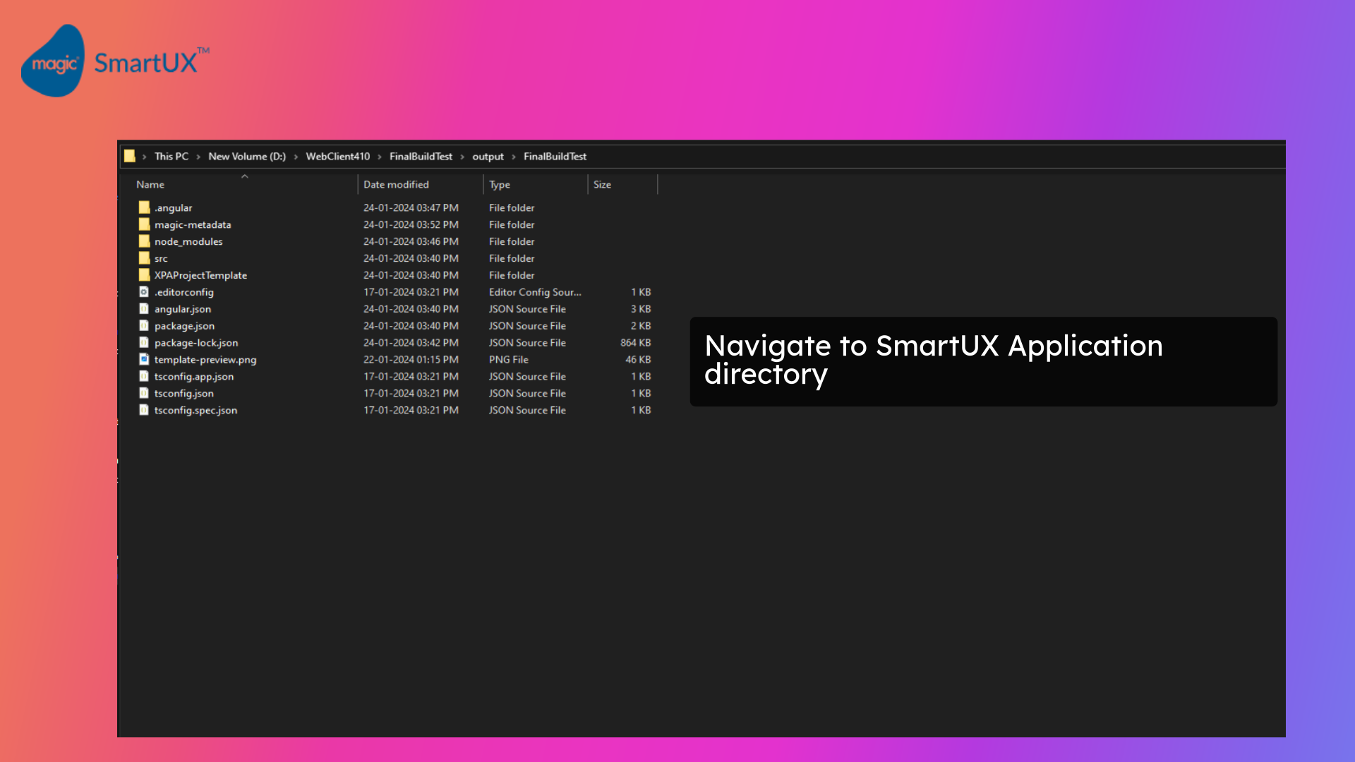
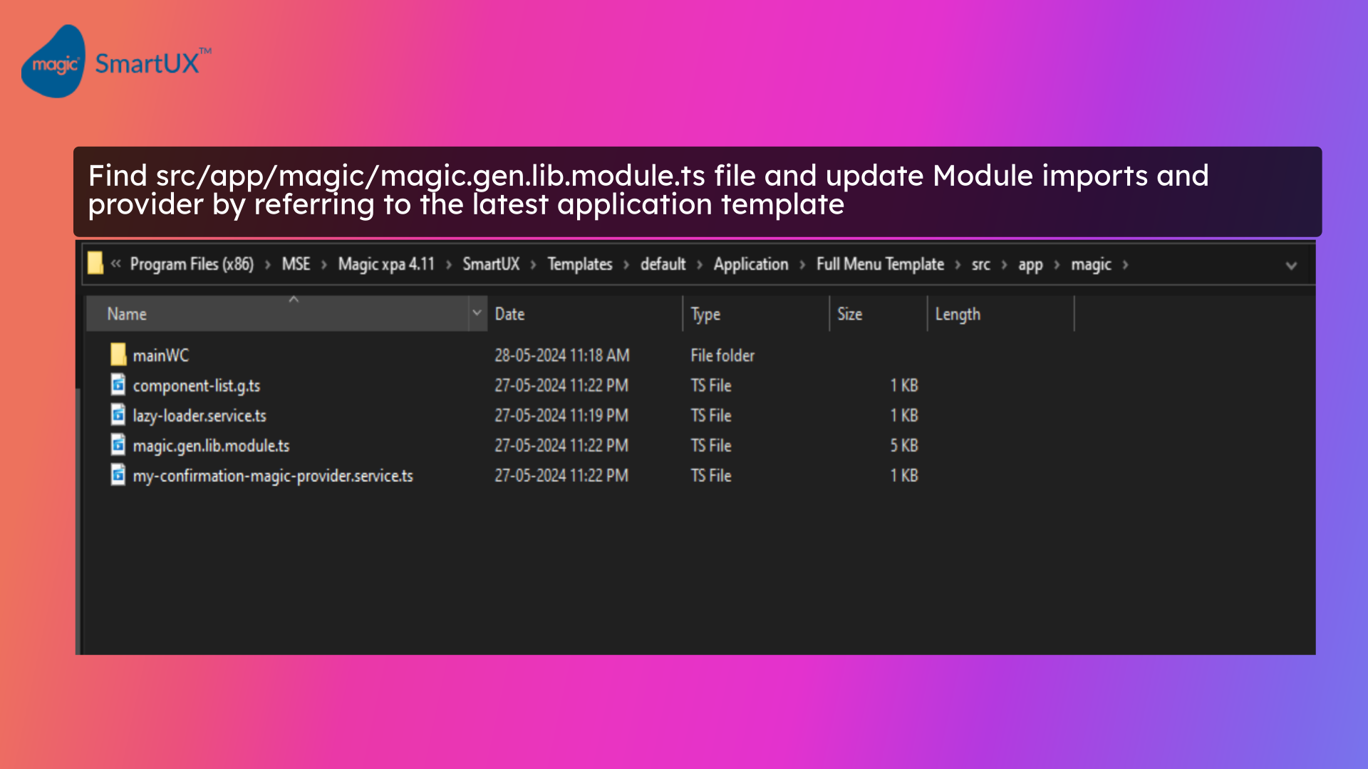
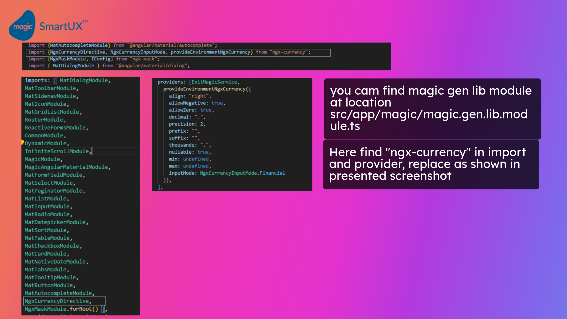
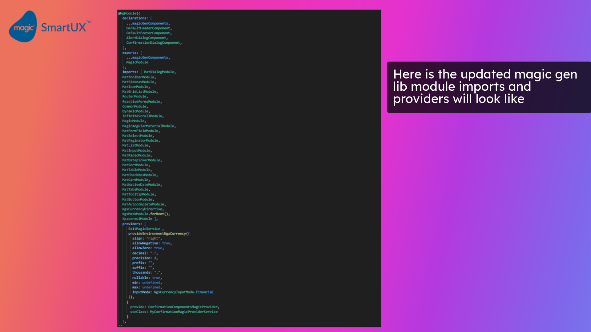
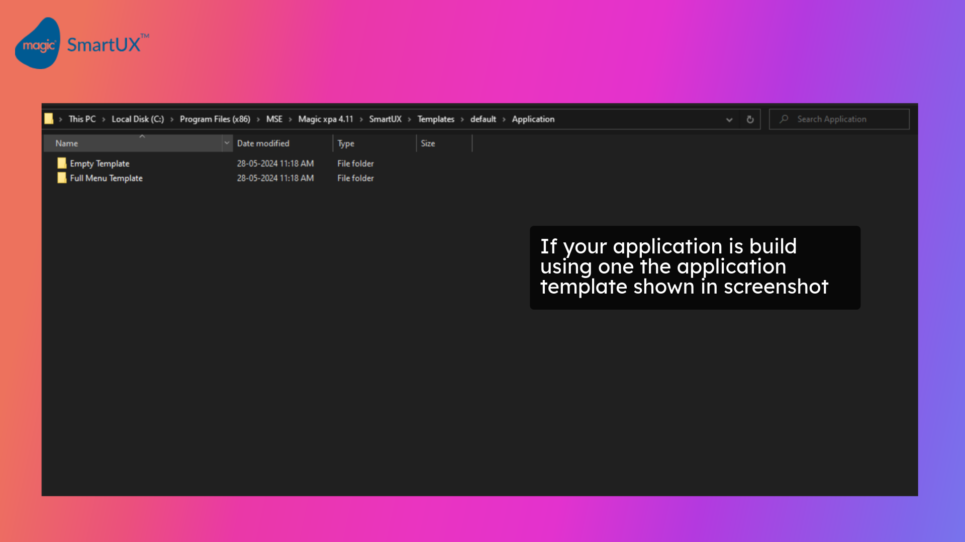
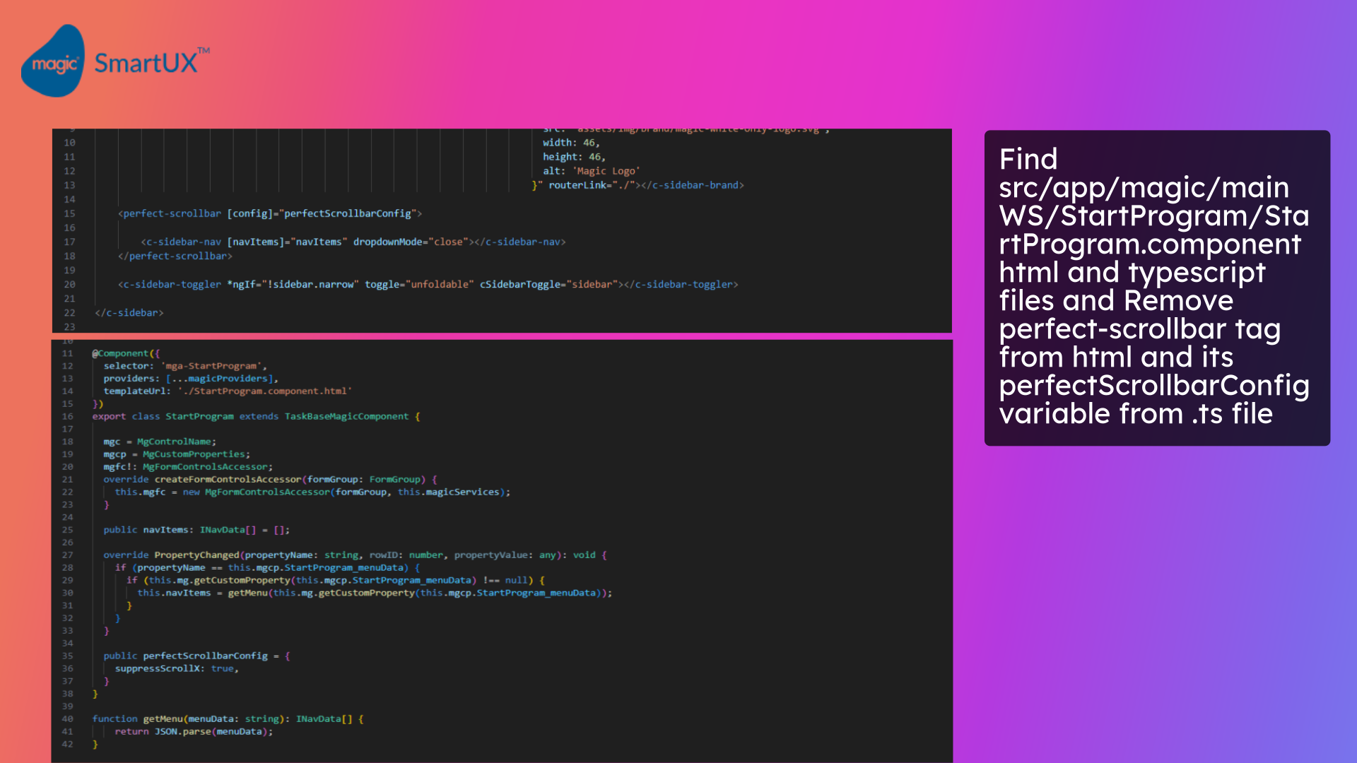
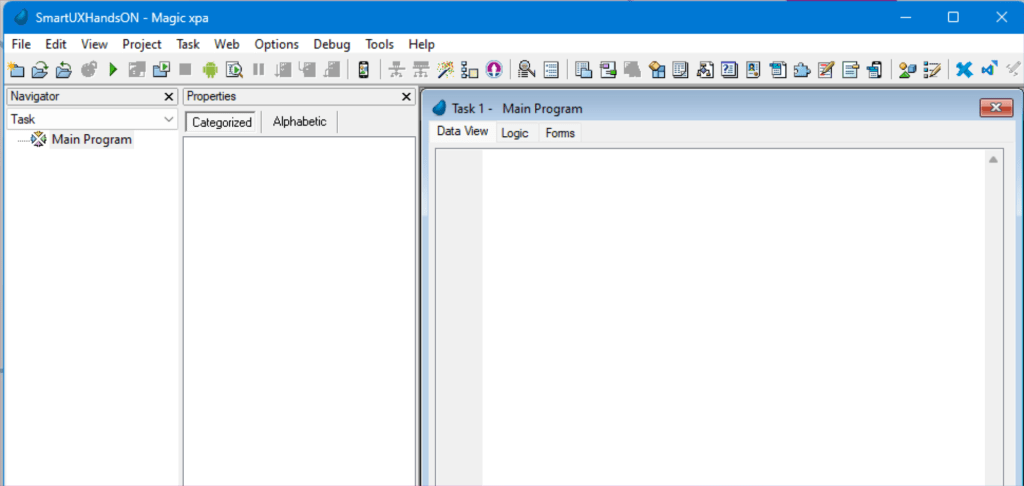
This guide will walk you through adding and designing a component and its route in SmartUX. Follow the precise instructions to seamlessly navigate the application and complete the required tasks.
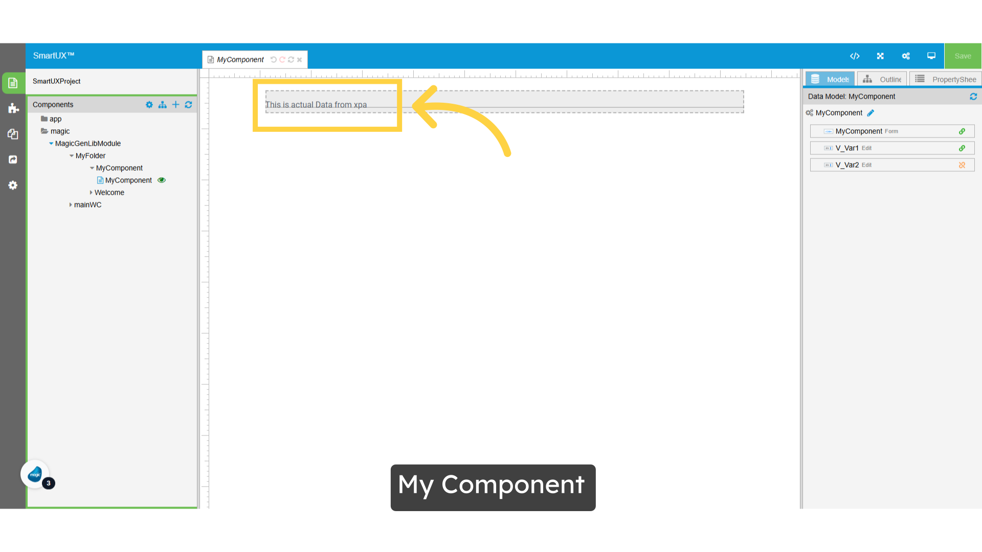
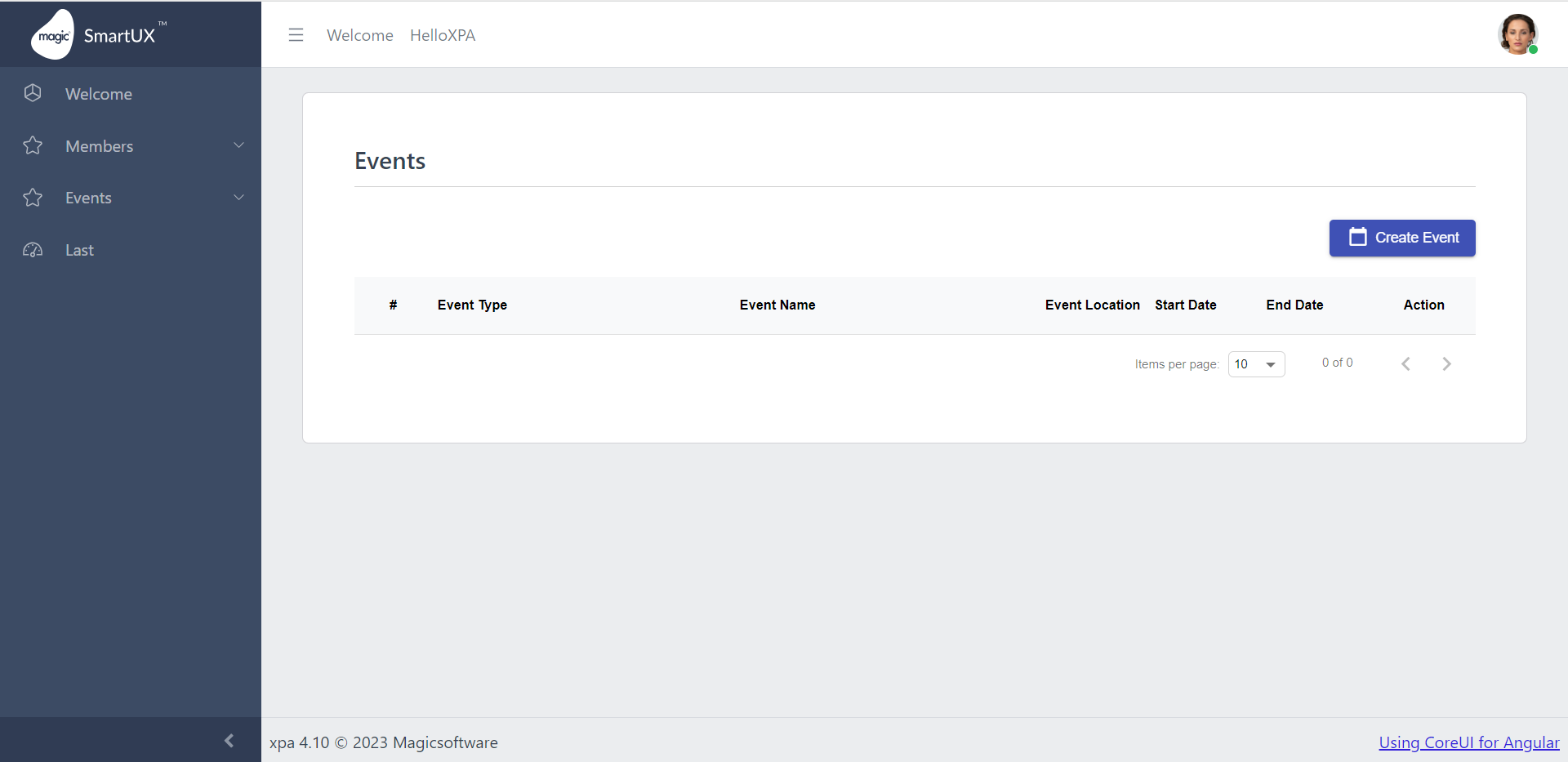
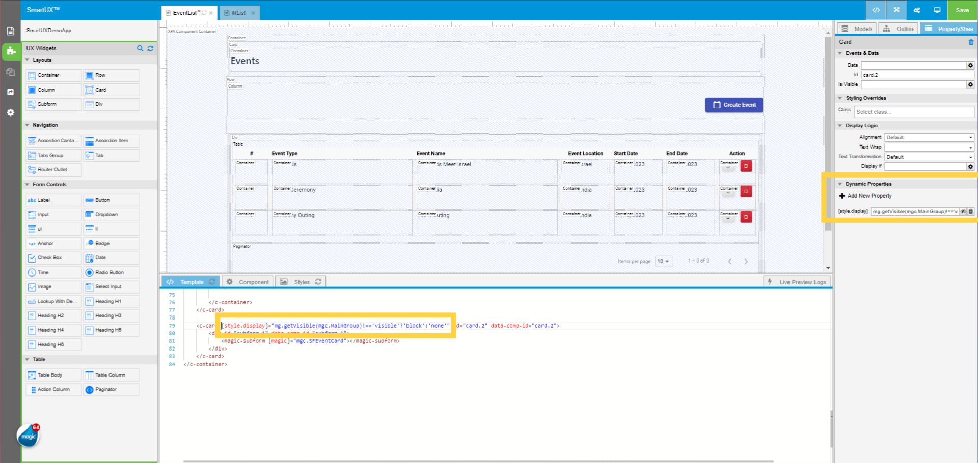
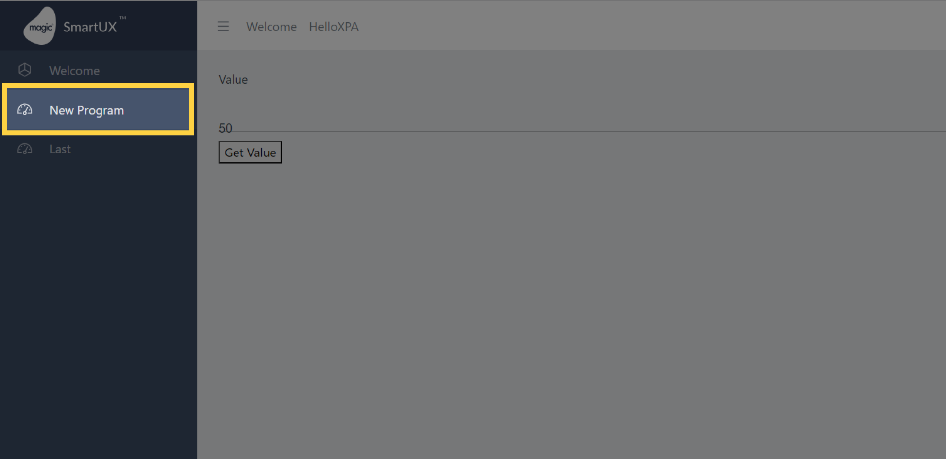
Upon successful completion of the specified steps, the result will reflect the desired outcome as shown in the image below:
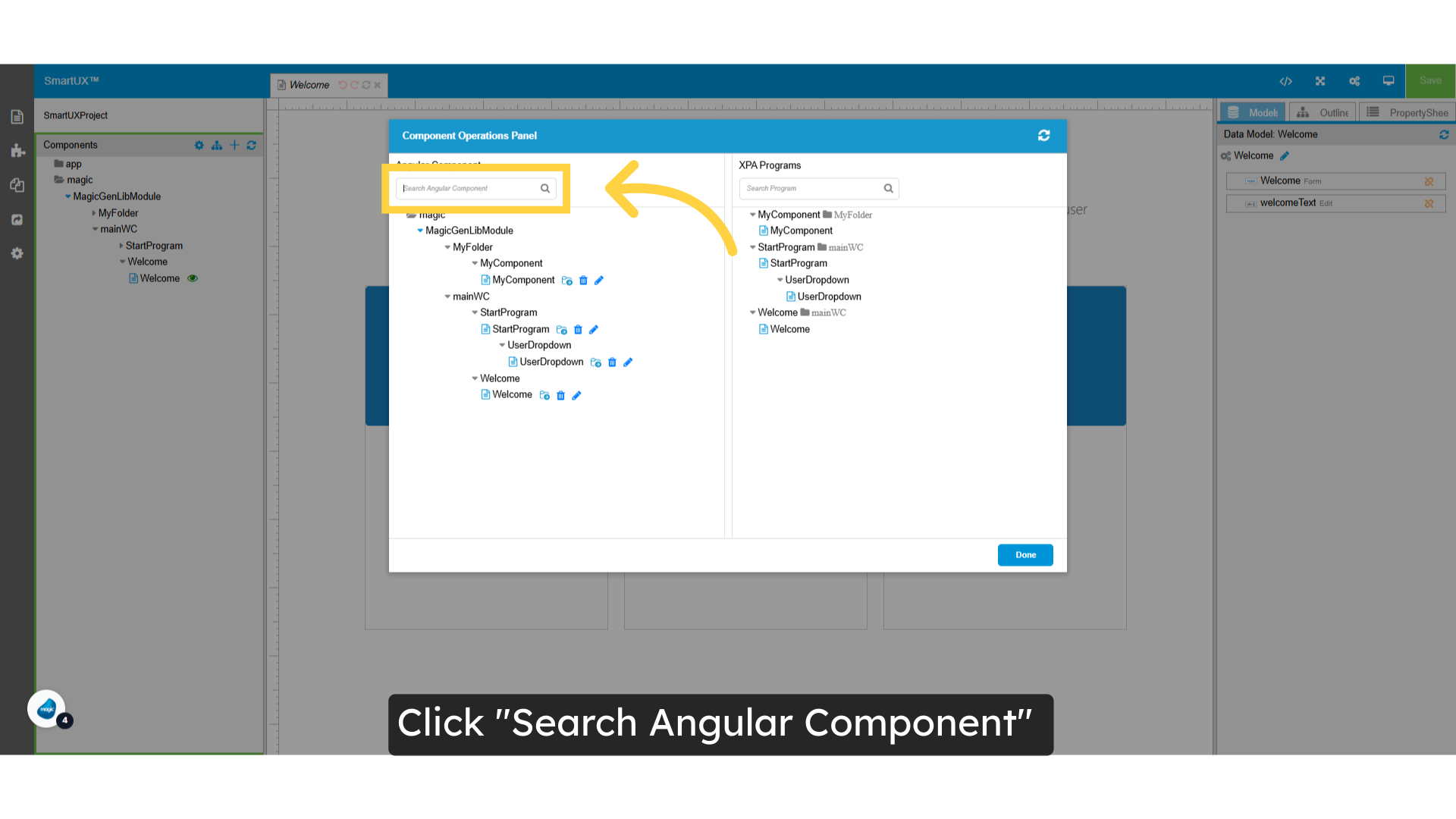
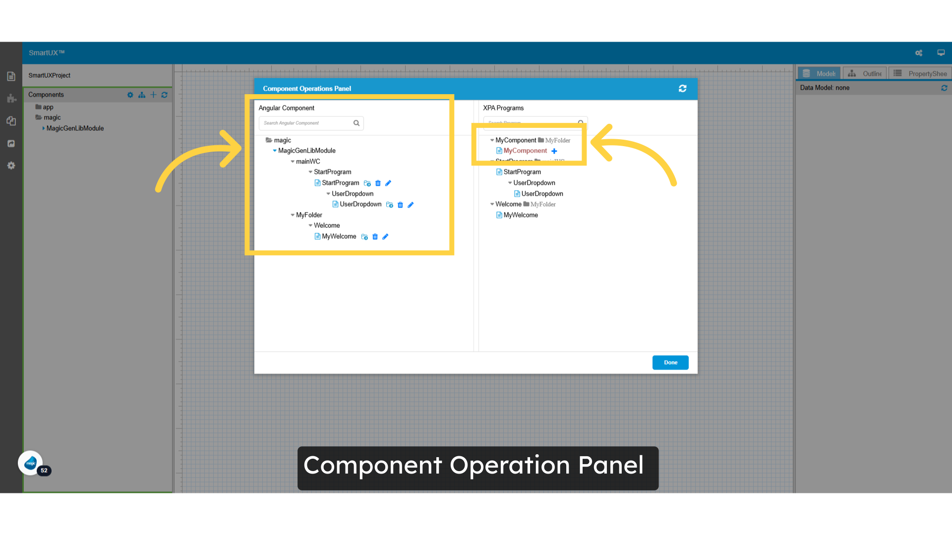
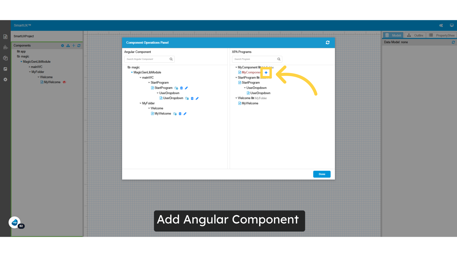
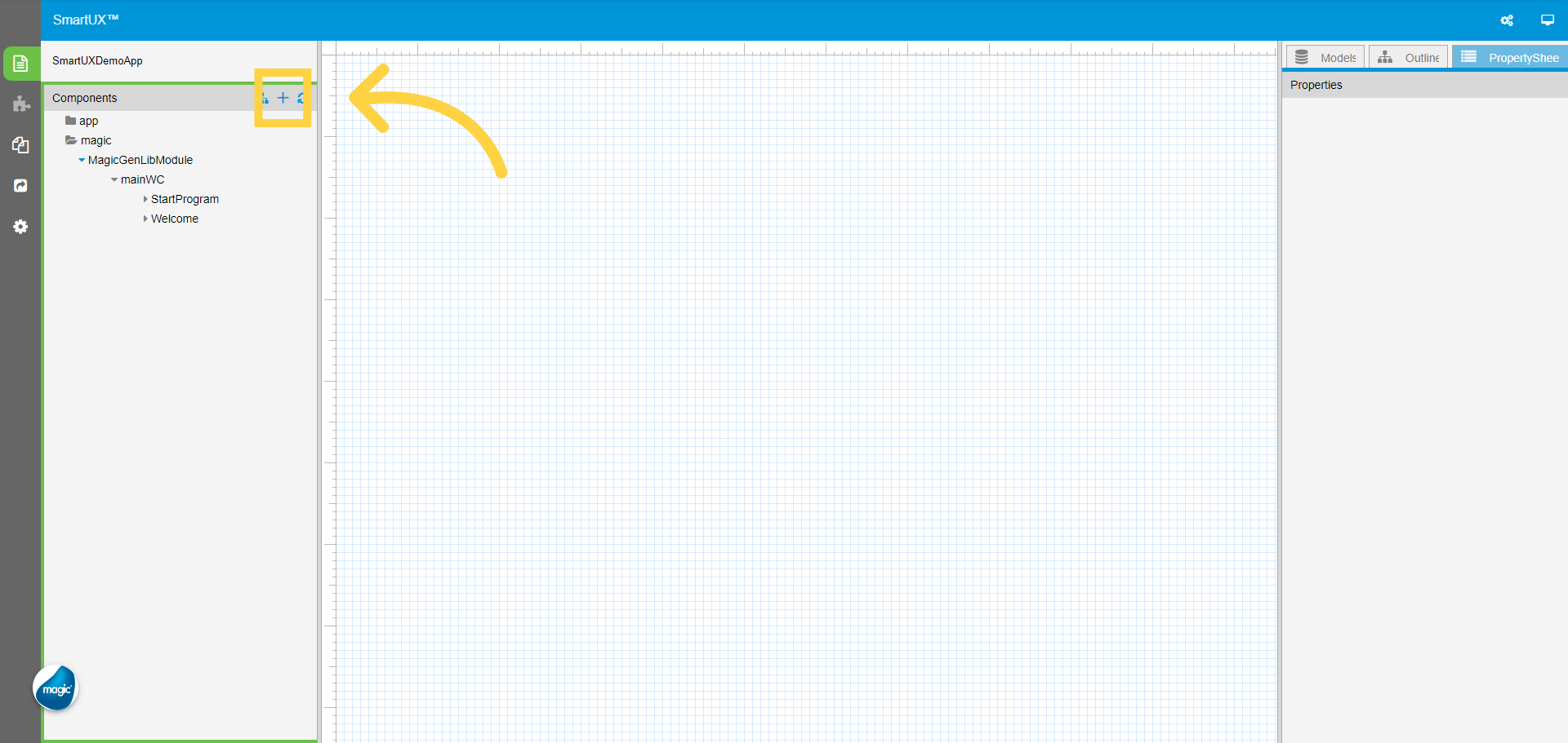
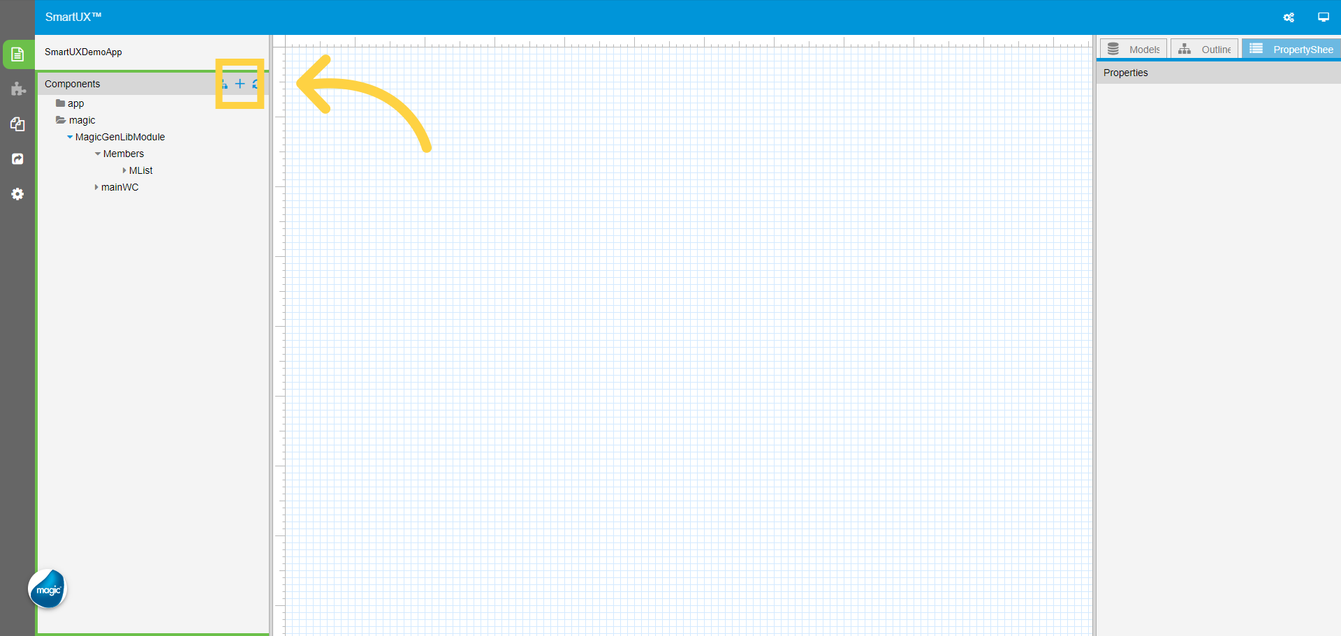
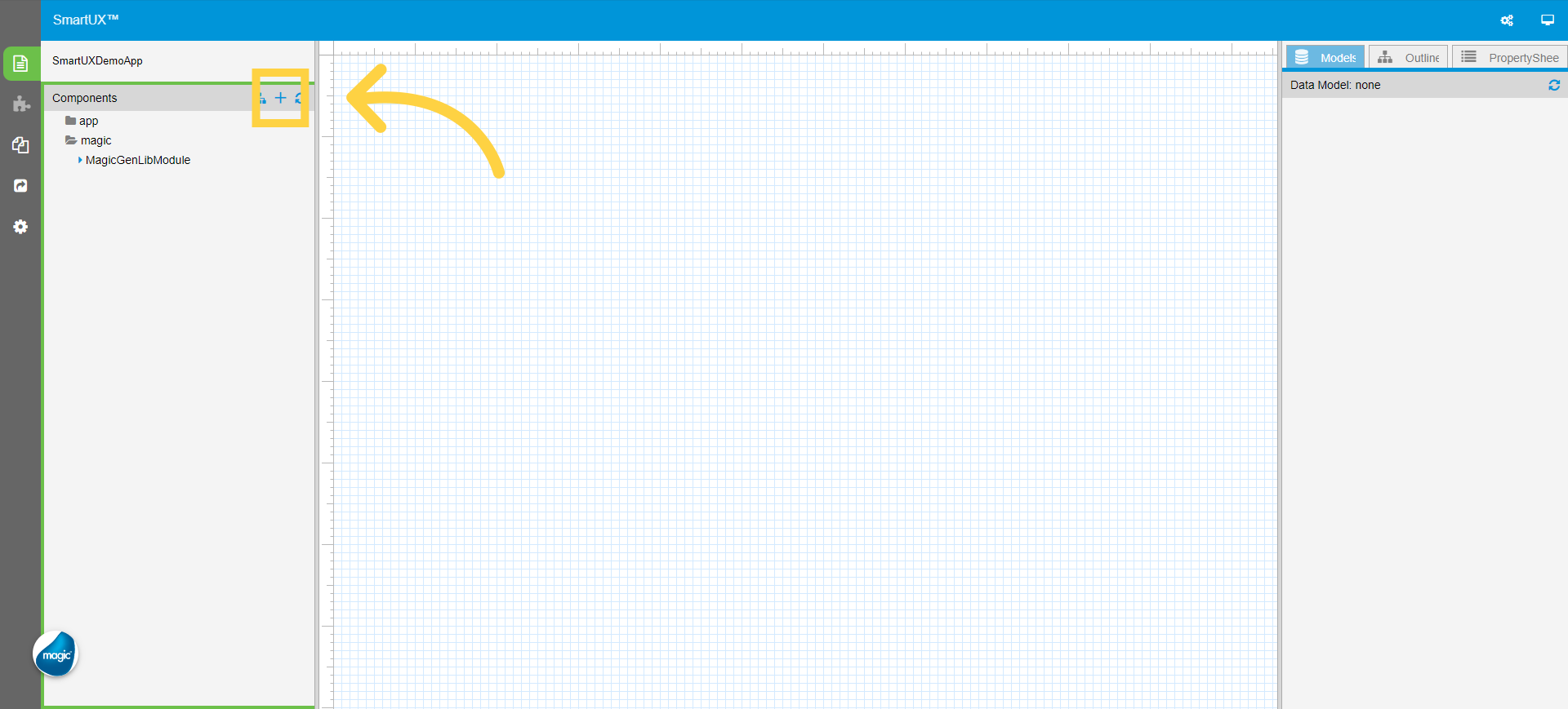
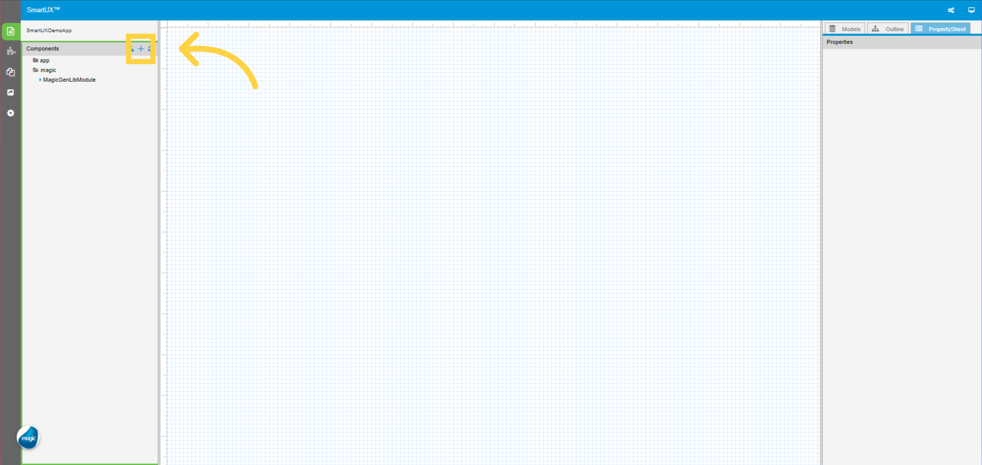
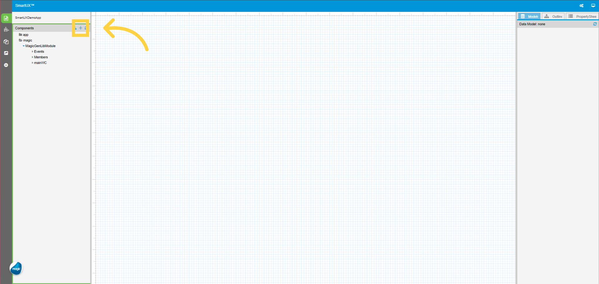
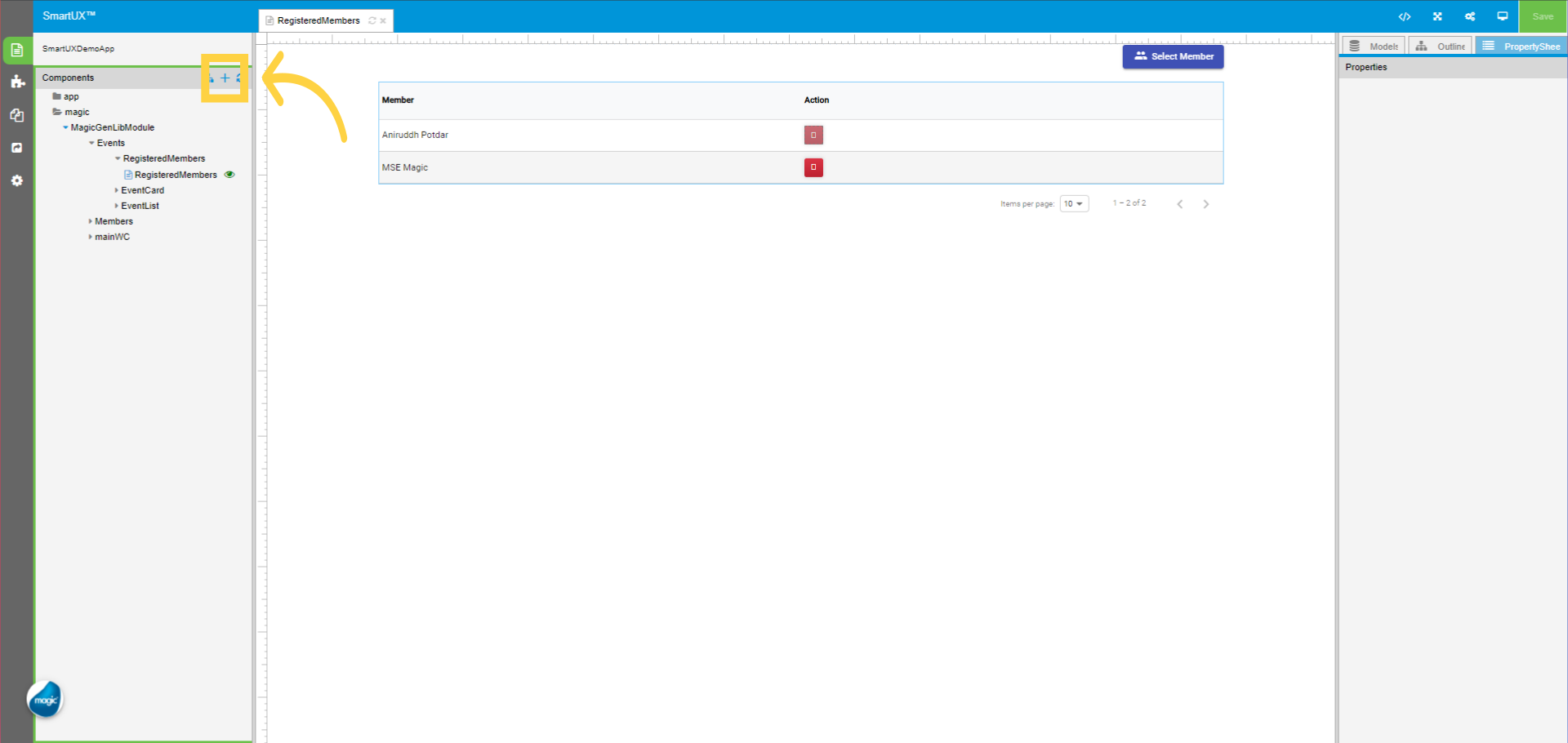
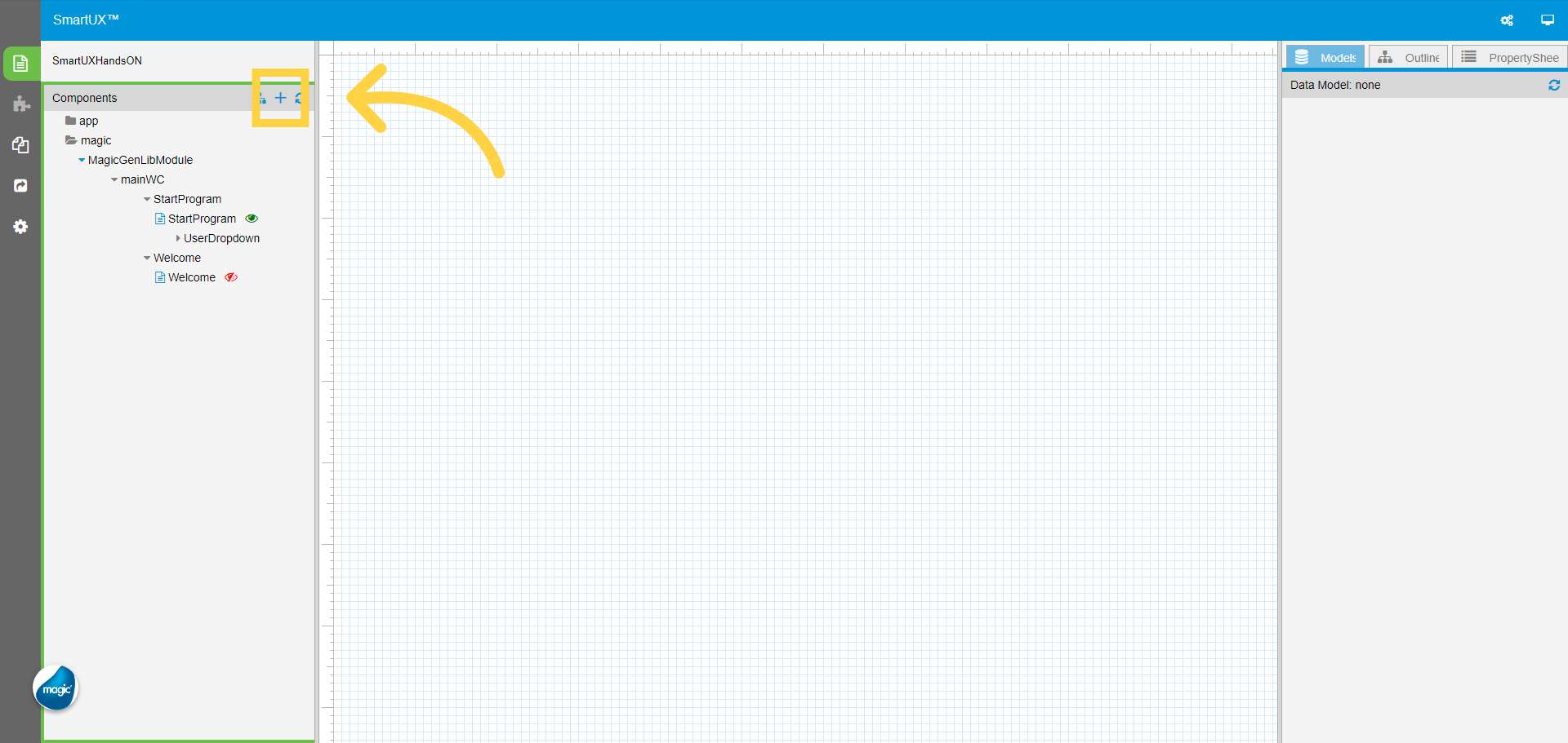
1. Click on Add Component
Click on Add Component, this will open a list of programs from Magic xpa.
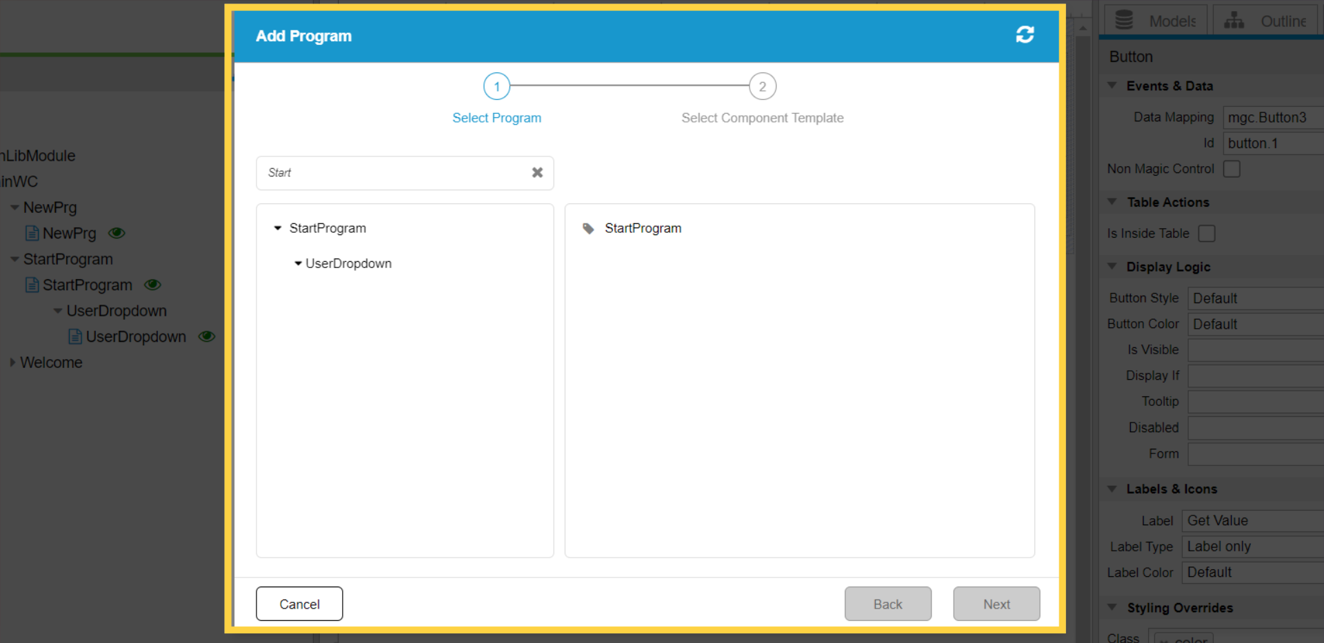
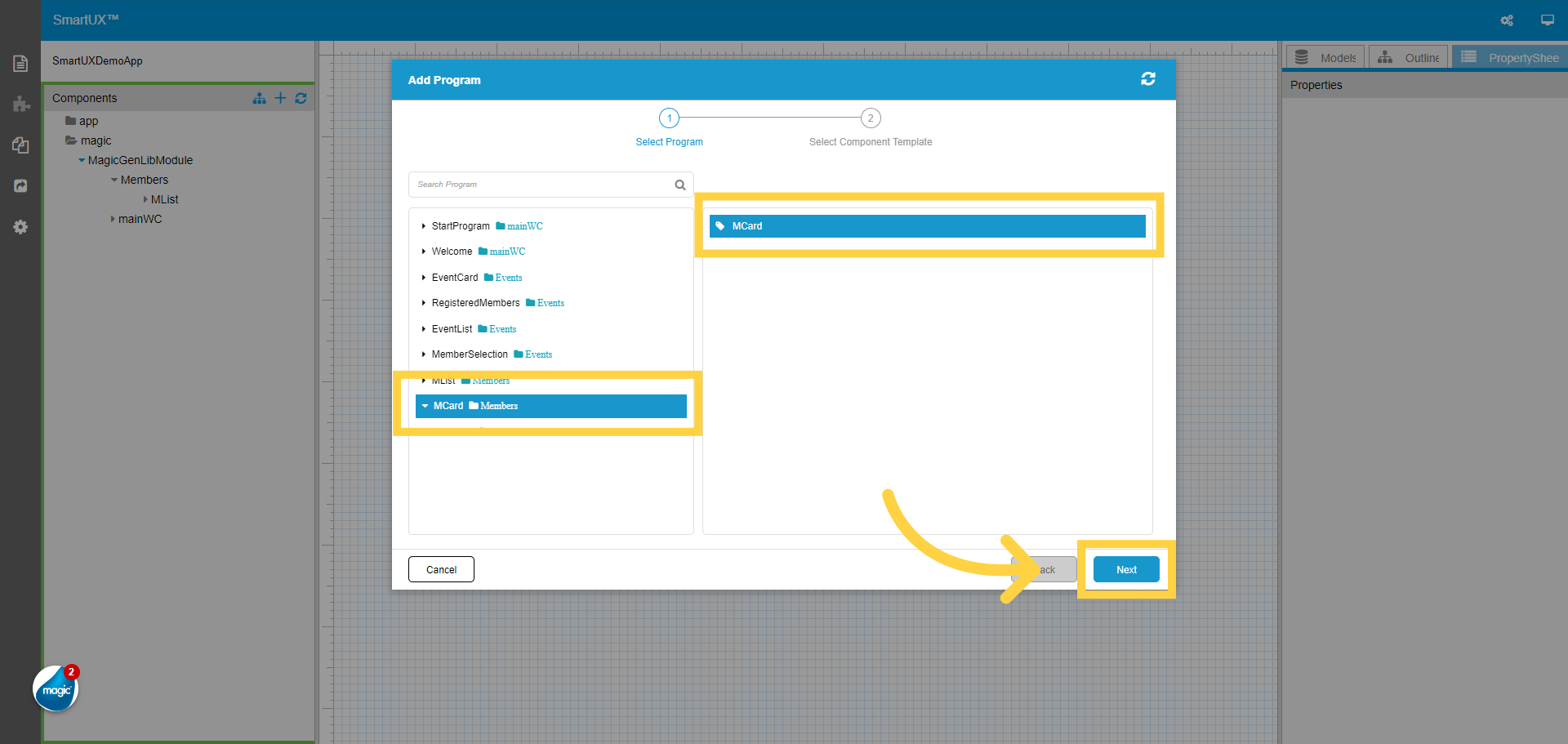
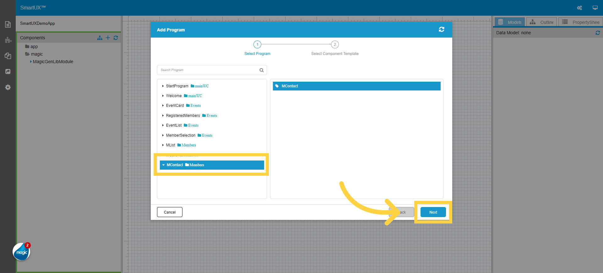
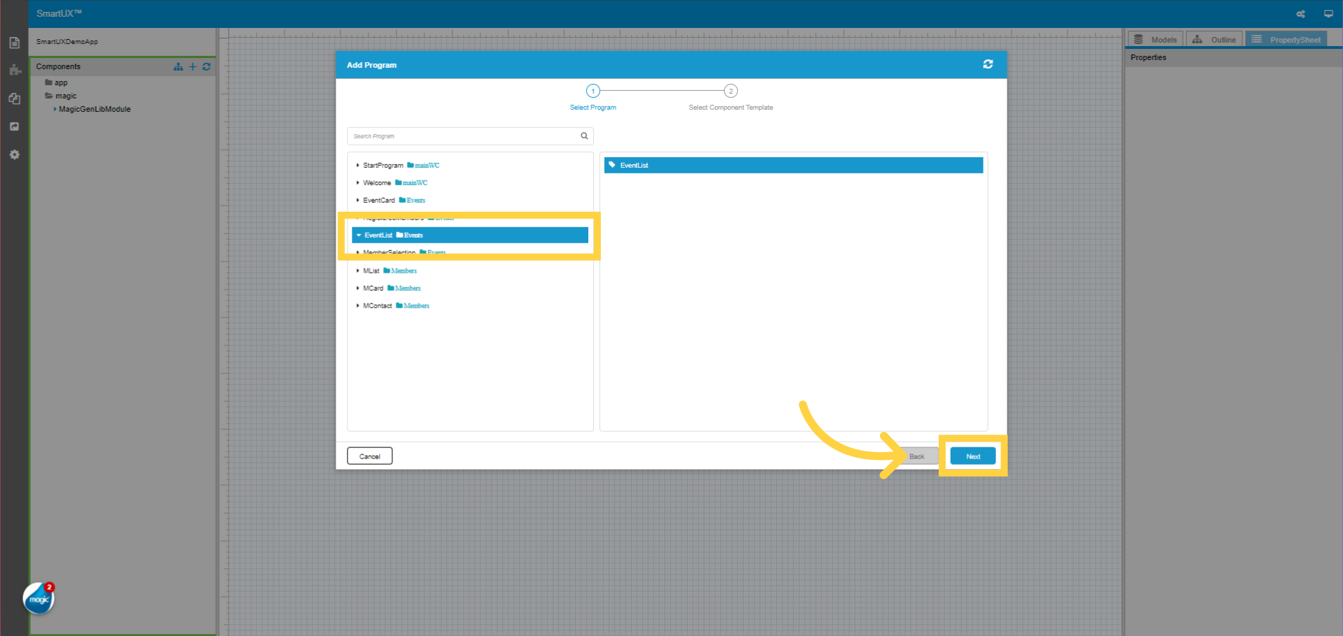
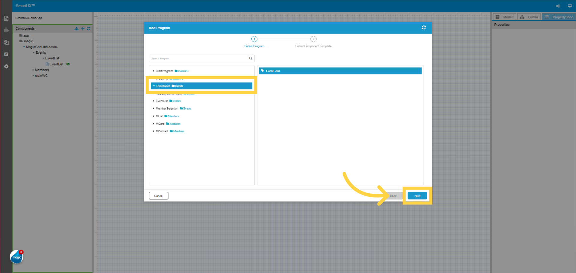
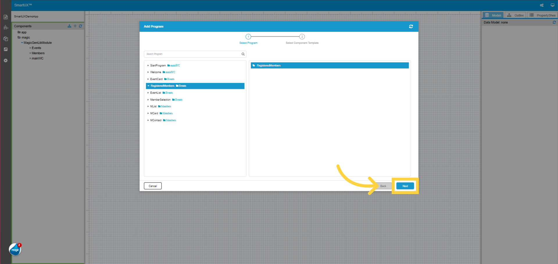
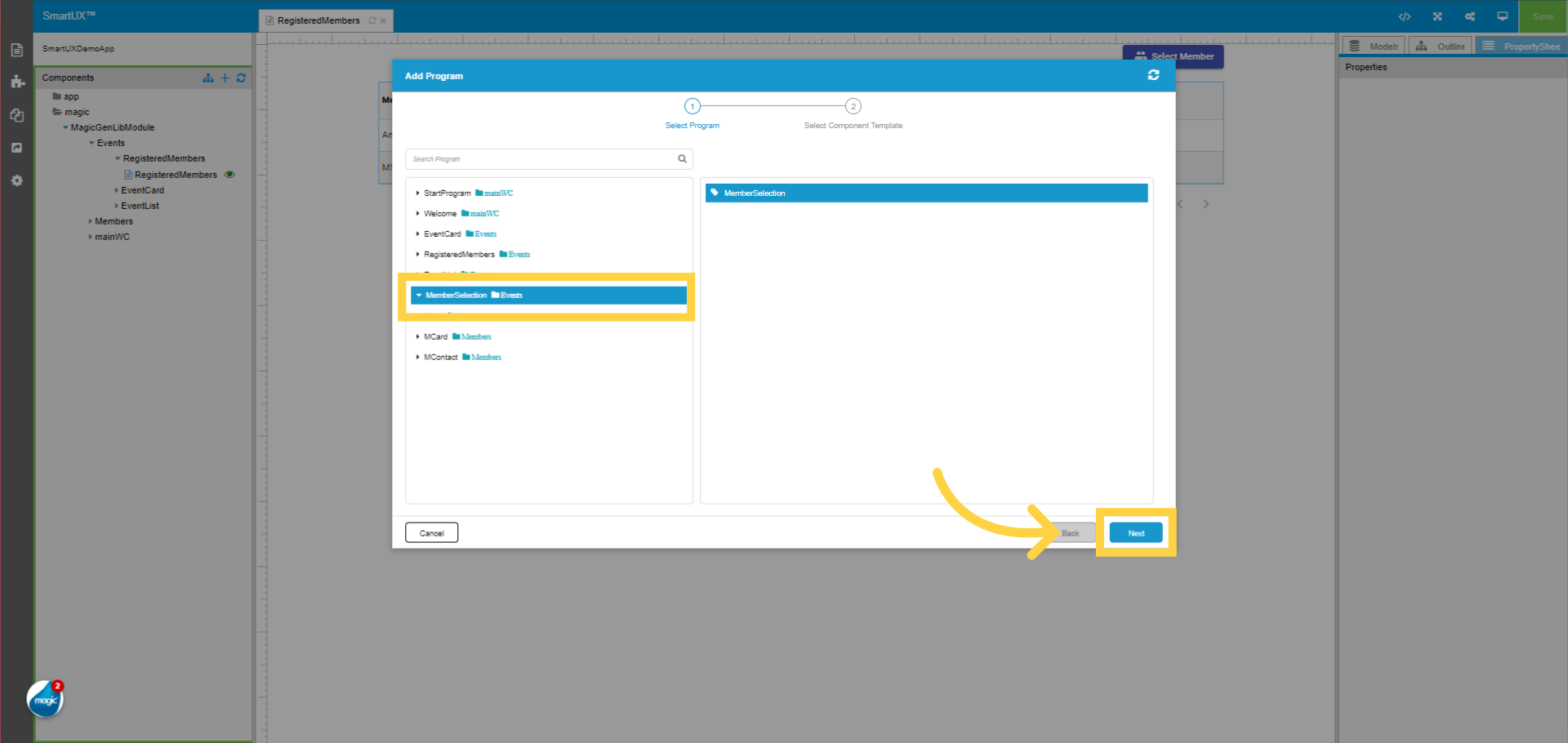
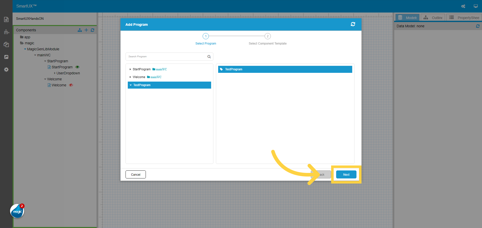
2. Select the program to add as a component
Select the Program you wish to Add as a component in SmartUX.

3. Click “Next”
Select the program and click Next.
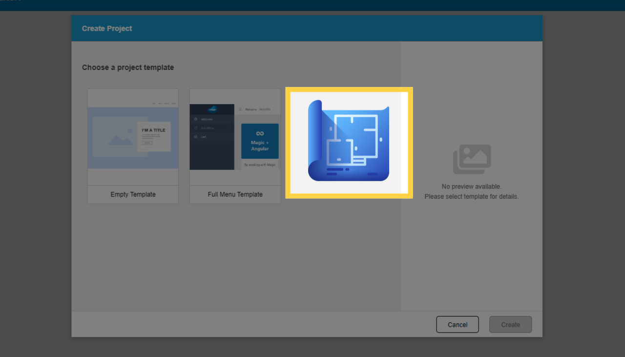
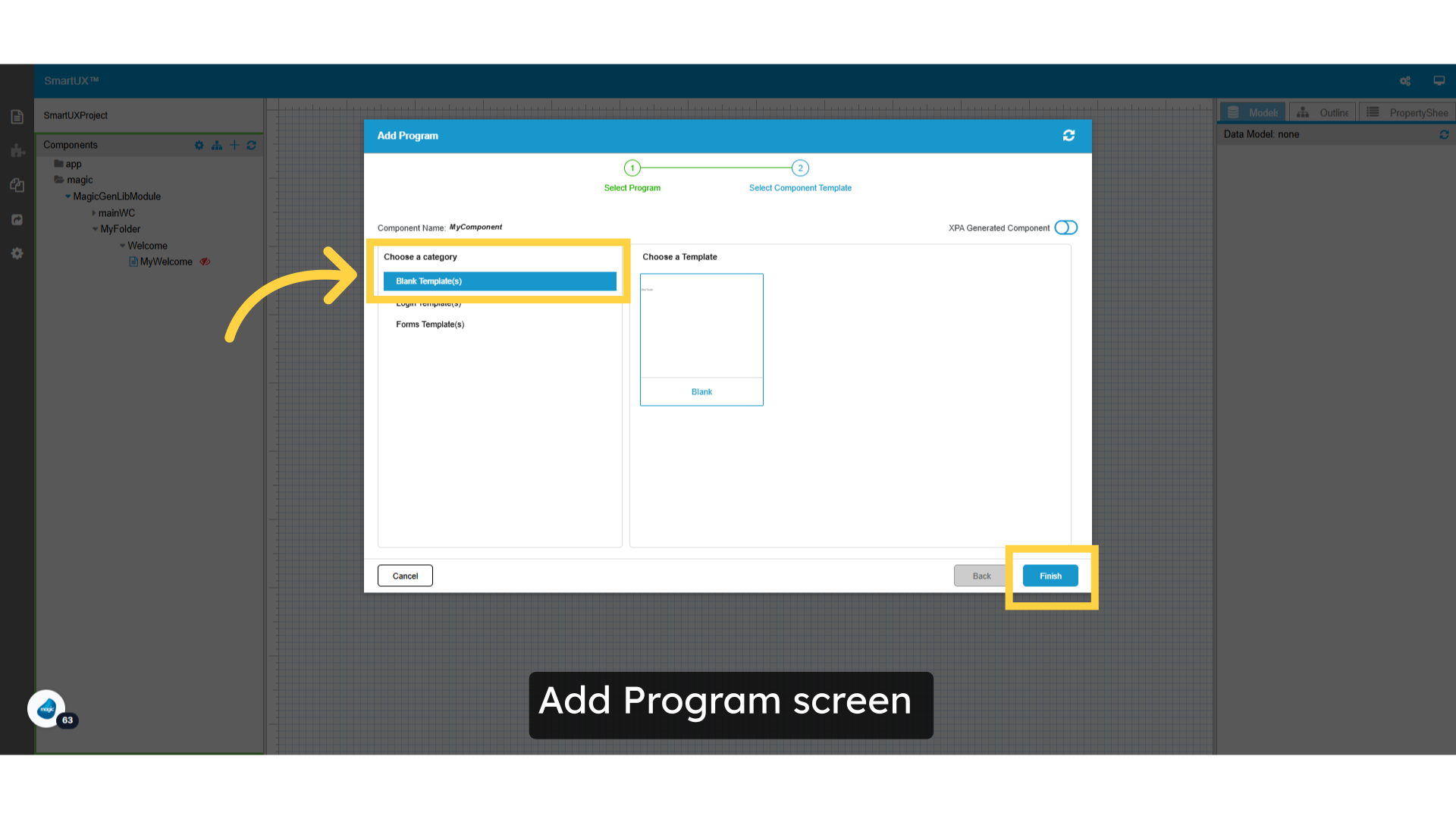
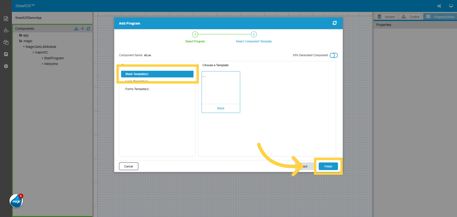
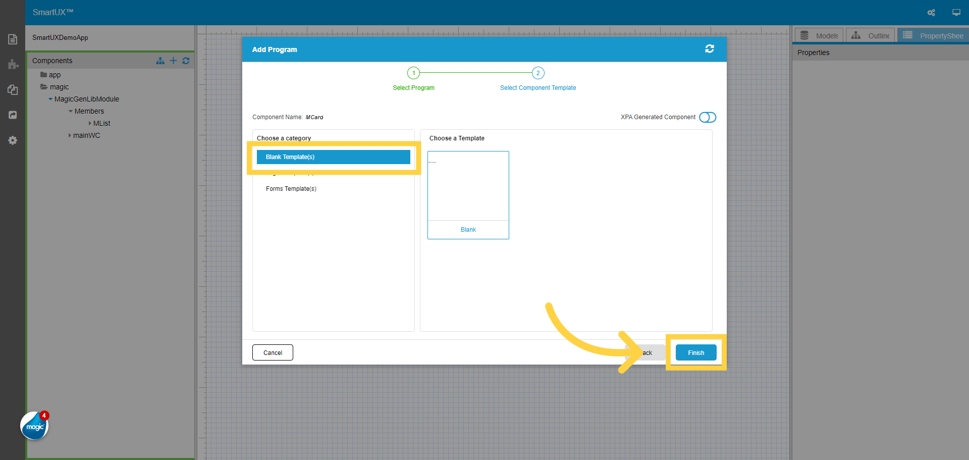
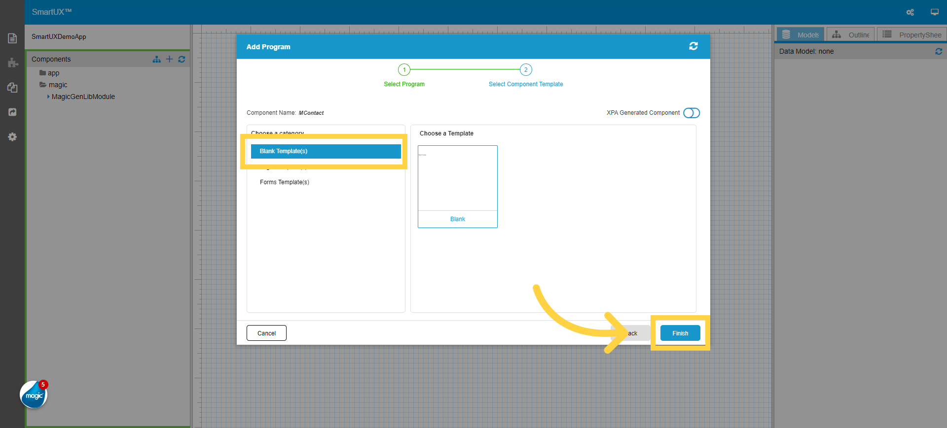
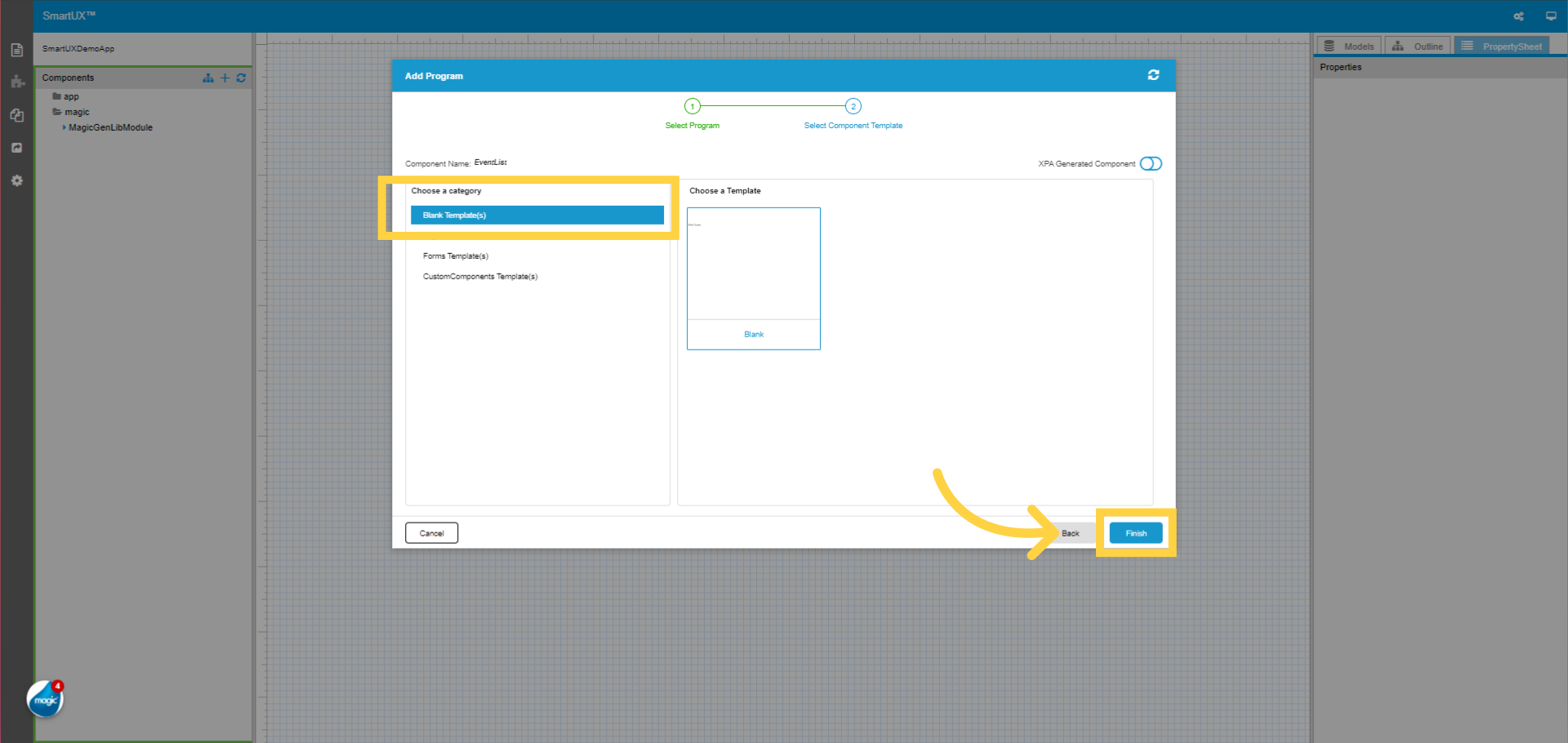
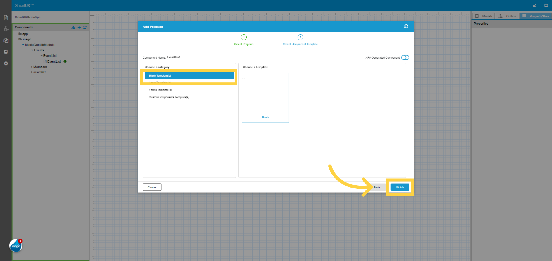
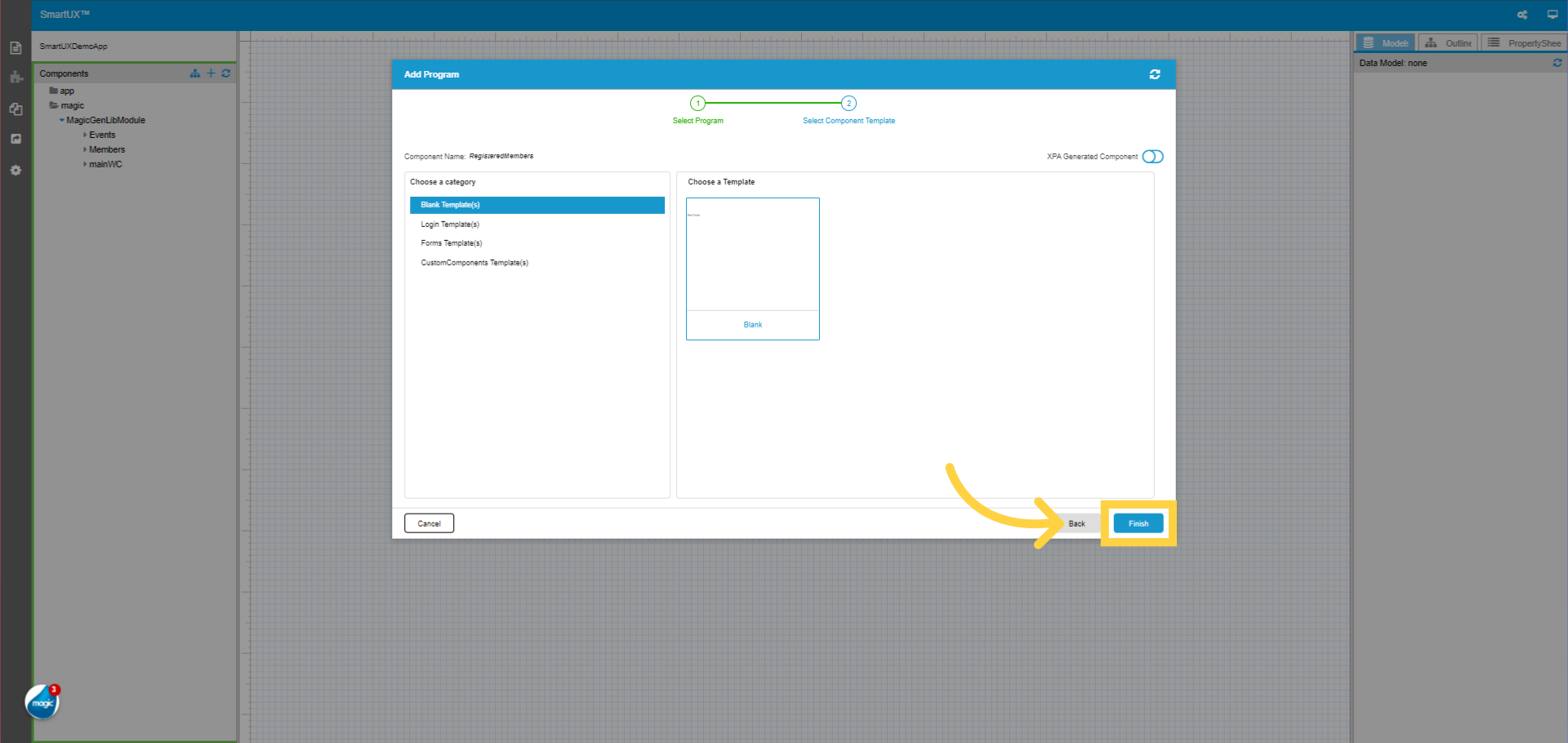
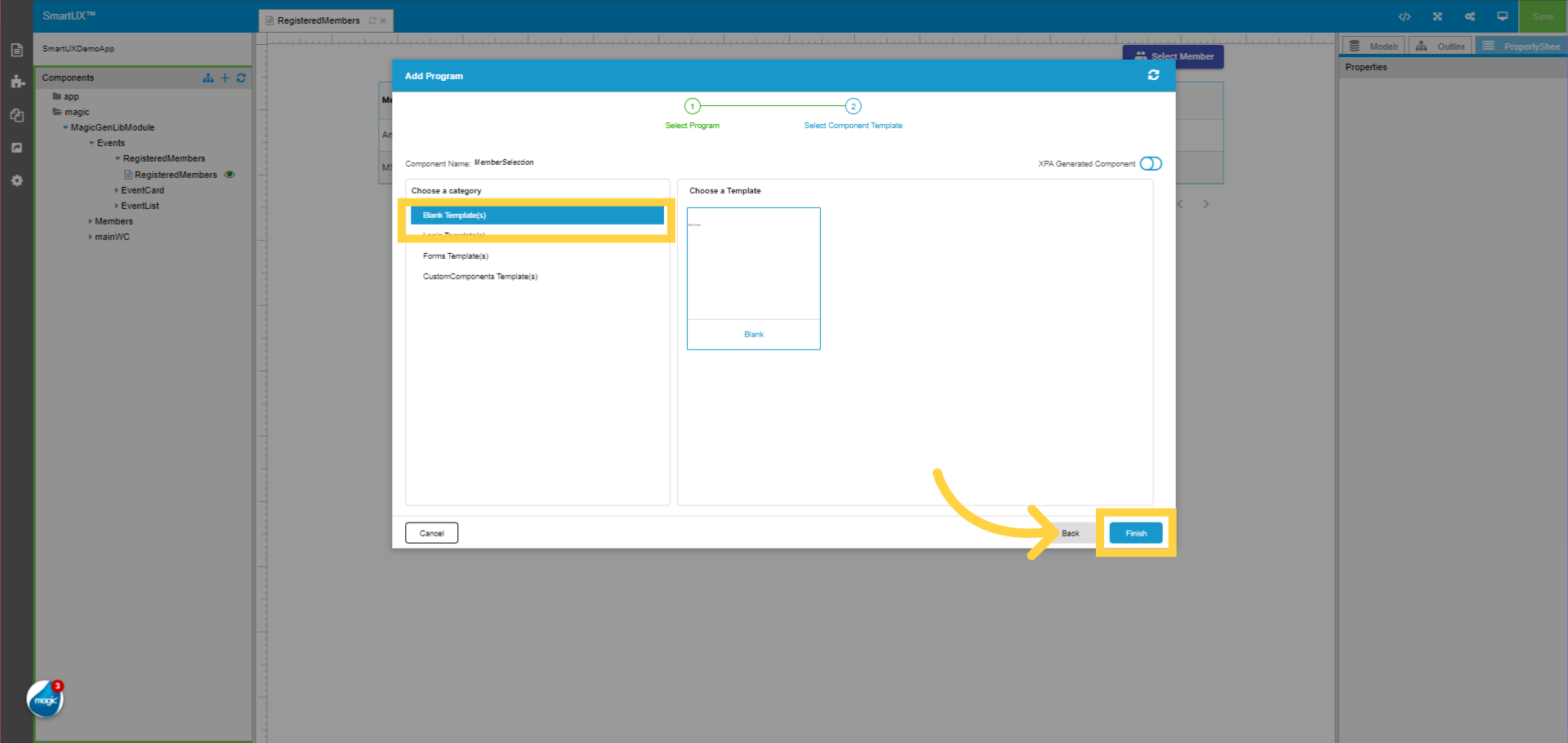
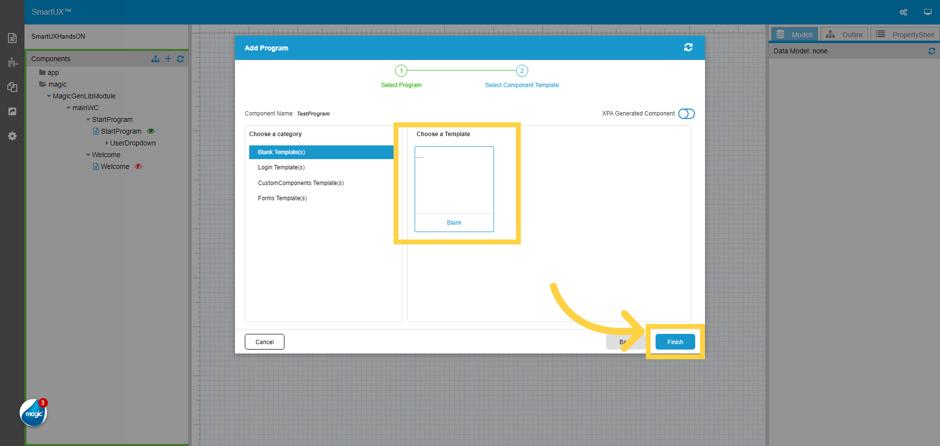
4. Select the Component Template
Select the Component Template and then click on the Finish button. Here we select a Blank template.
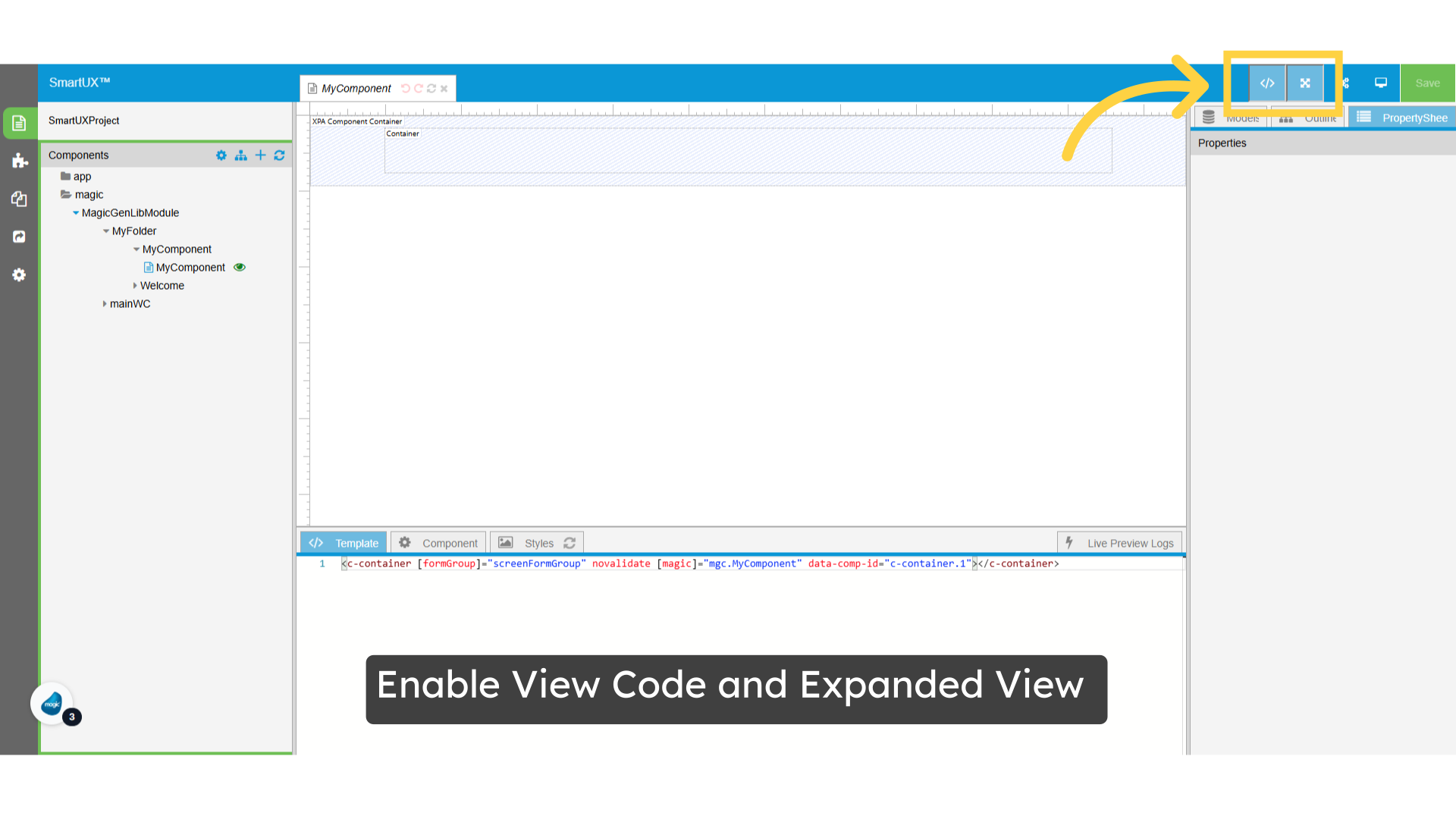
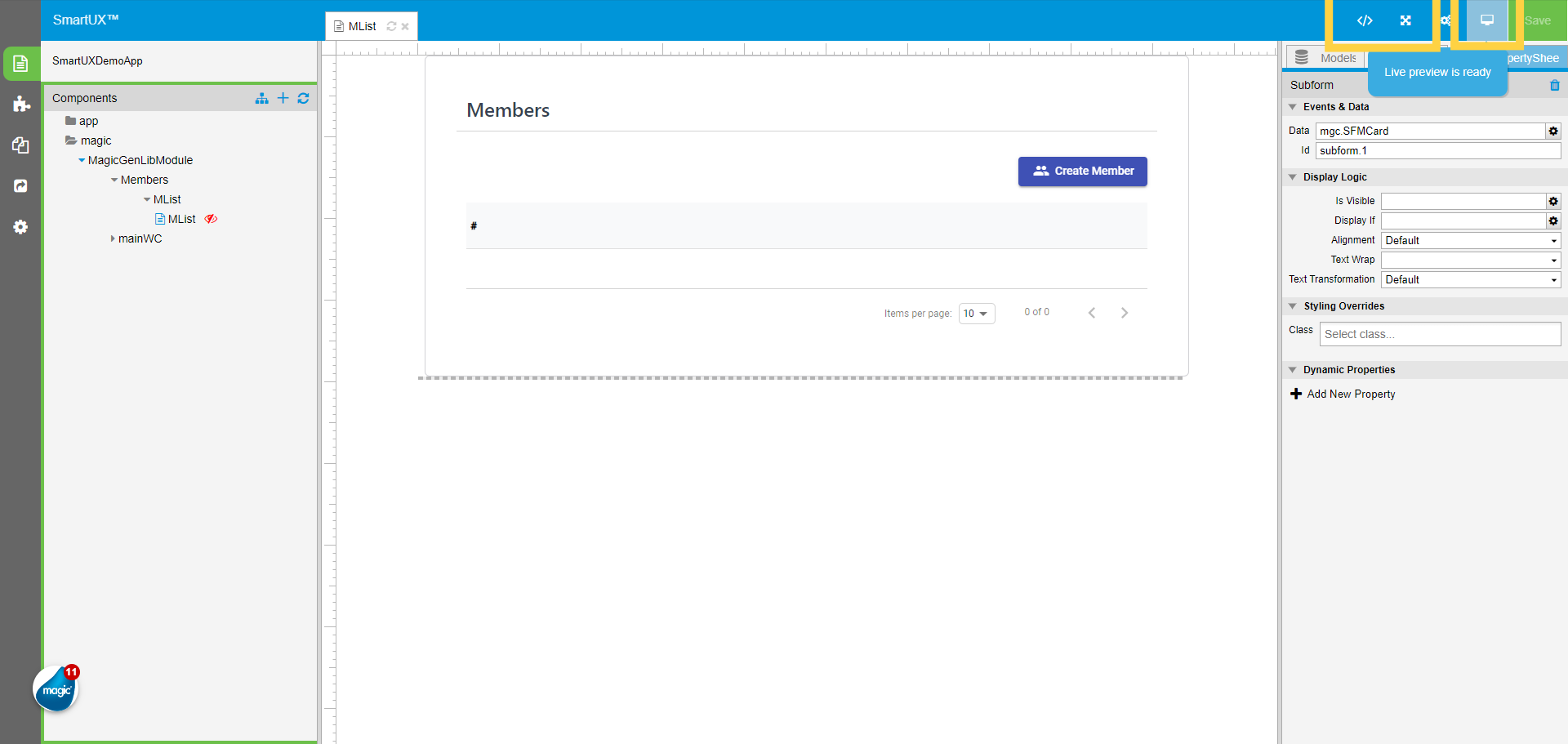
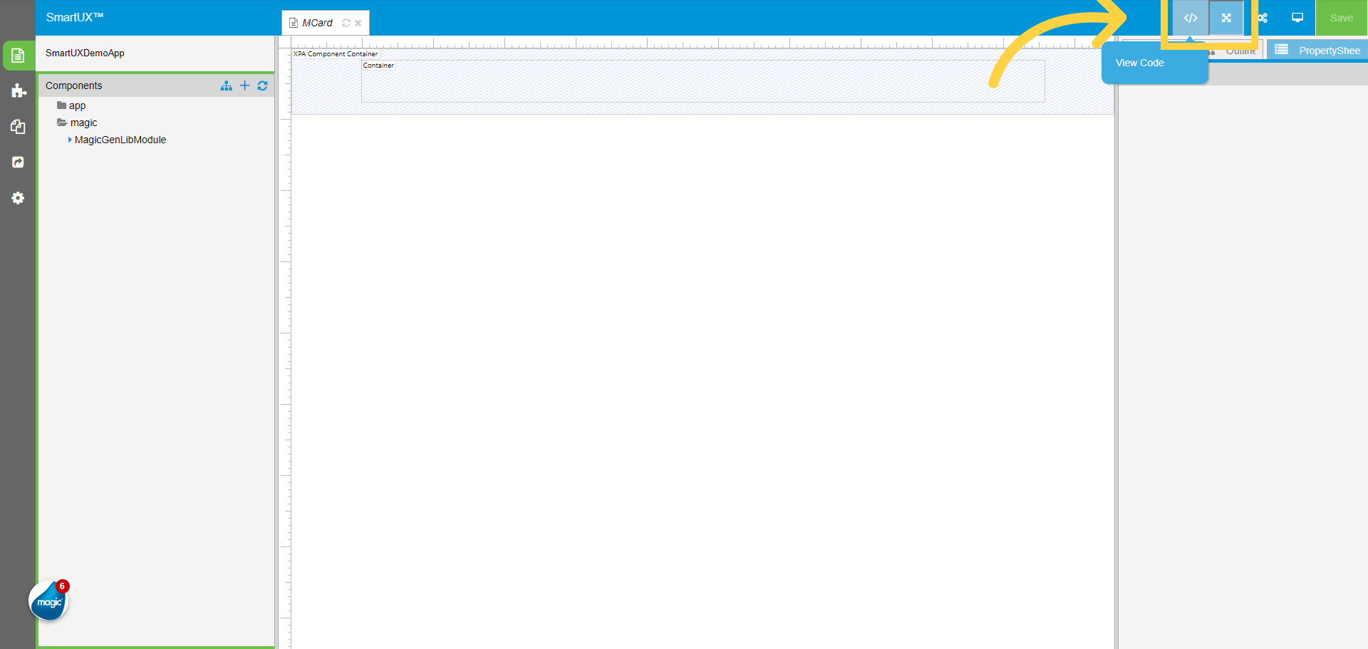
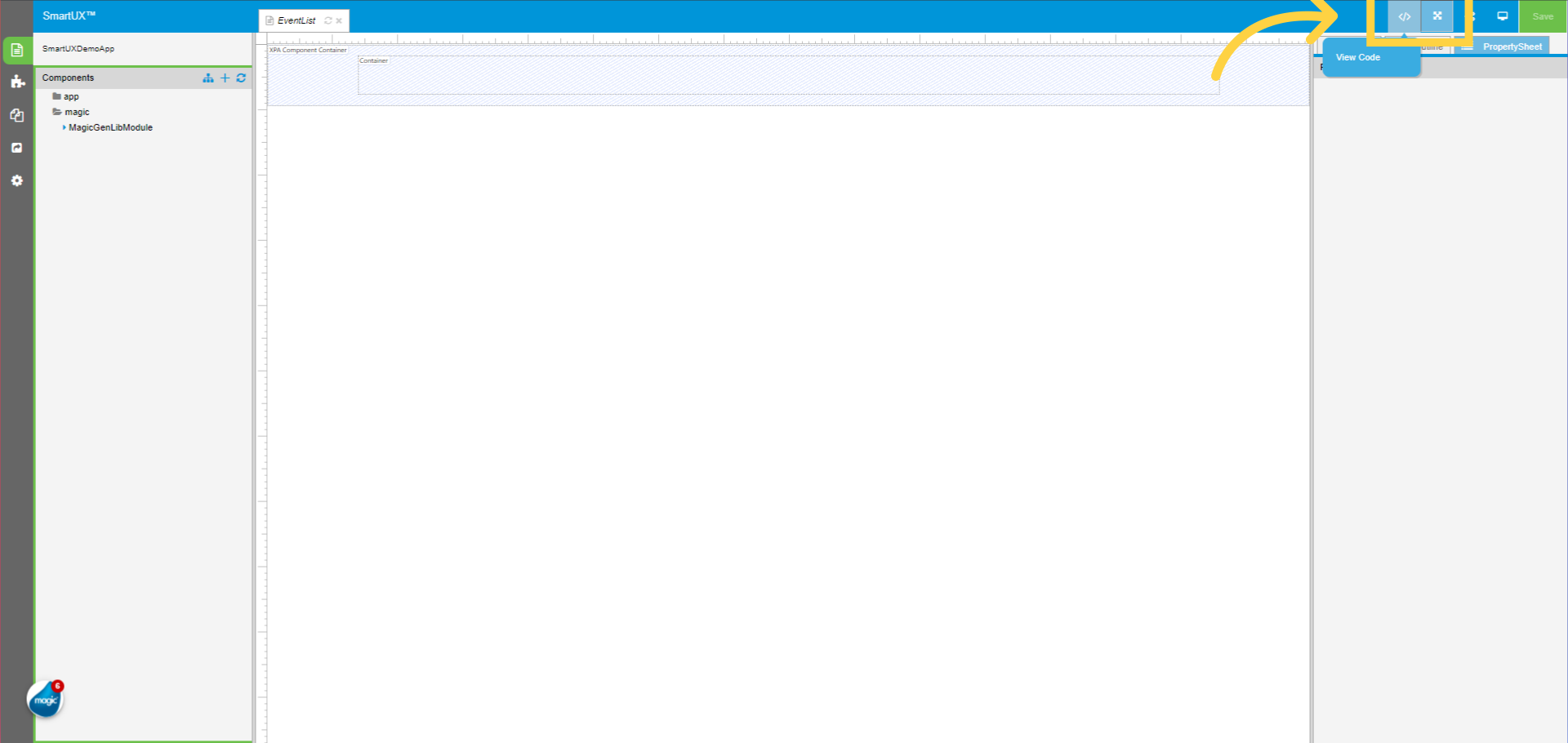
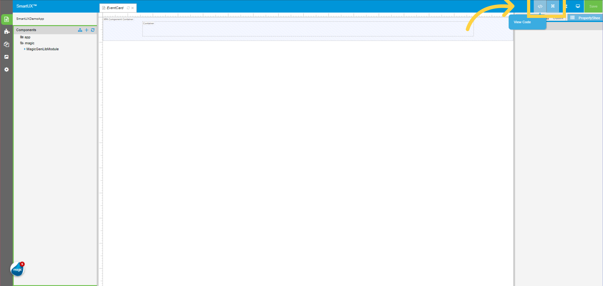
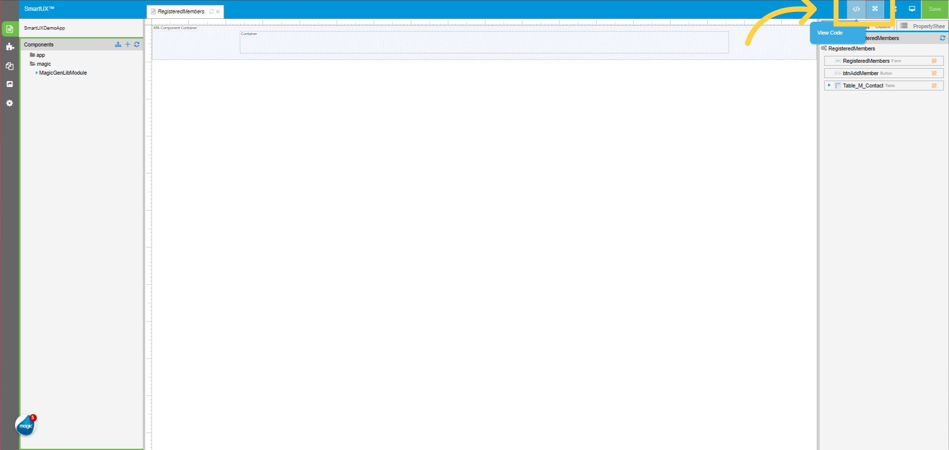
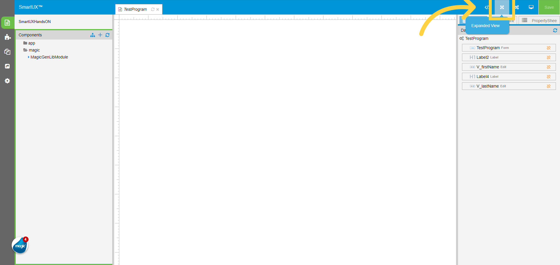
5. Switch to Expanded View on Canvas
To see the canvas in design mode click on Expanded View.
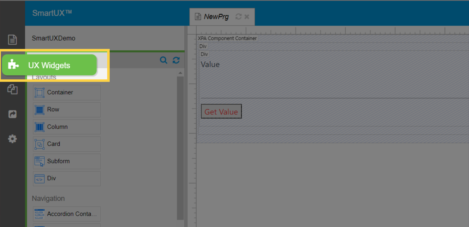
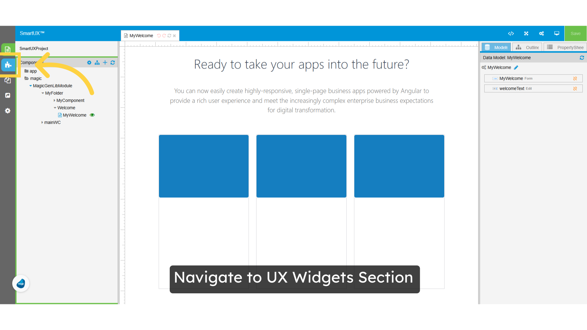
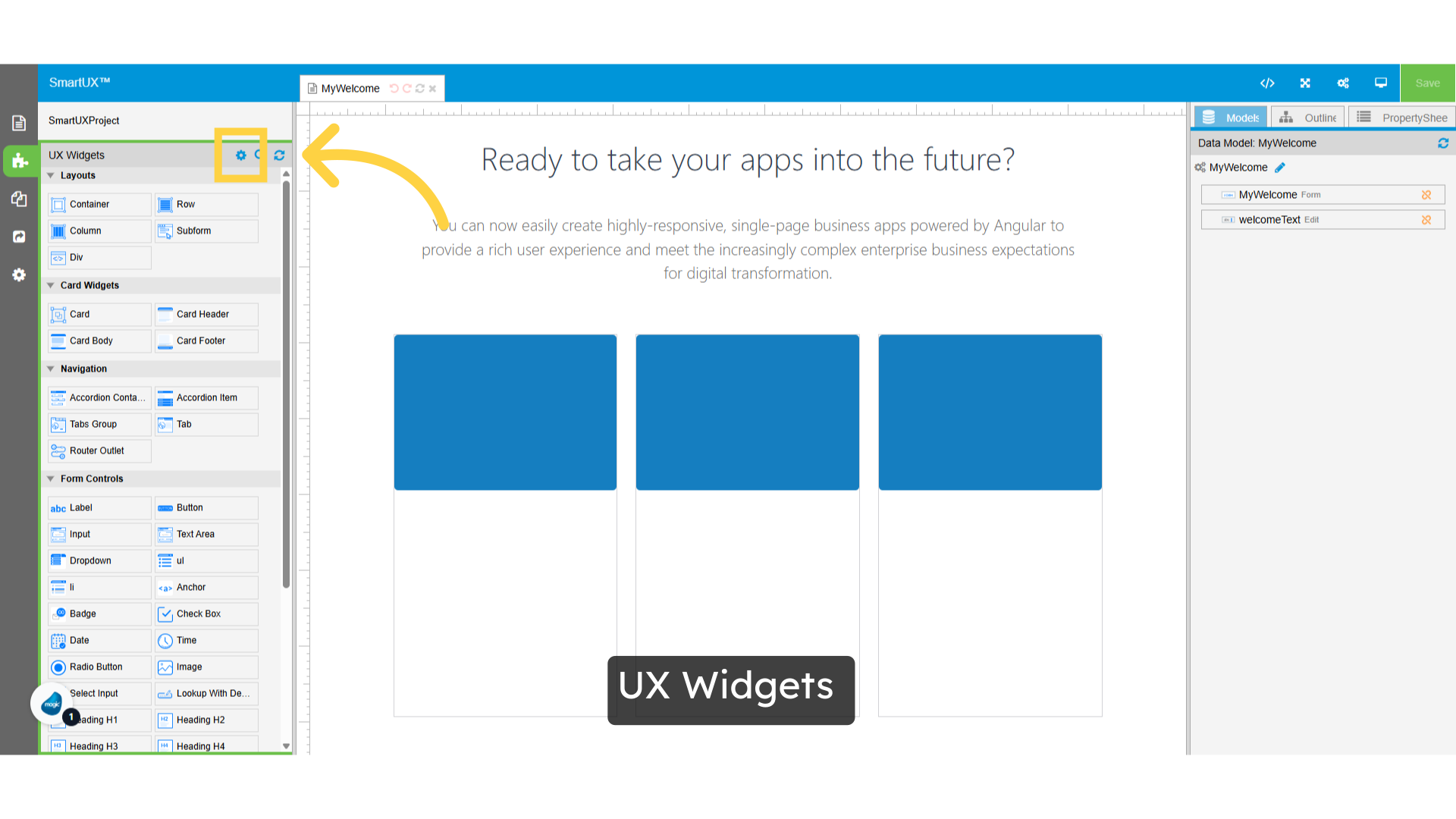
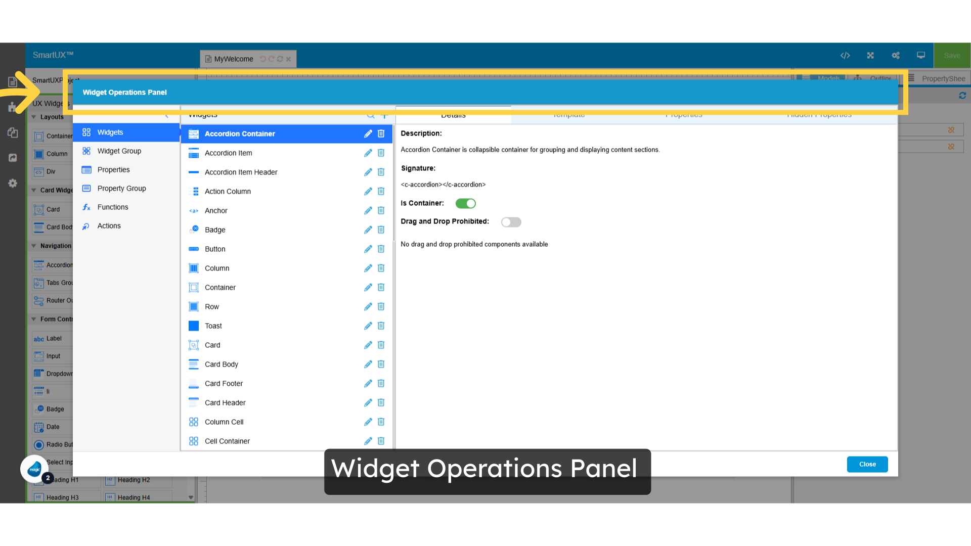
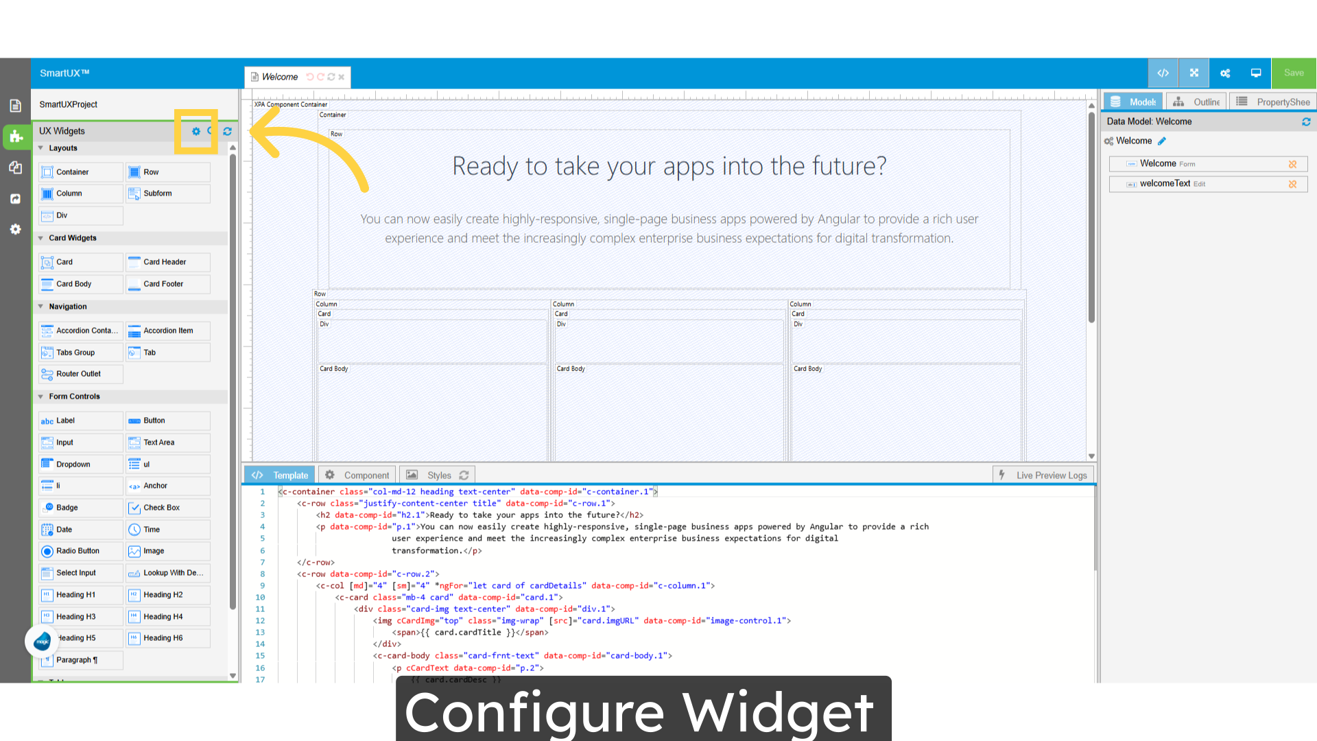
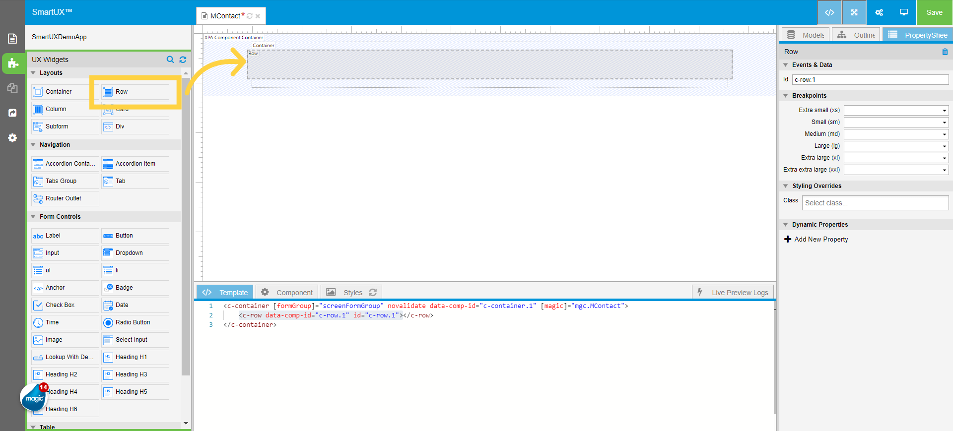
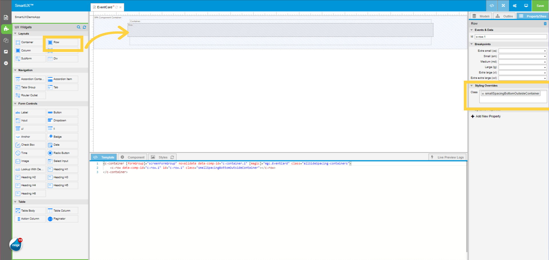
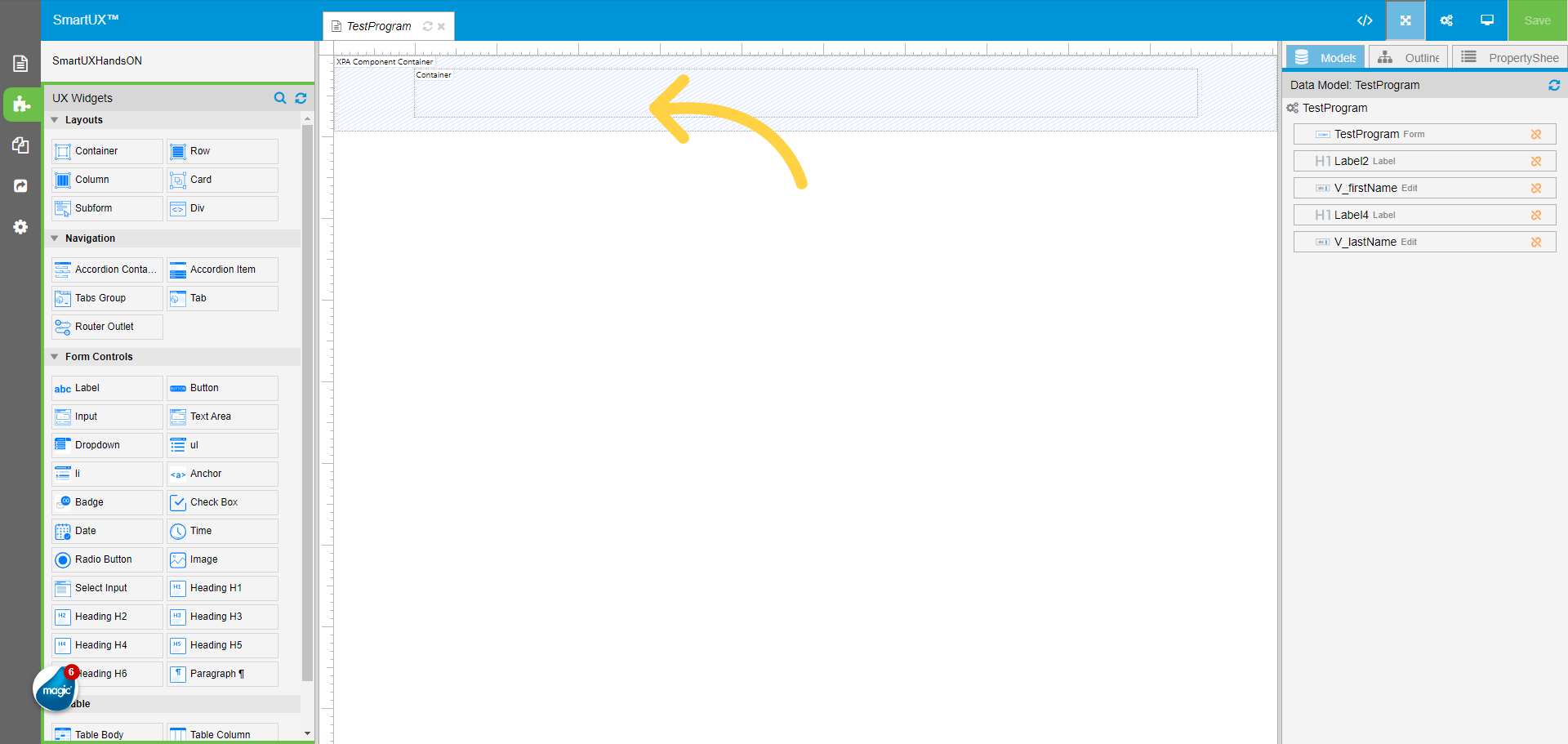
6. Open Widgets Pane
From the left pane select the UX Widgets. This will open a widgets pane showing the set of widgets to drag and drop on canvas.

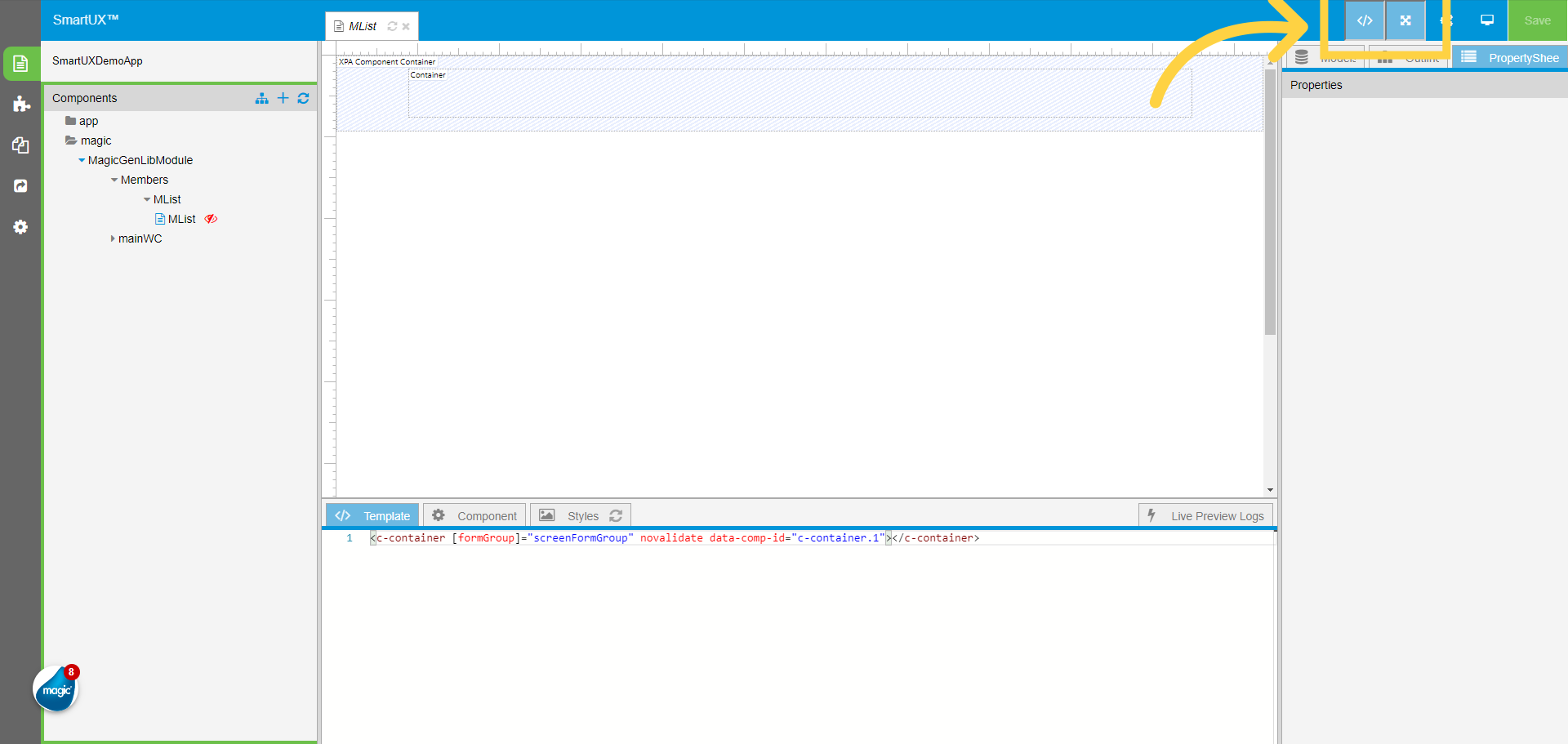
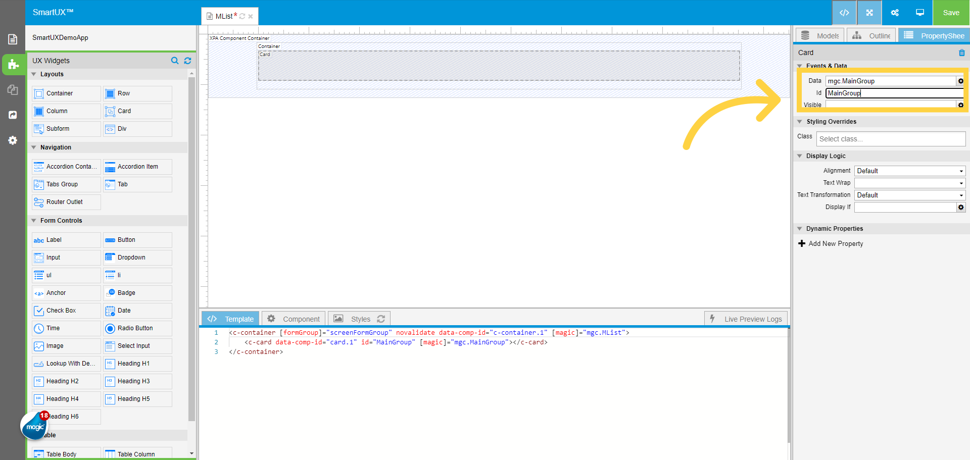
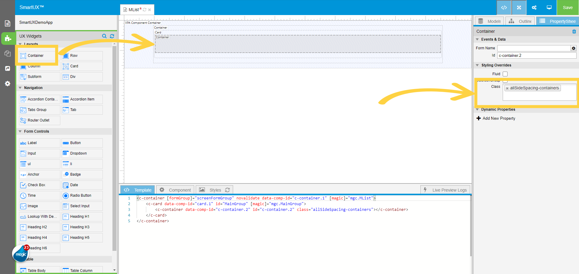
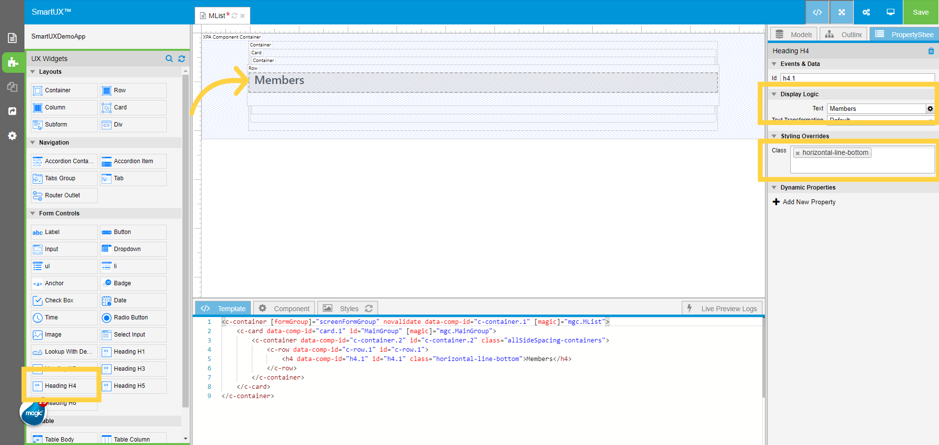
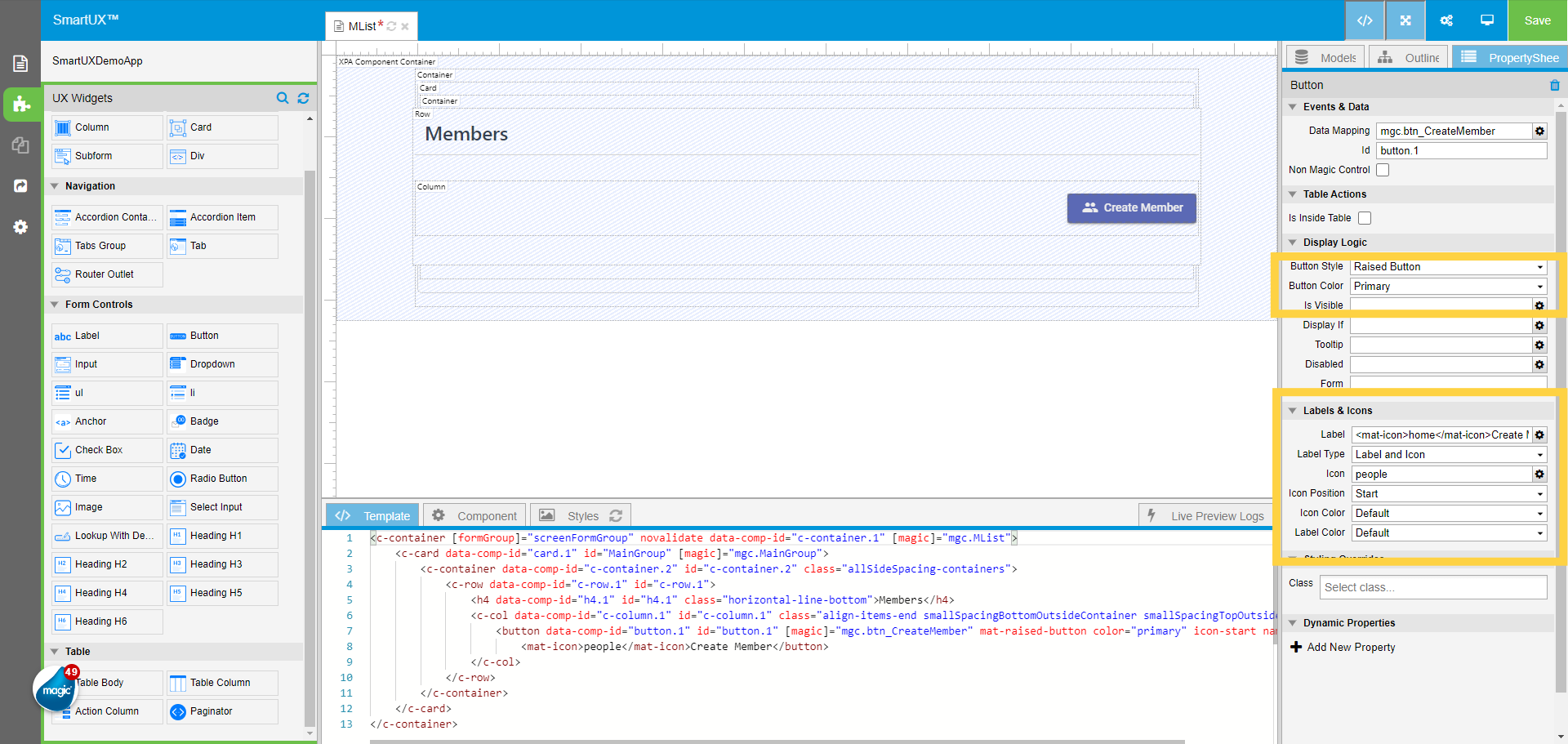
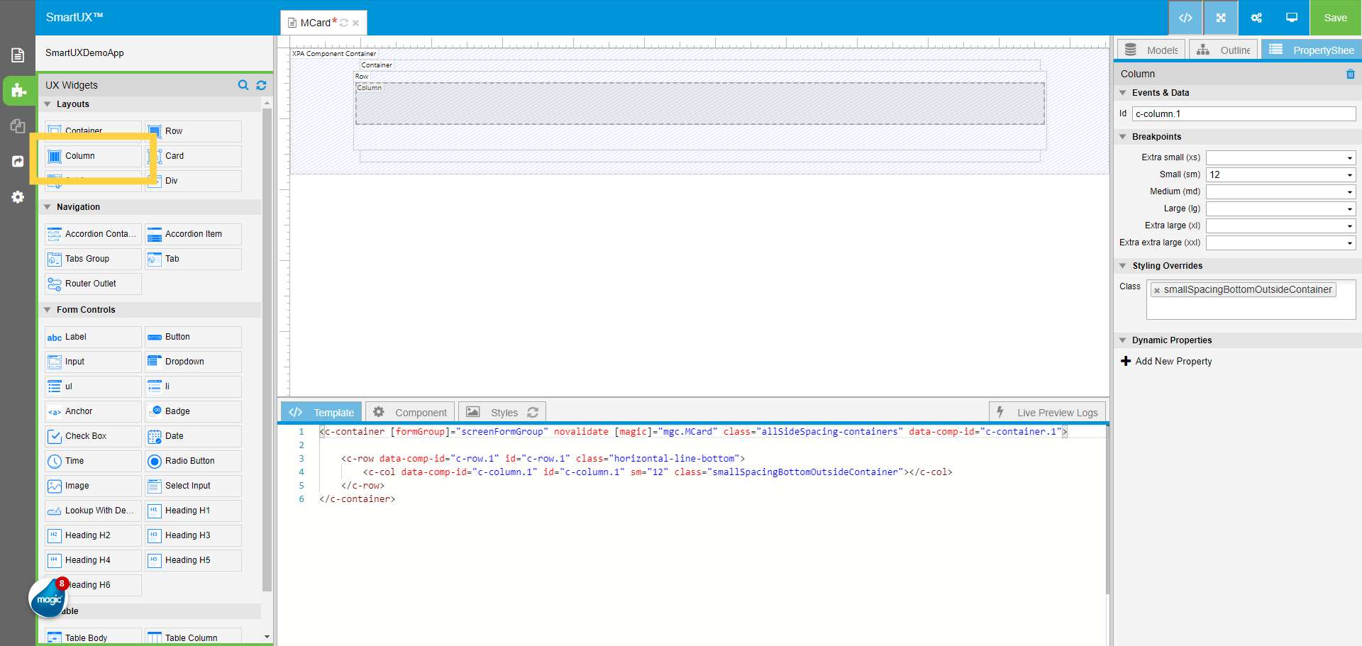
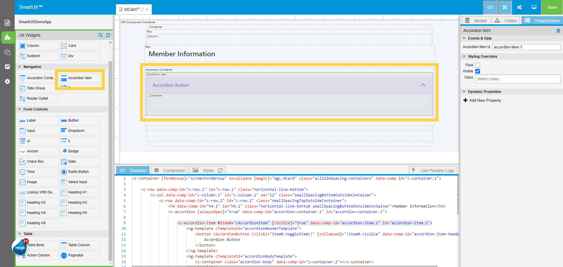
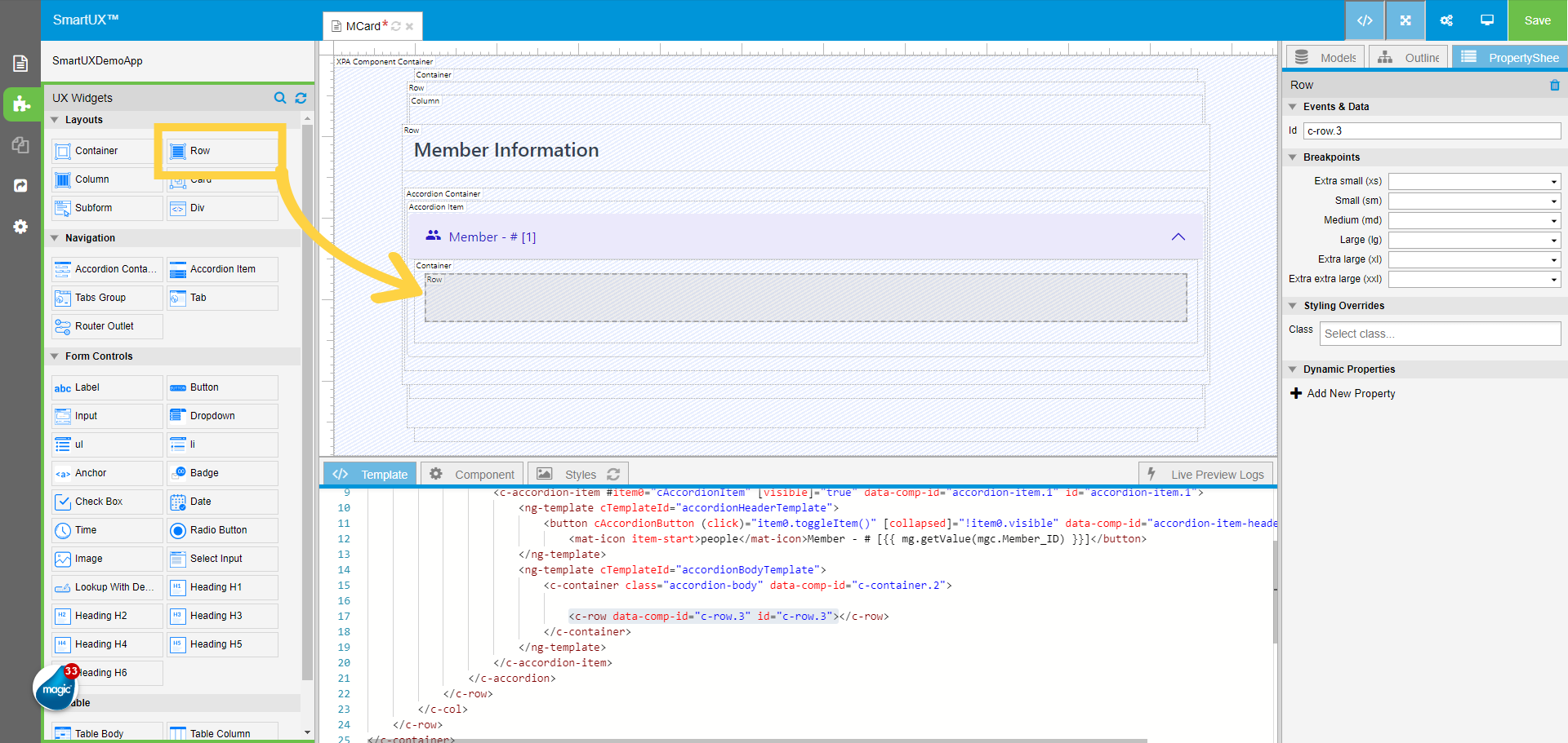
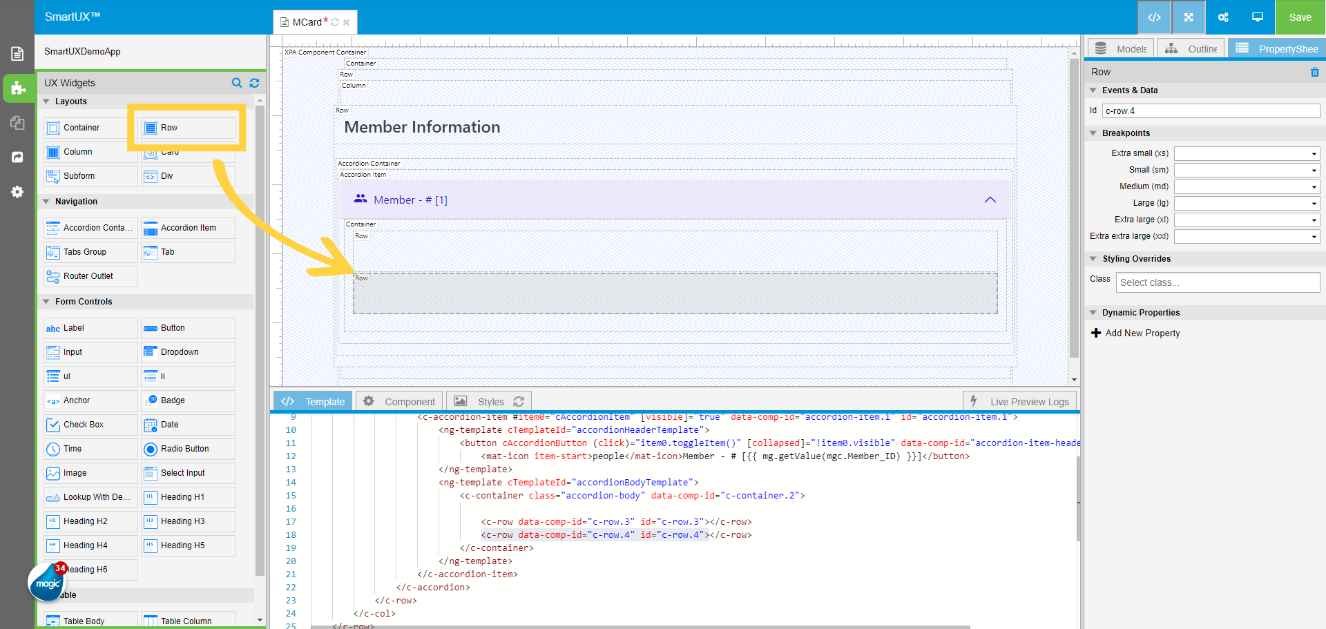
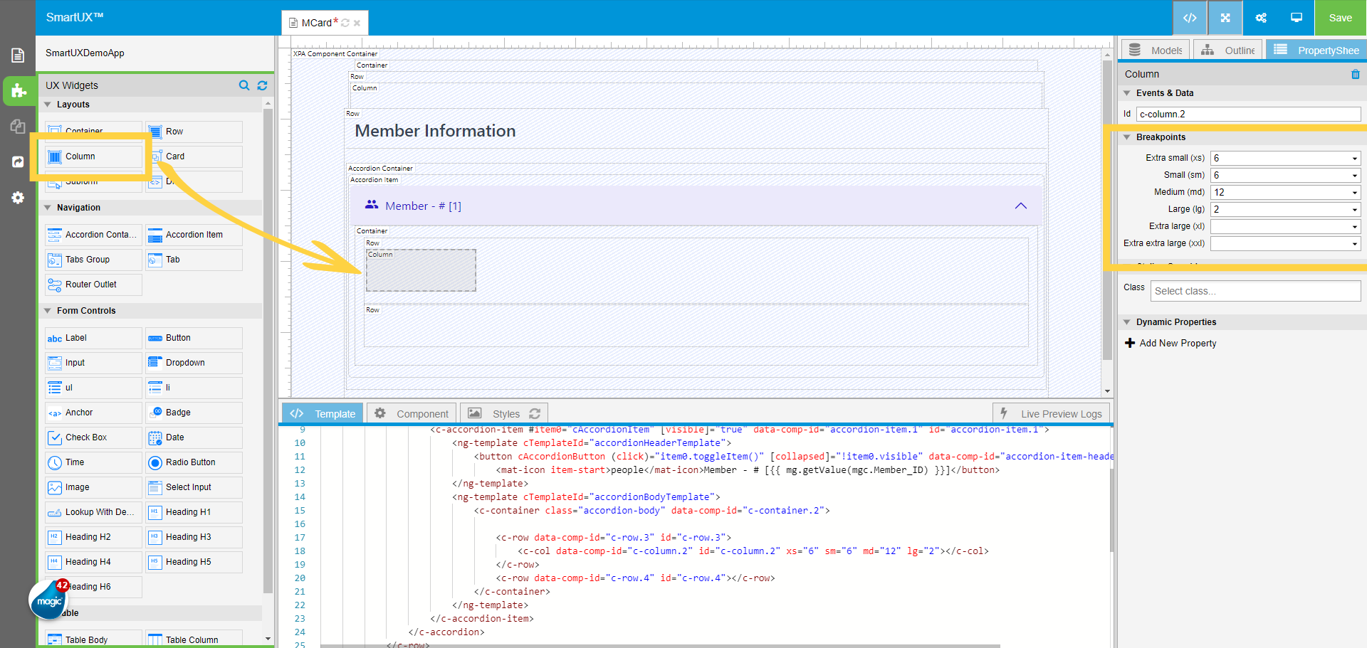
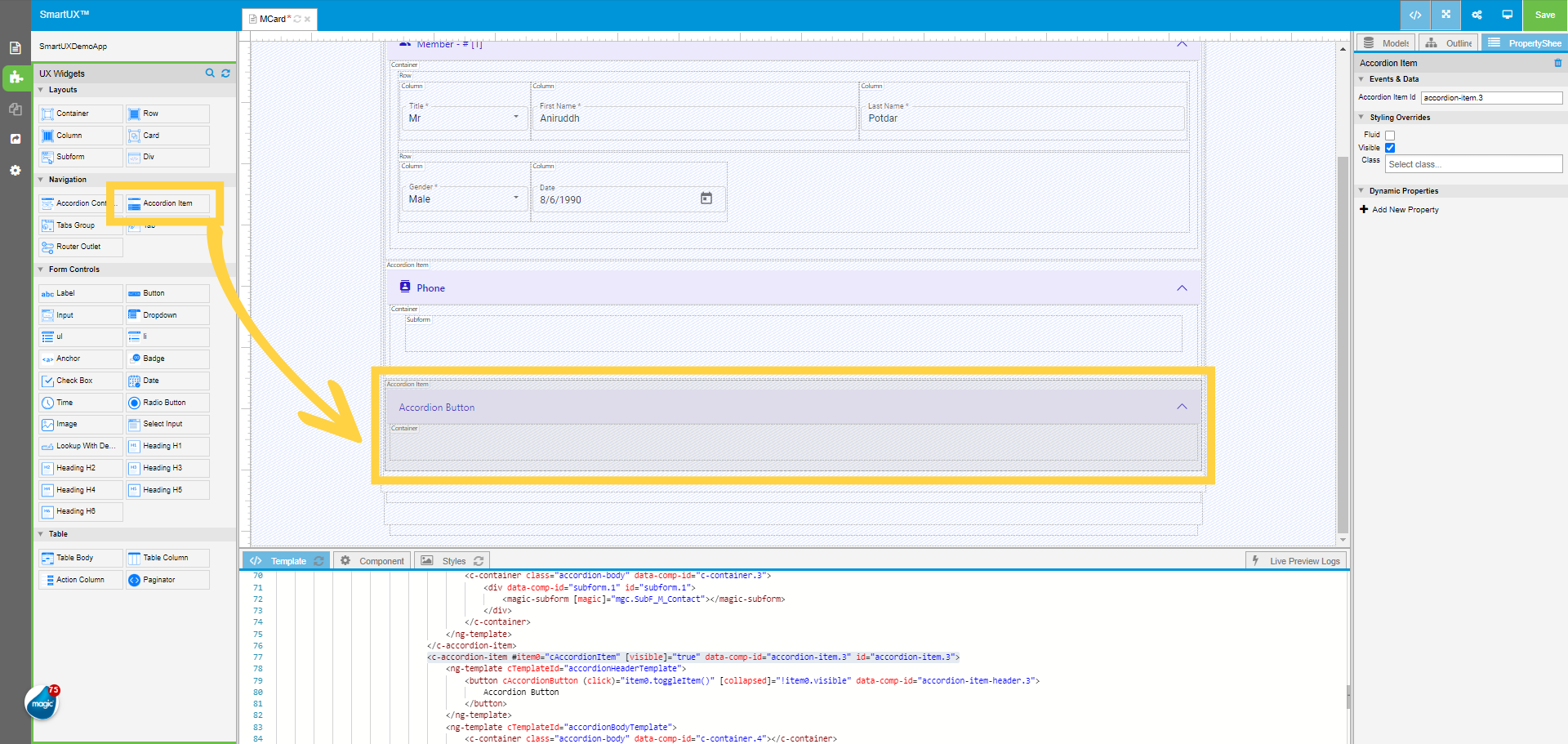
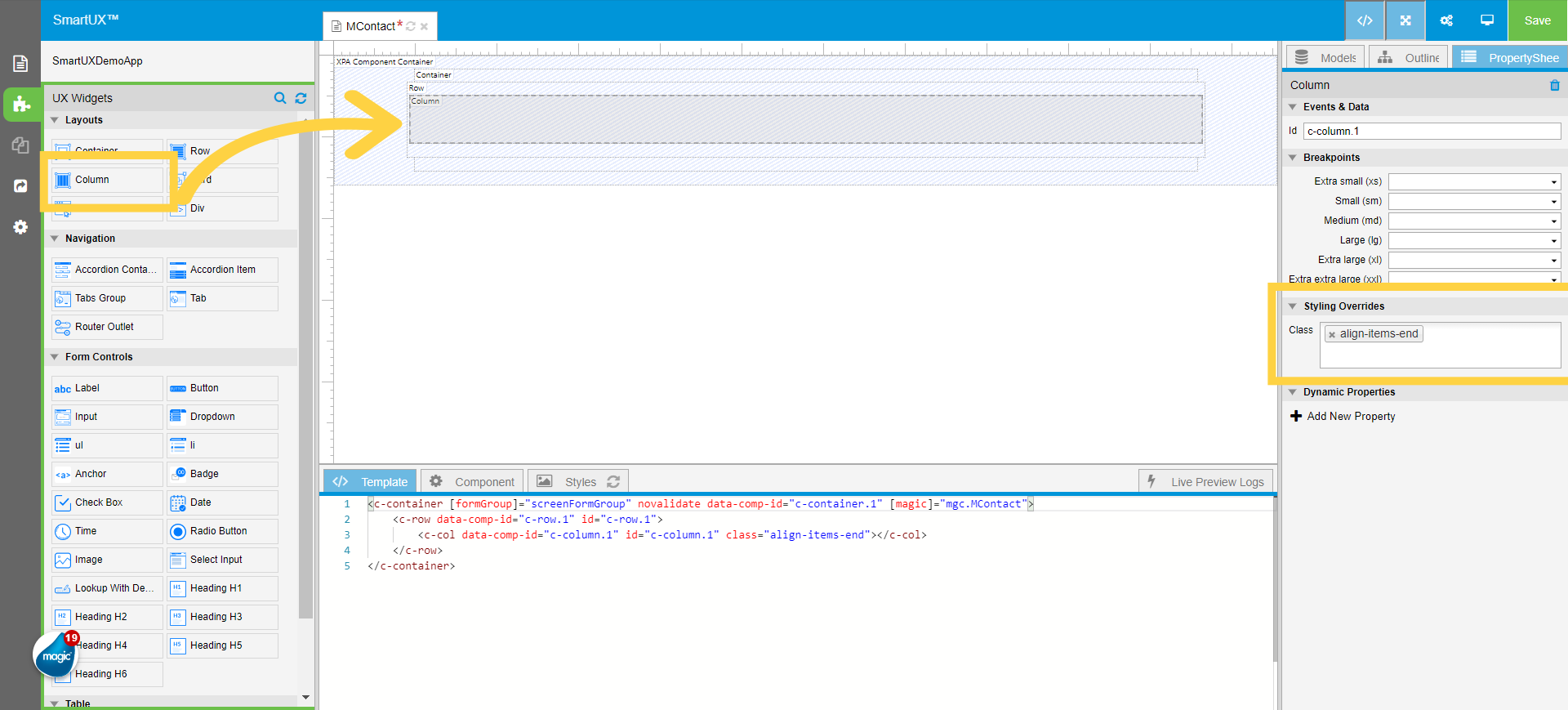
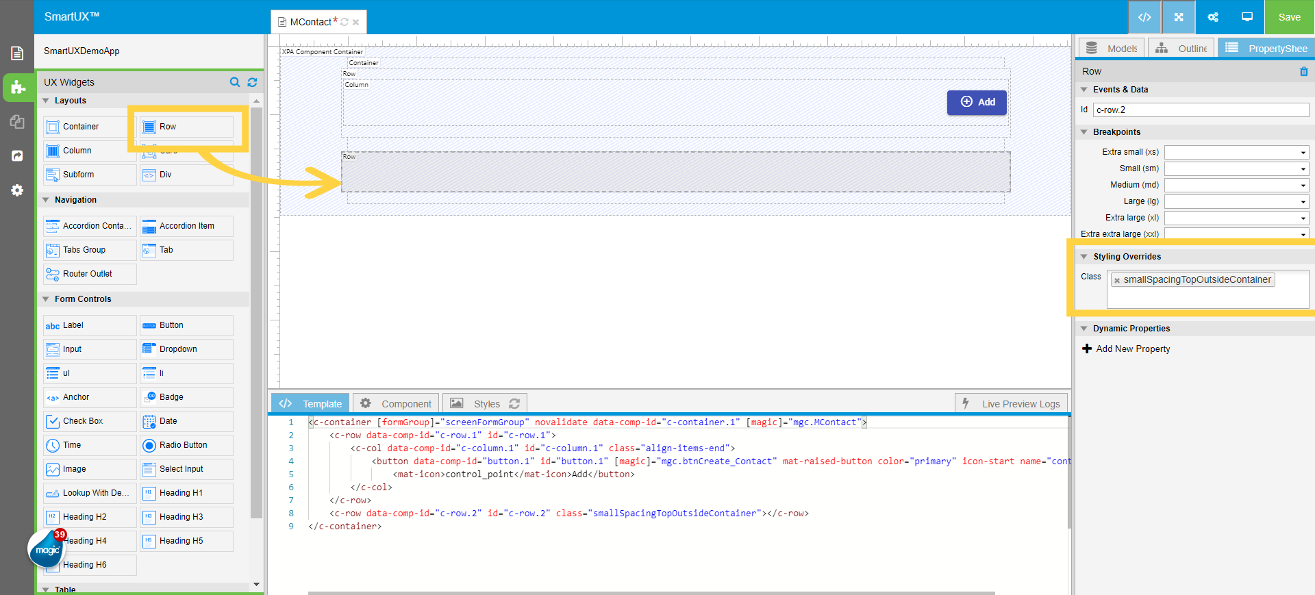
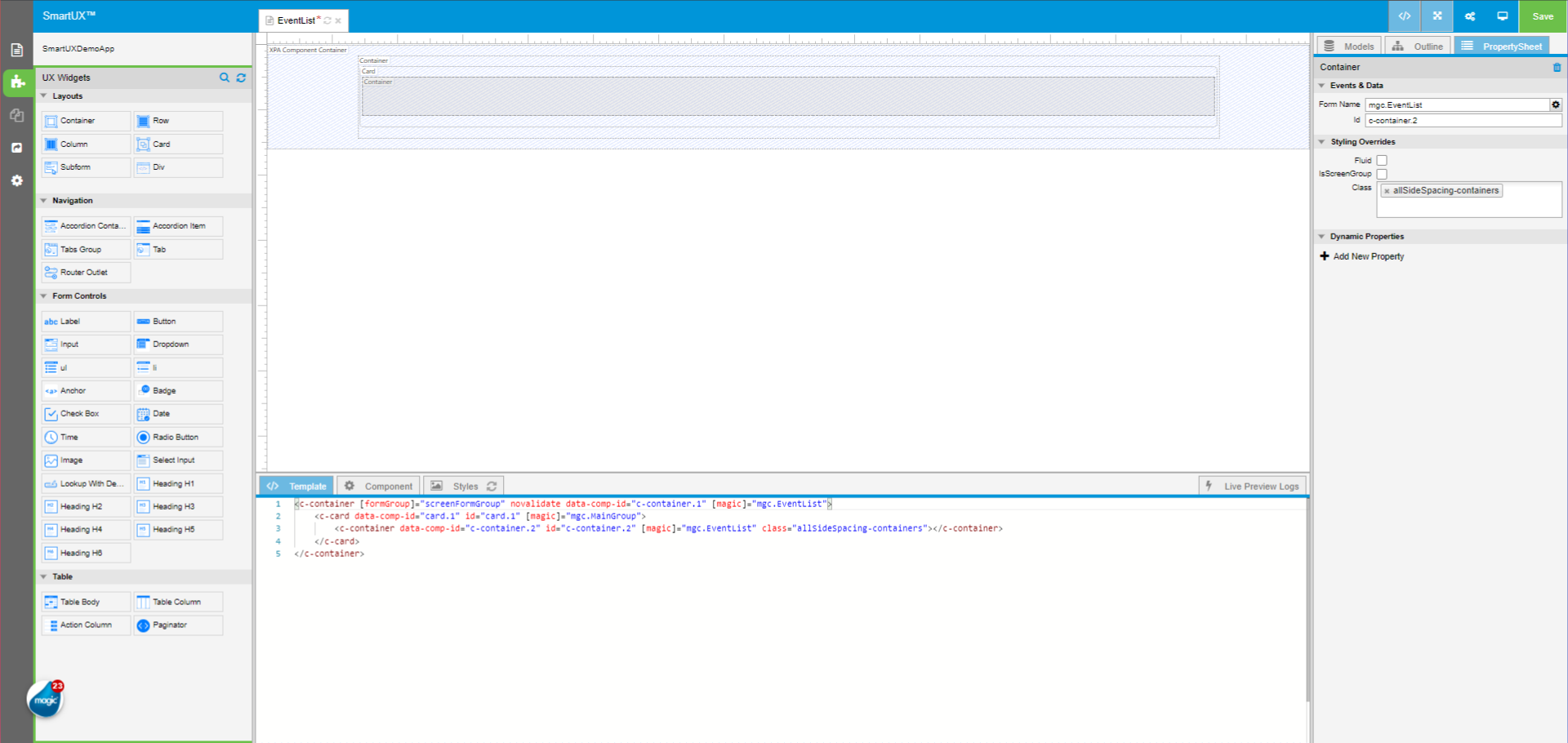
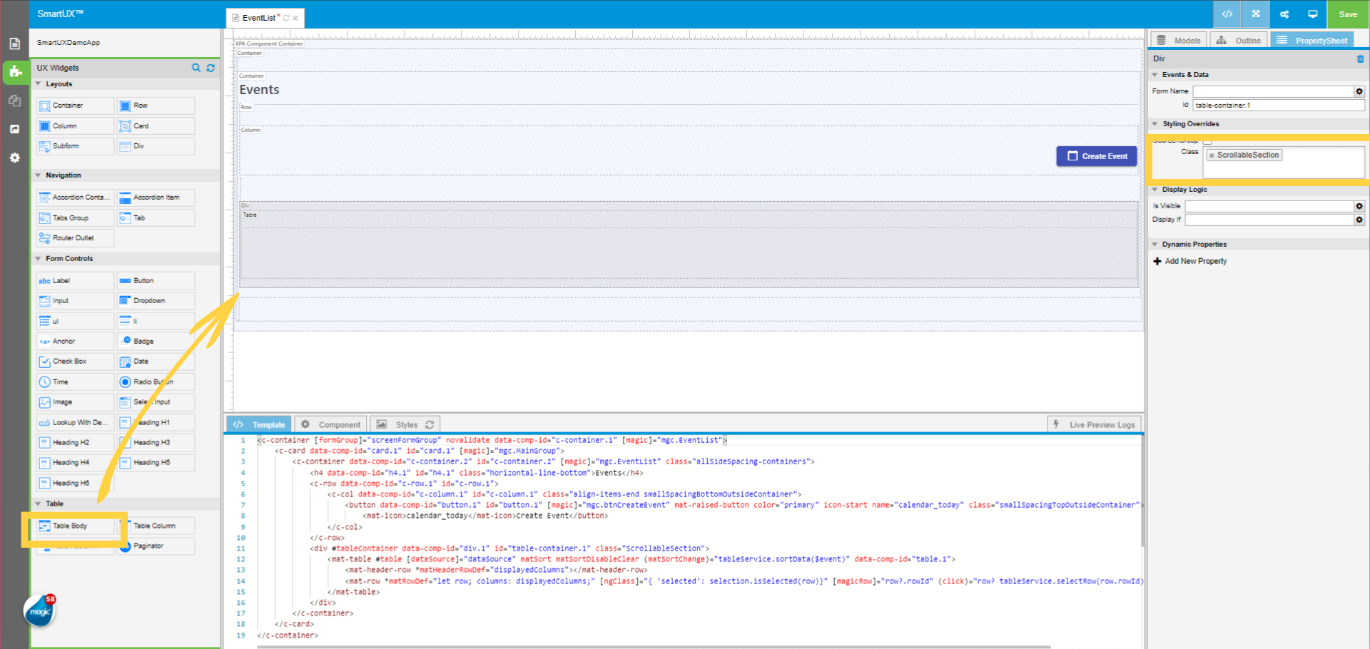
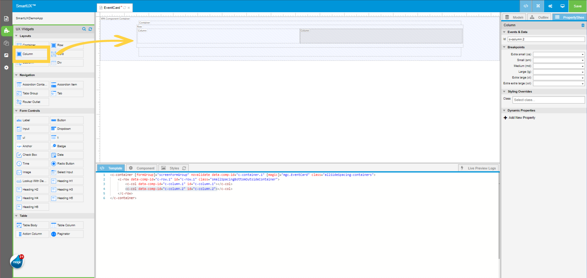
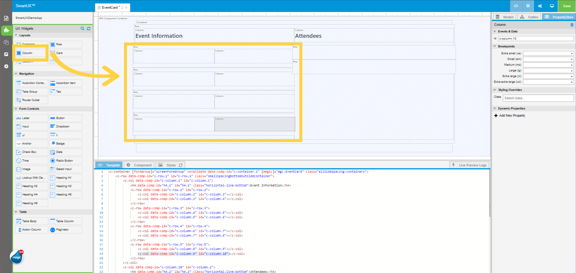
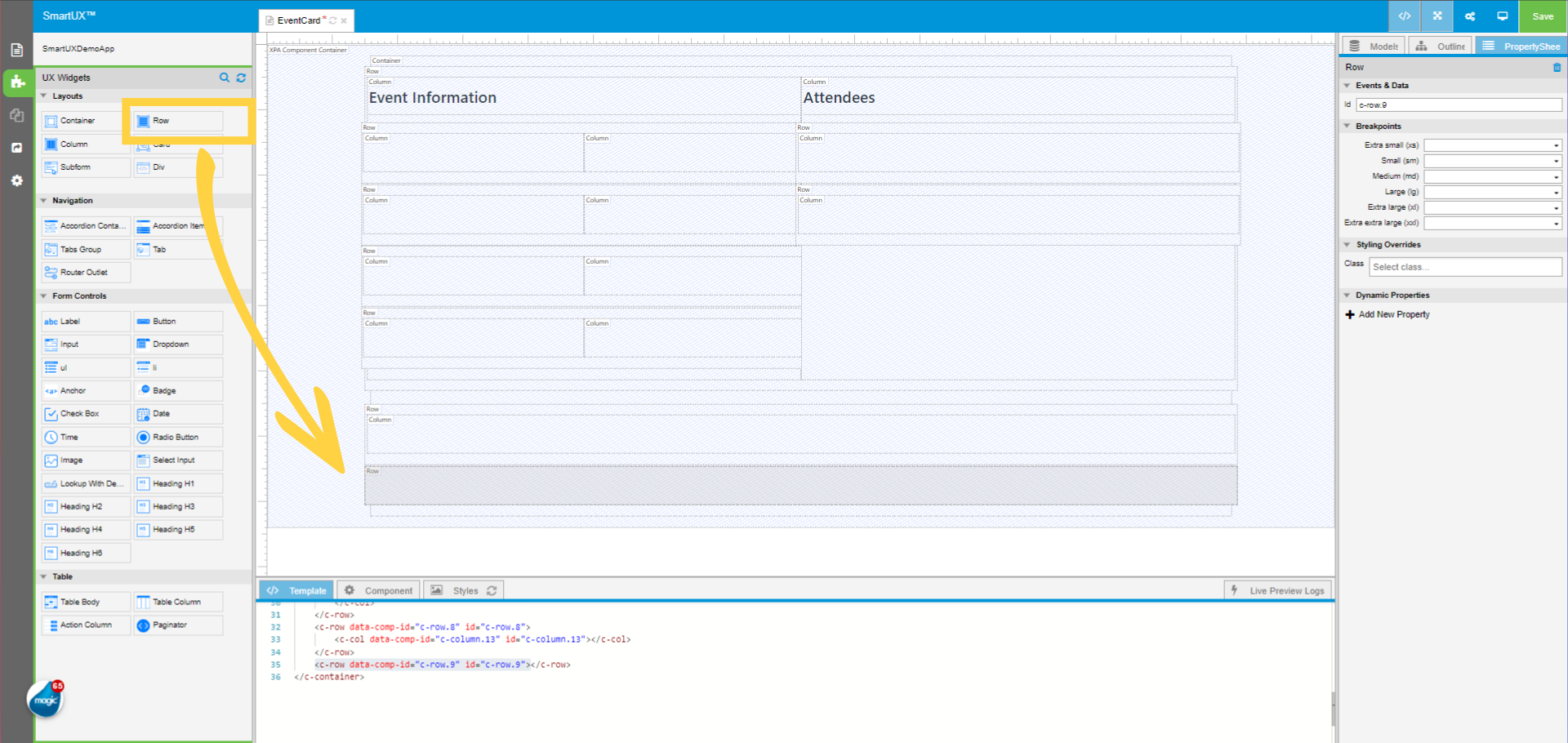
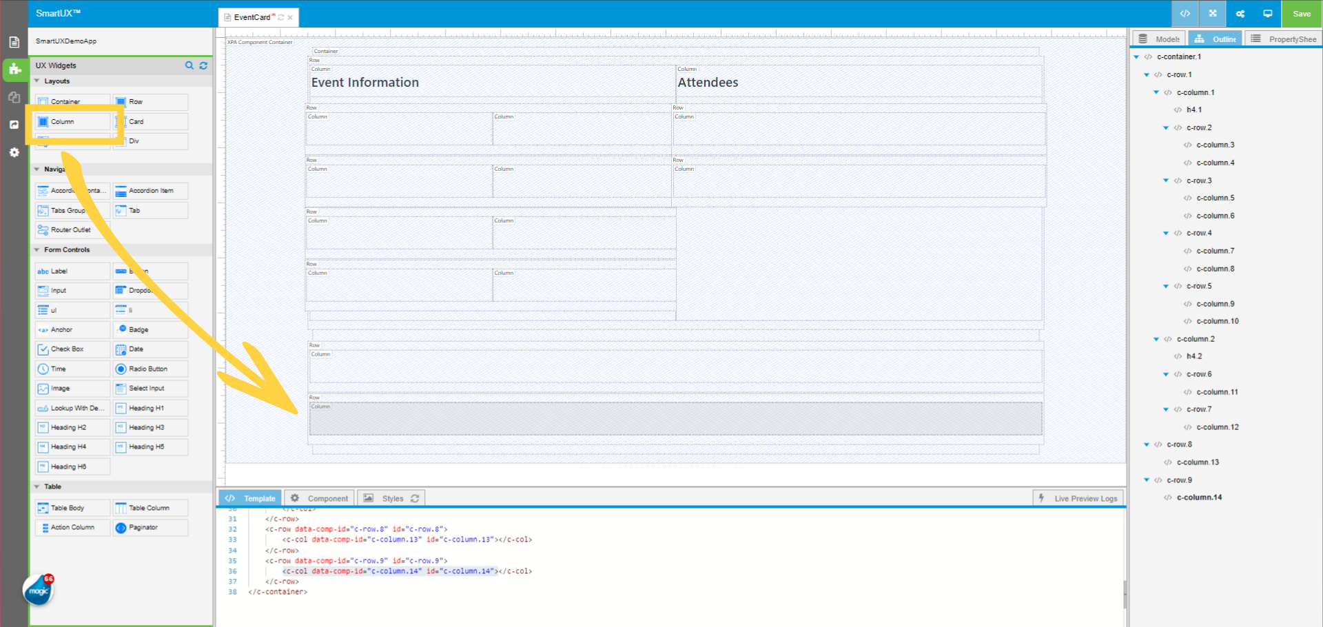
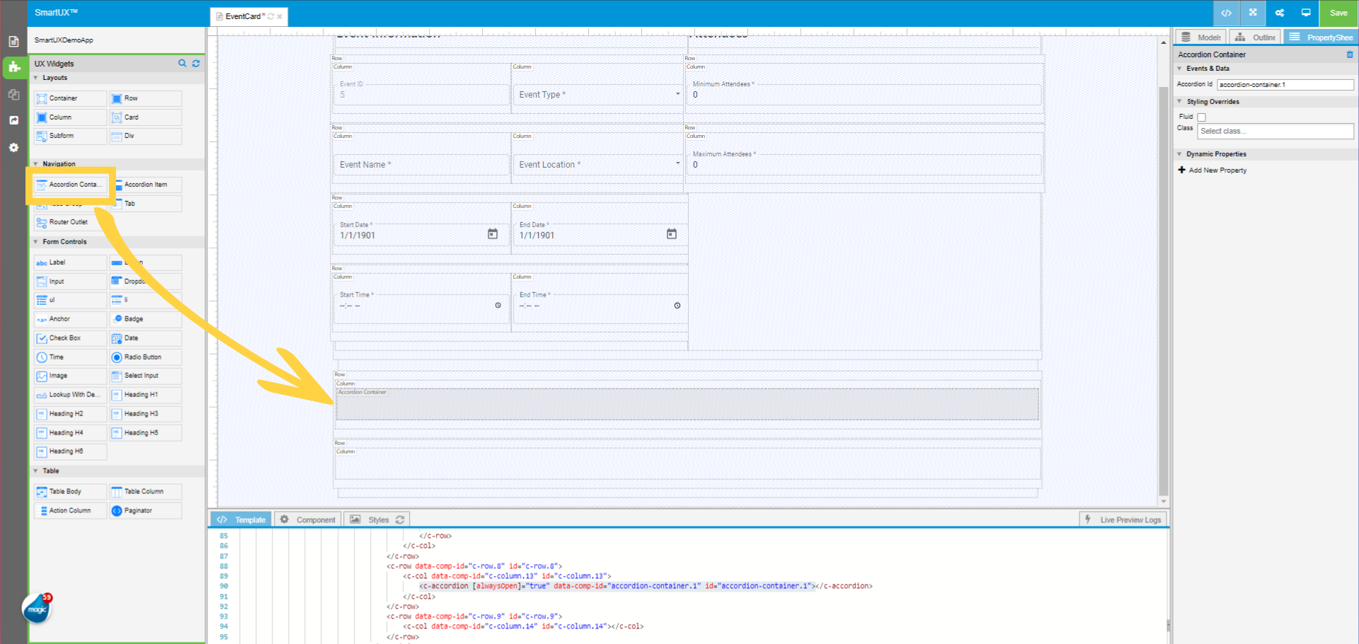
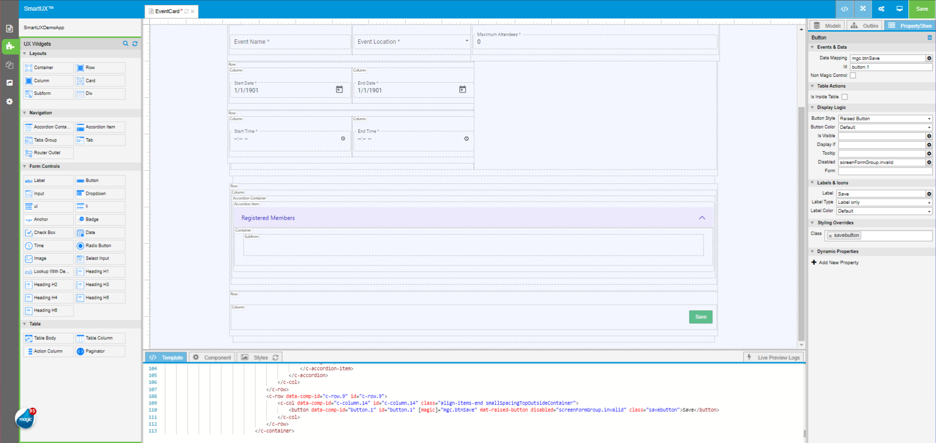
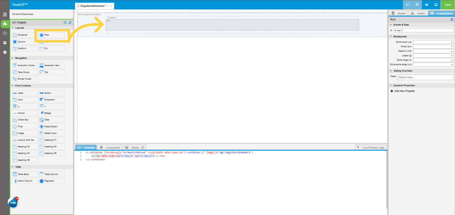
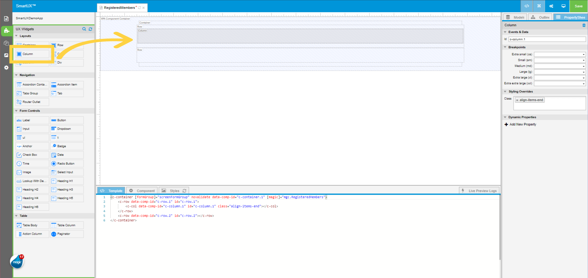
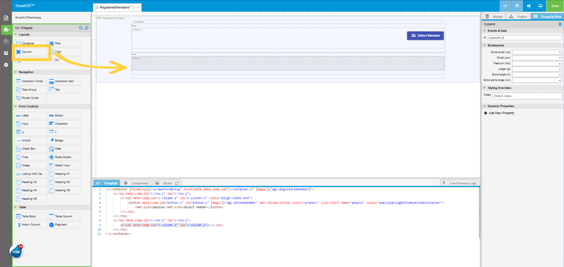
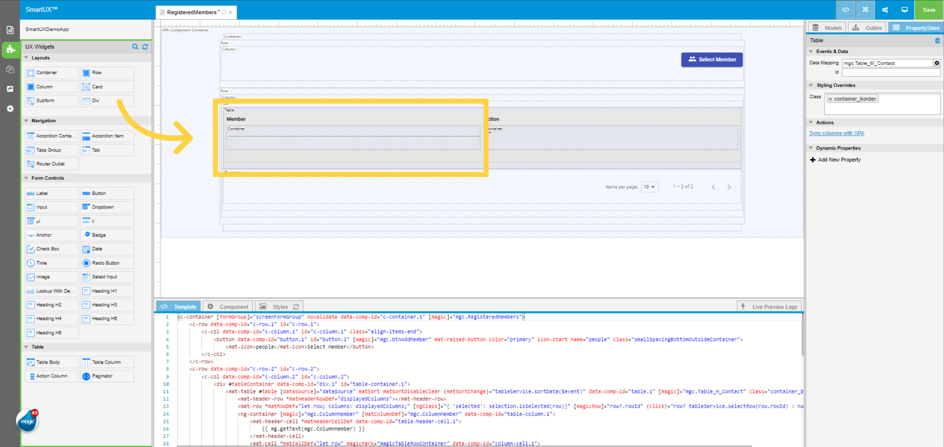
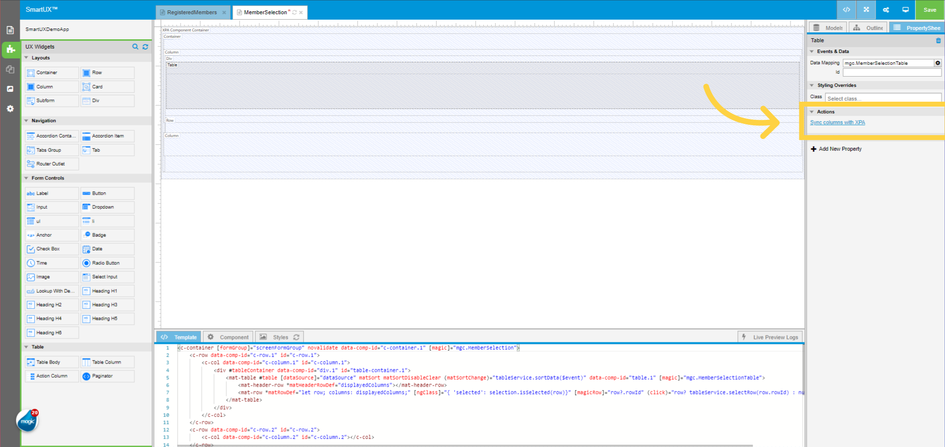
7. Select the Container Widget
Select the Container Widget dropped on the Canvas.
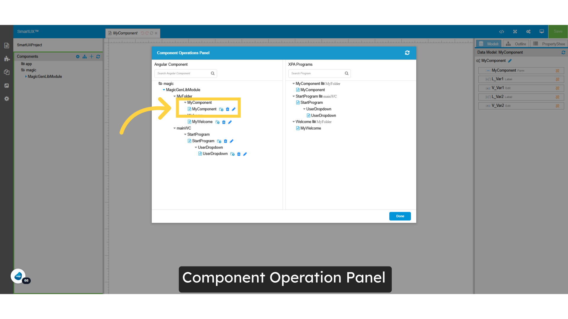
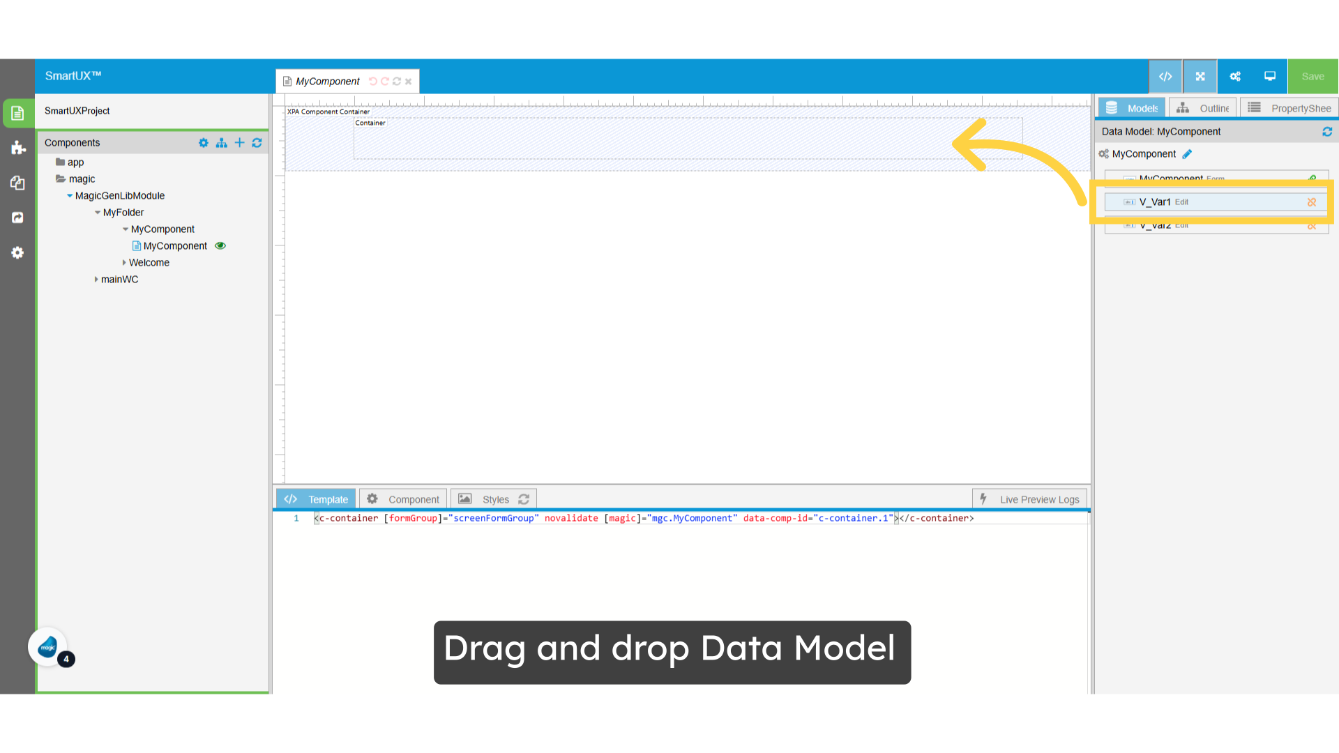
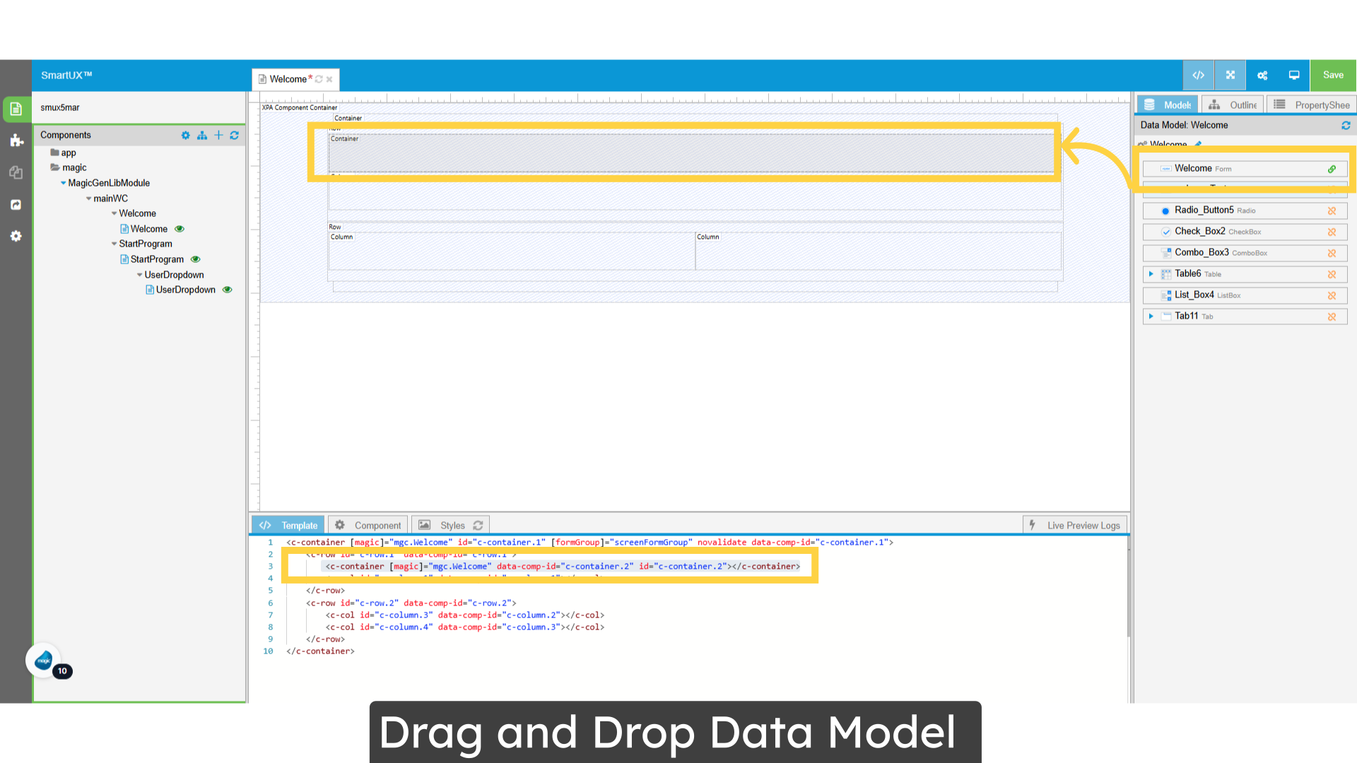
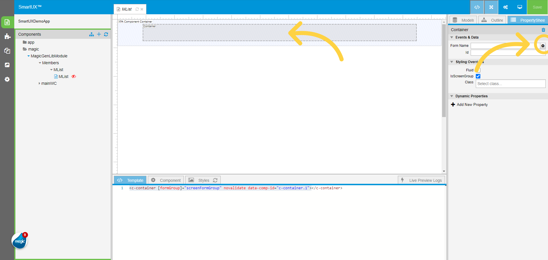
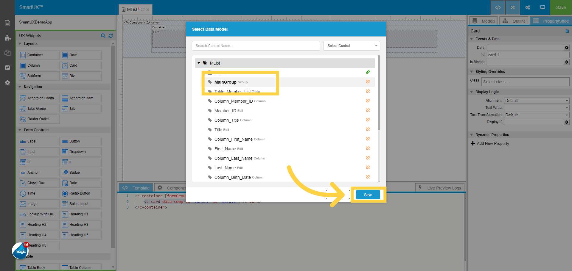
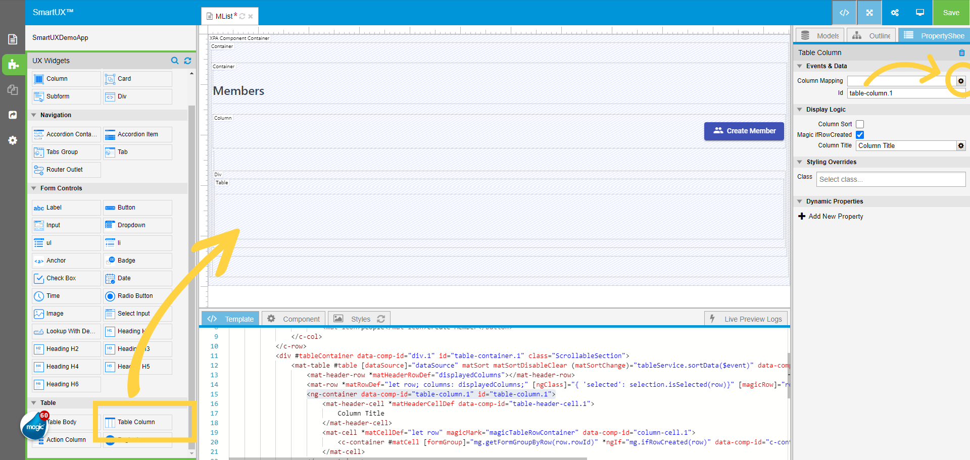
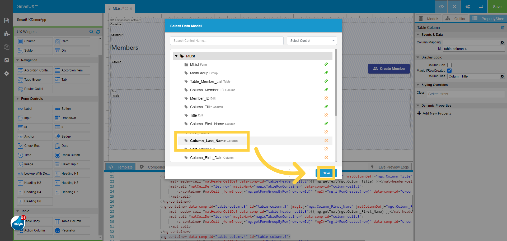
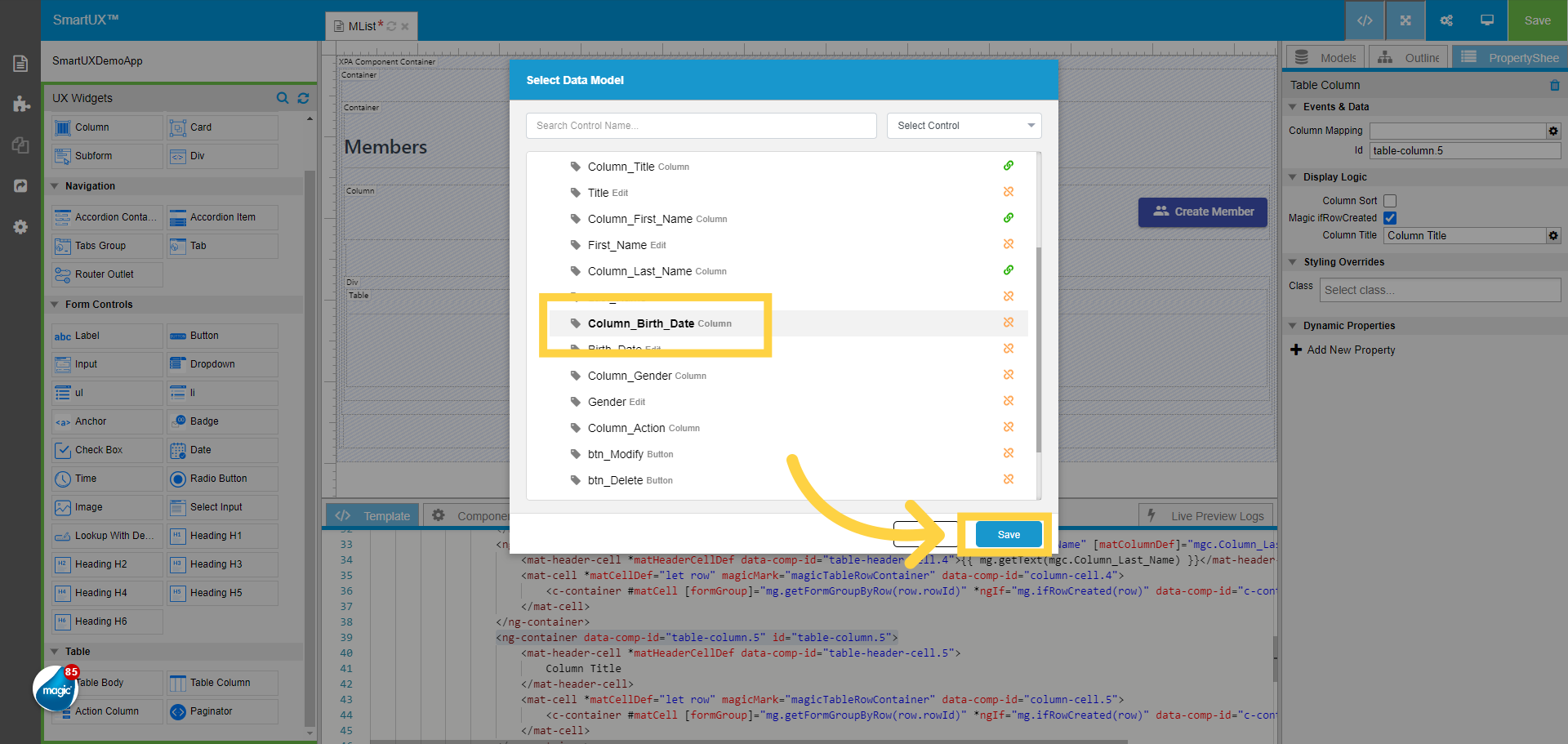
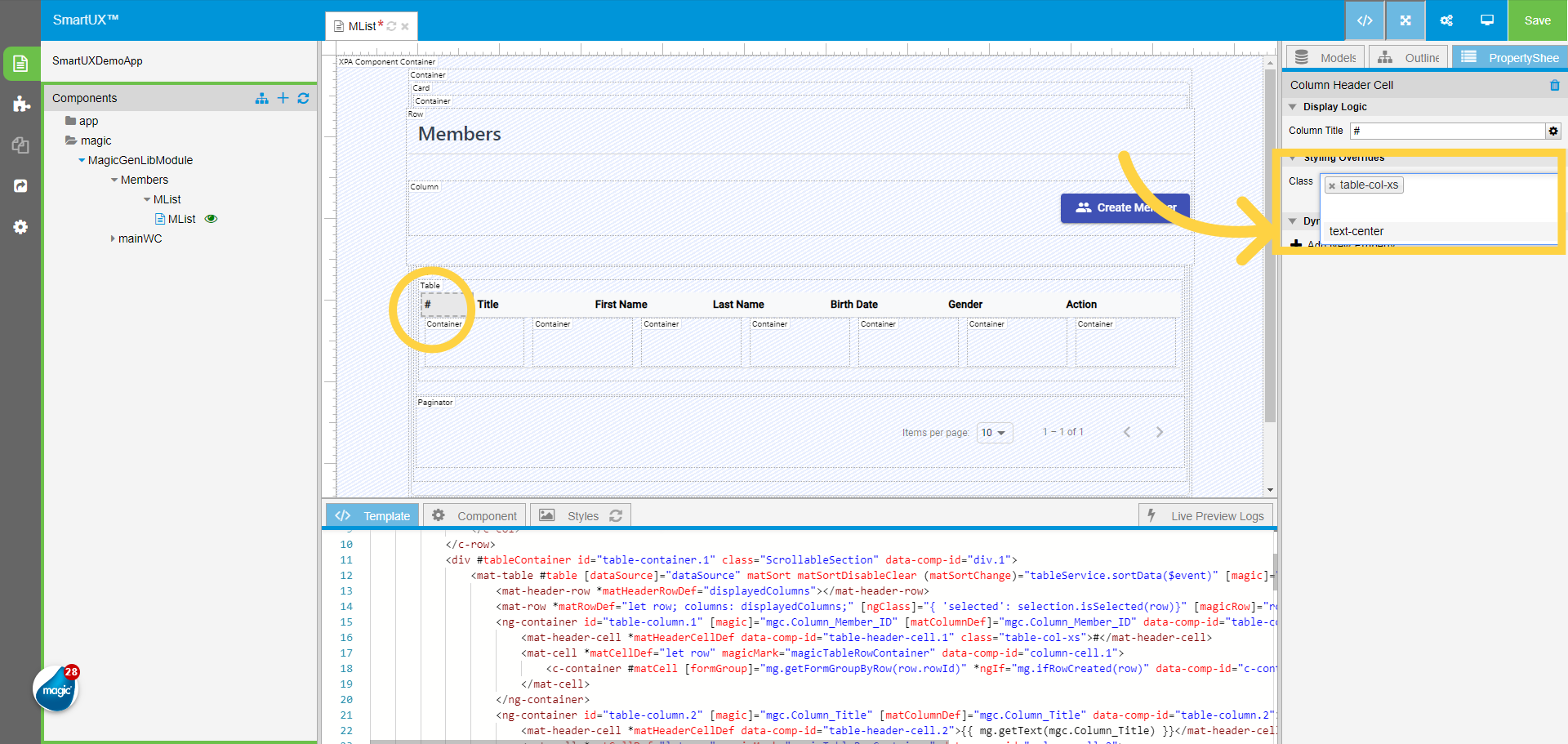
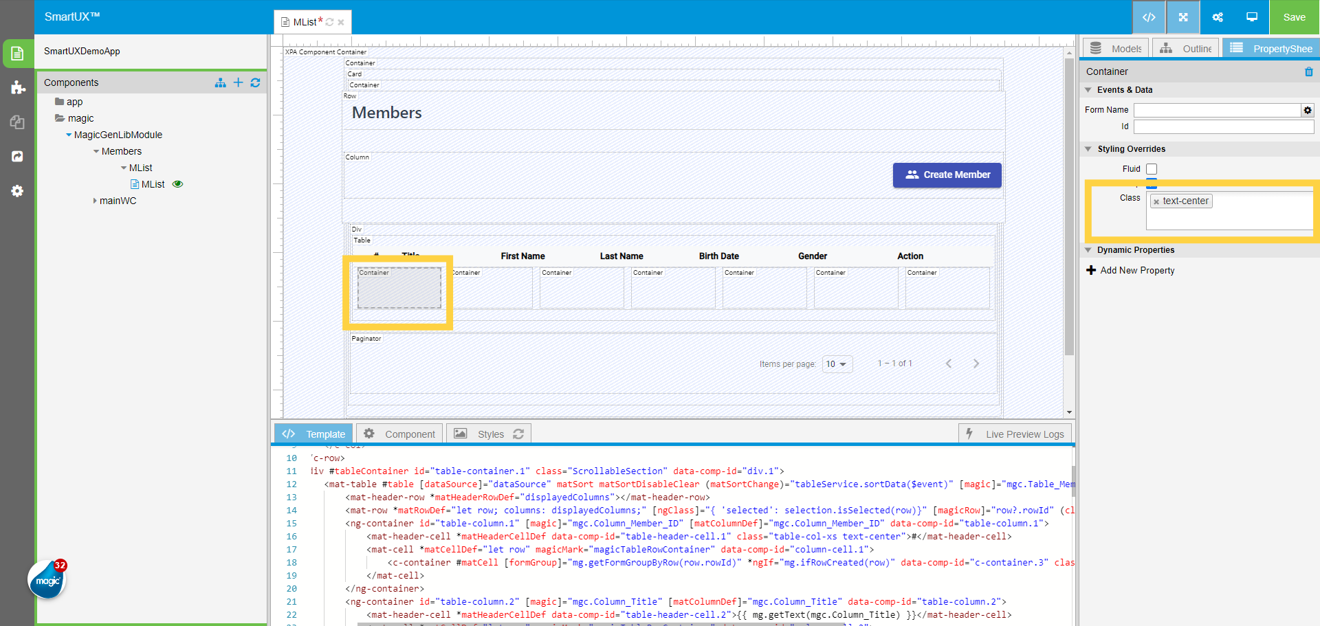
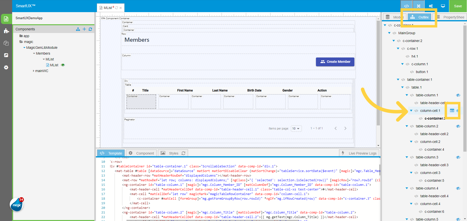
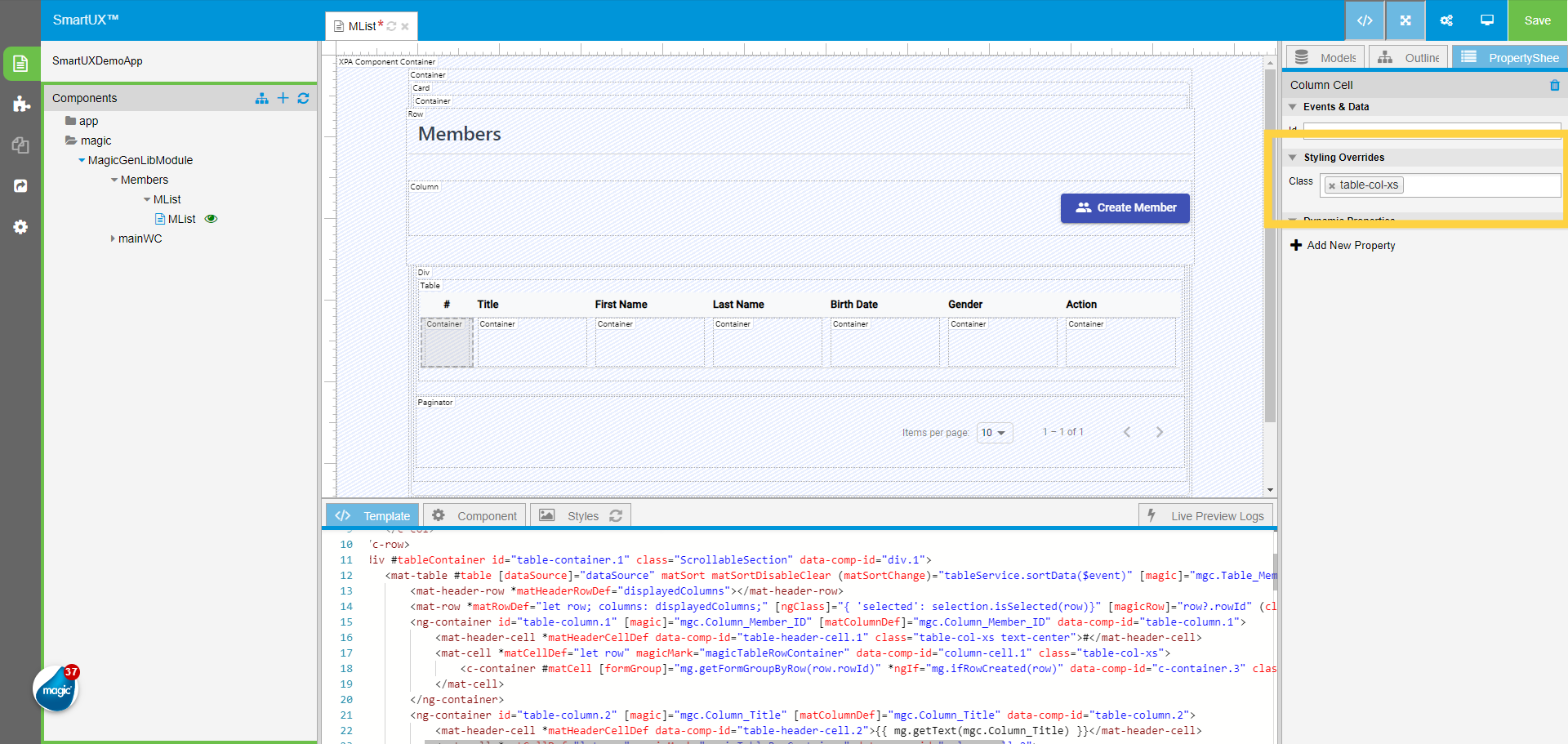
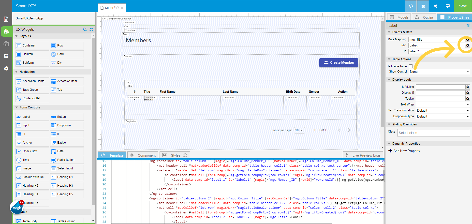
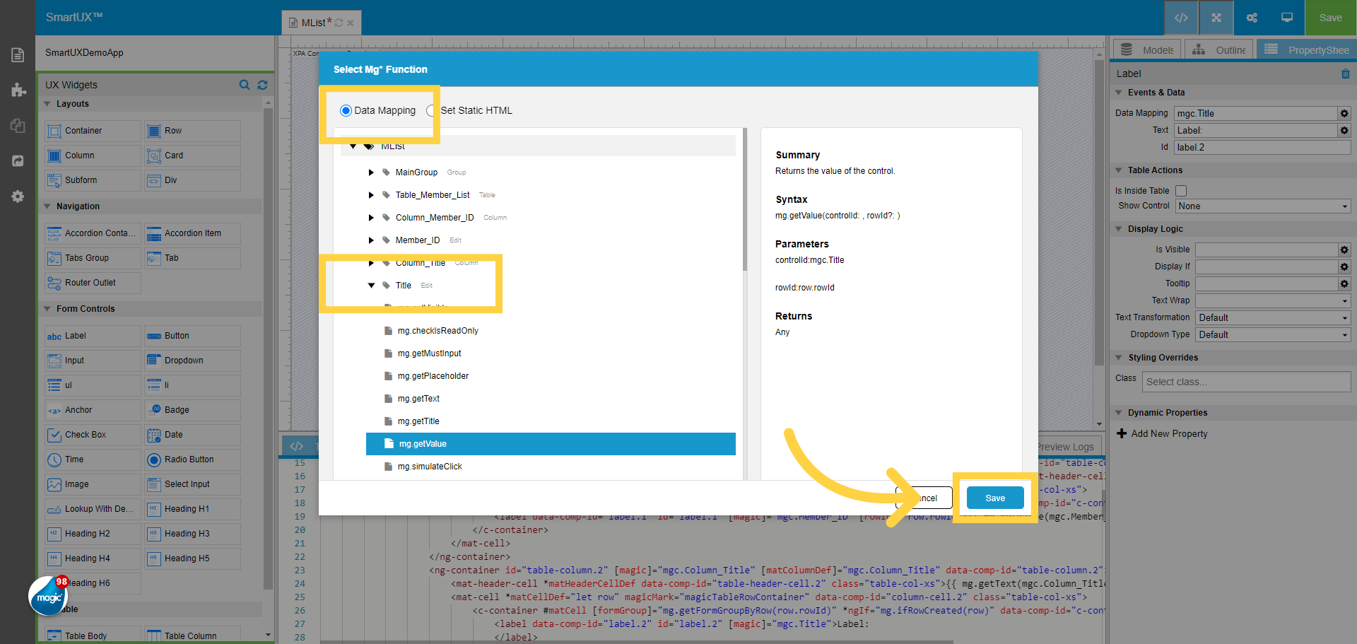
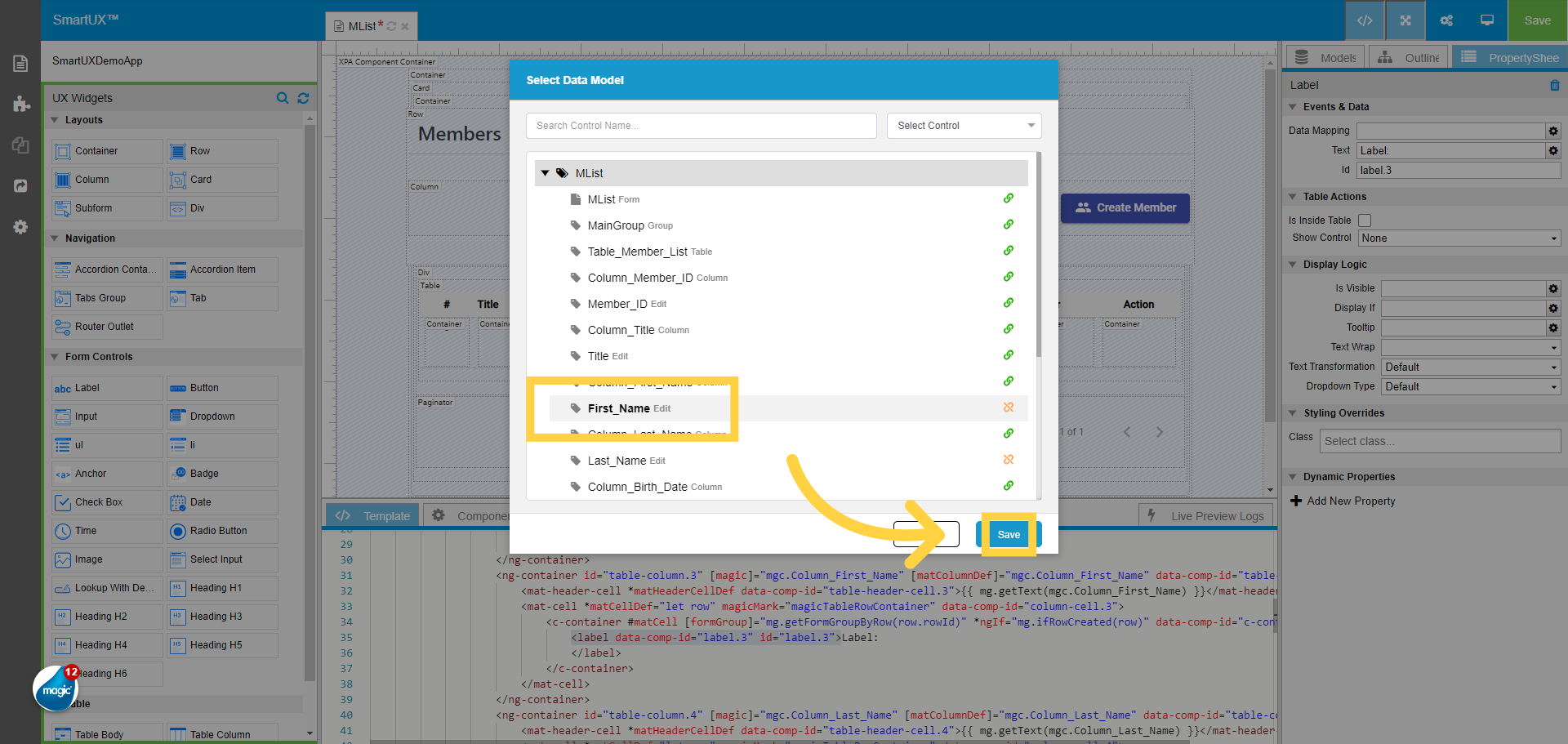
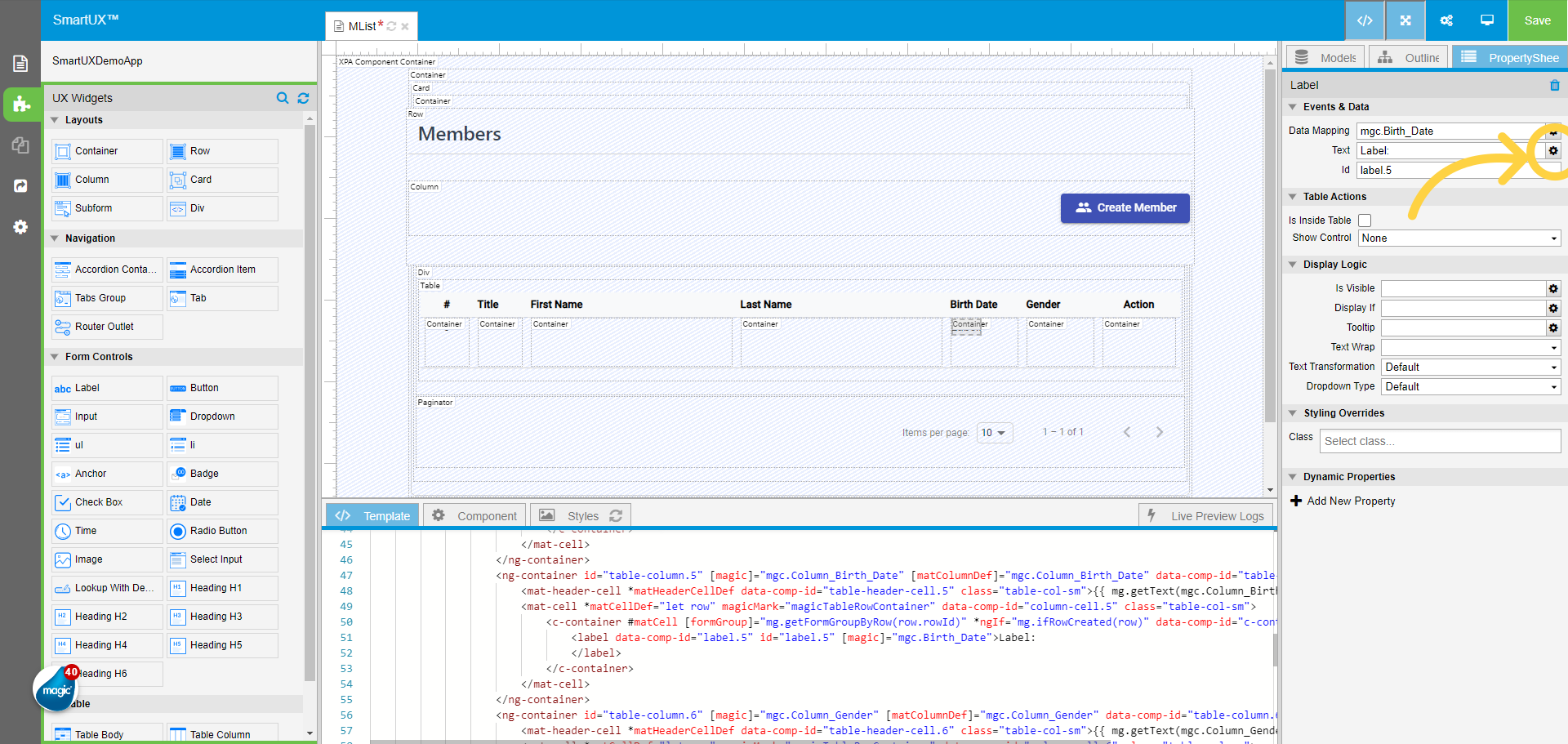
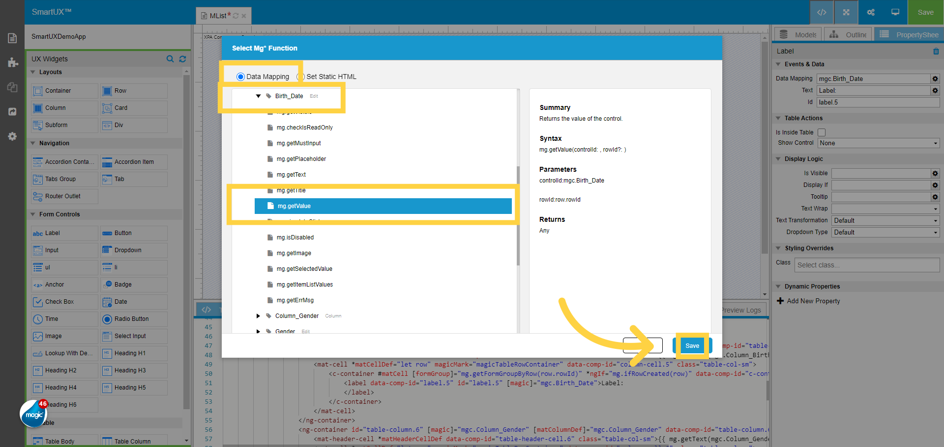
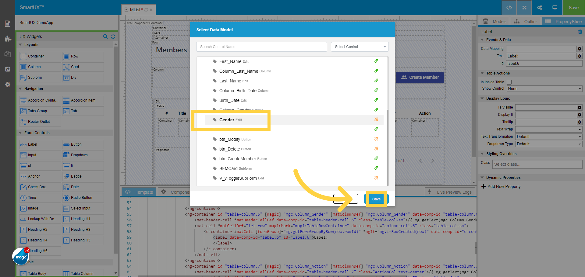
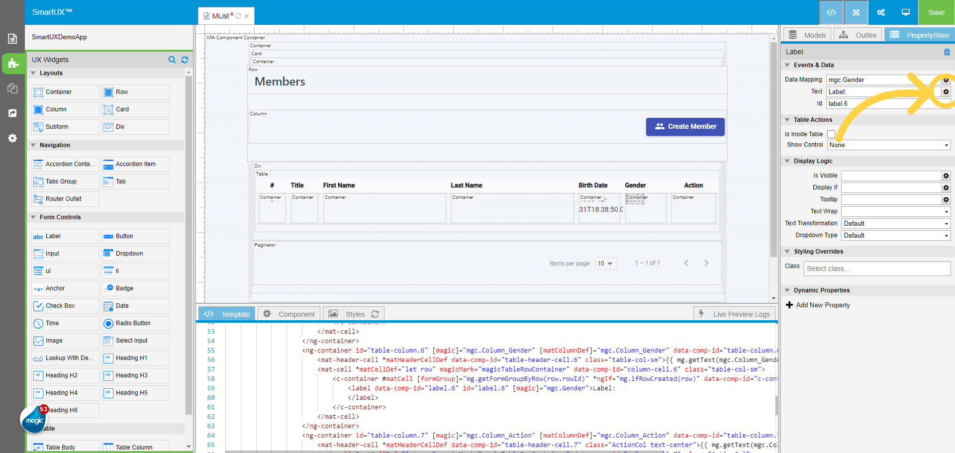
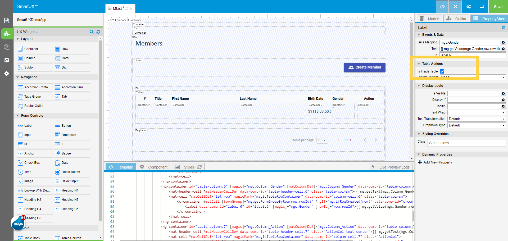
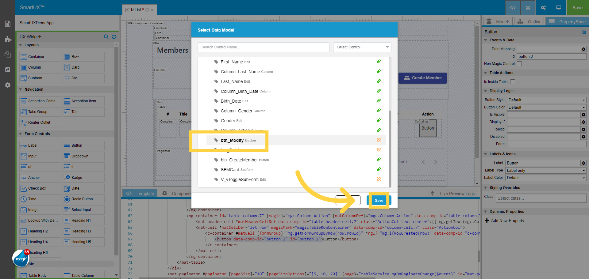
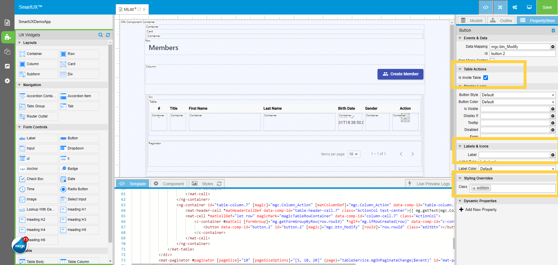
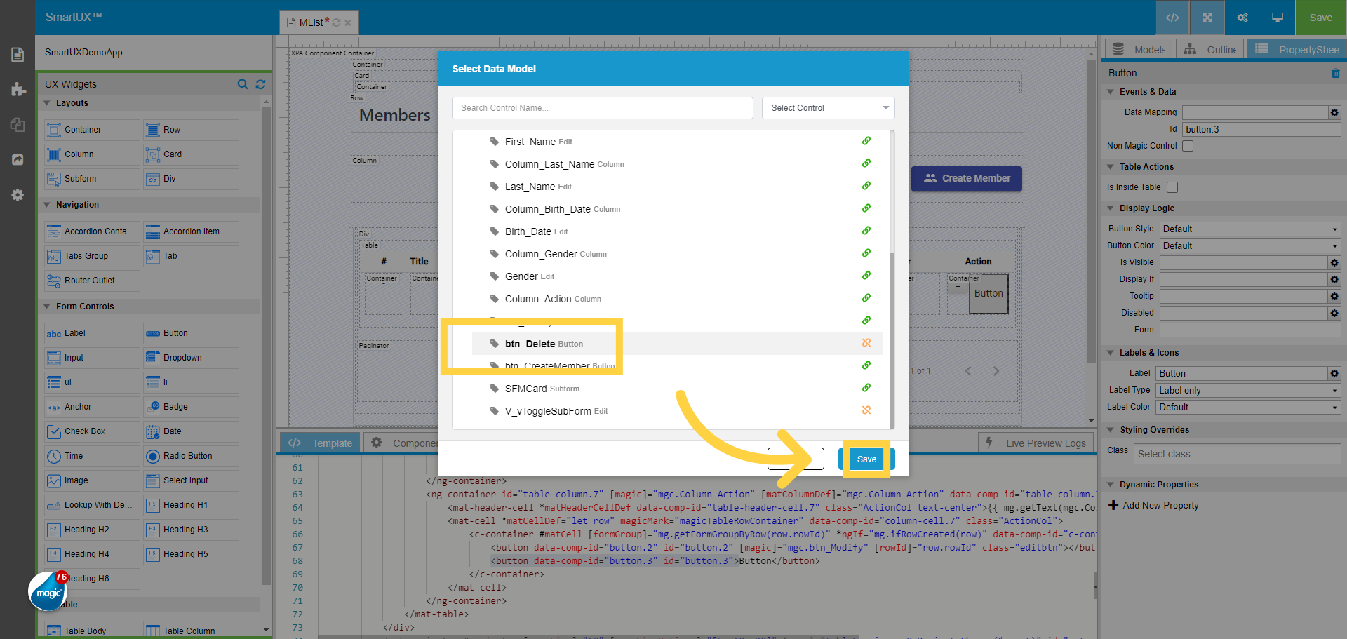
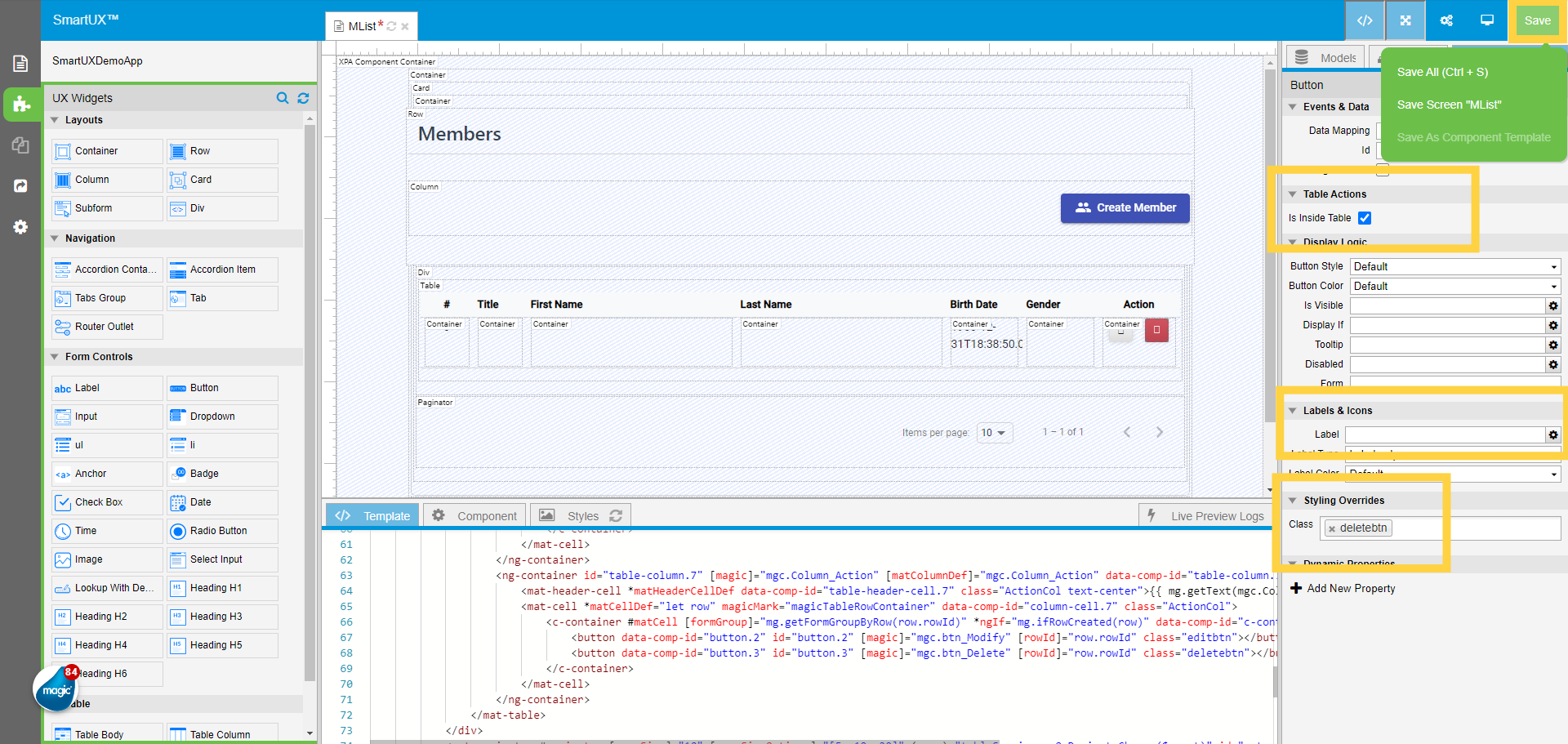
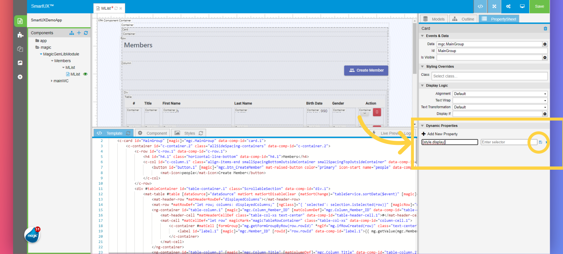
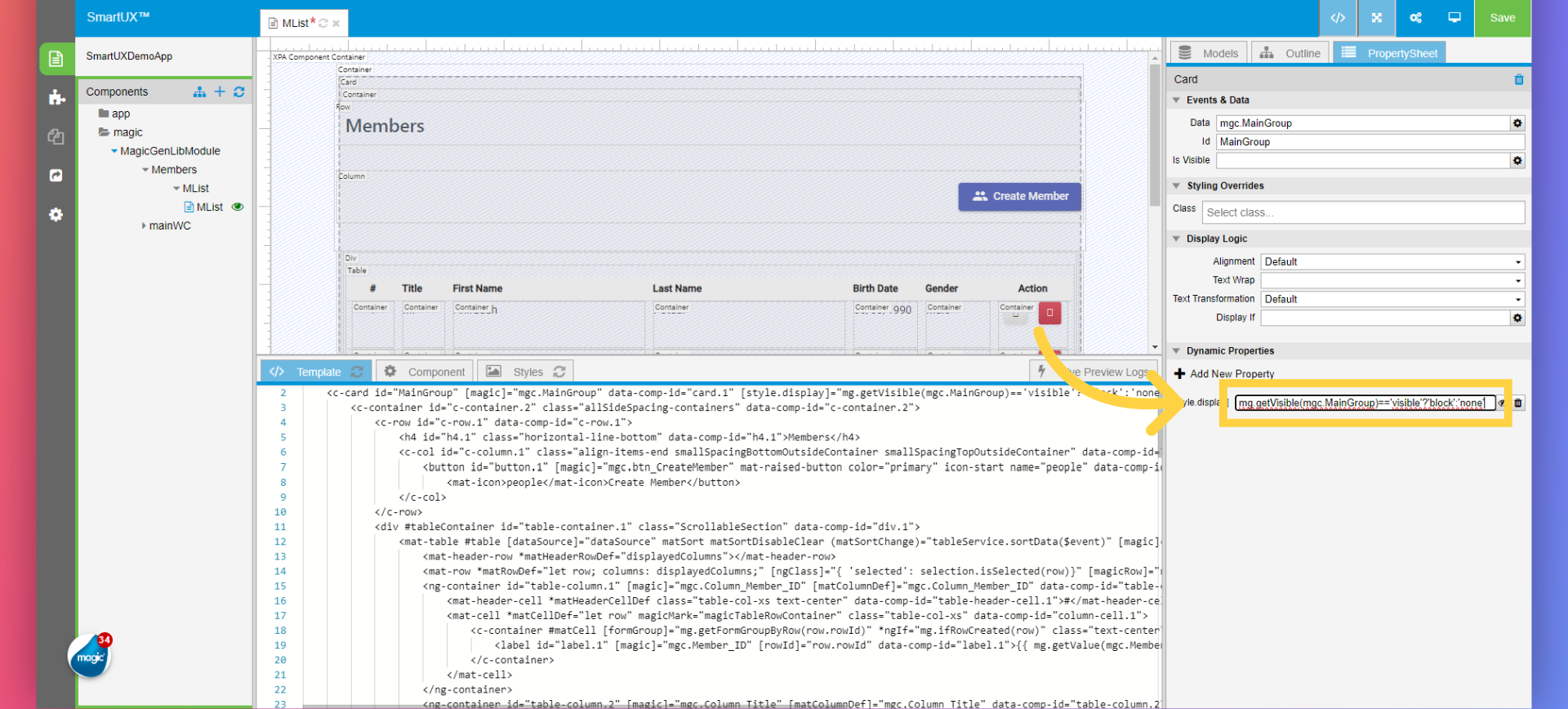
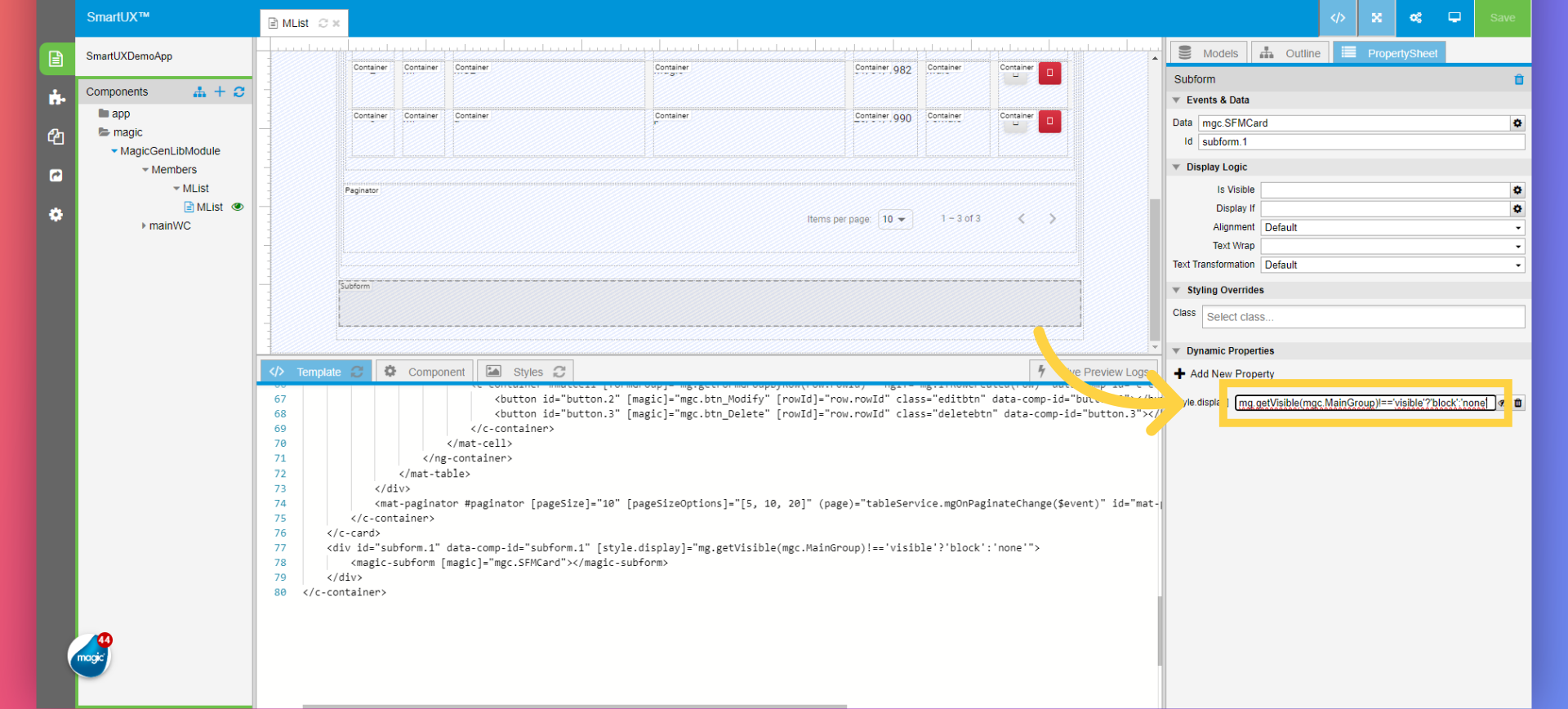
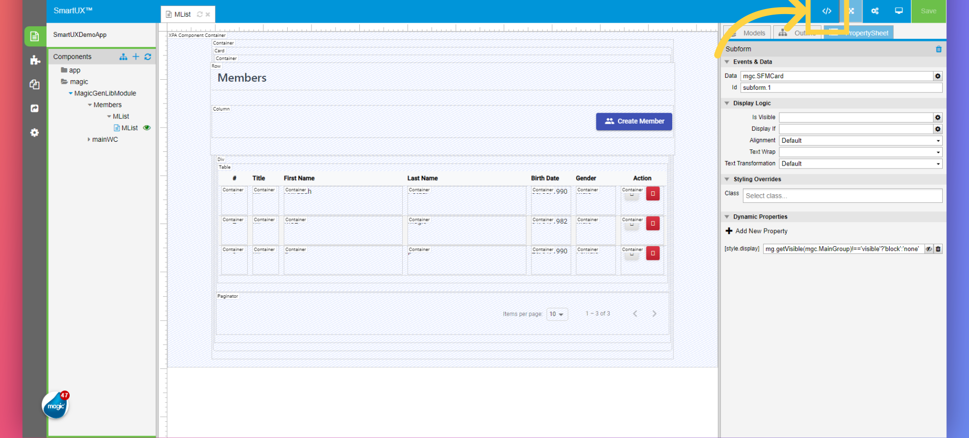
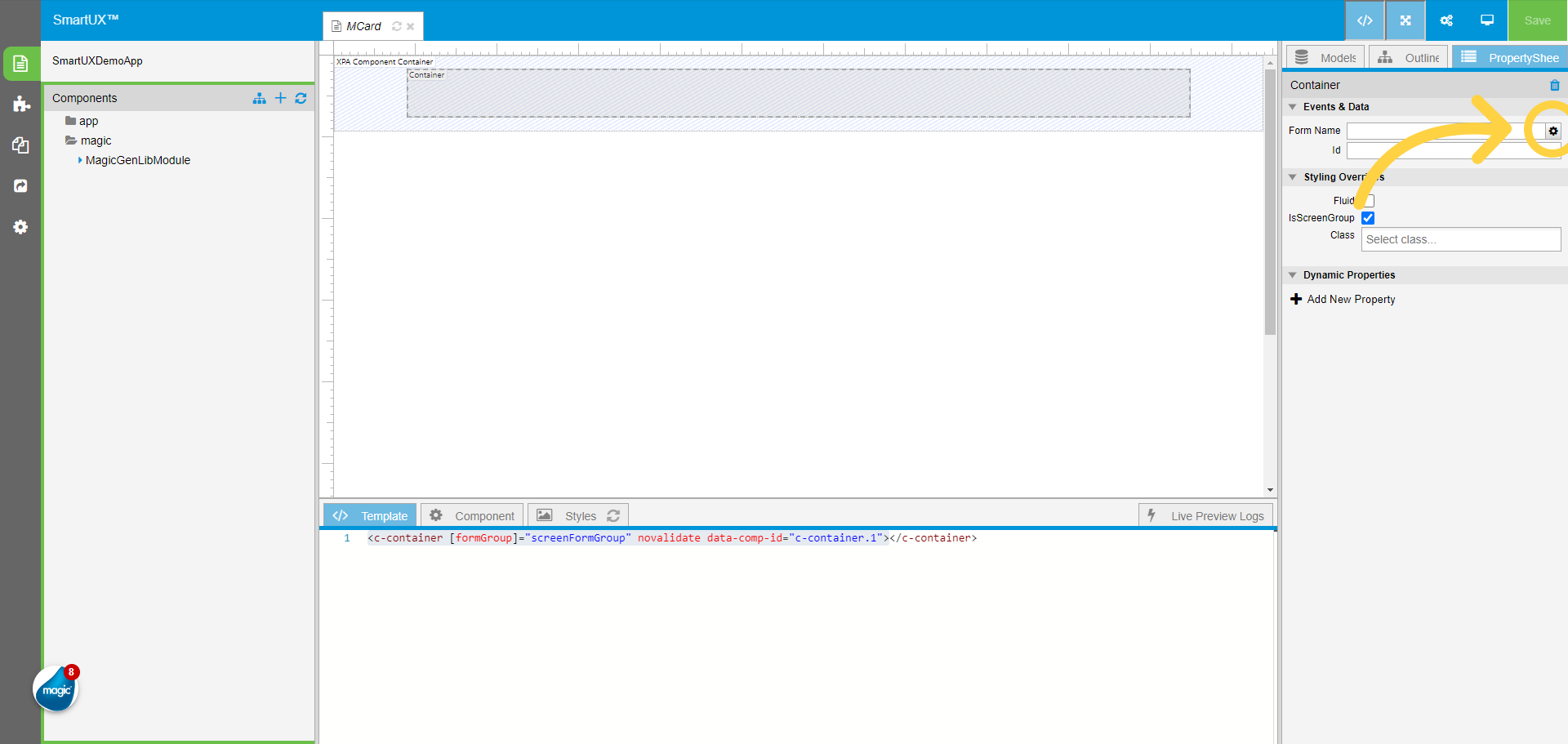
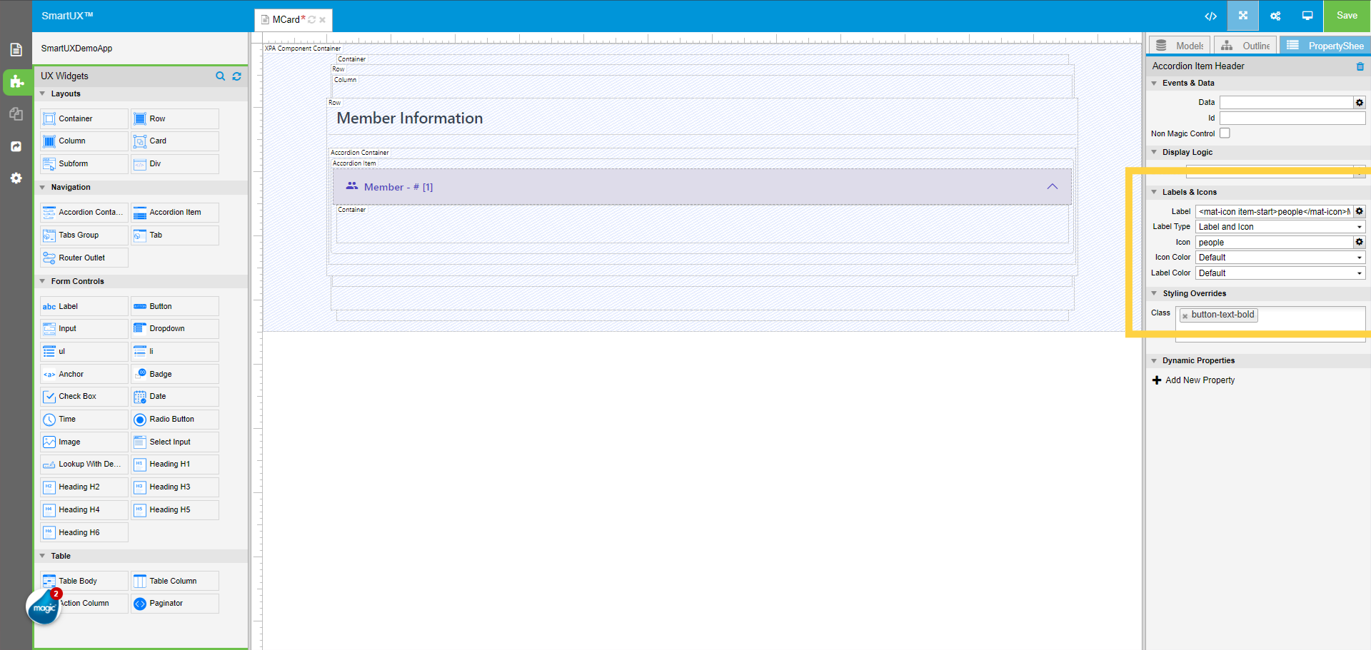
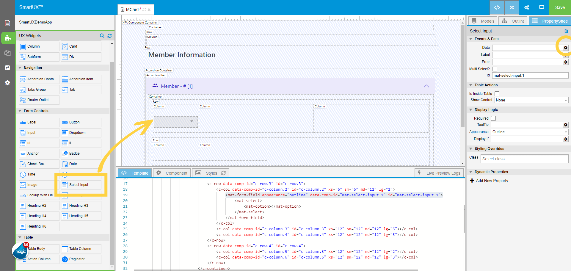
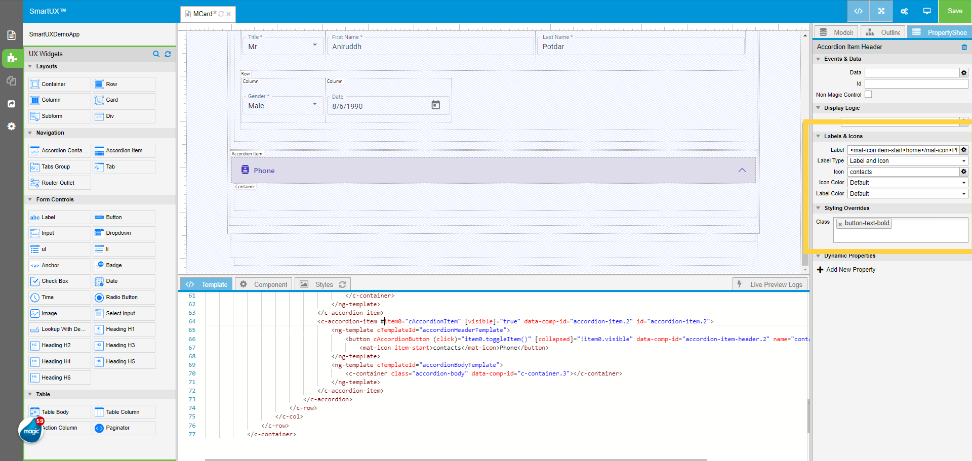
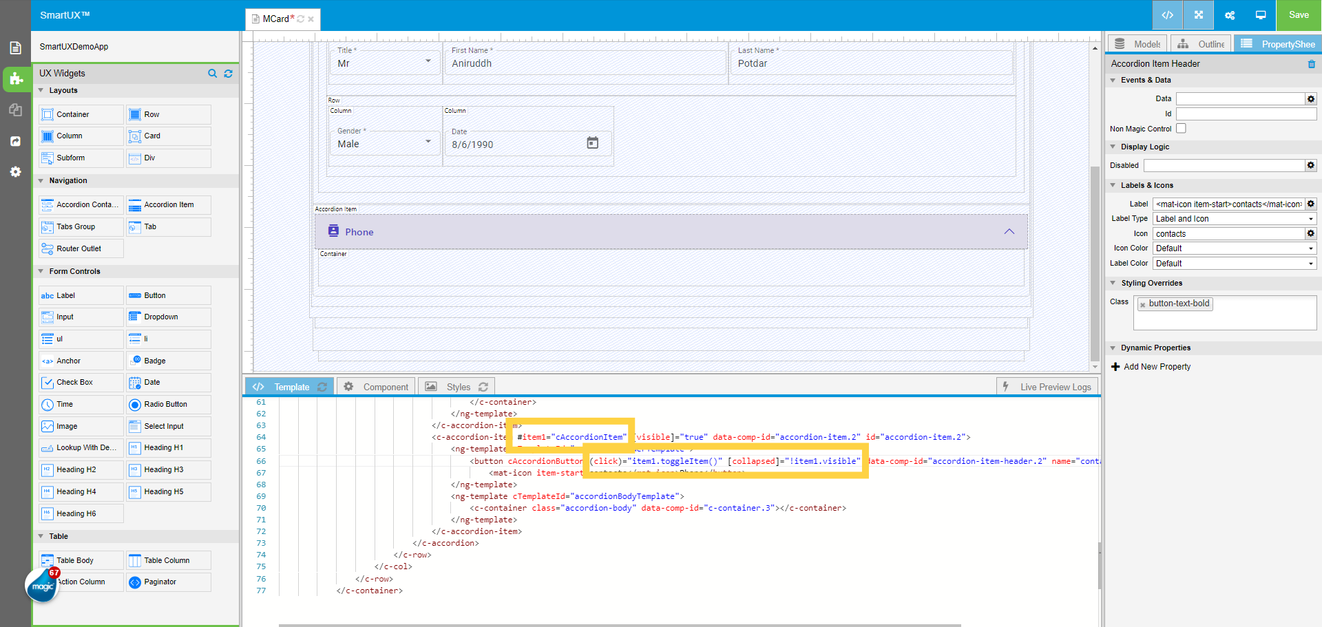
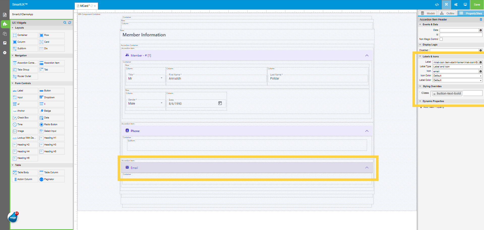
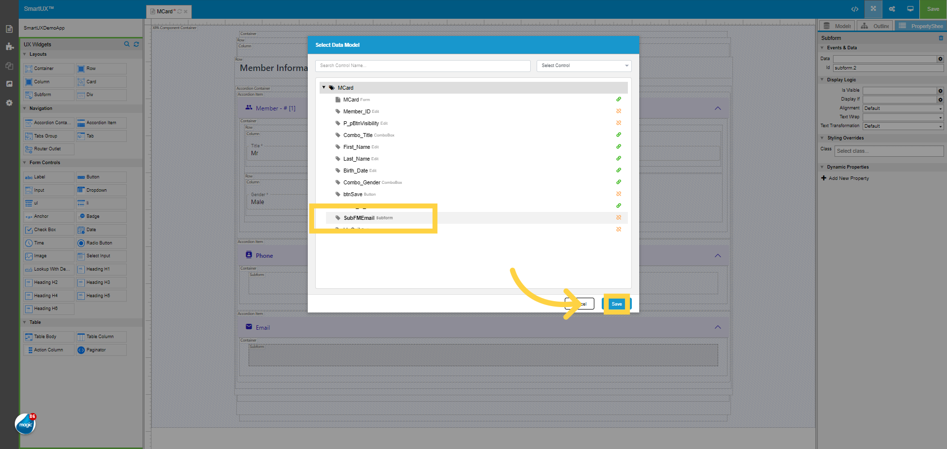
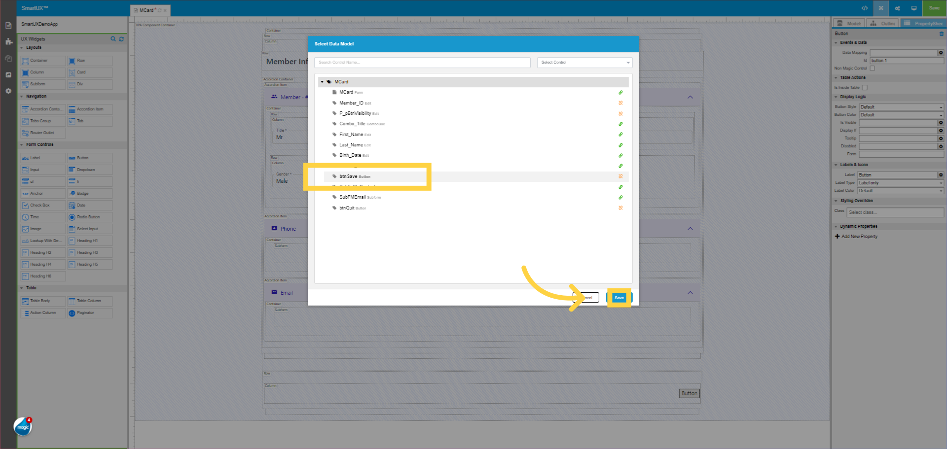
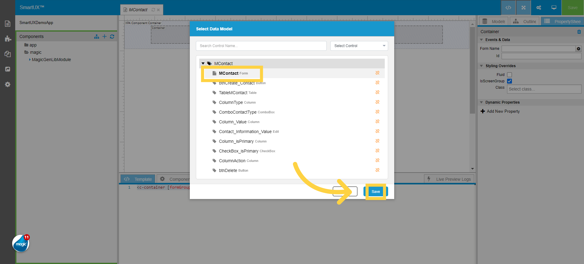
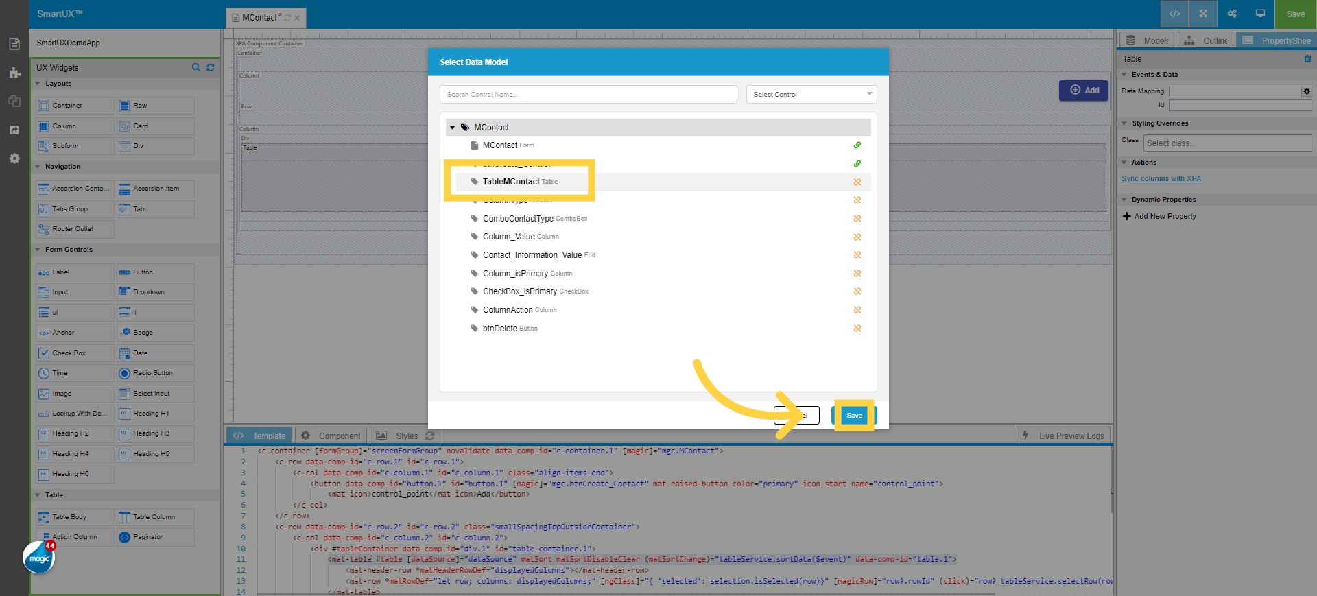
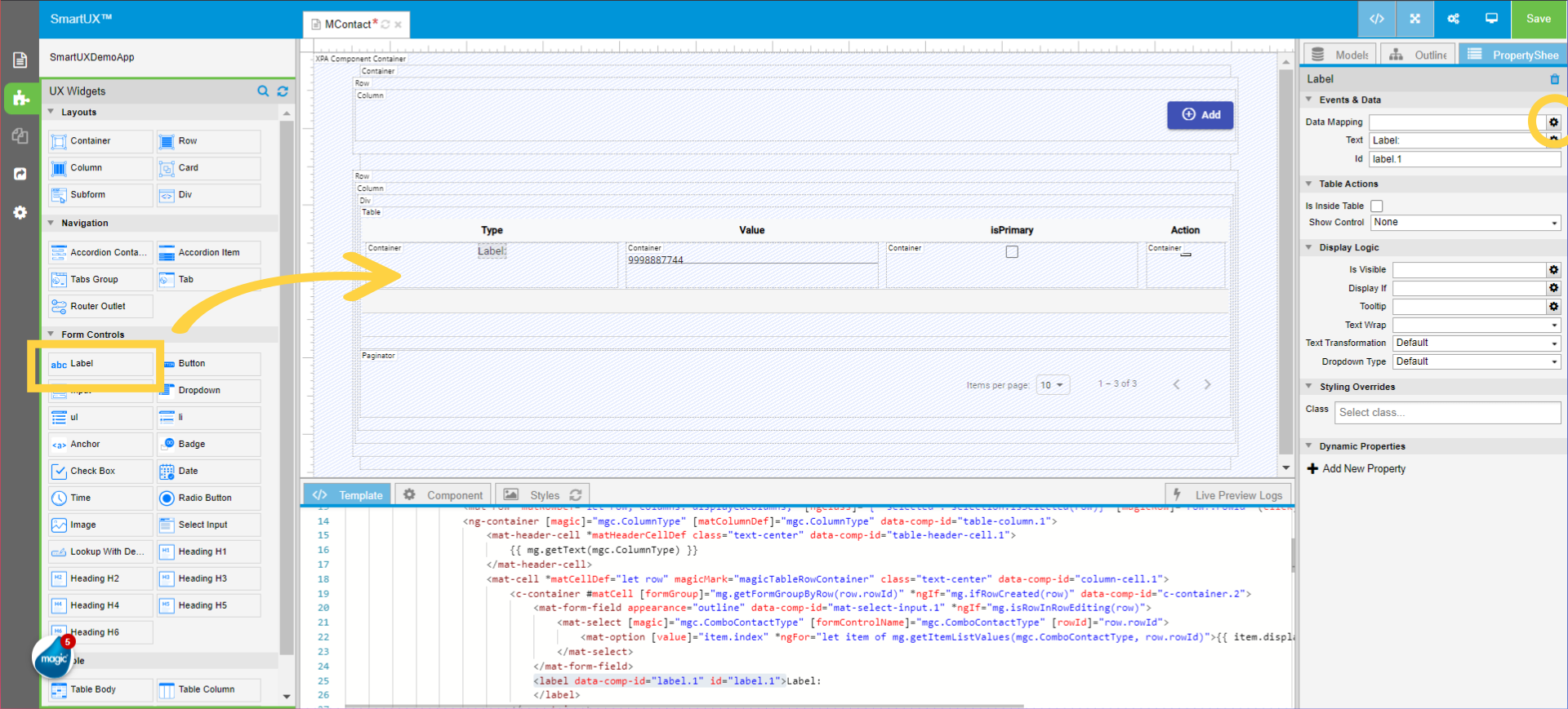
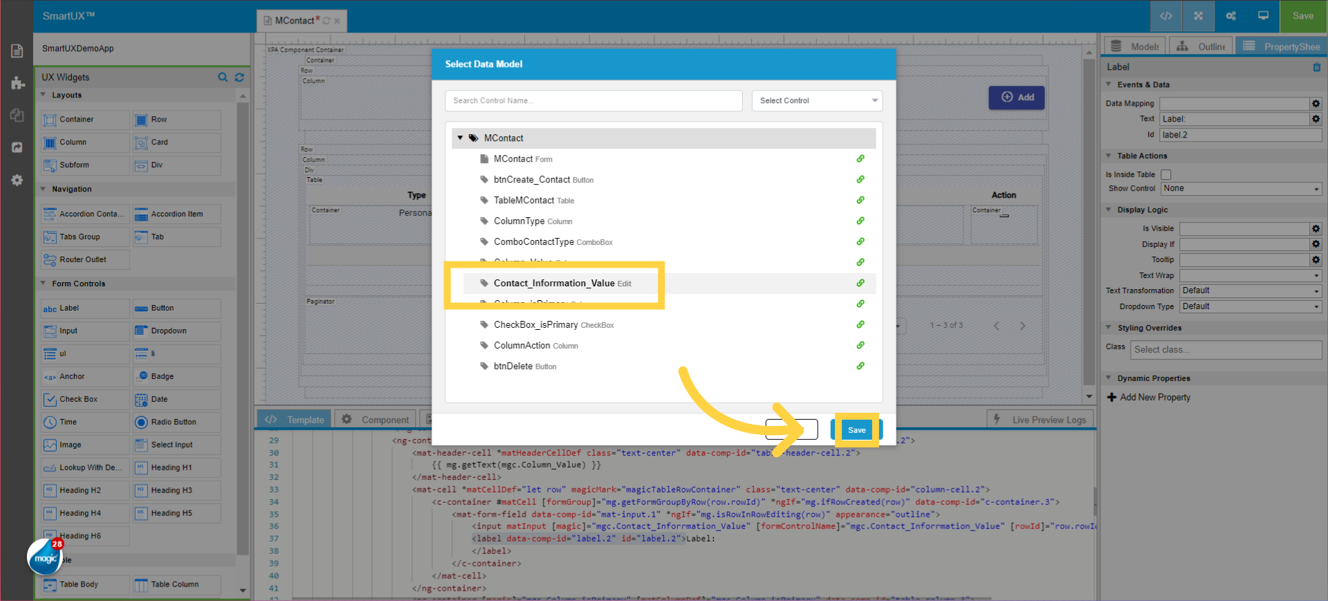
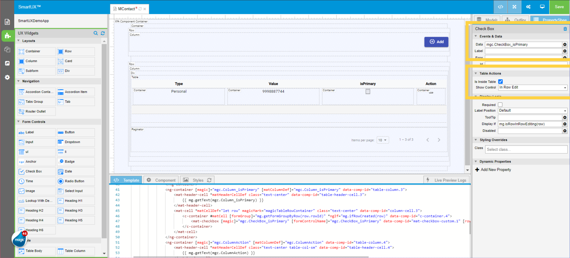
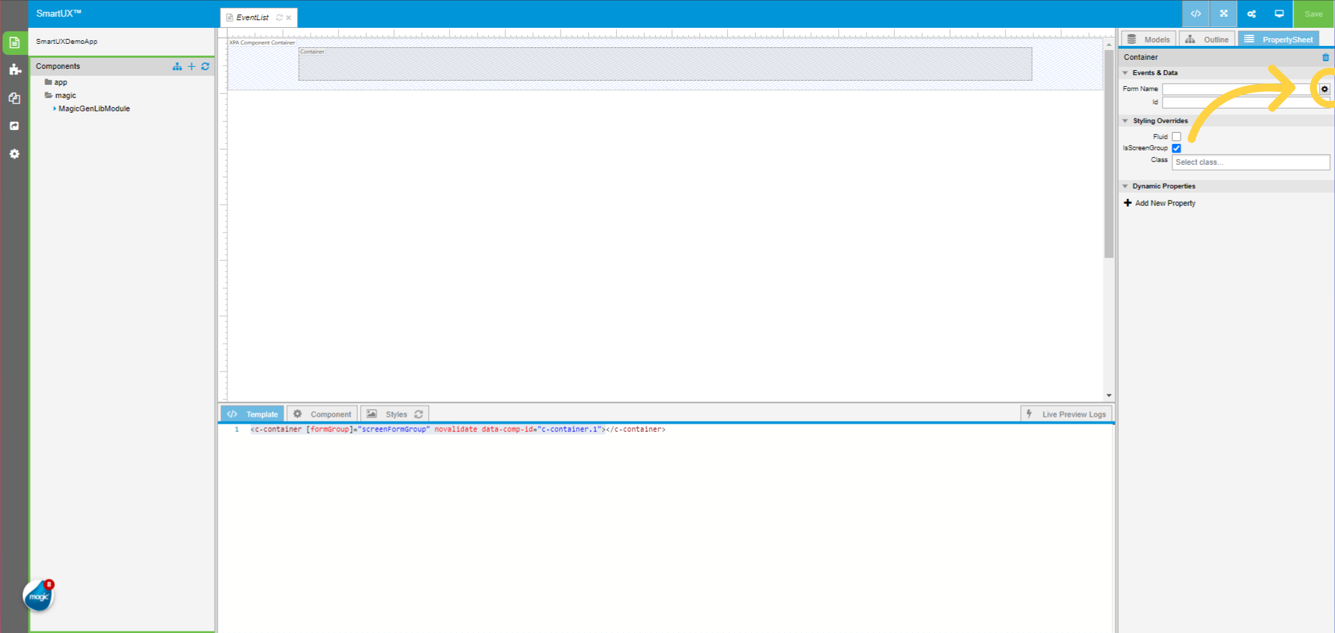
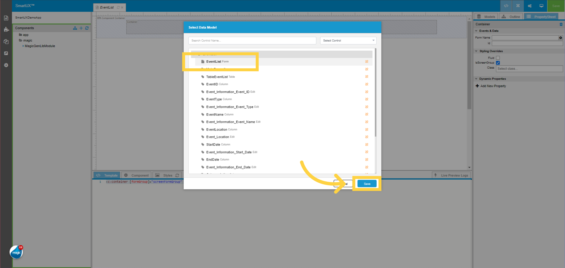
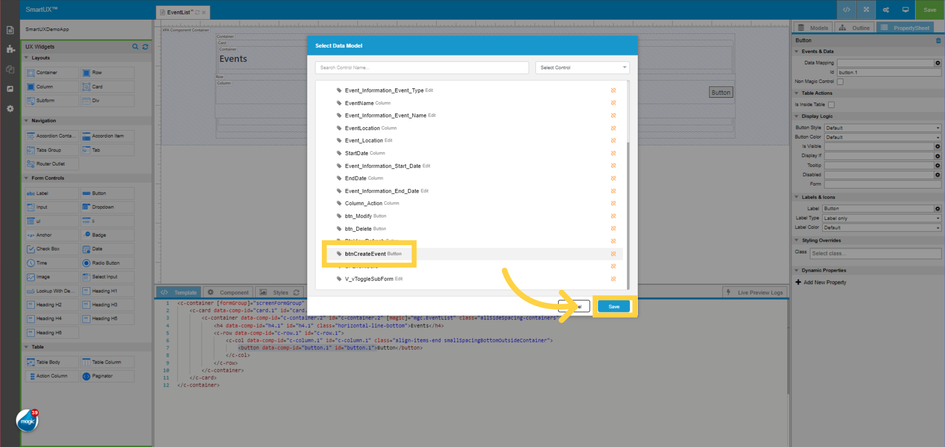
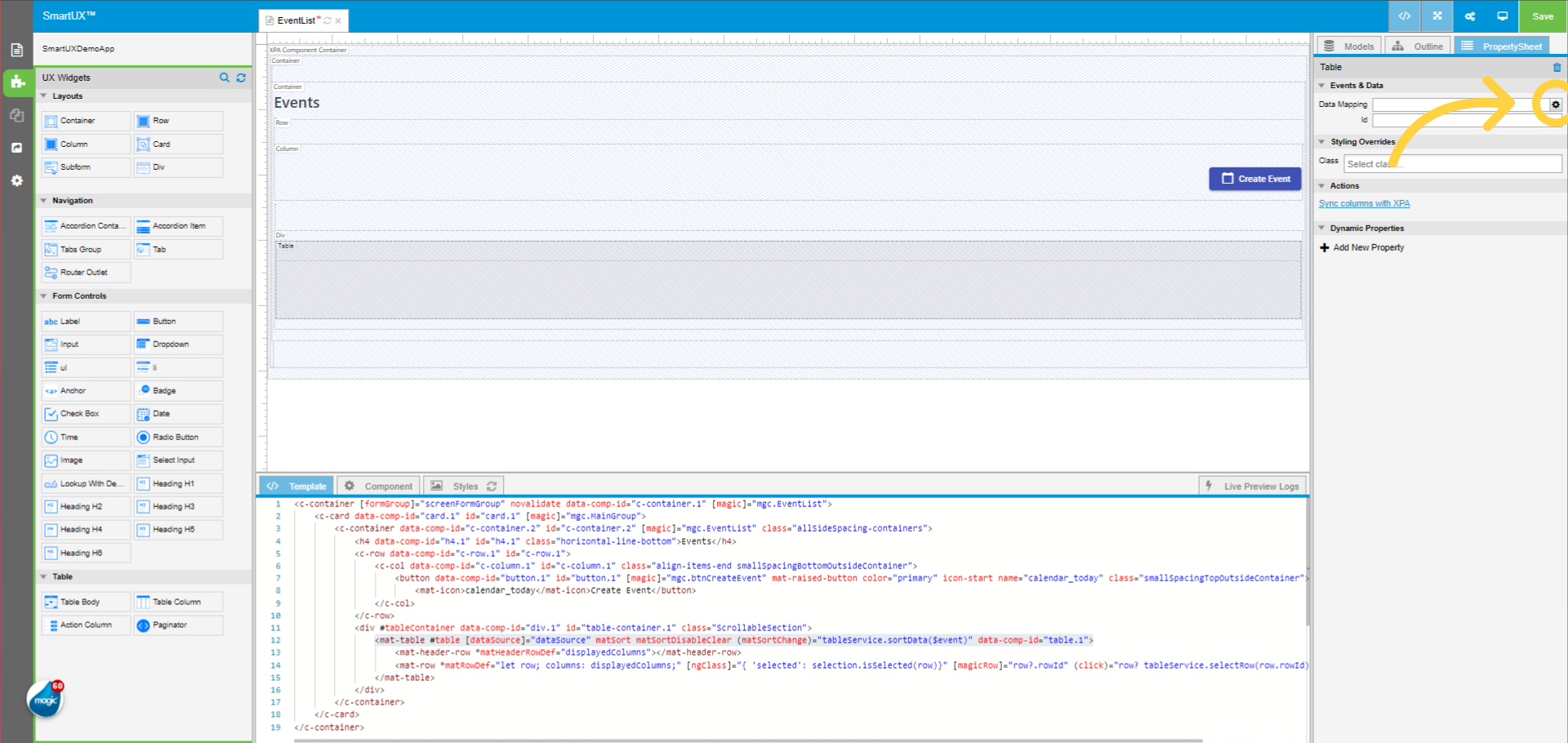
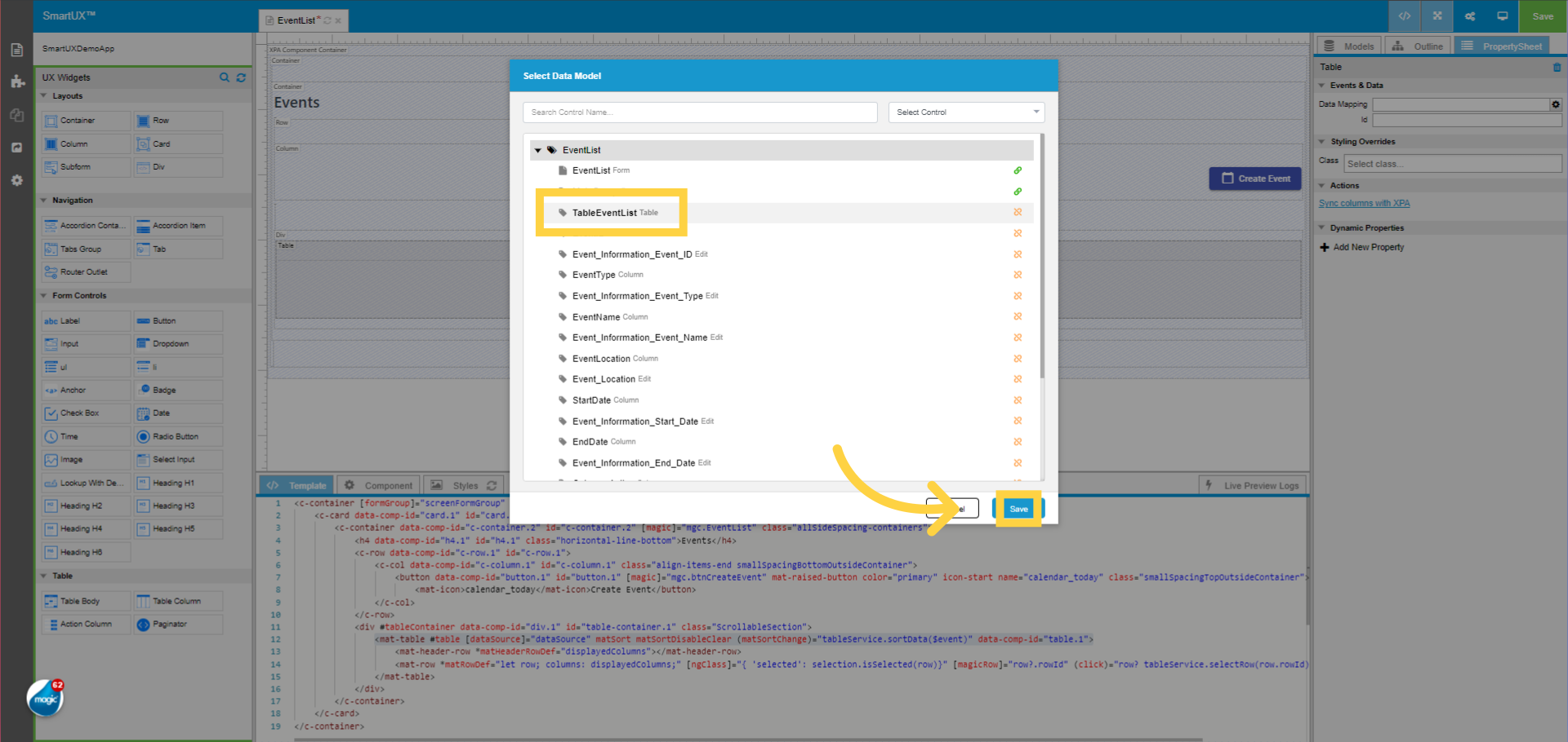
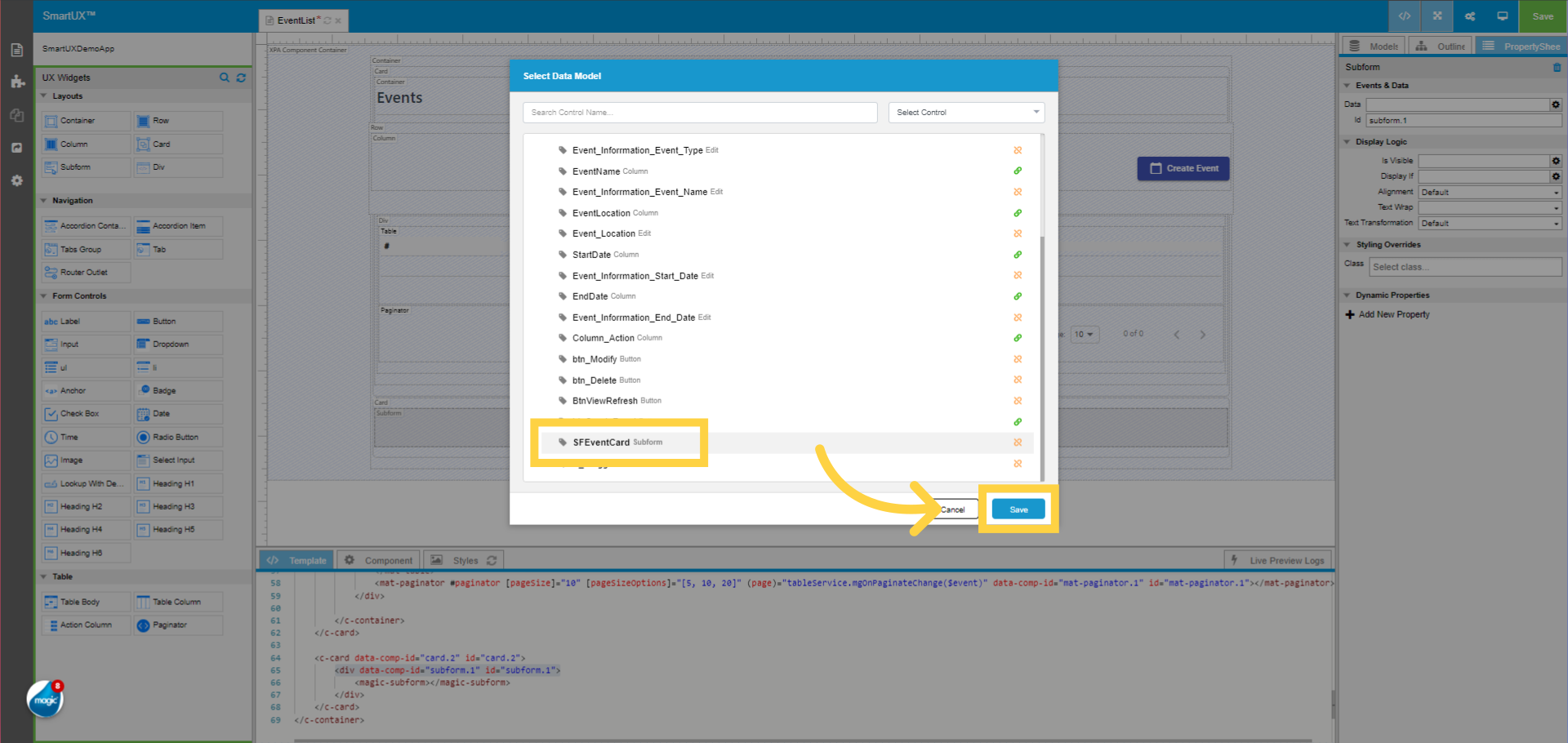
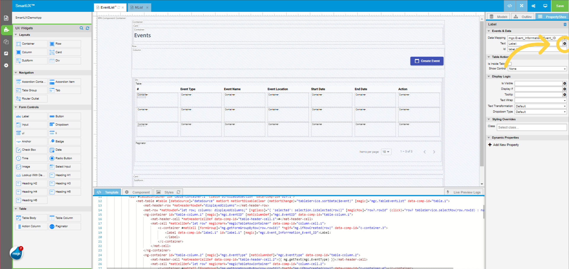
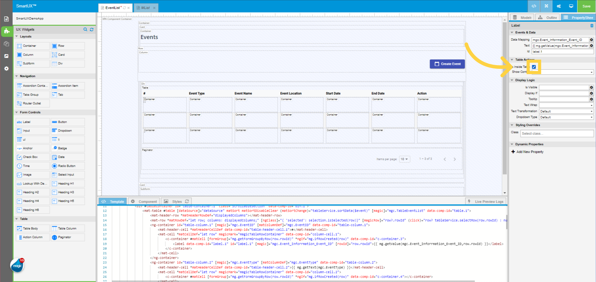
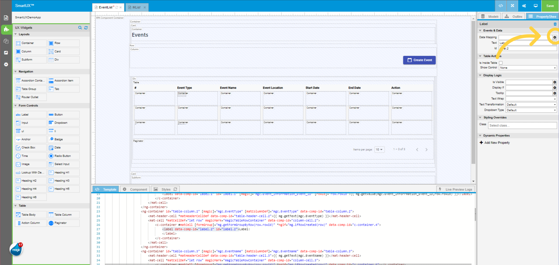
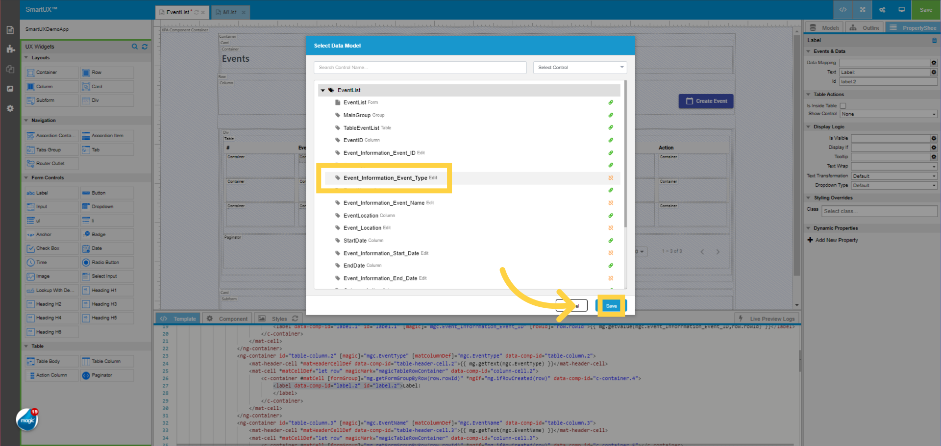
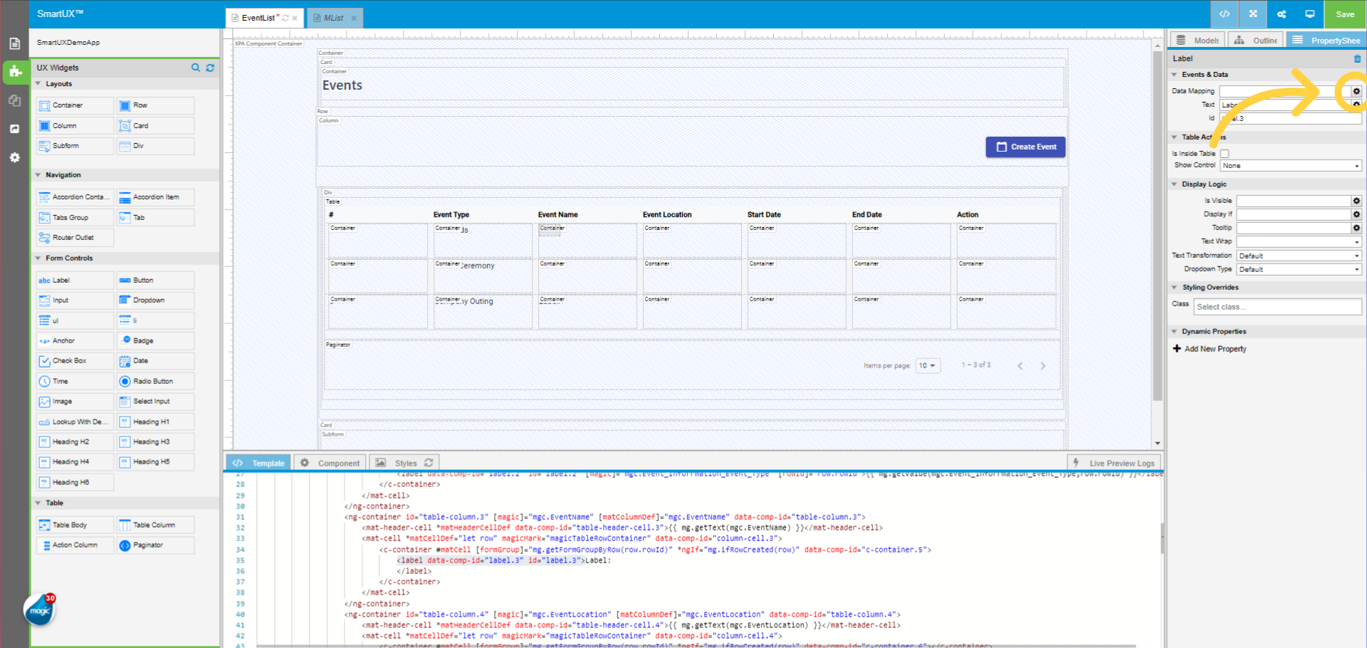
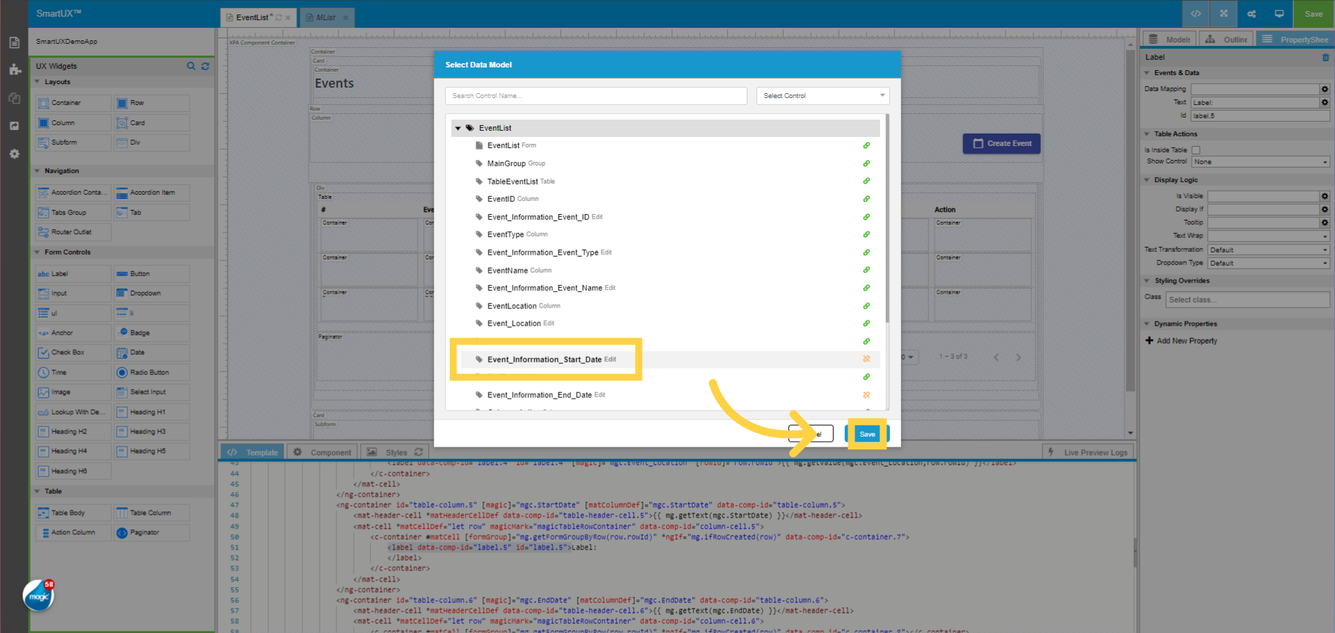
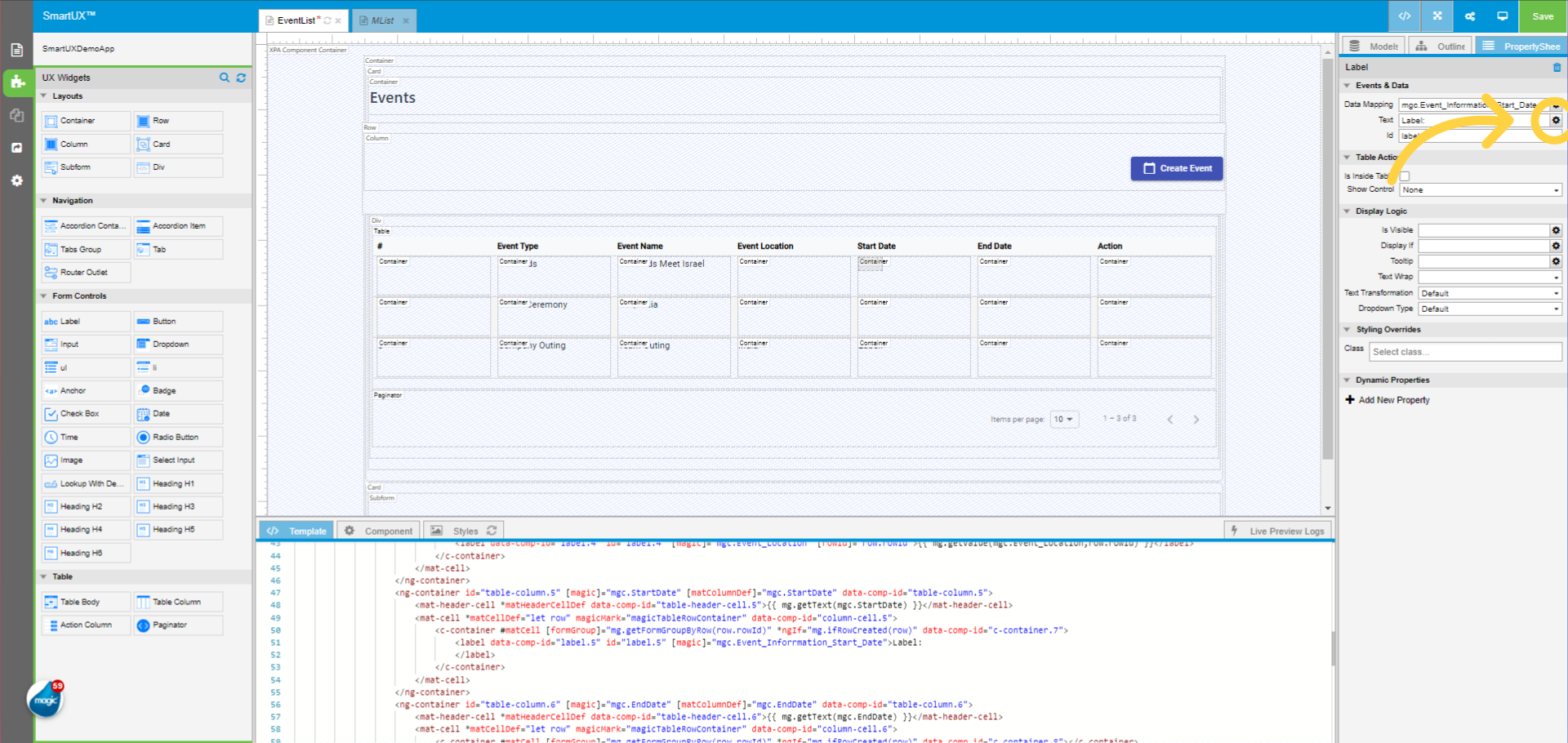
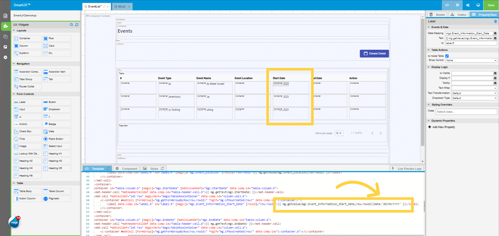
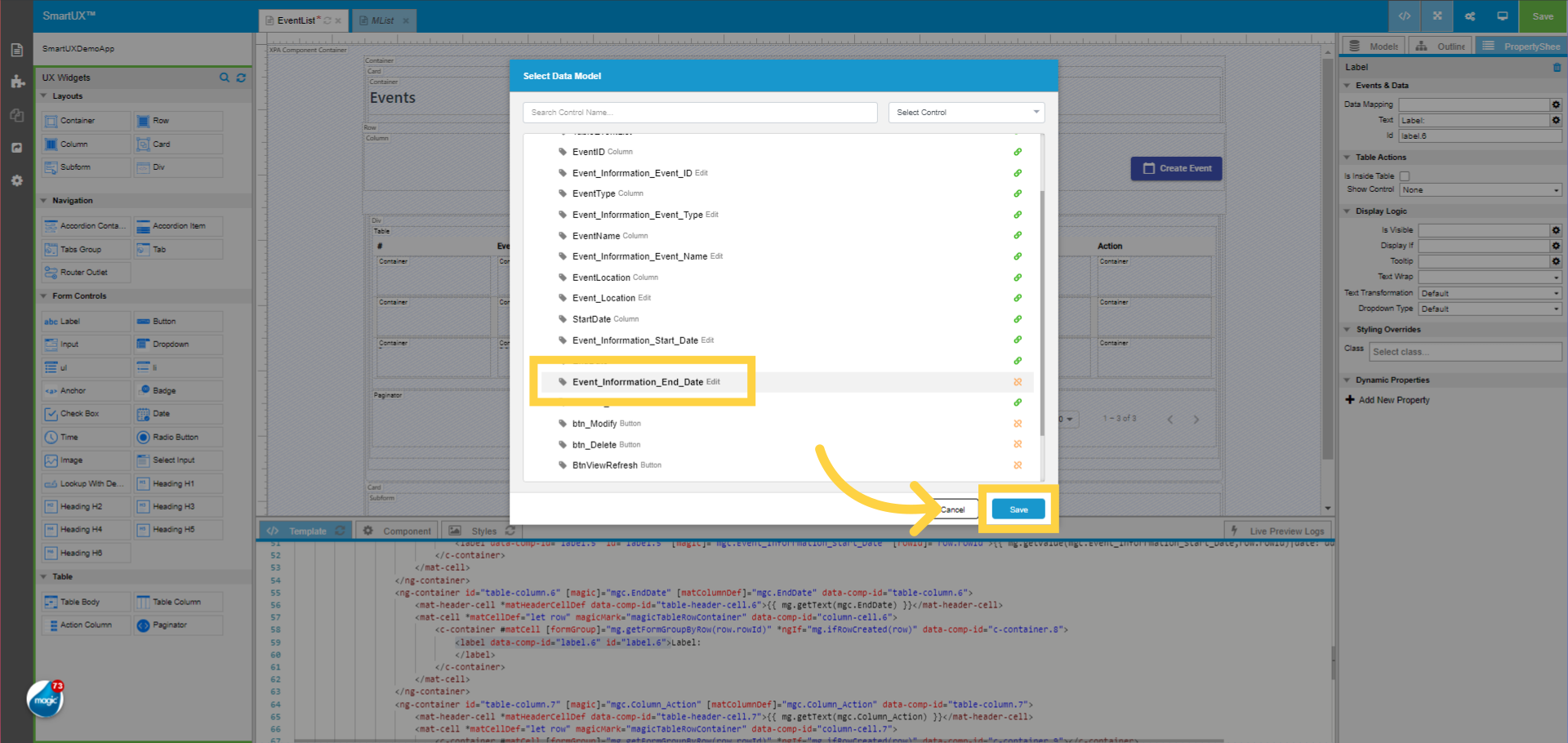
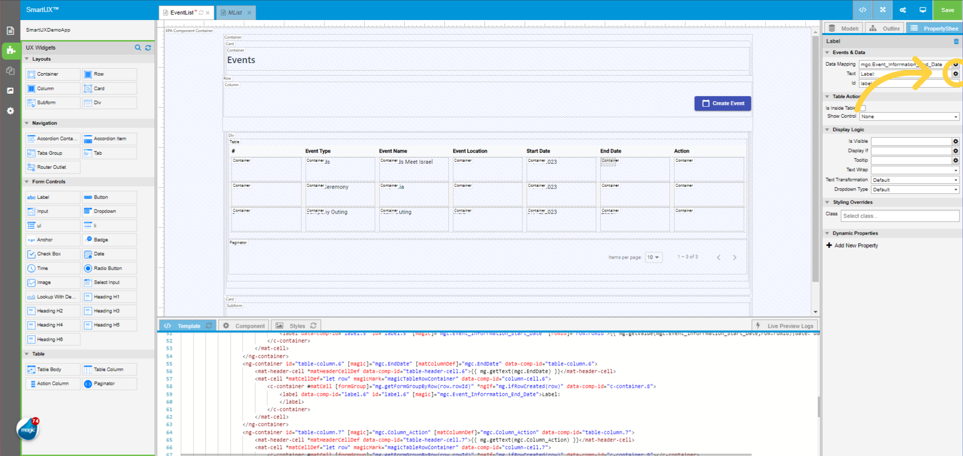
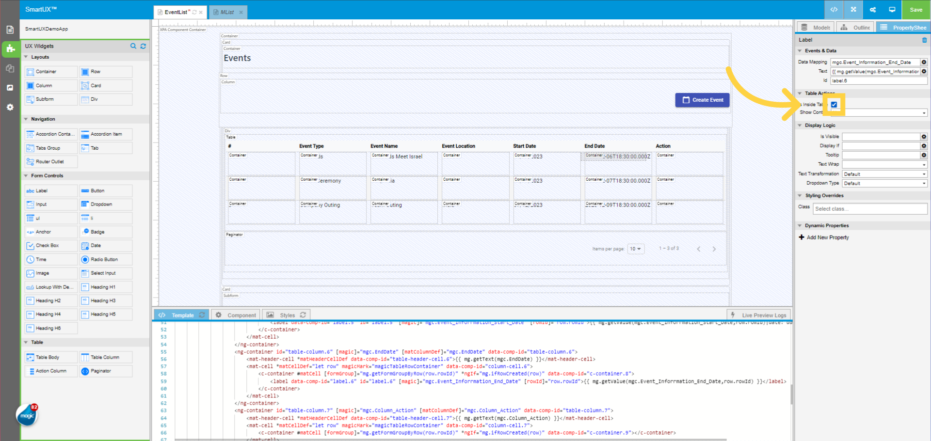
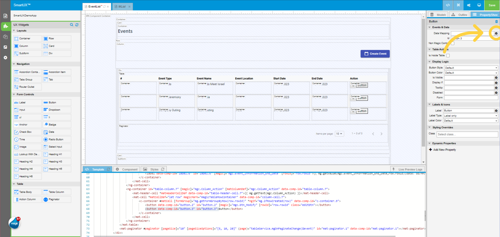
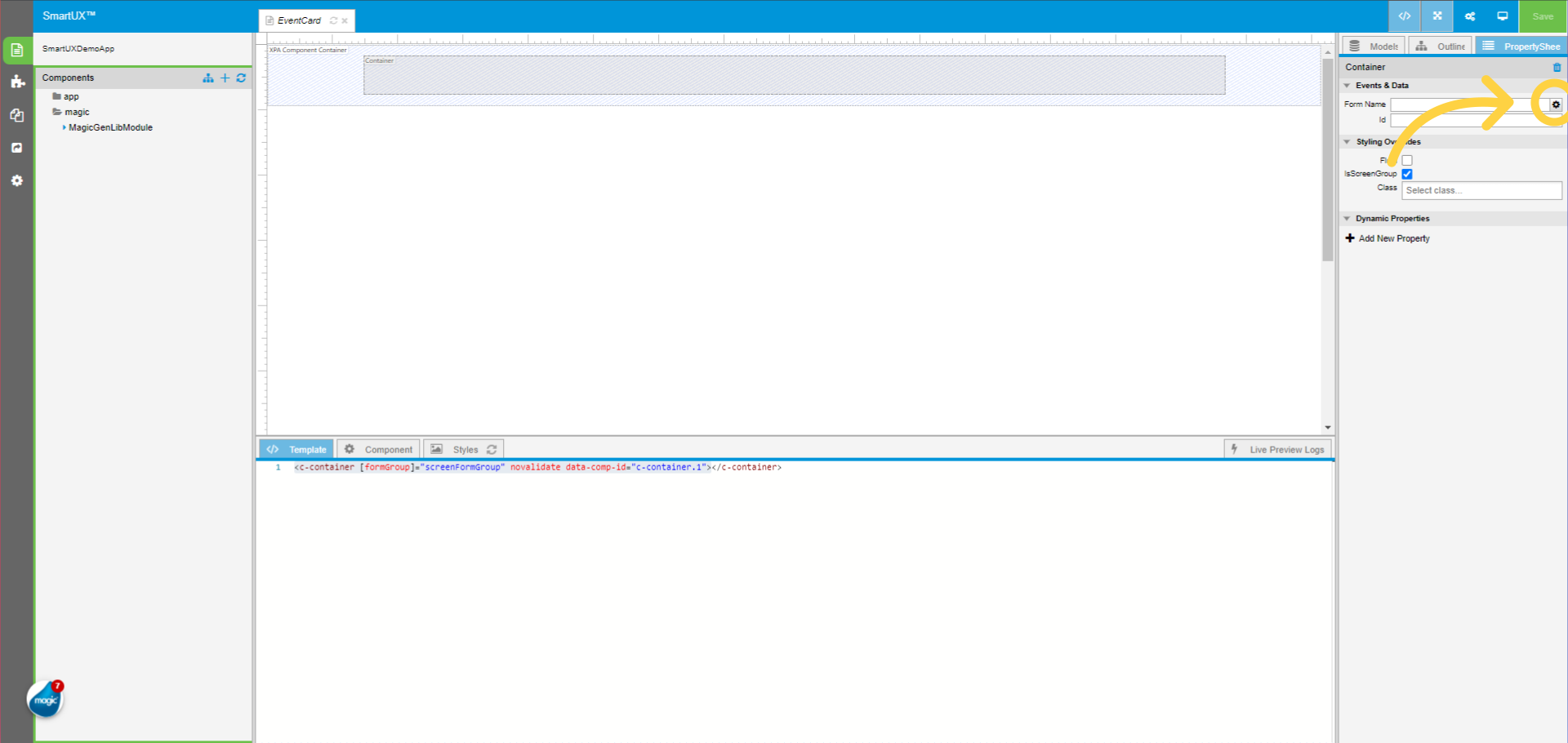
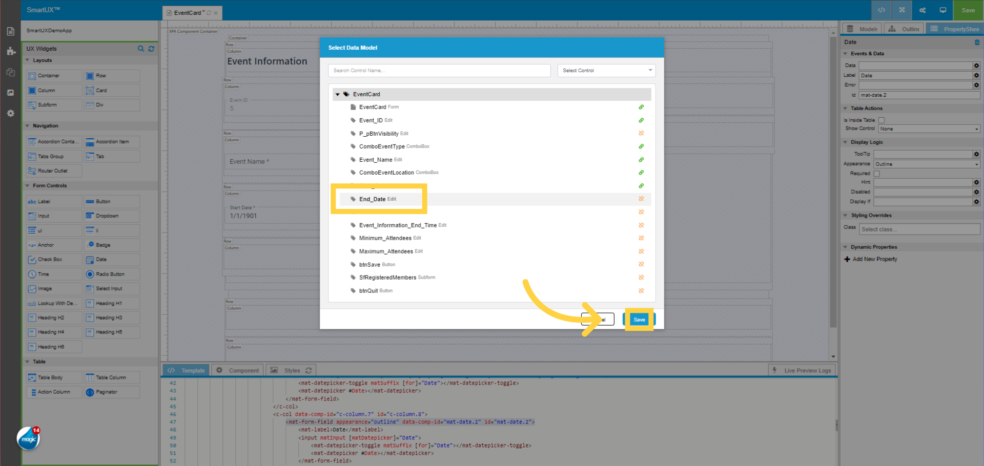
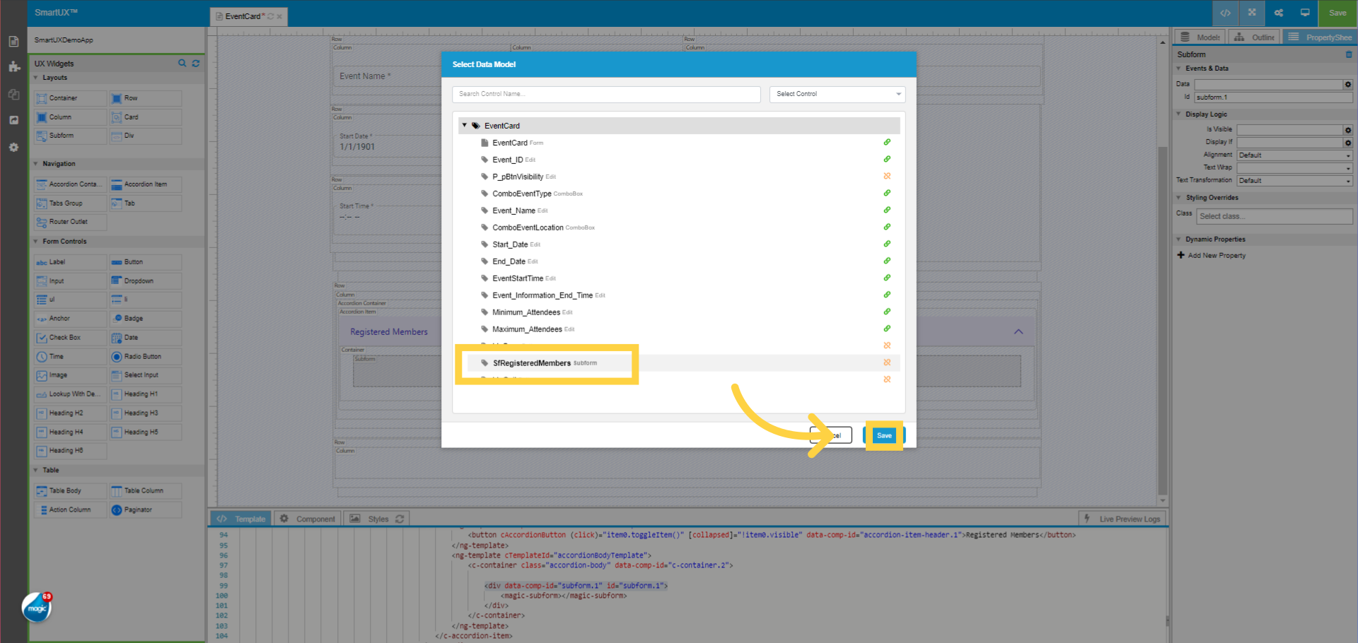
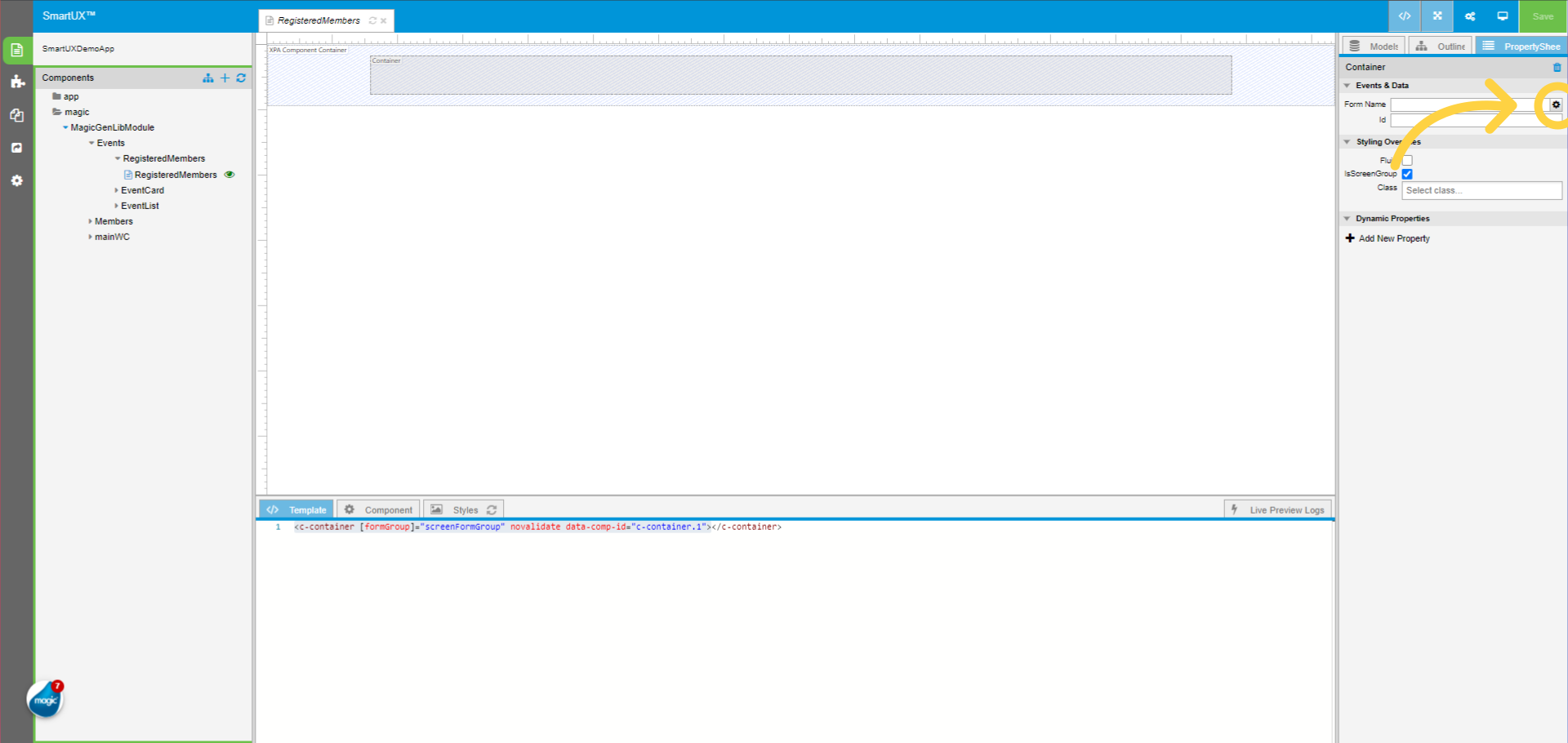
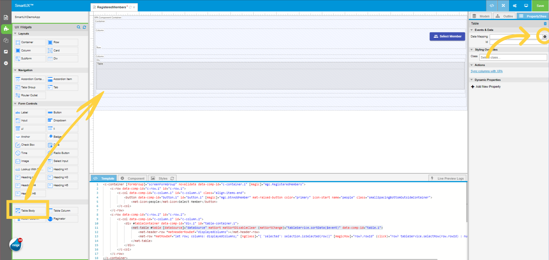
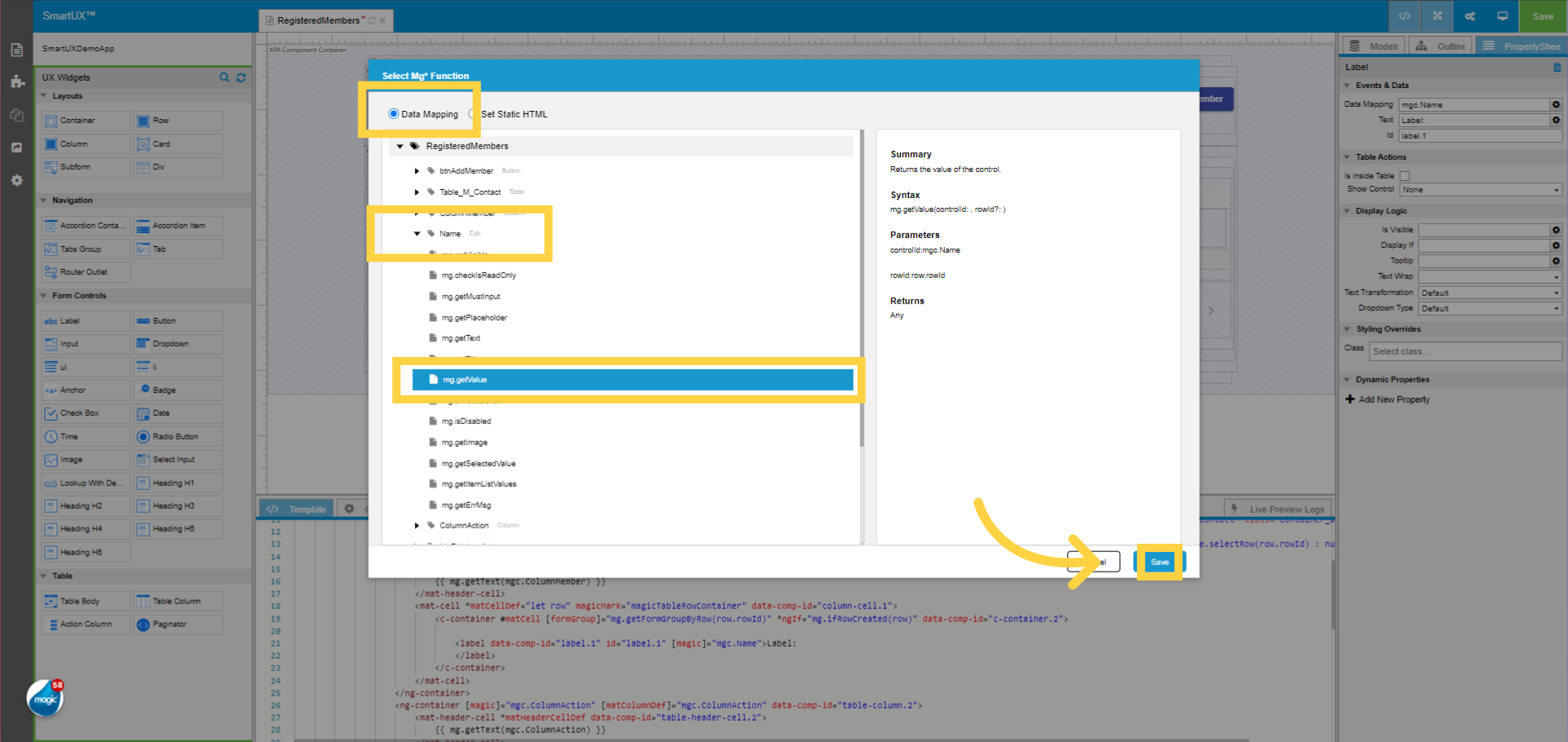
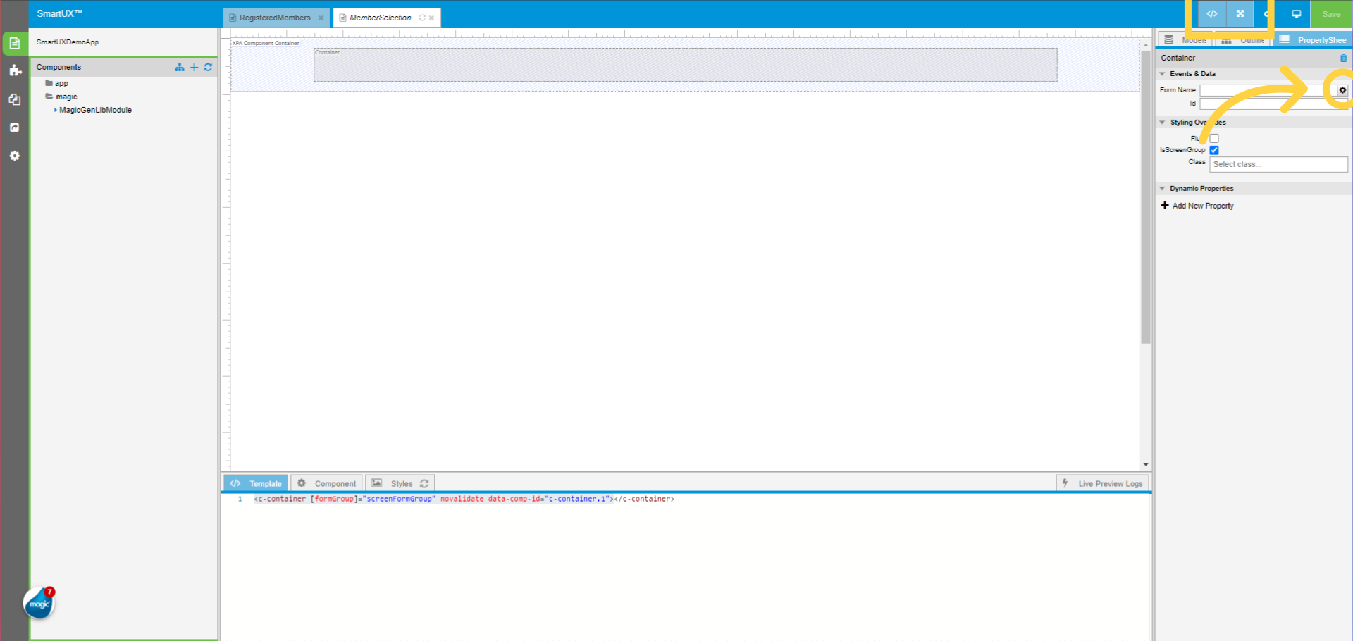
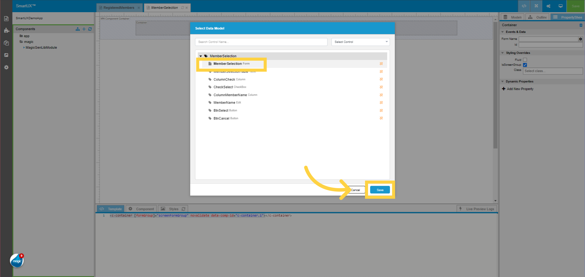
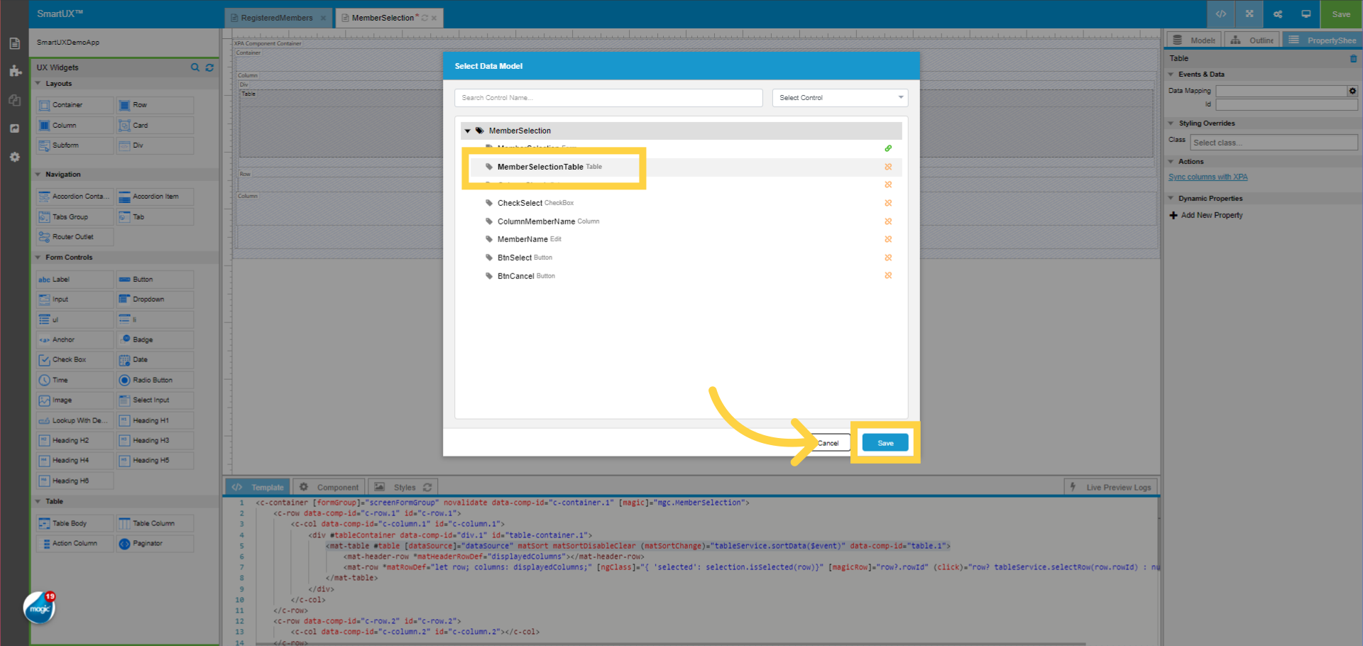
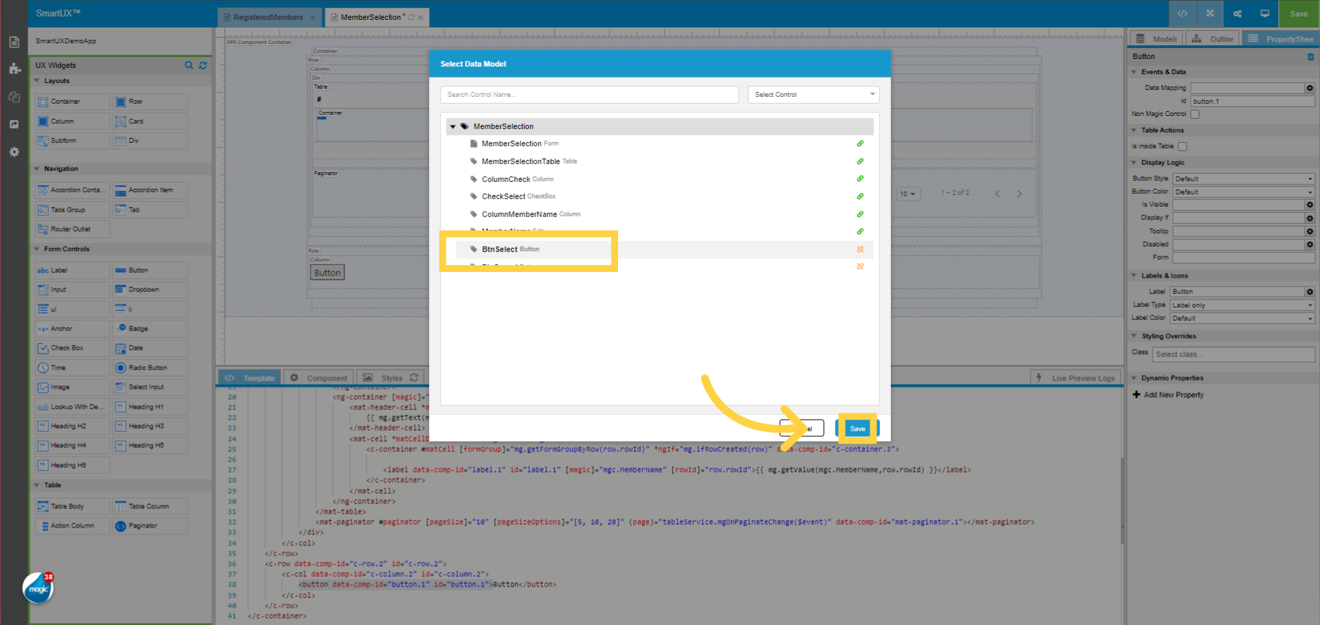
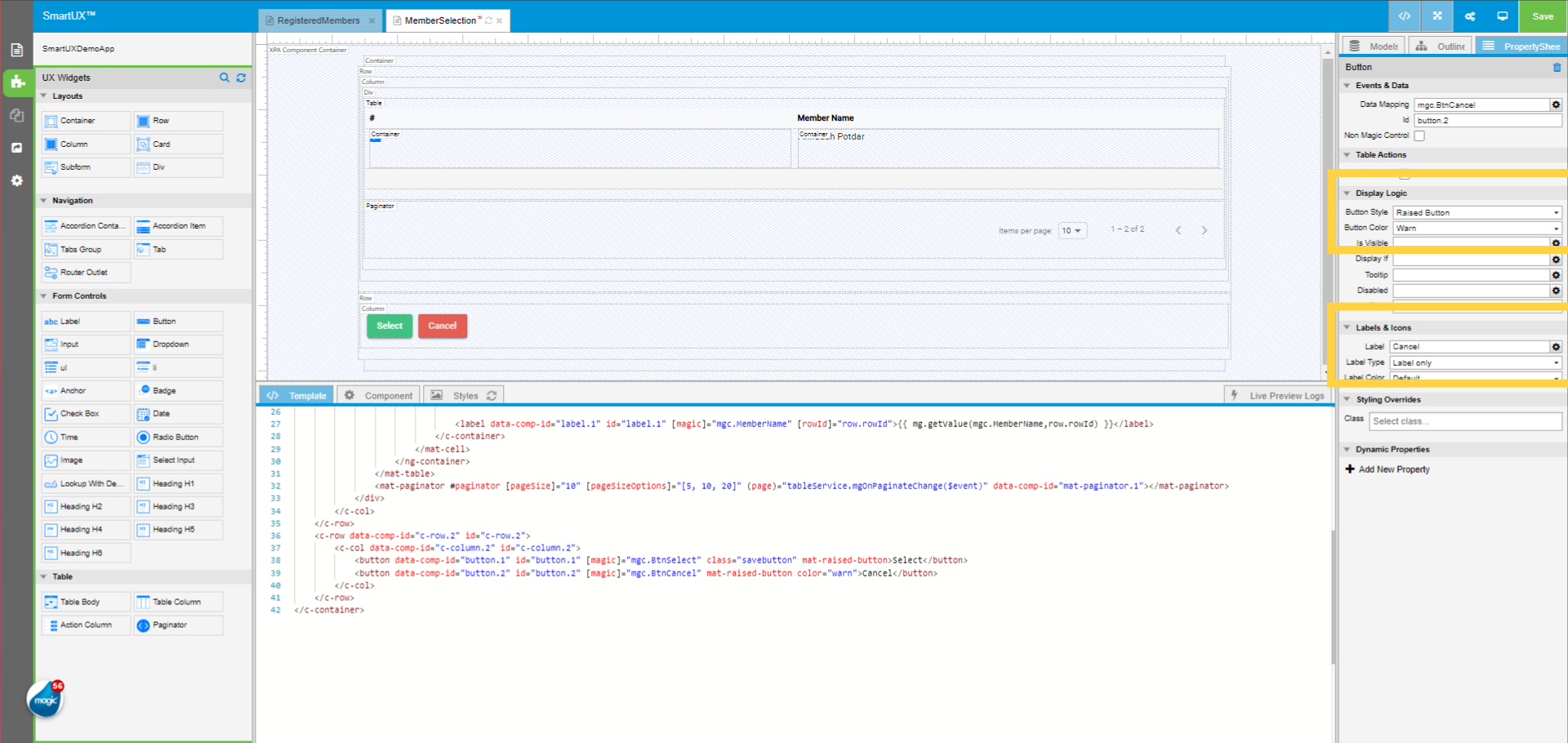
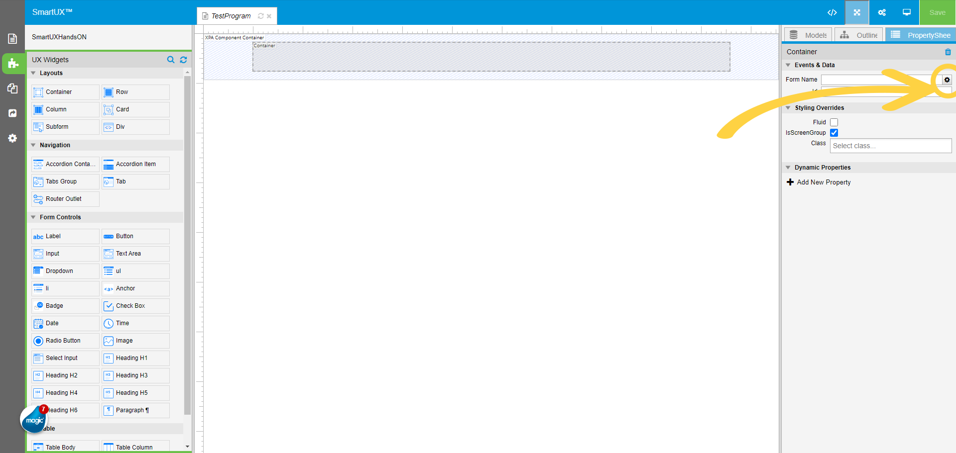
8. Click on the gear icon to open the Model list for mapping
On the Container widget property sheet map the Form Name using the gear icon to the container.
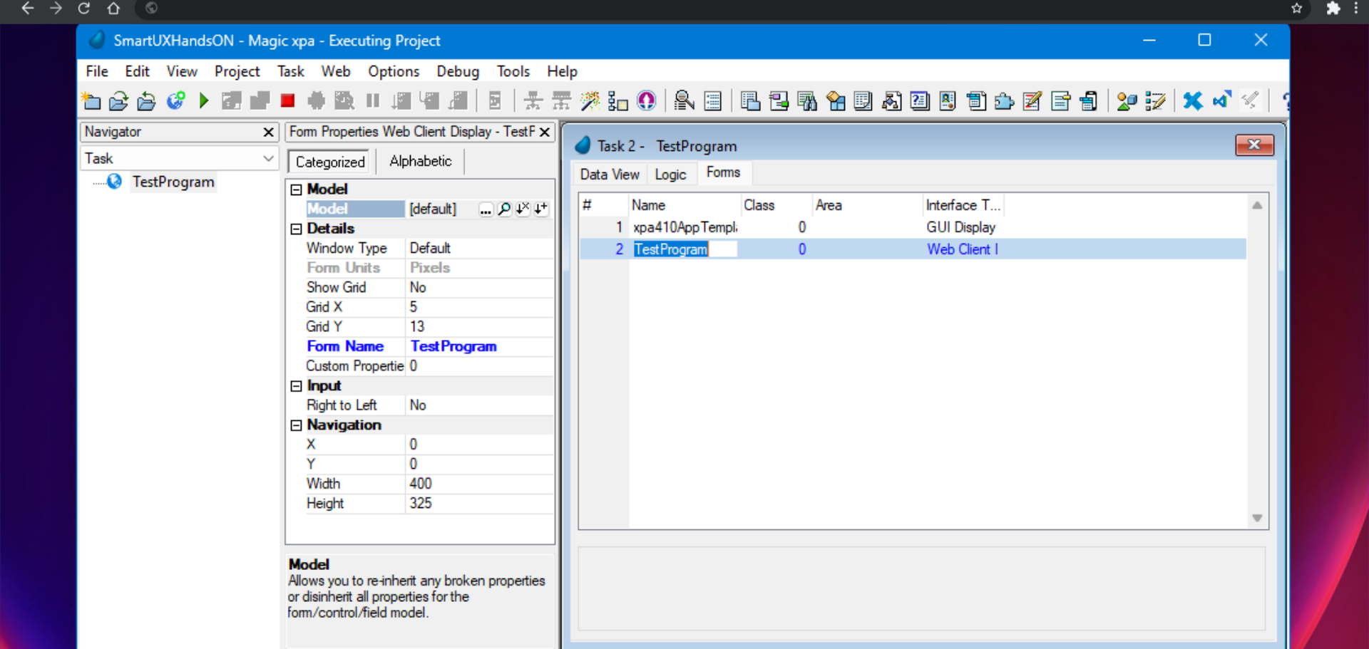
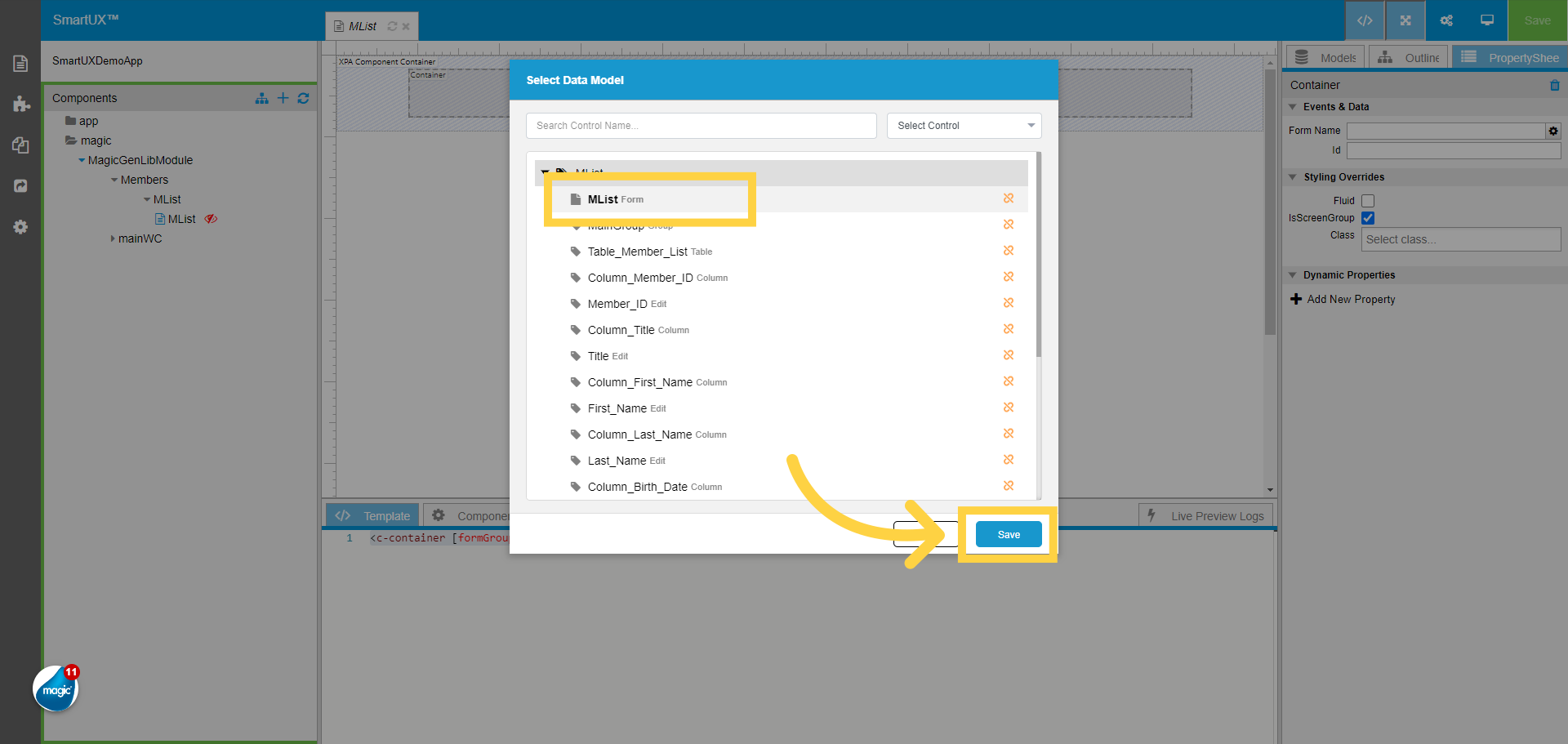
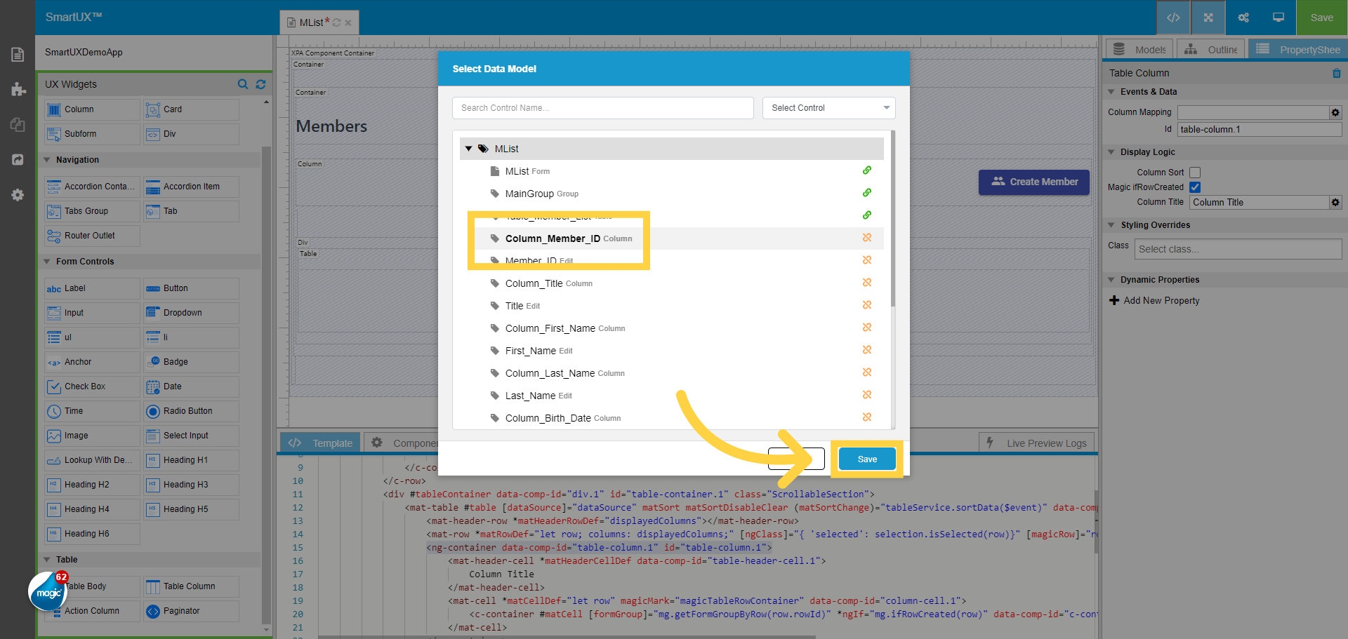
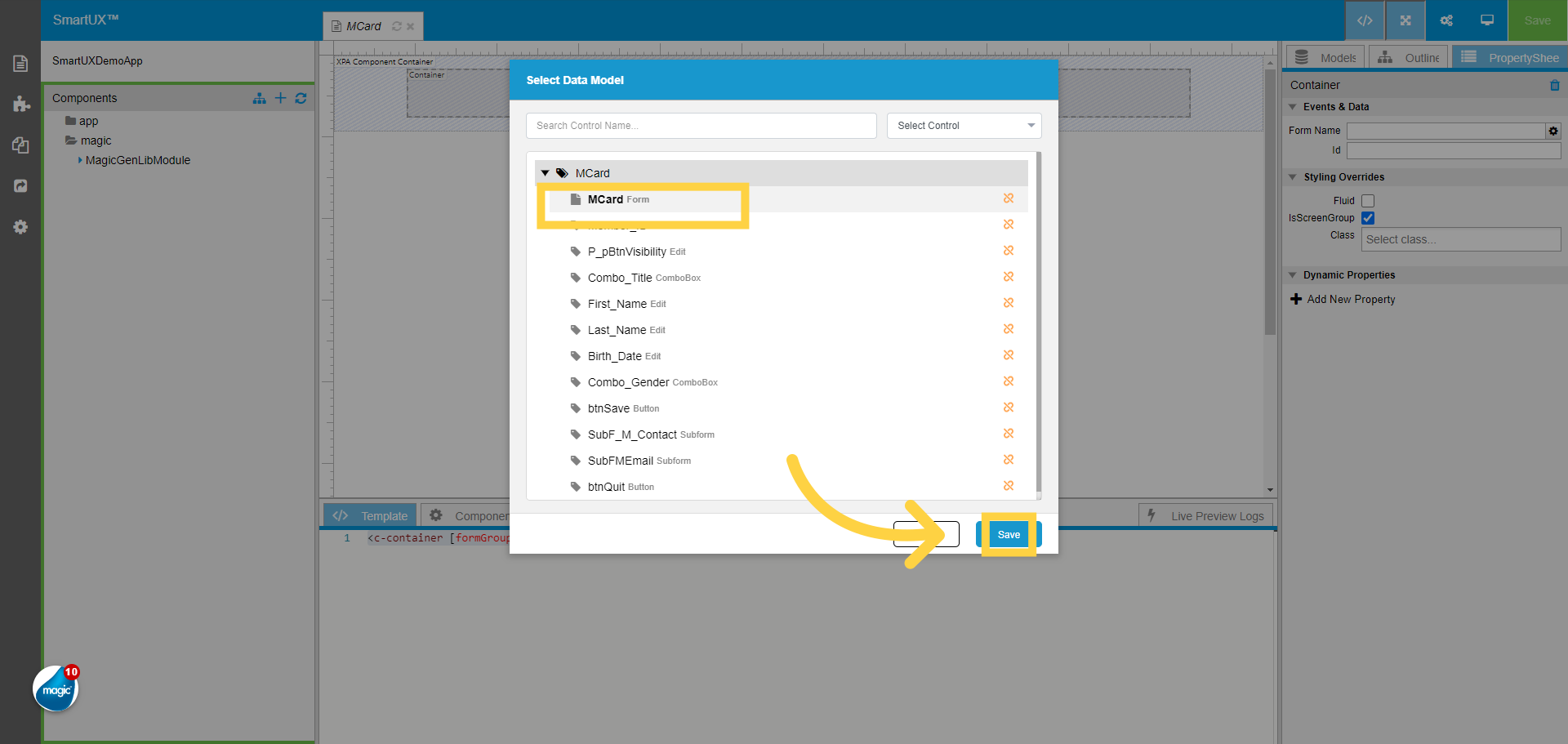
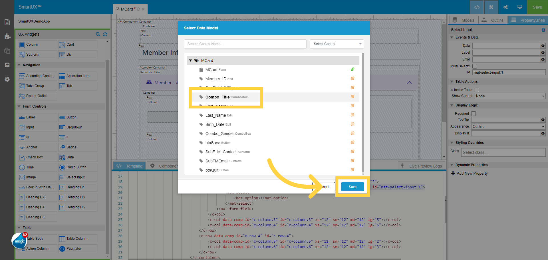
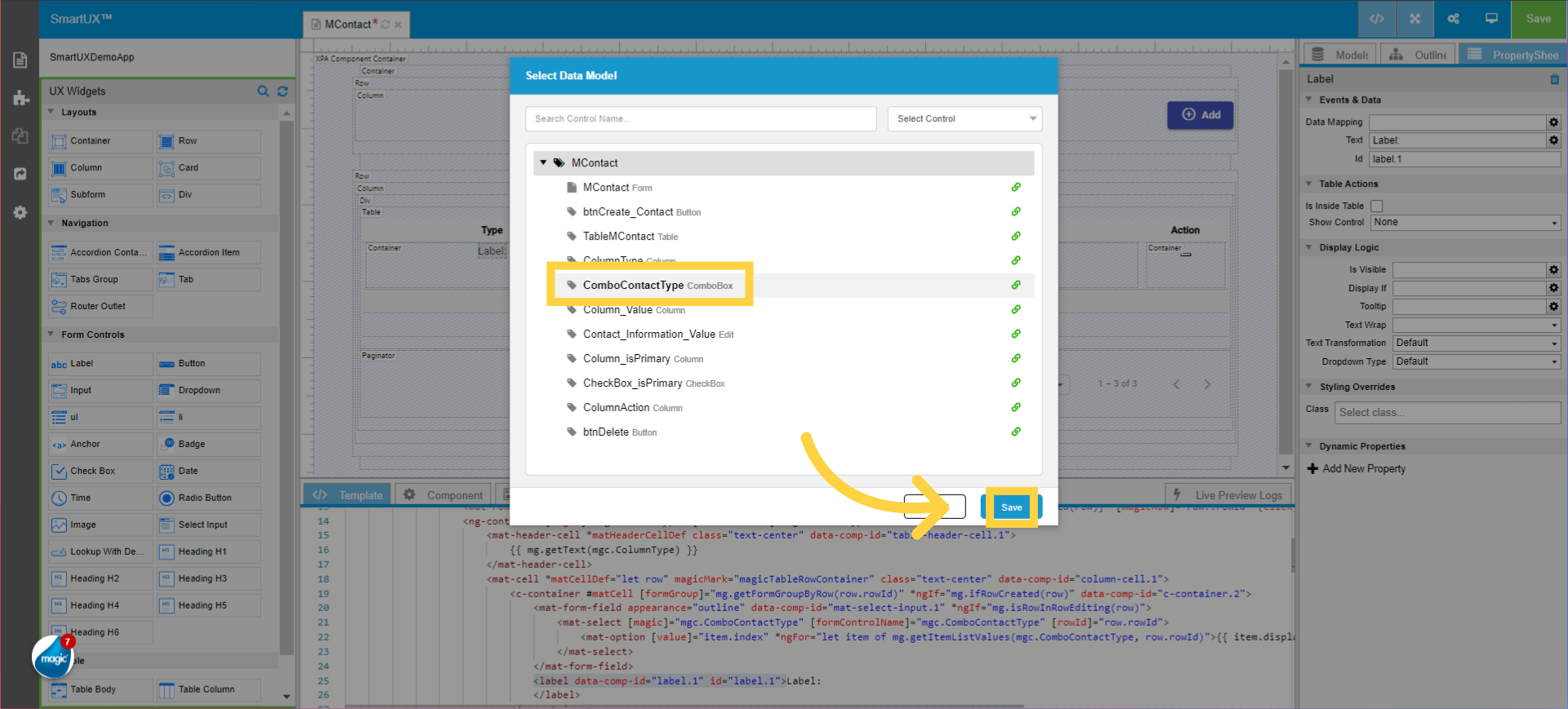
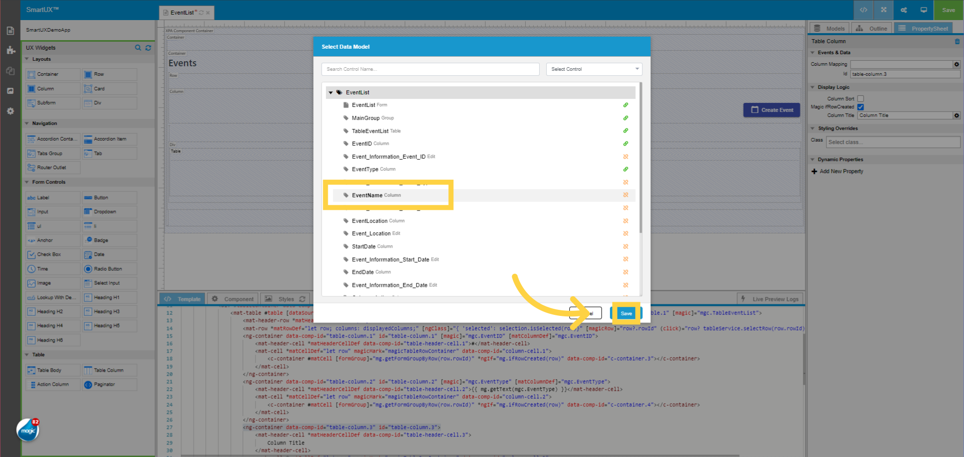
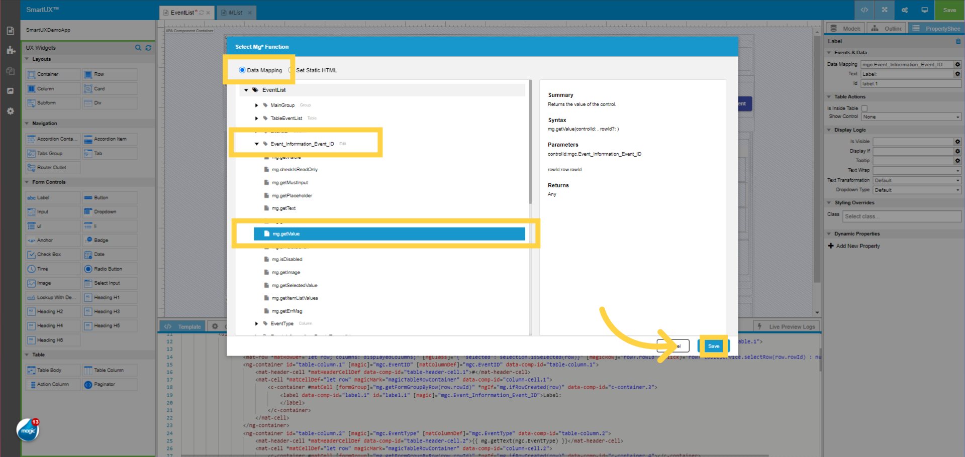
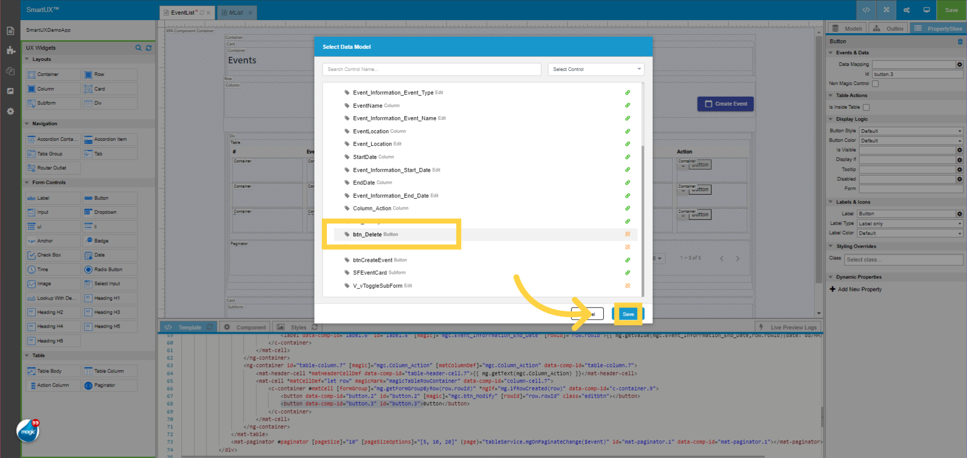
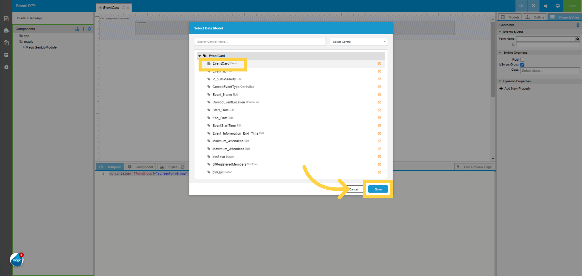
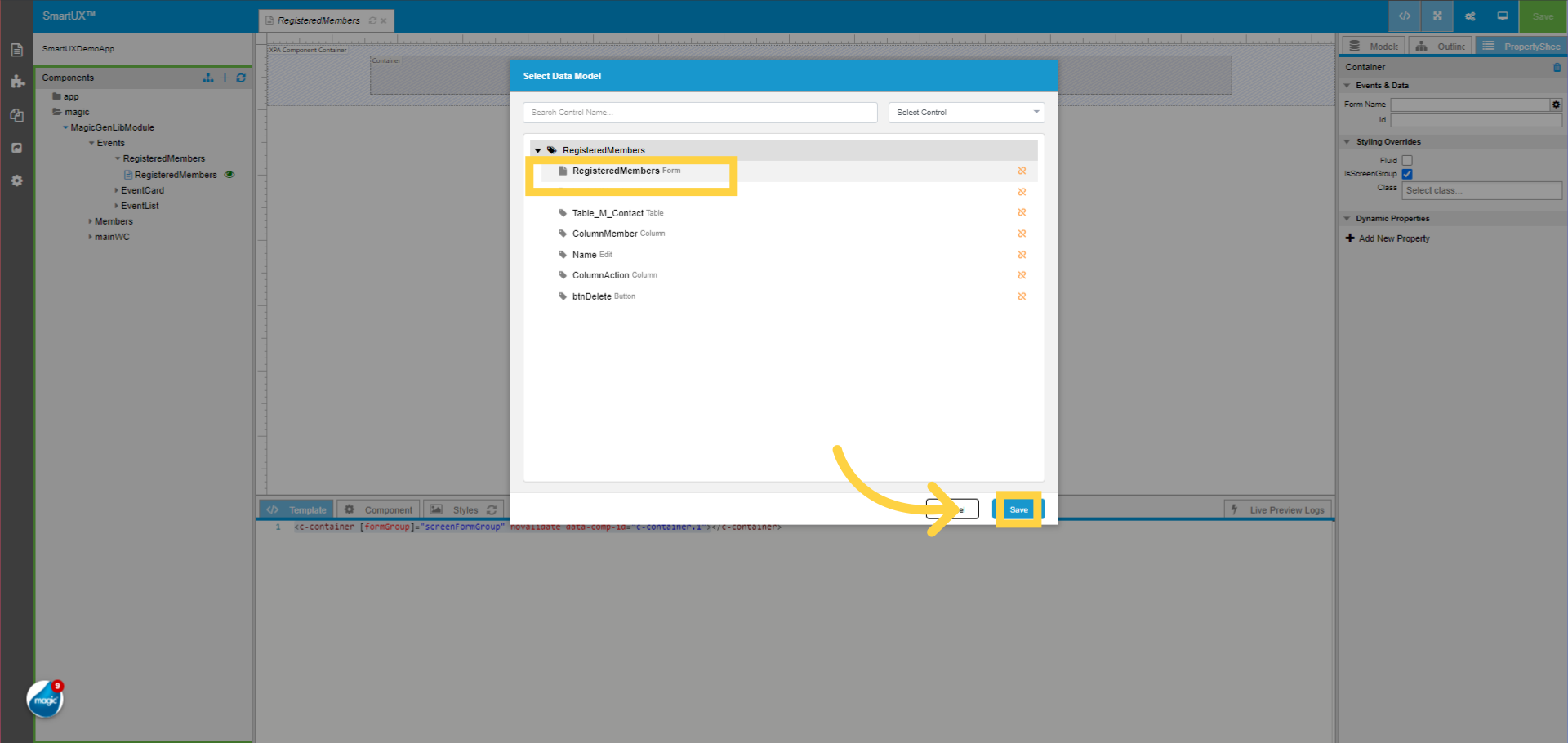
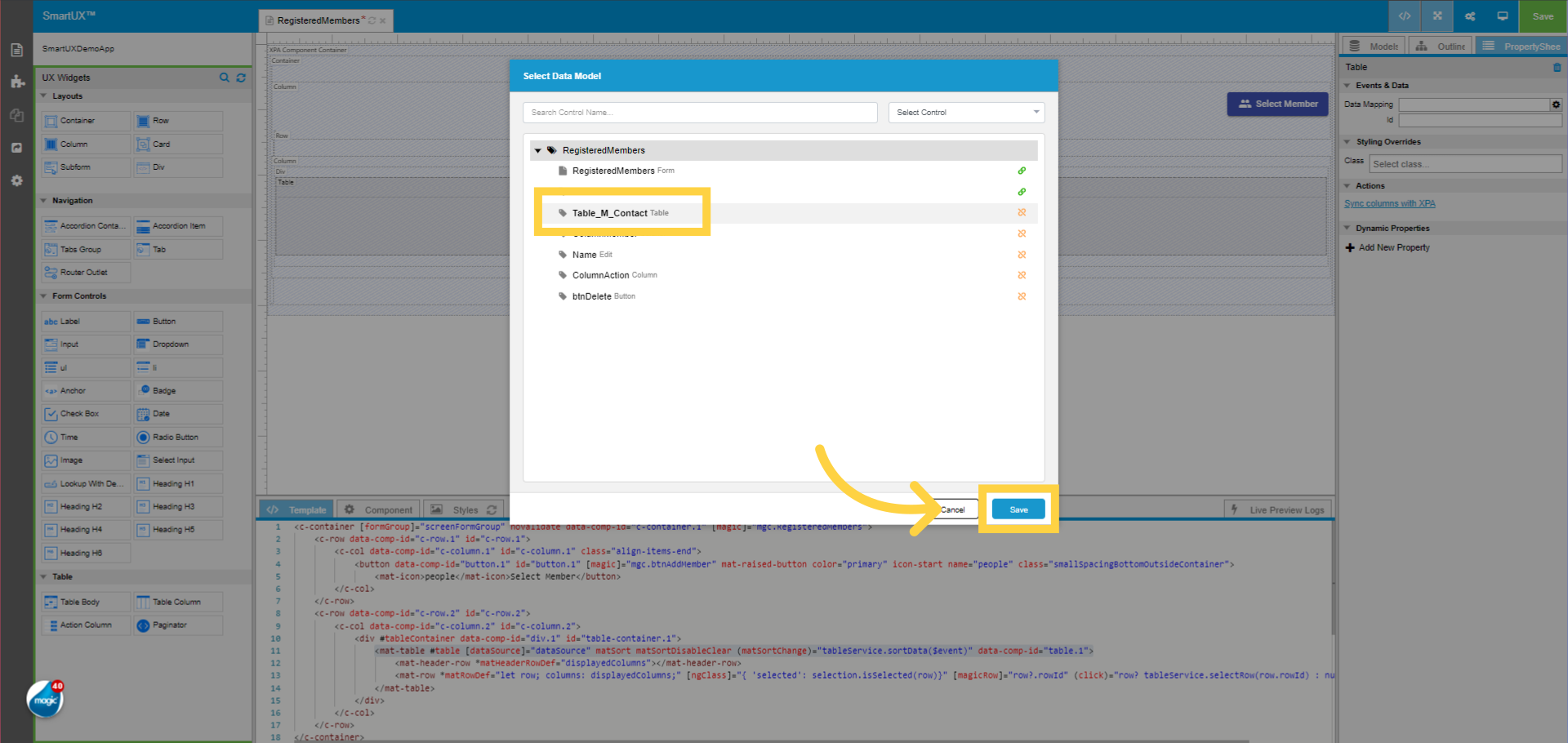
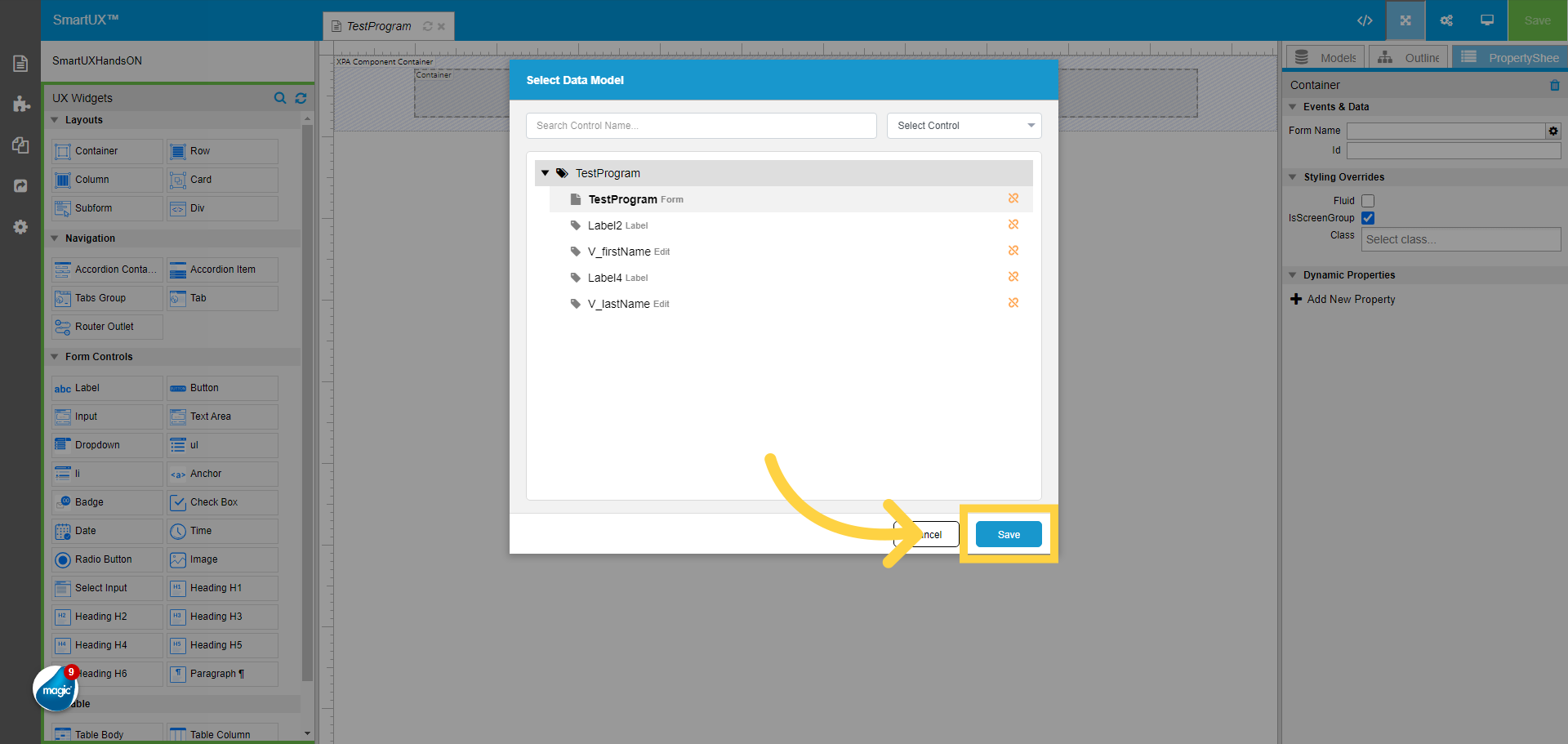
9. Click “TestProgram” form to do the mapping and save
Choose the “TestProgram” form model to Map it with the Container widget Form Name property.

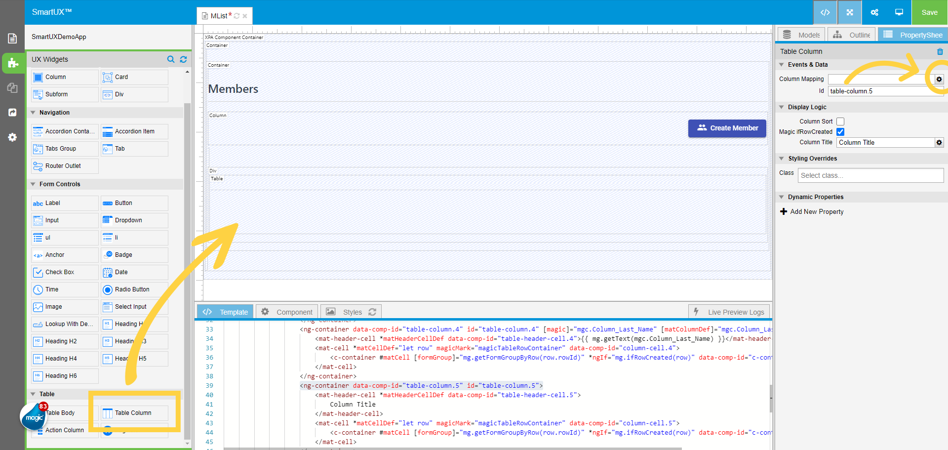
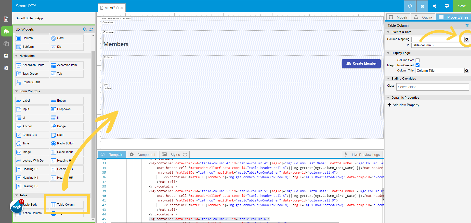
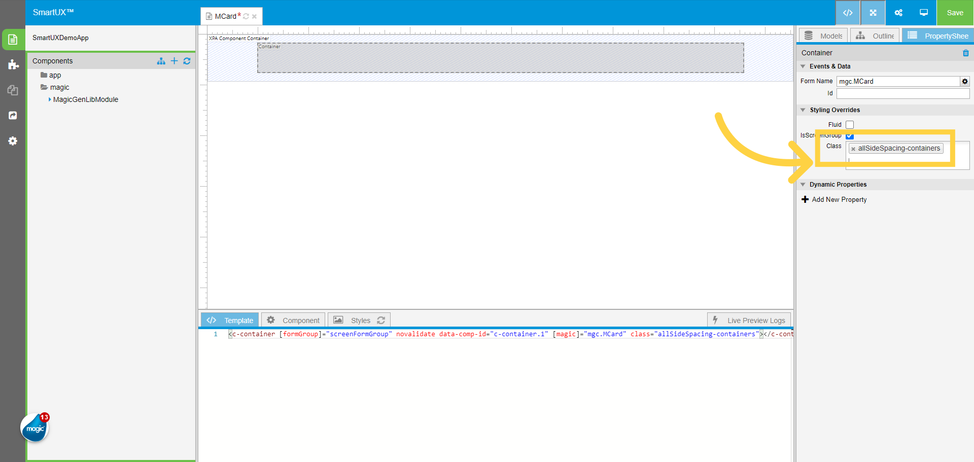
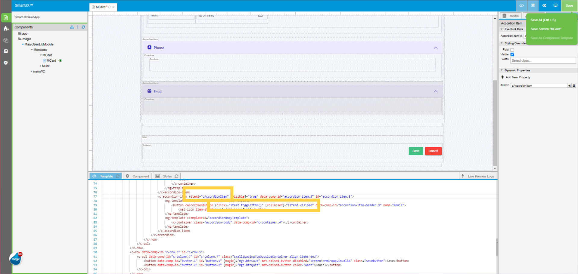
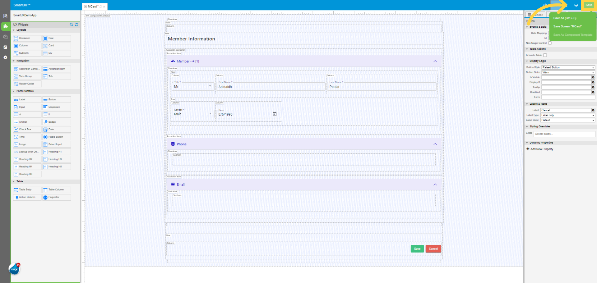
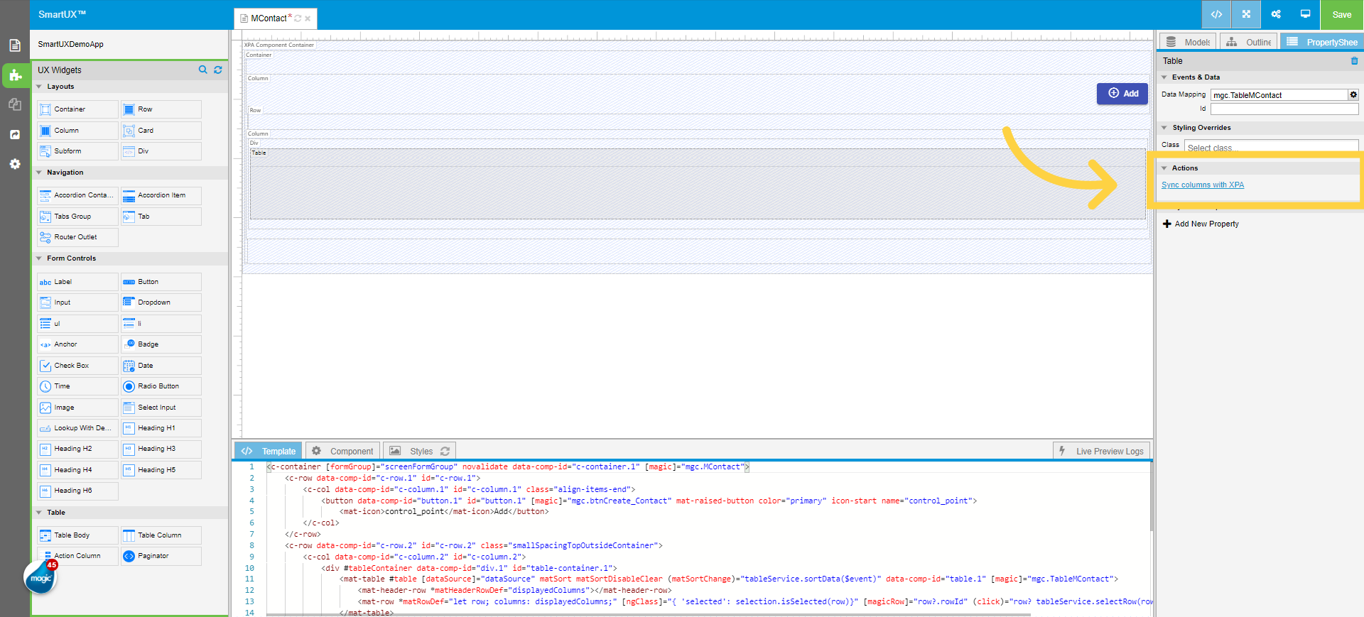
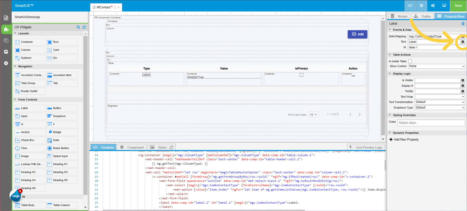
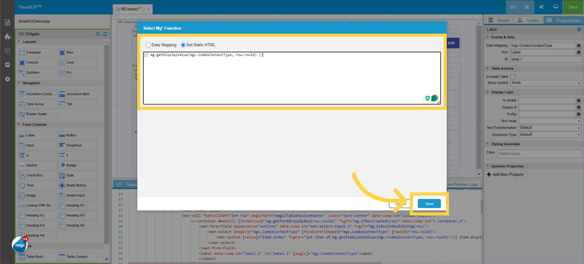
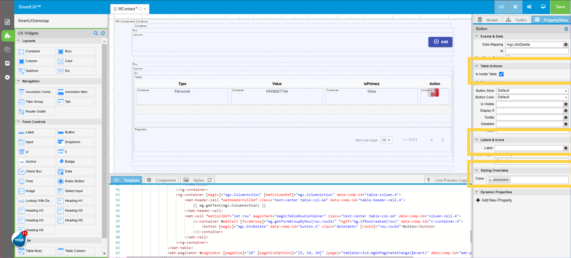
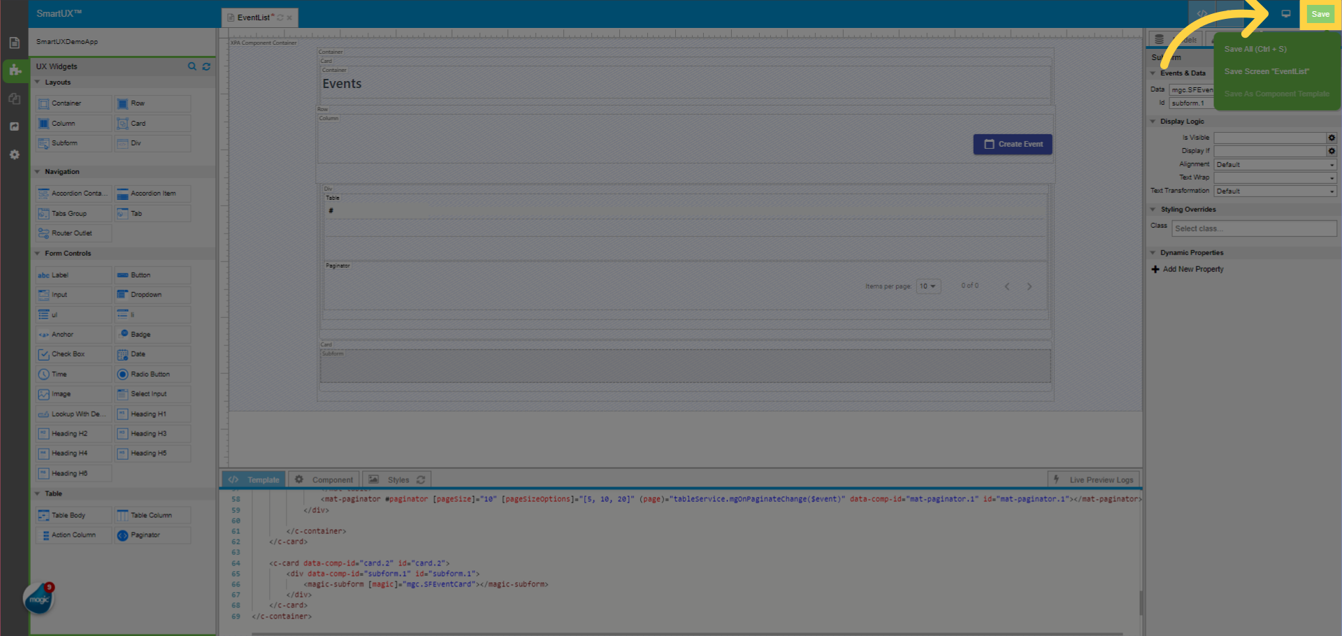
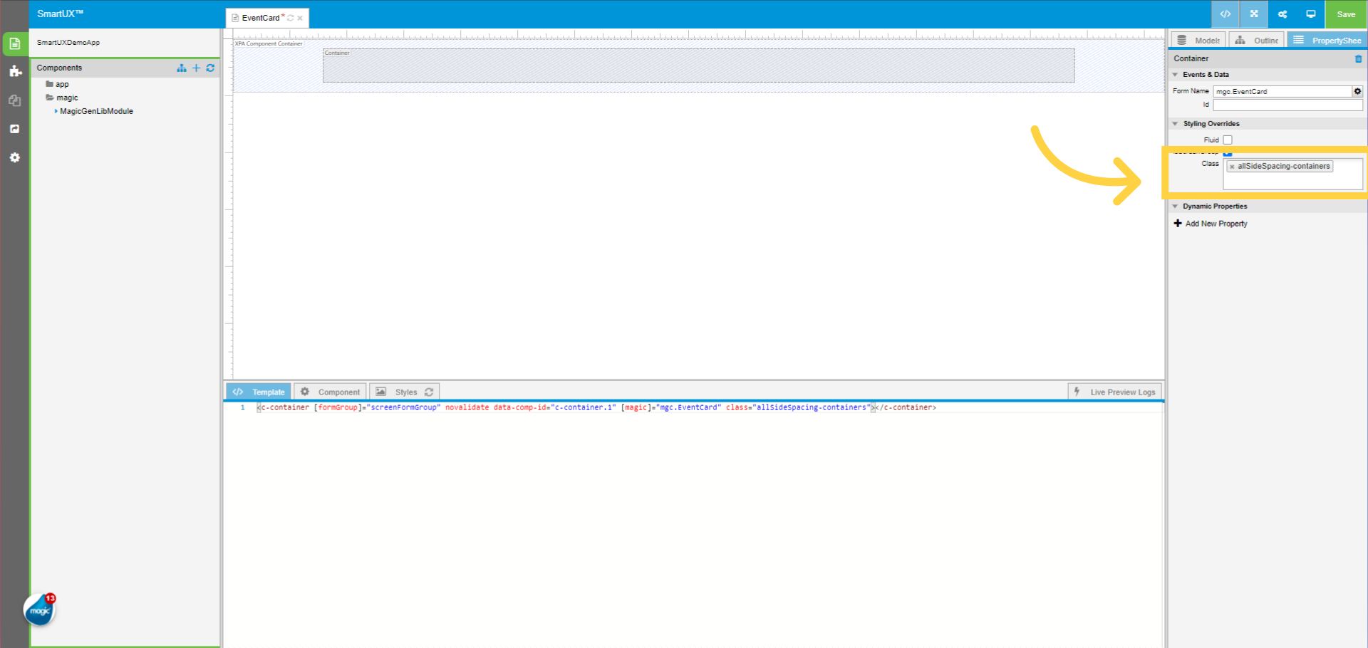
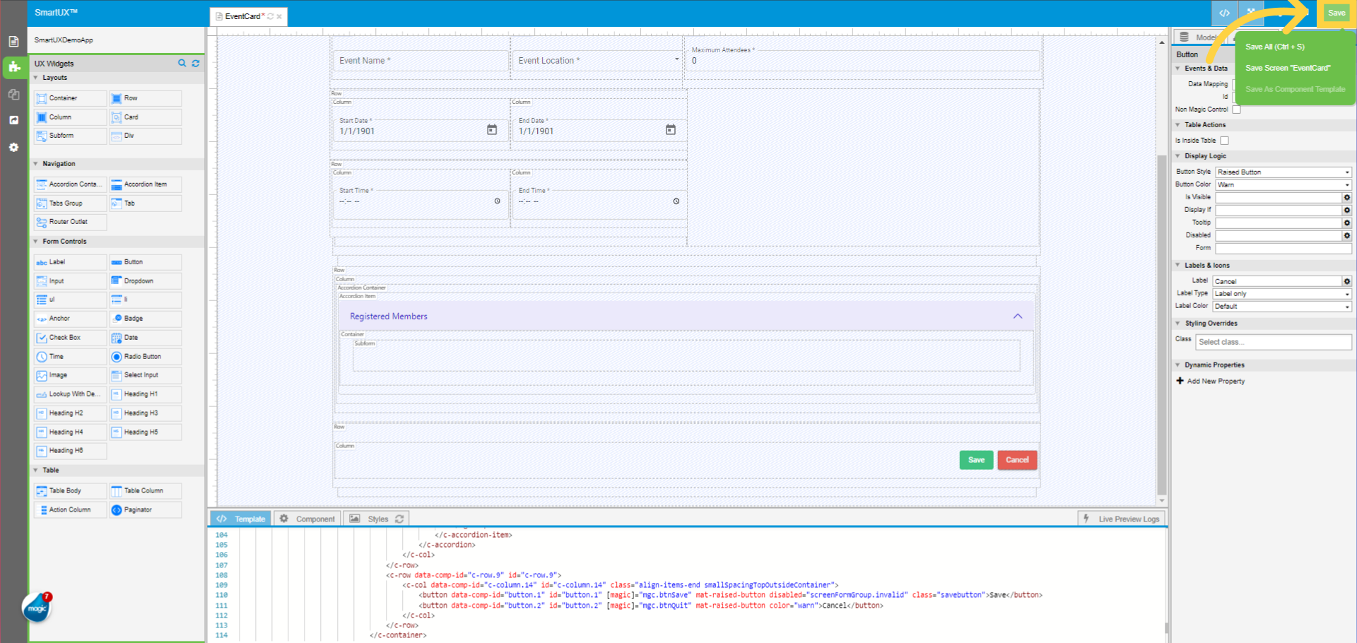
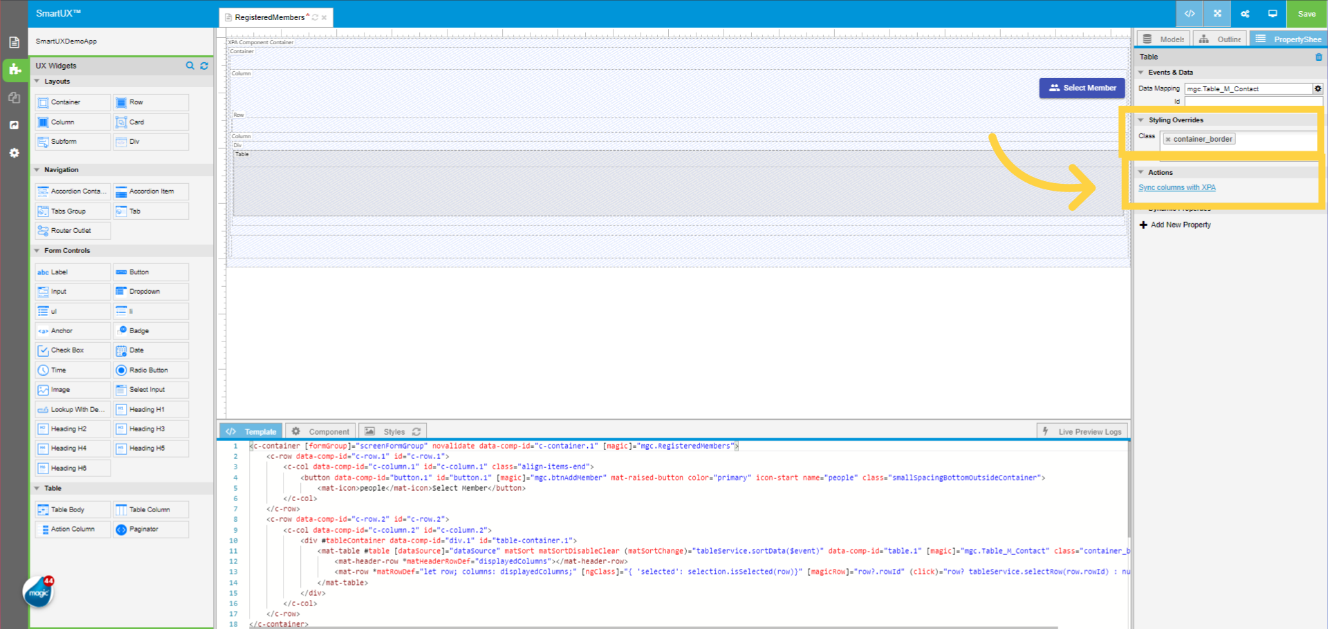
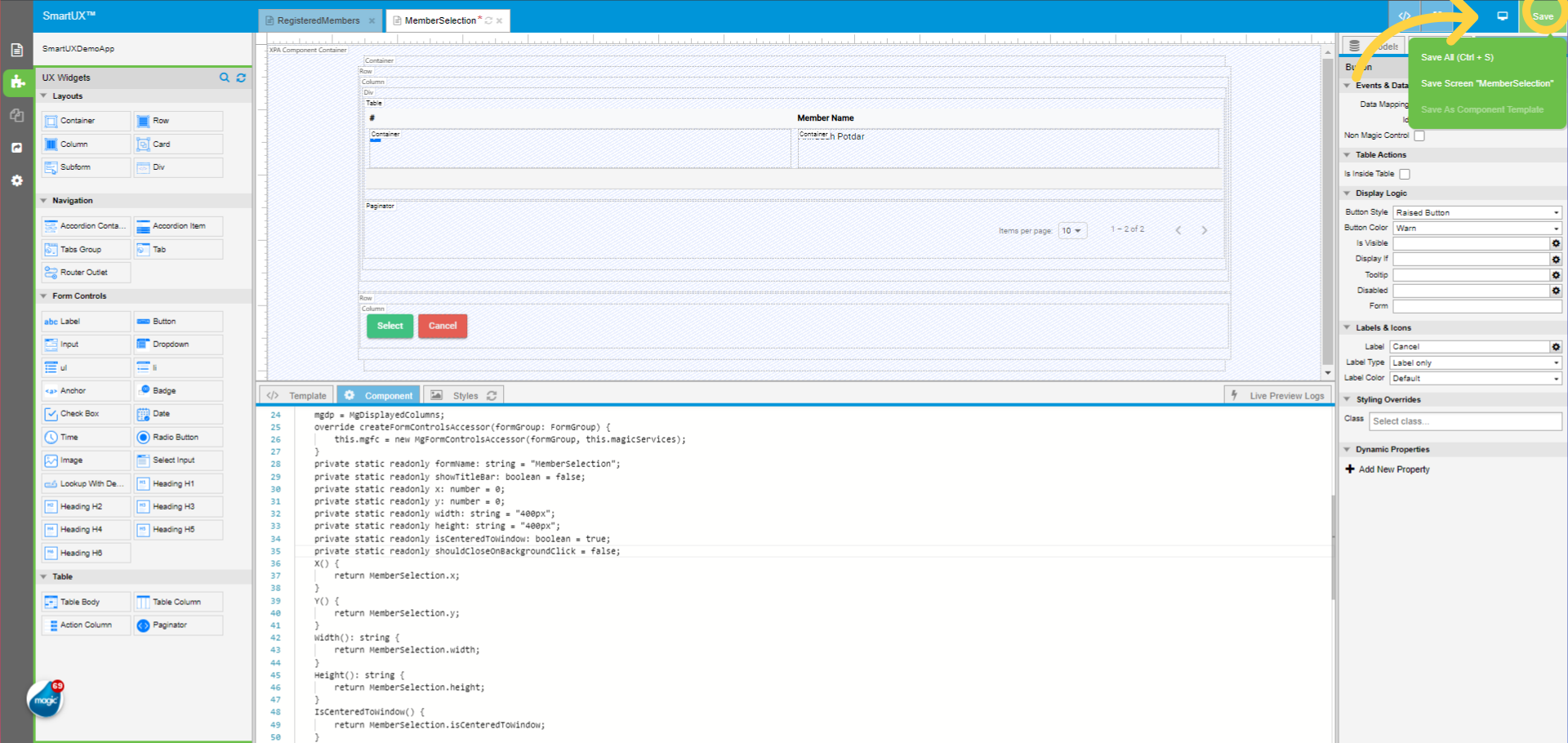
10. Click “Save”
Click on the “Save” button
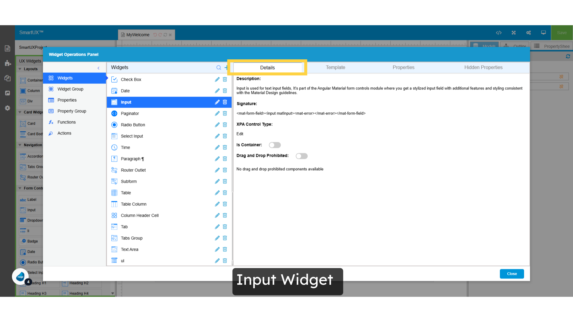
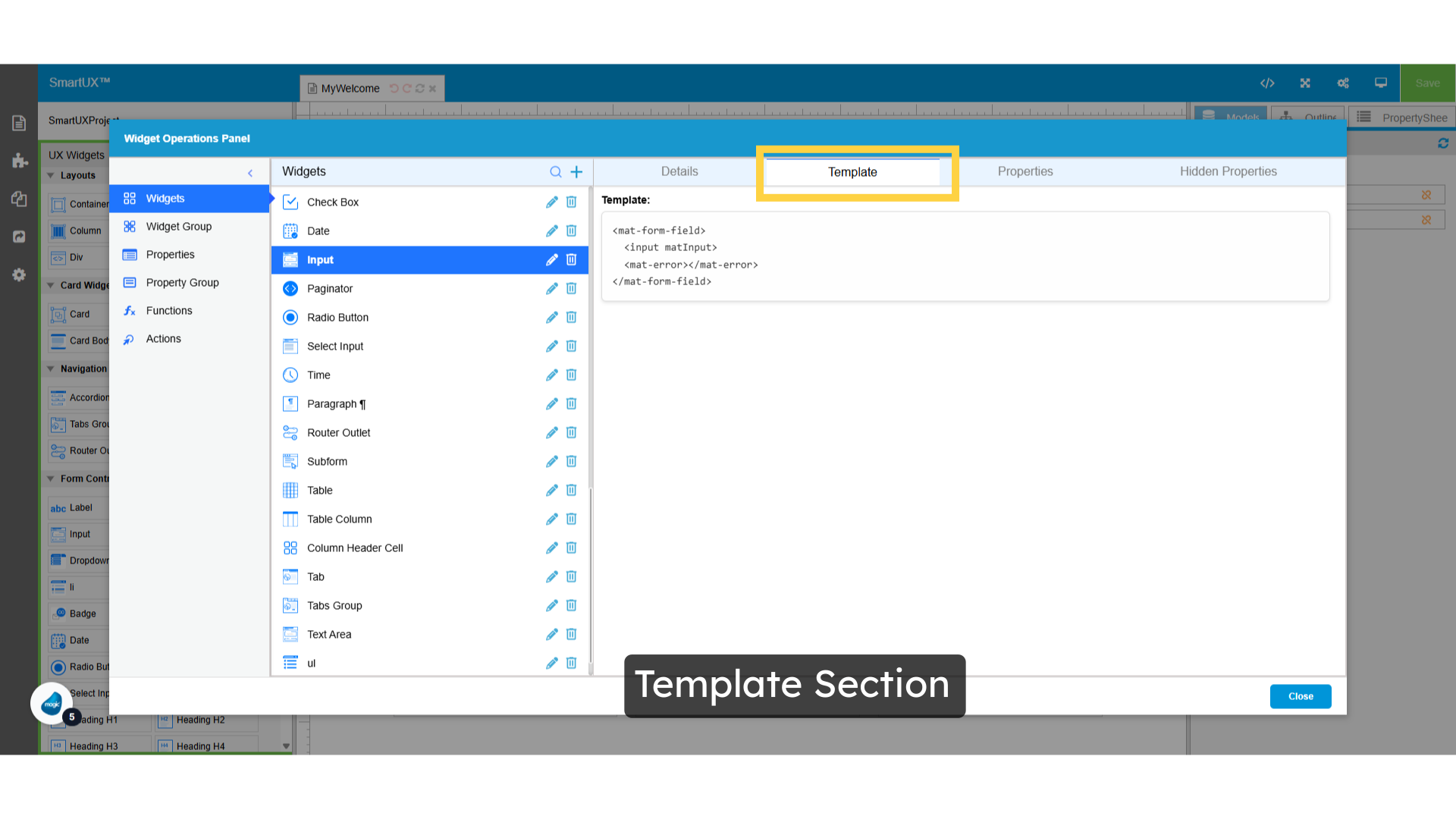
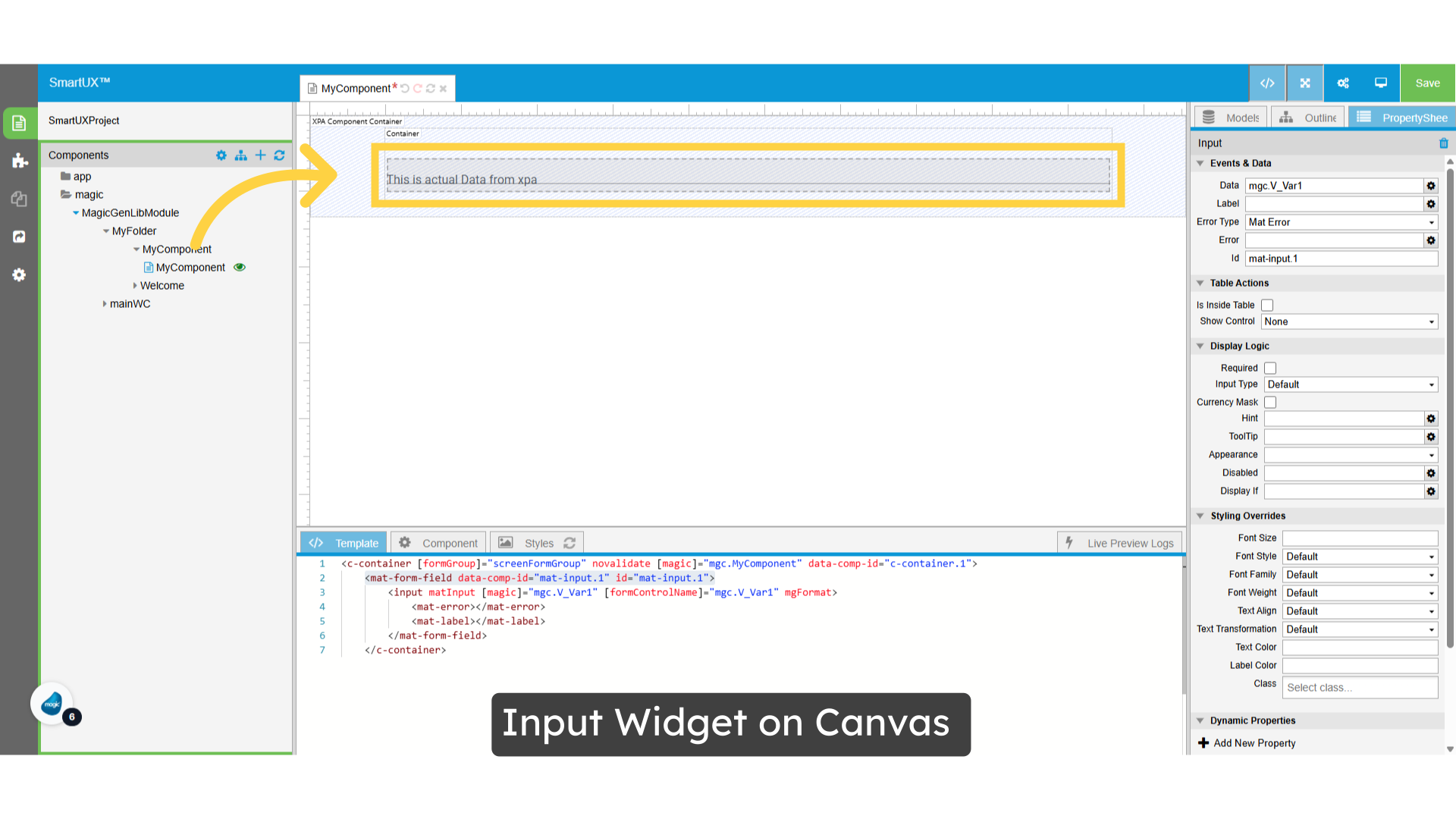
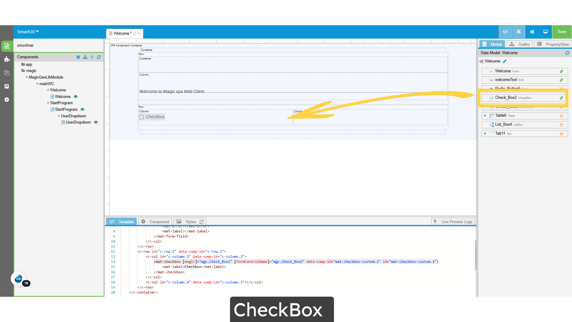
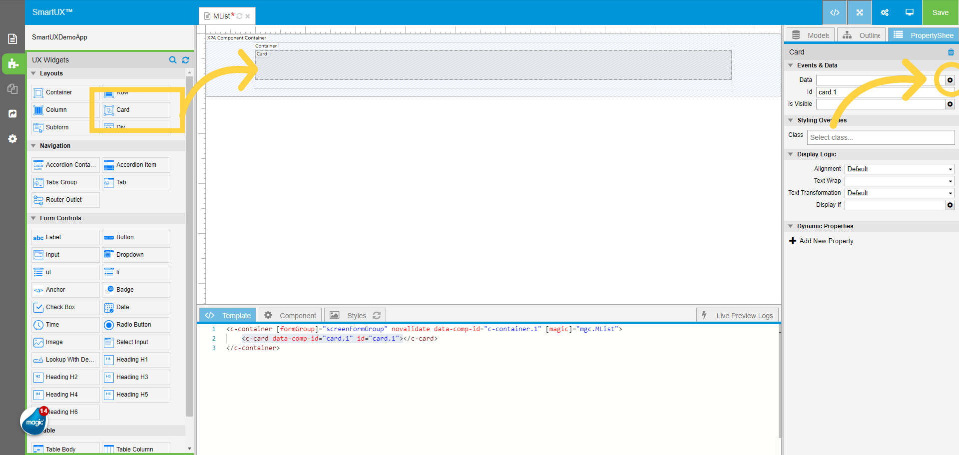
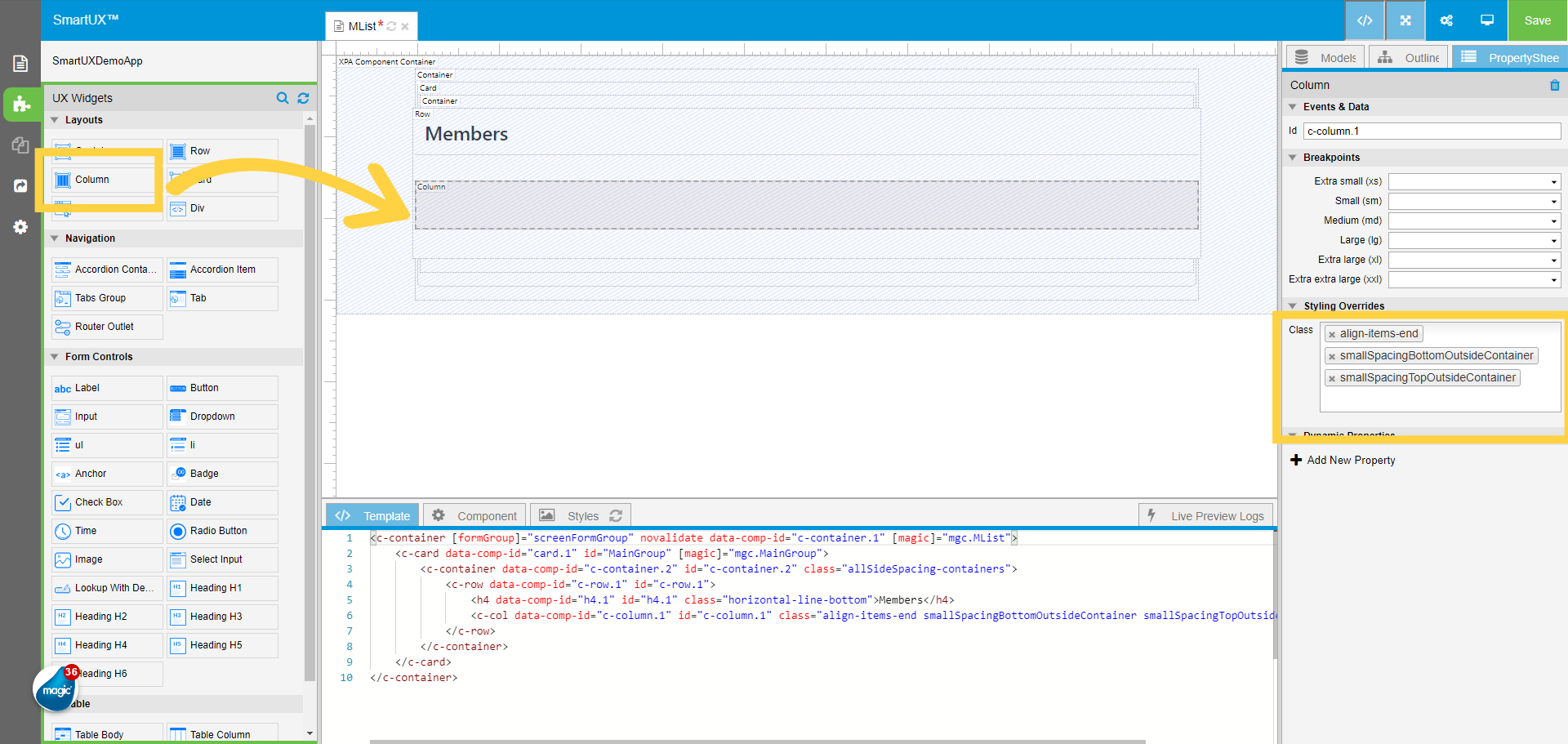
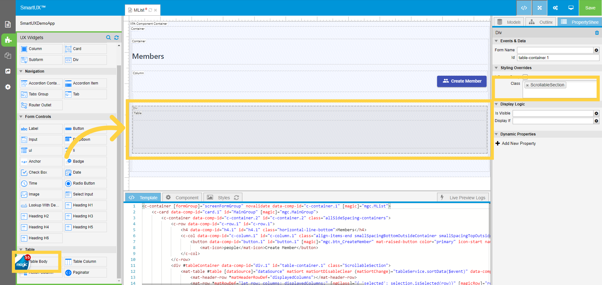
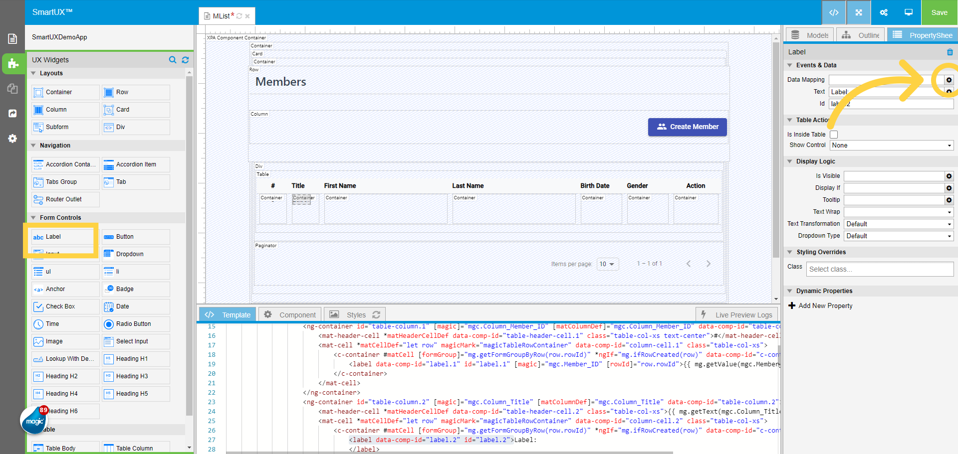
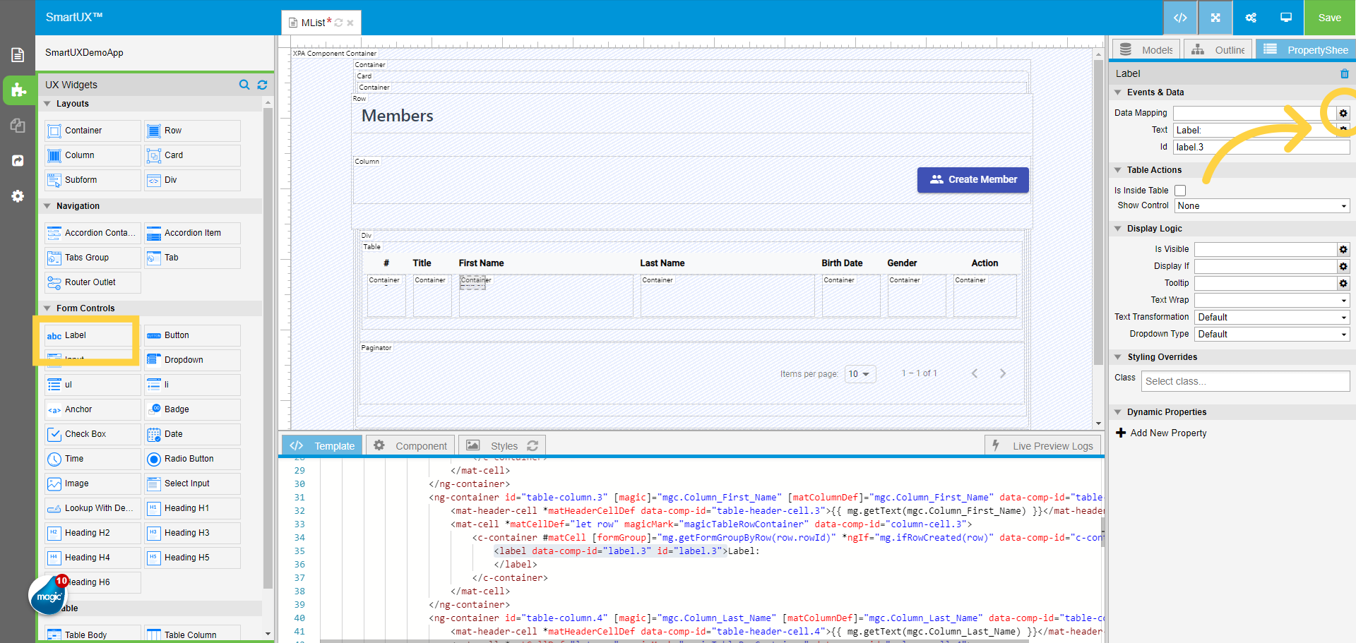
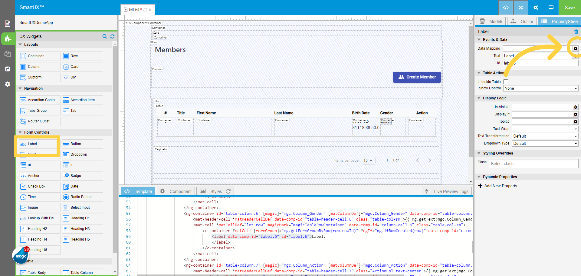
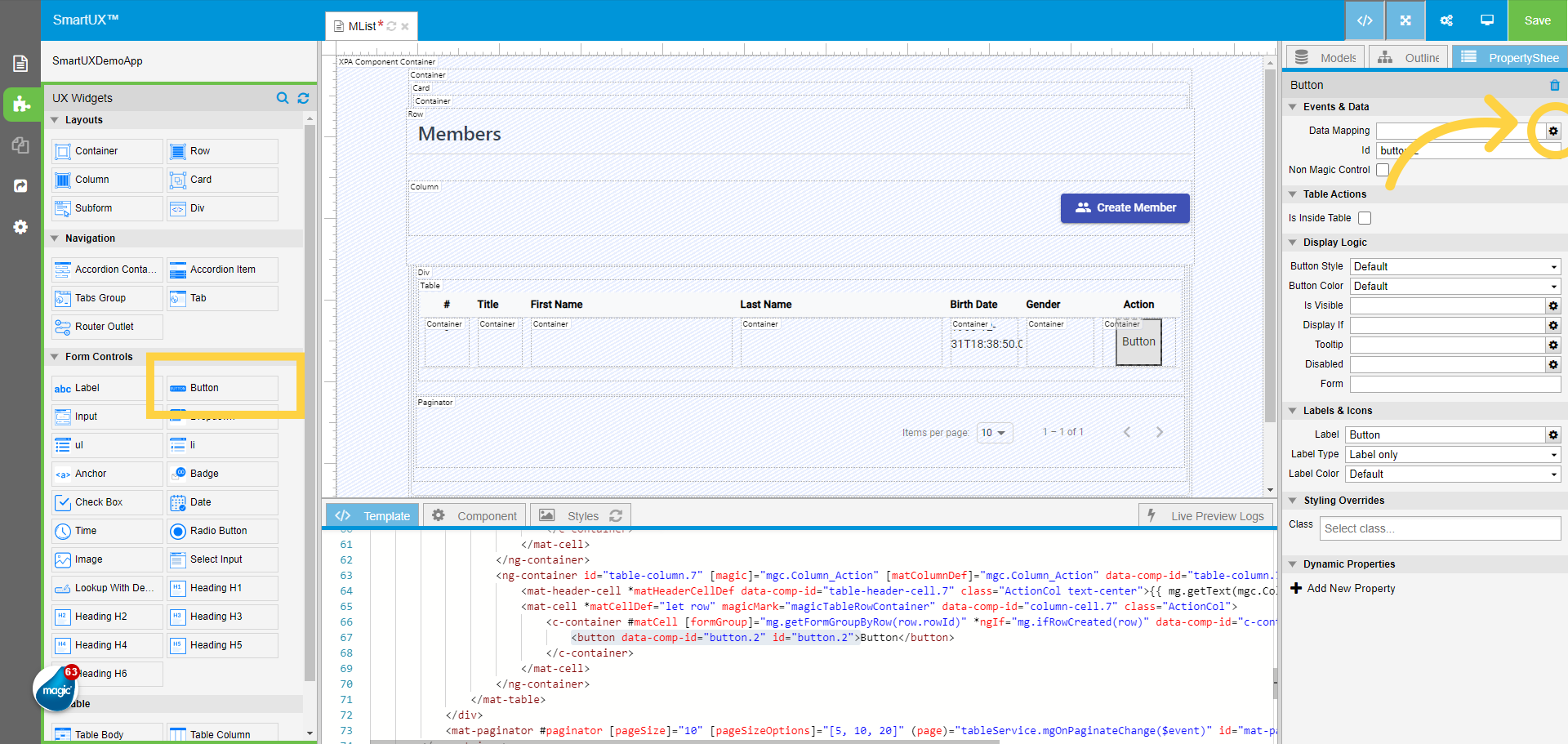
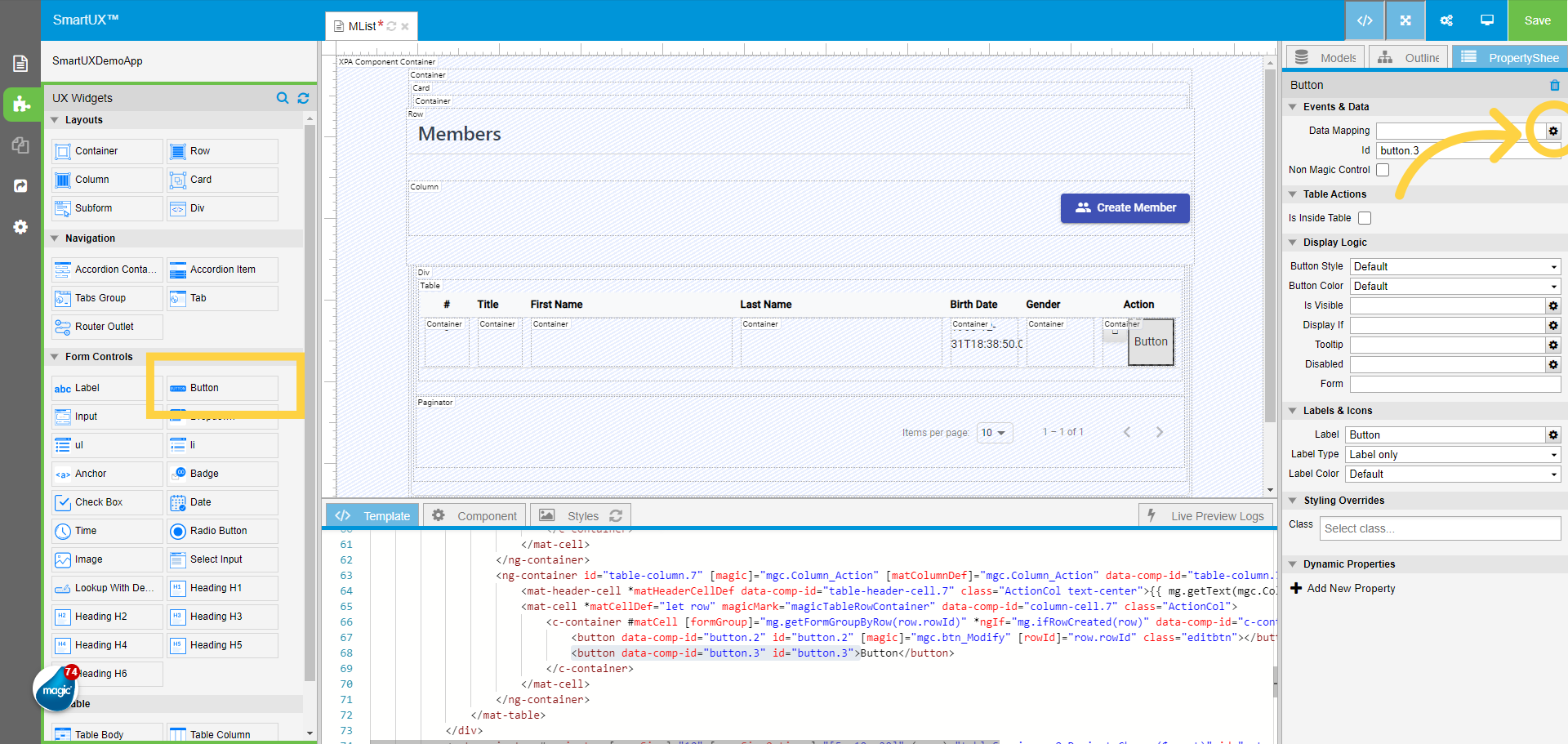
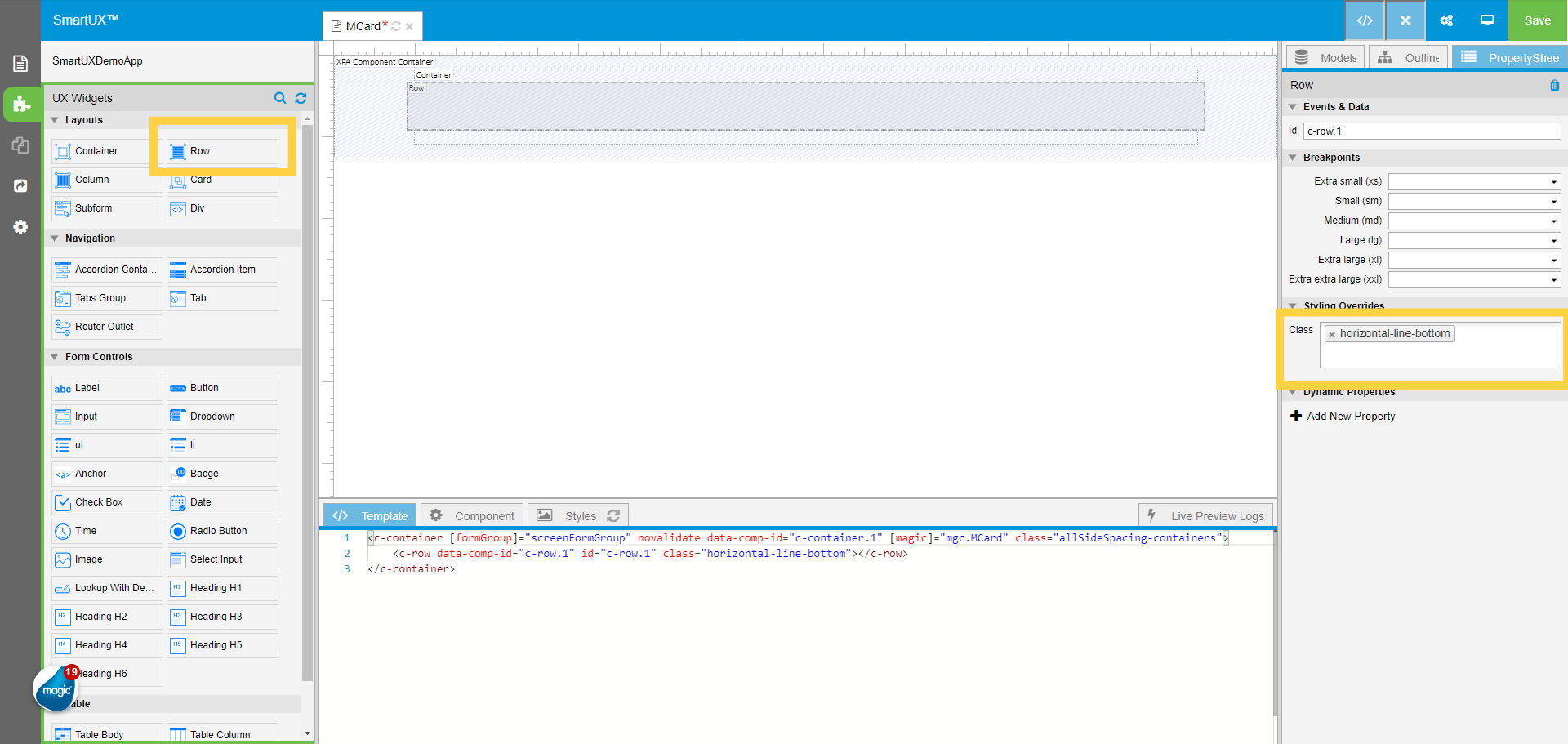
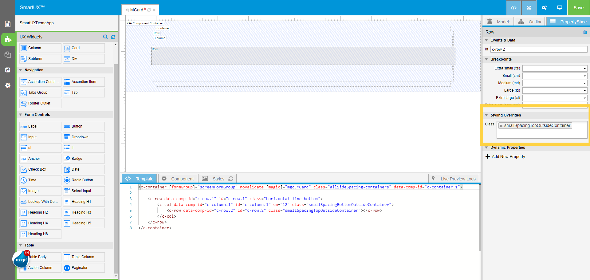
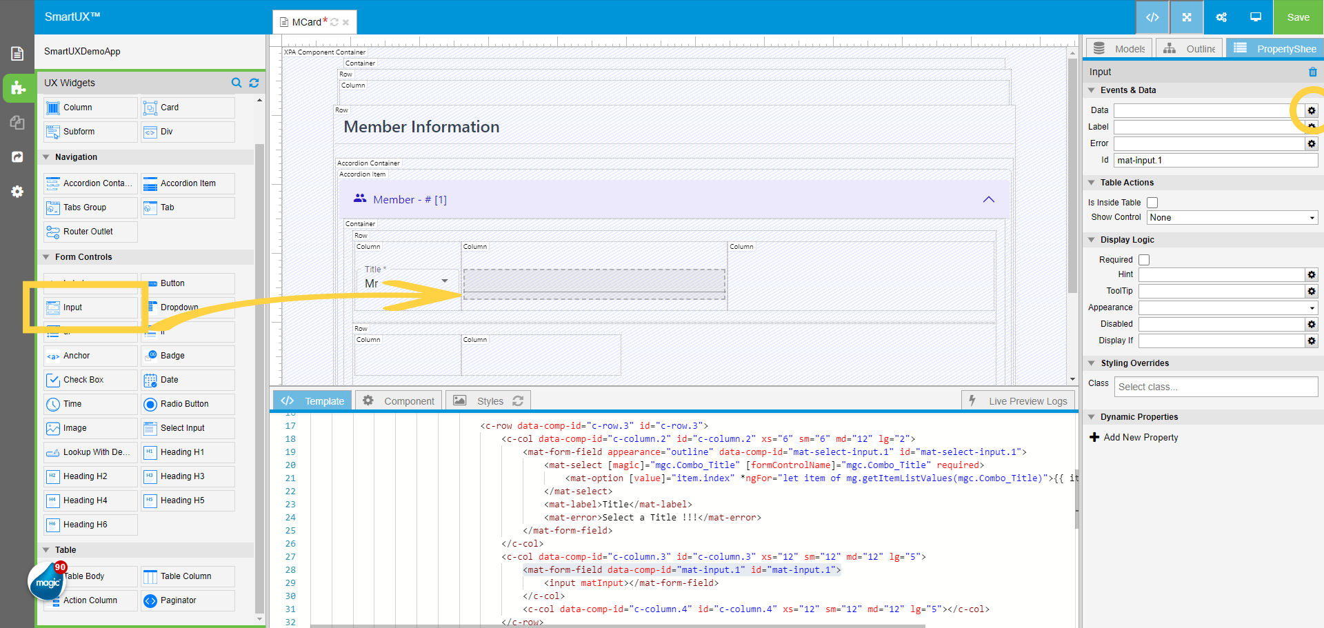
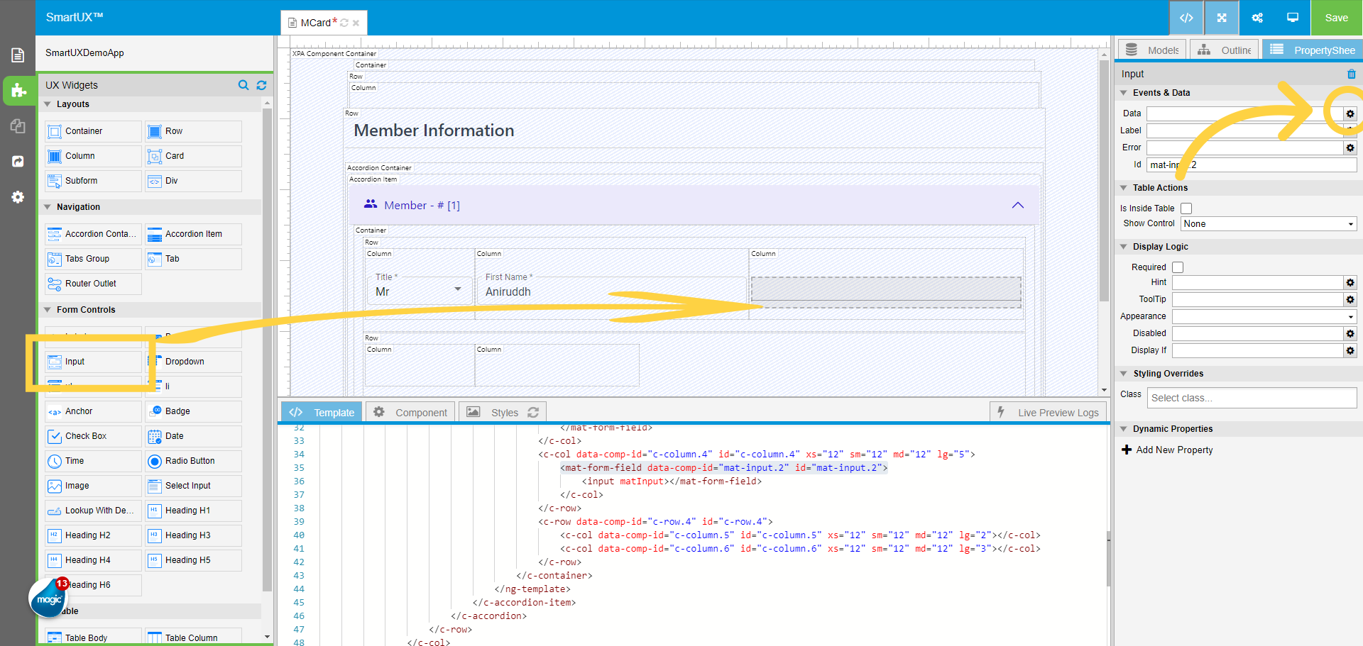
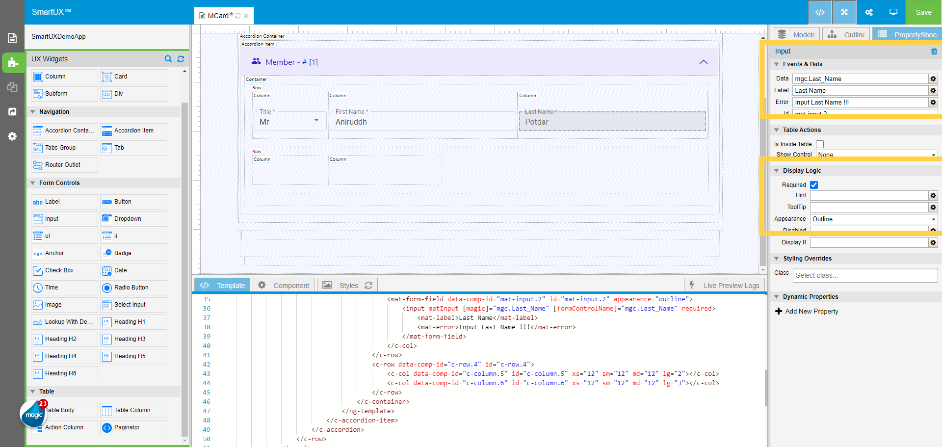
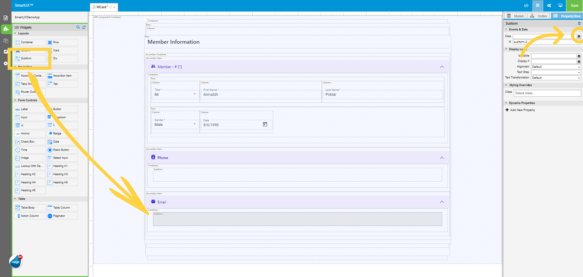
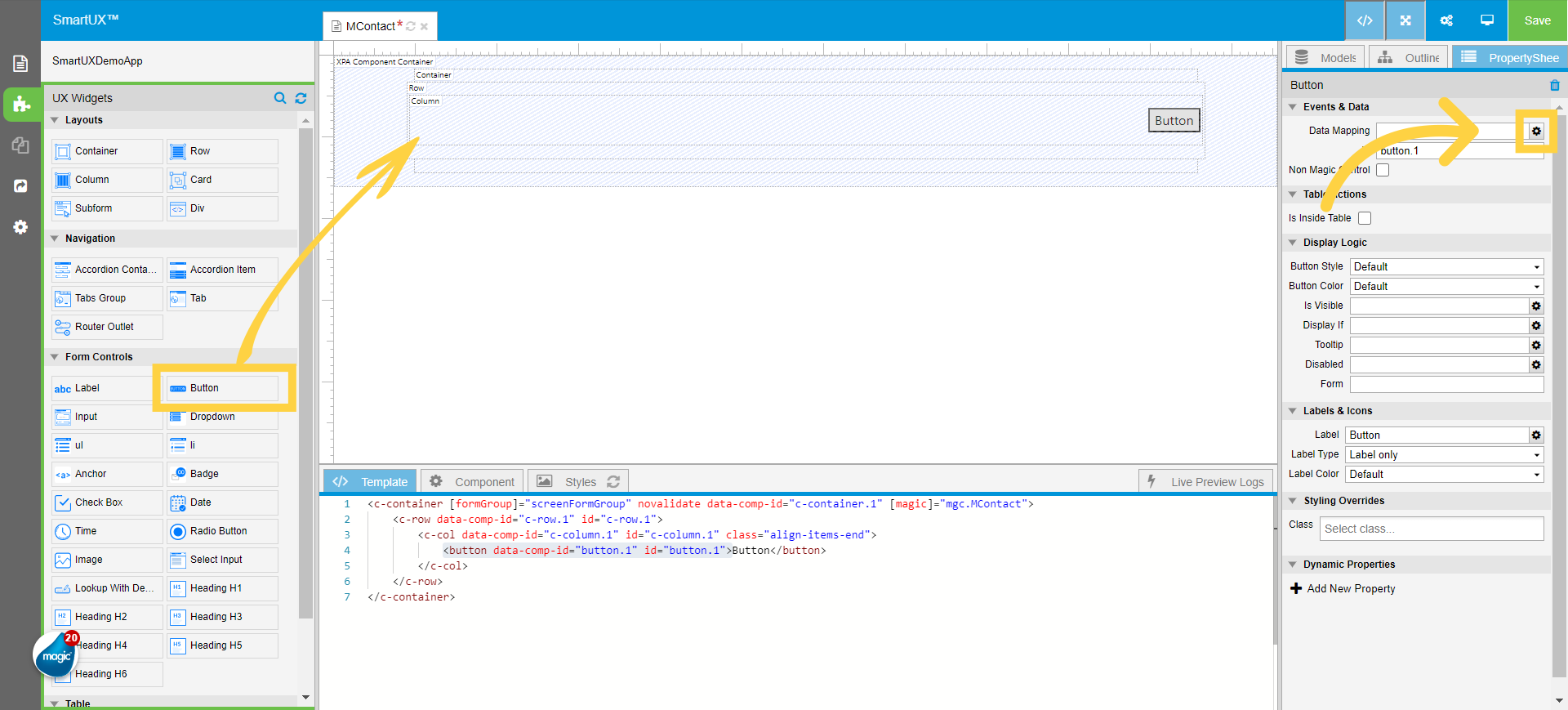
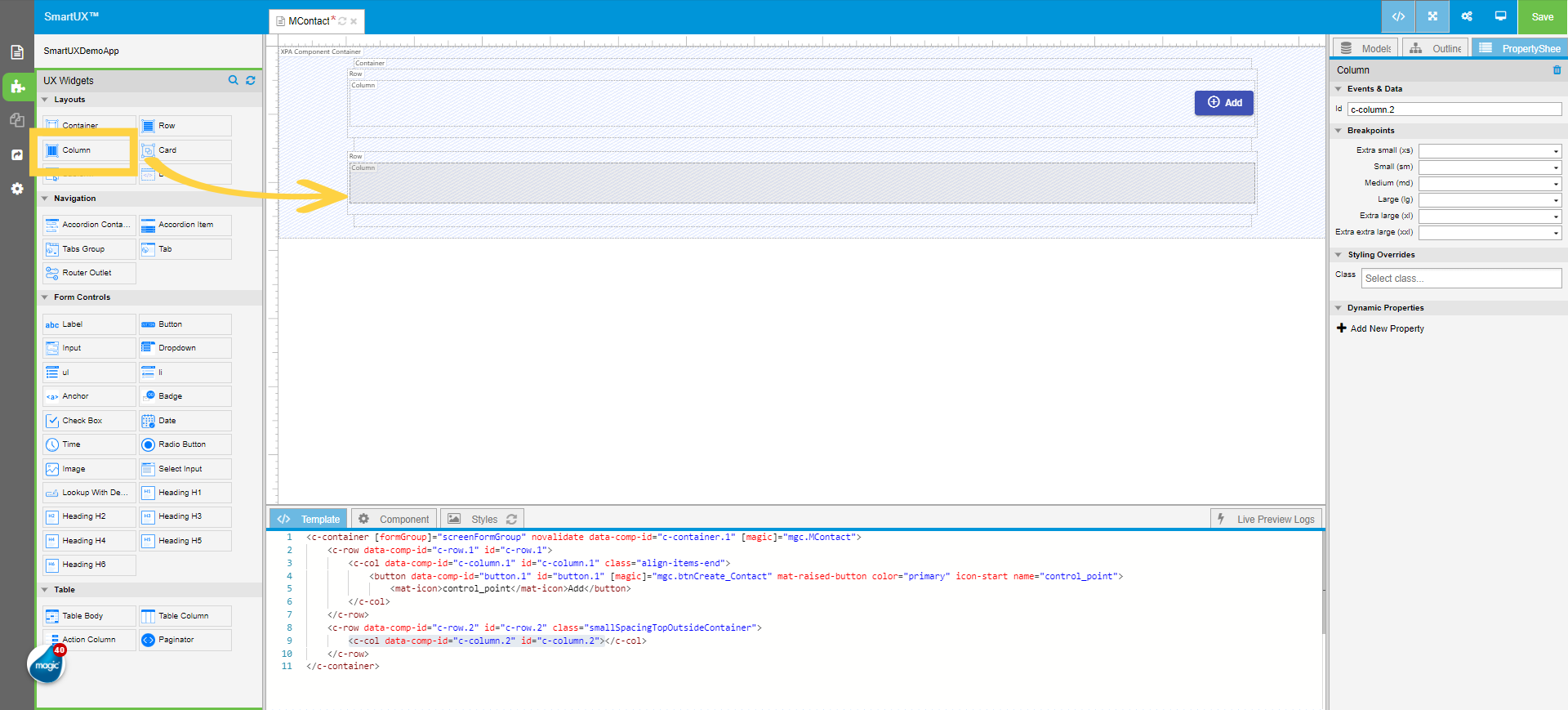
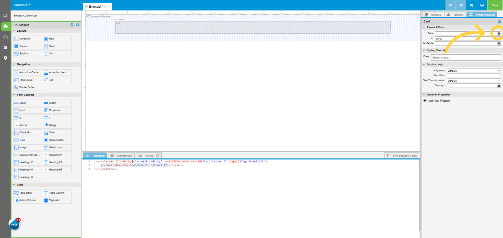
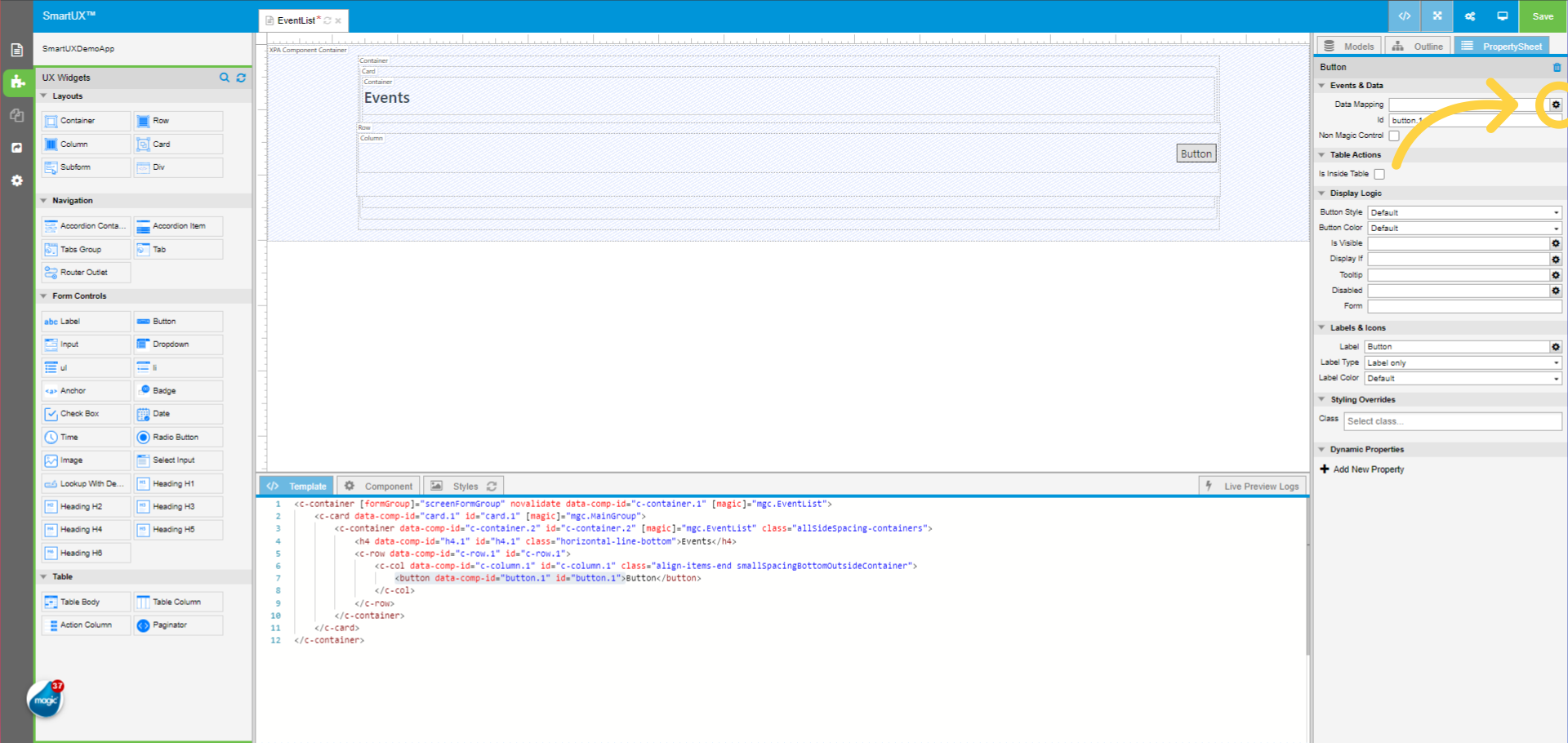
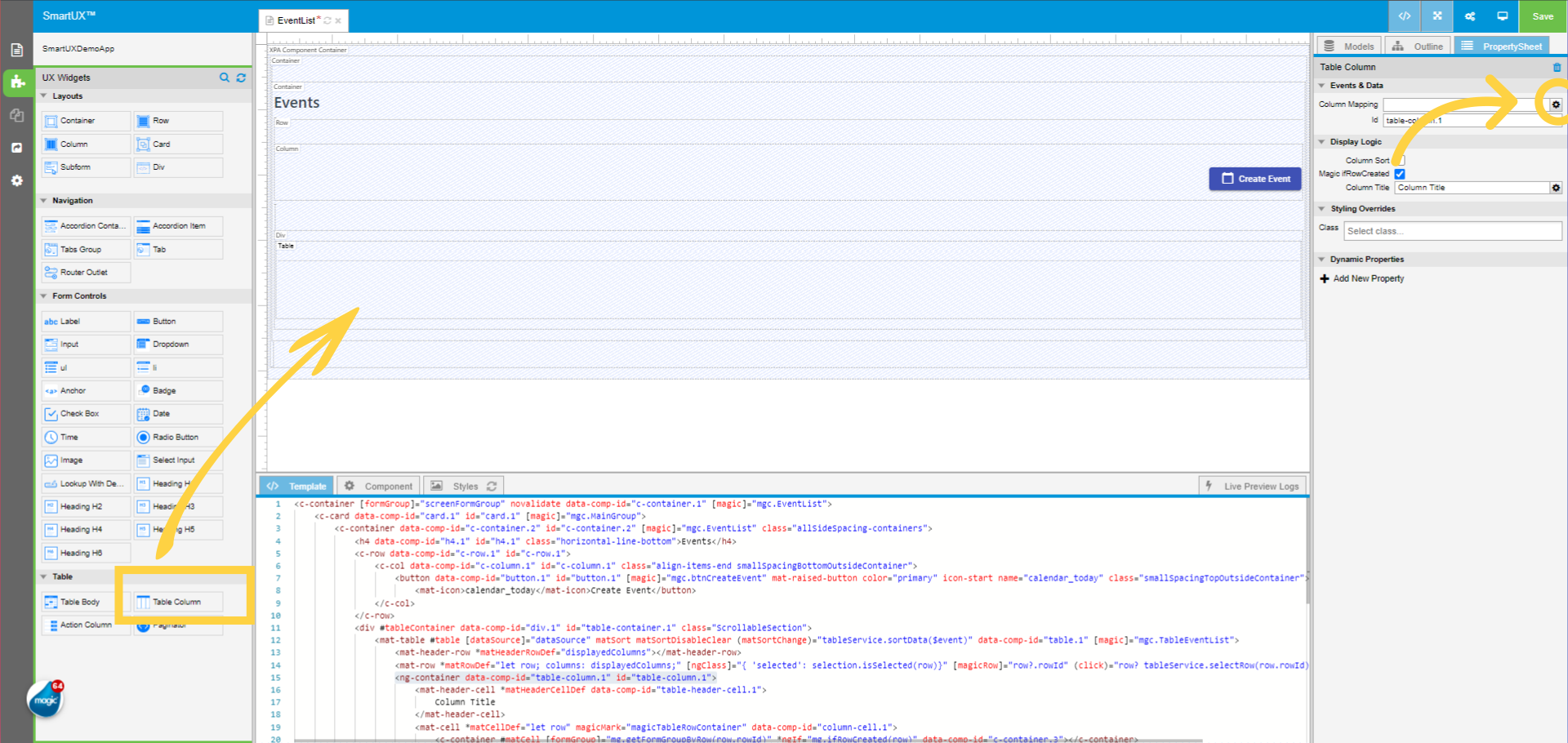
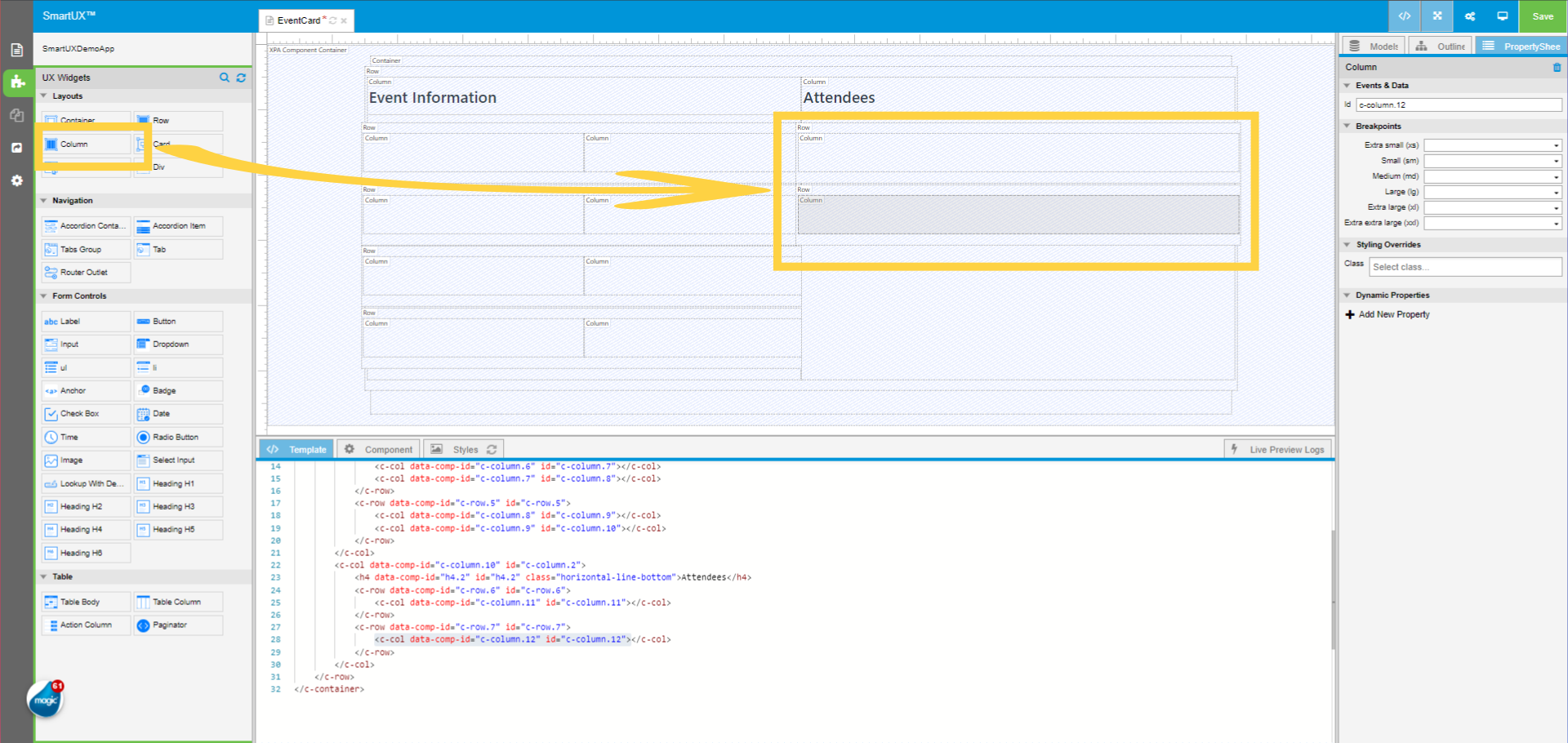
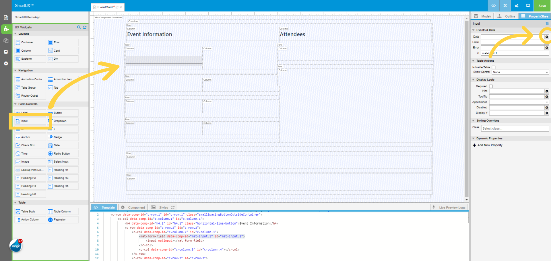
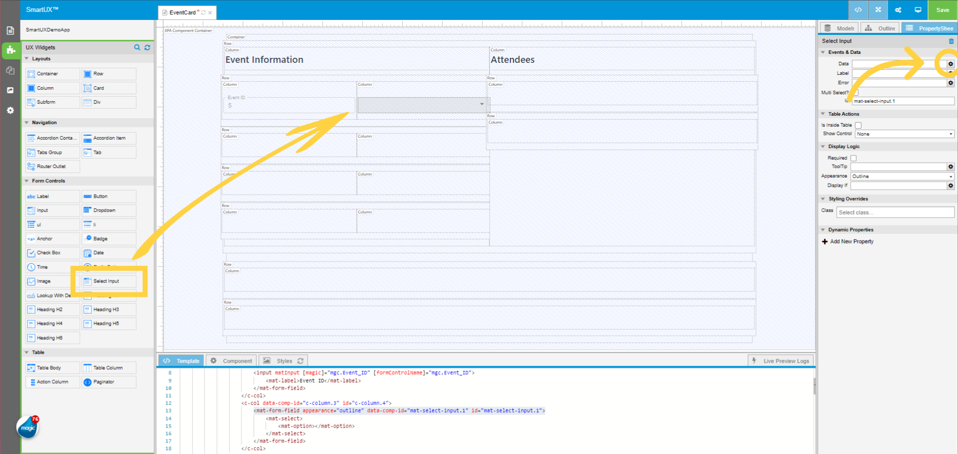
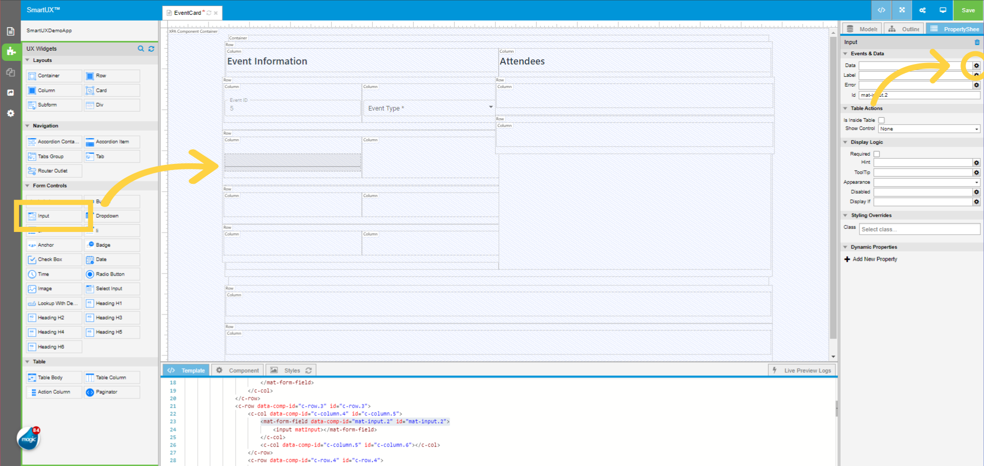
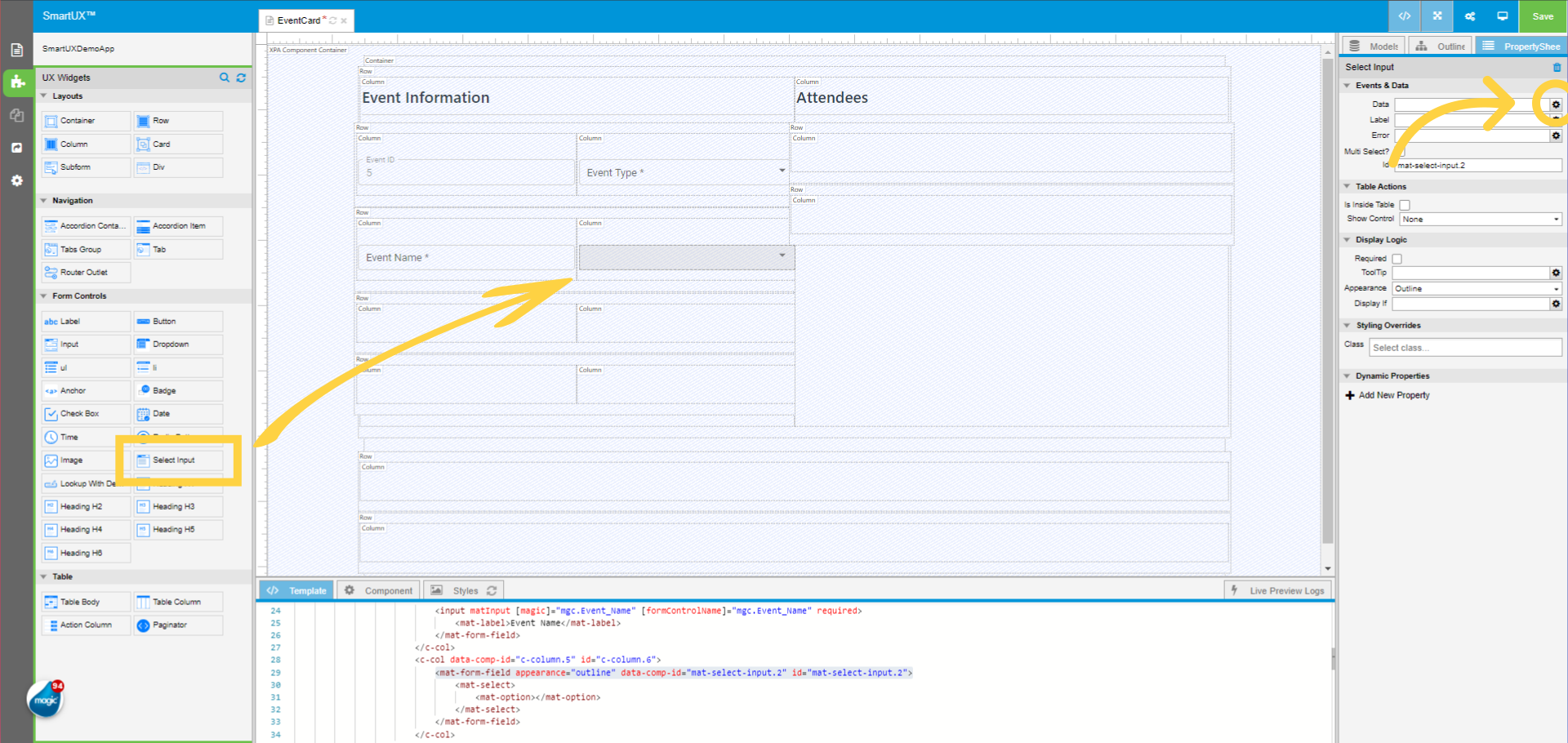
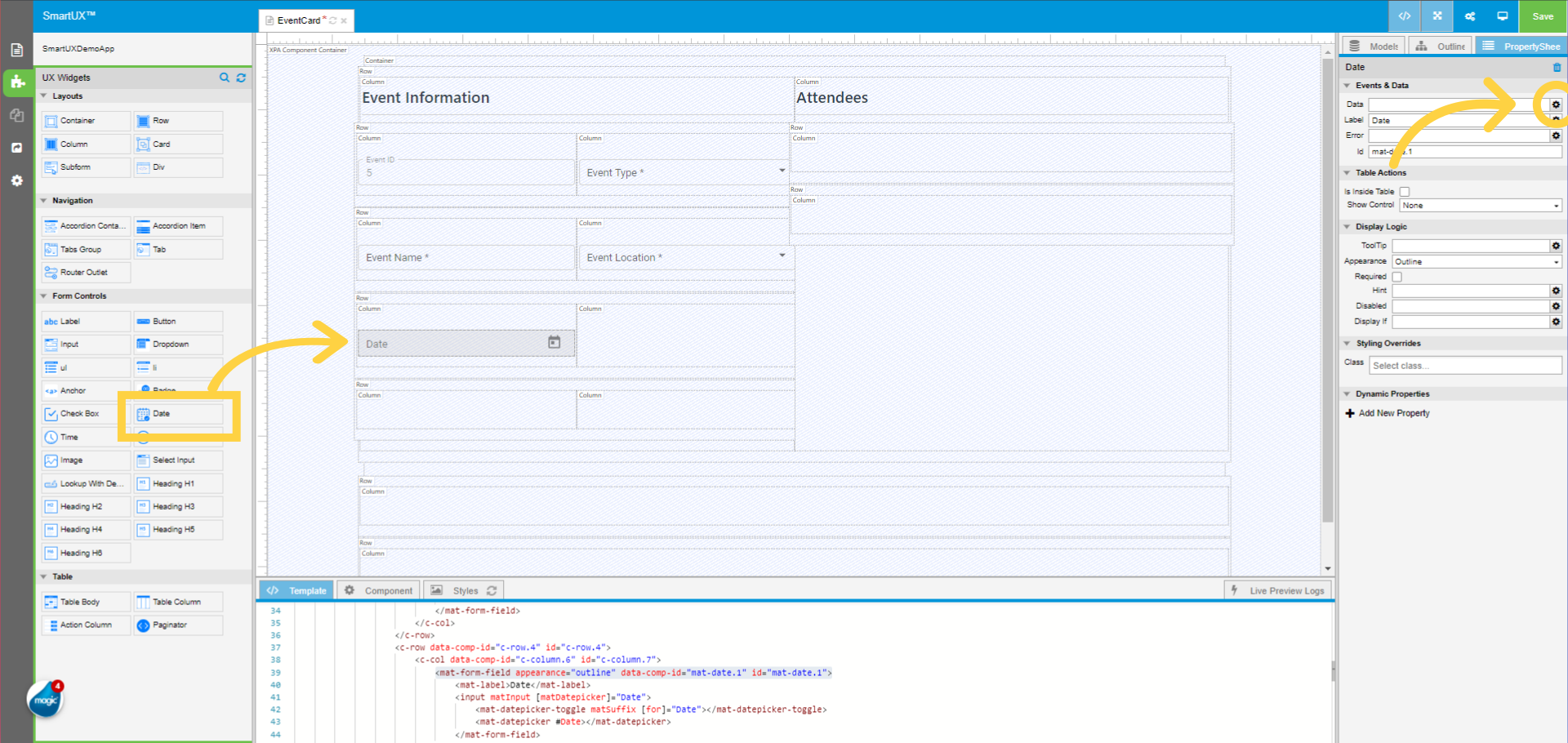
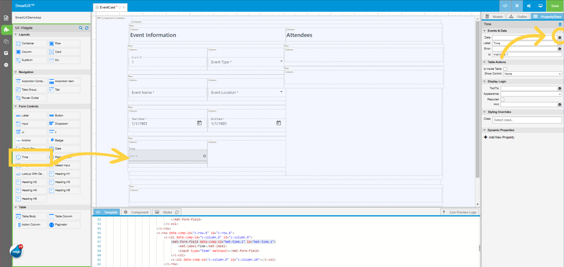
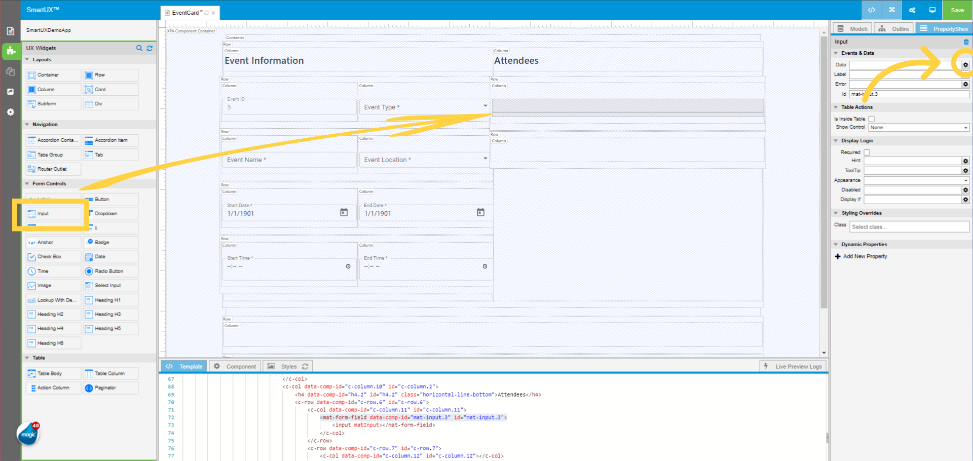
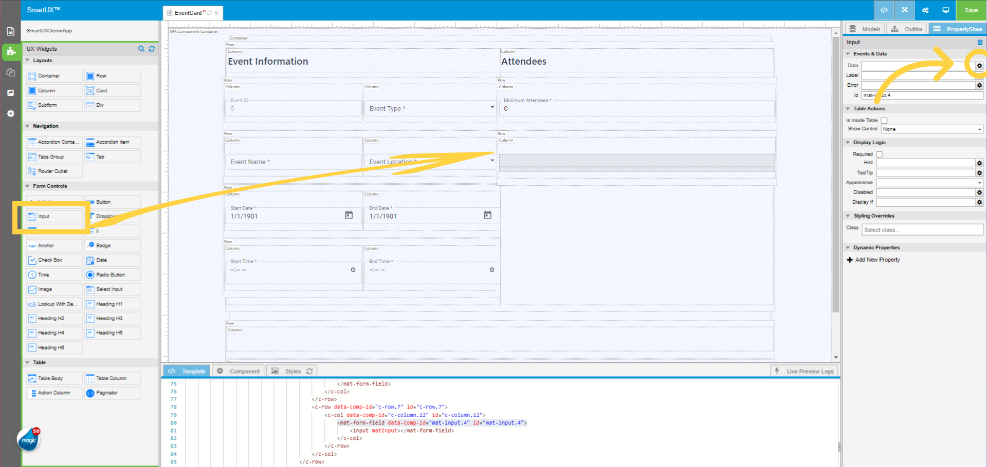
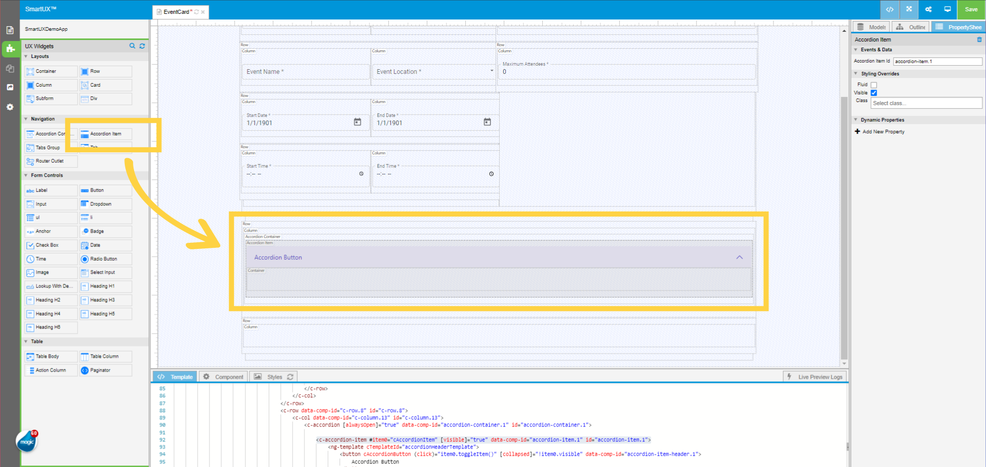
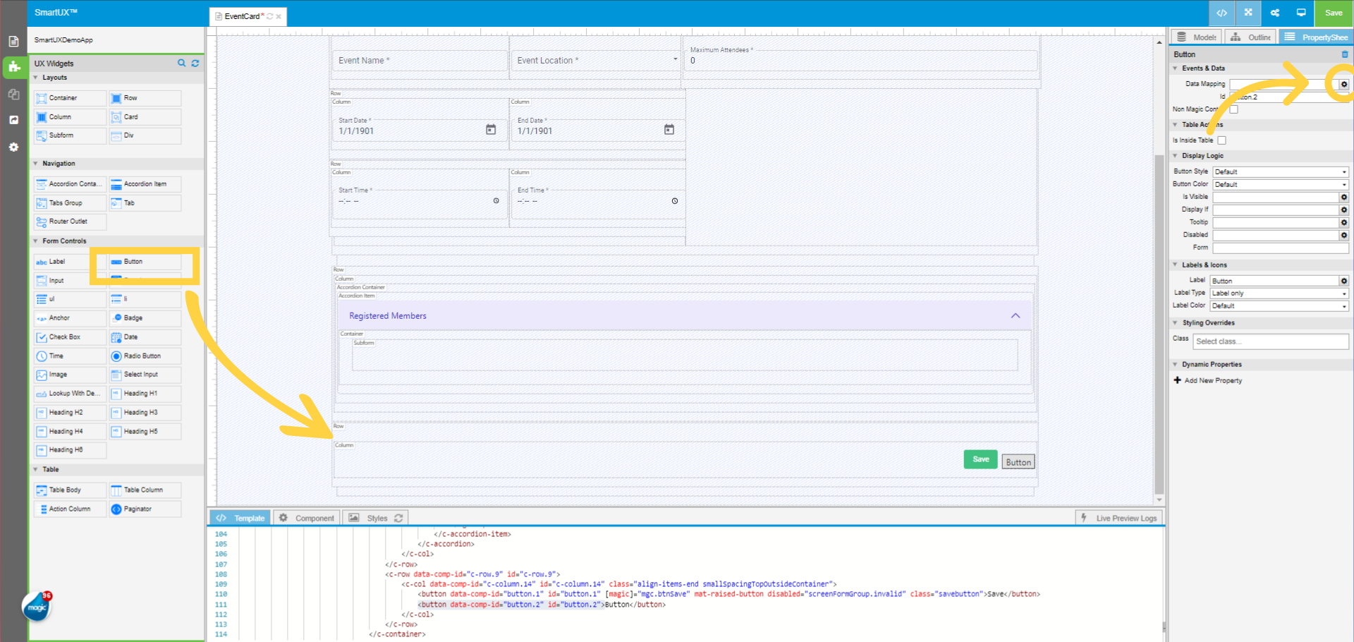
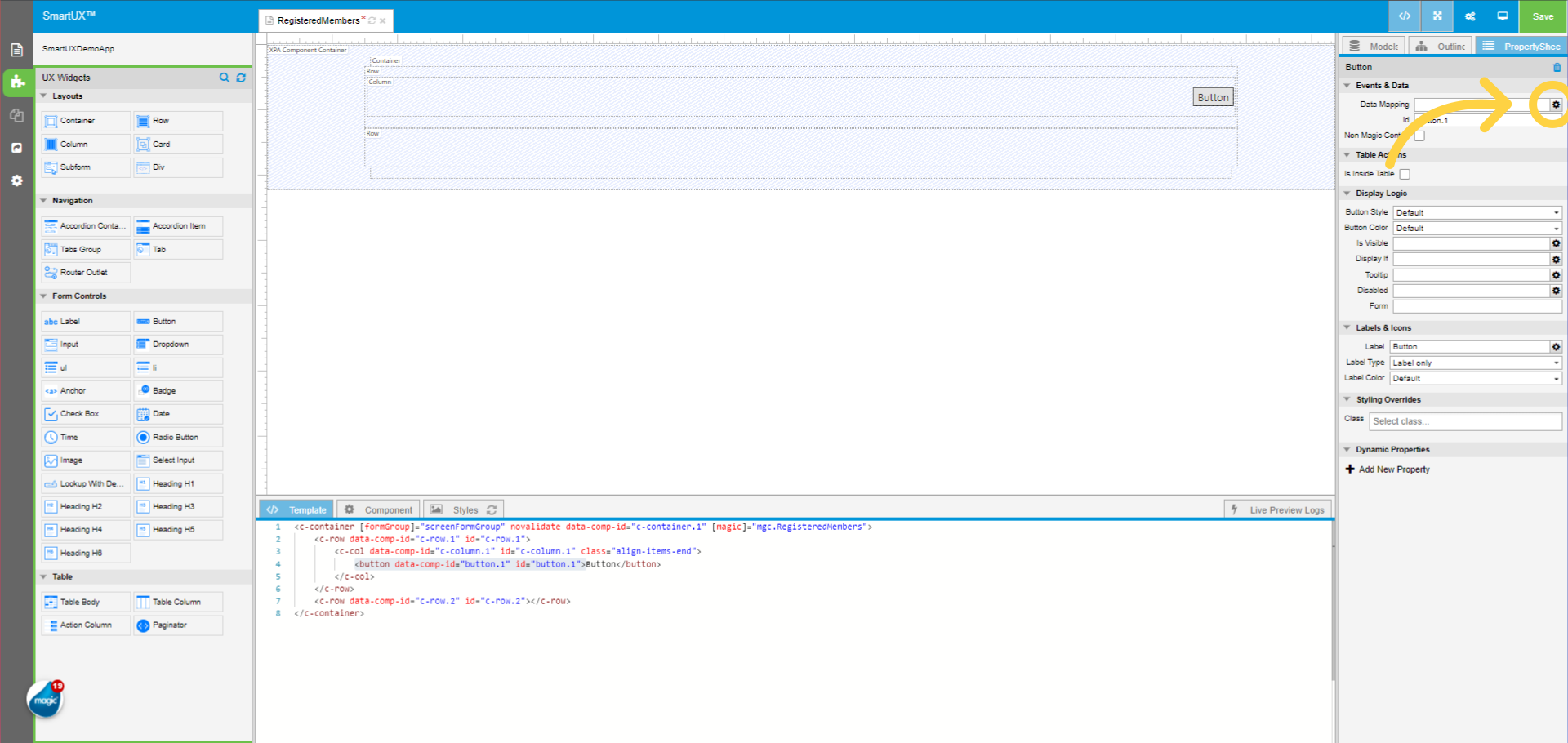
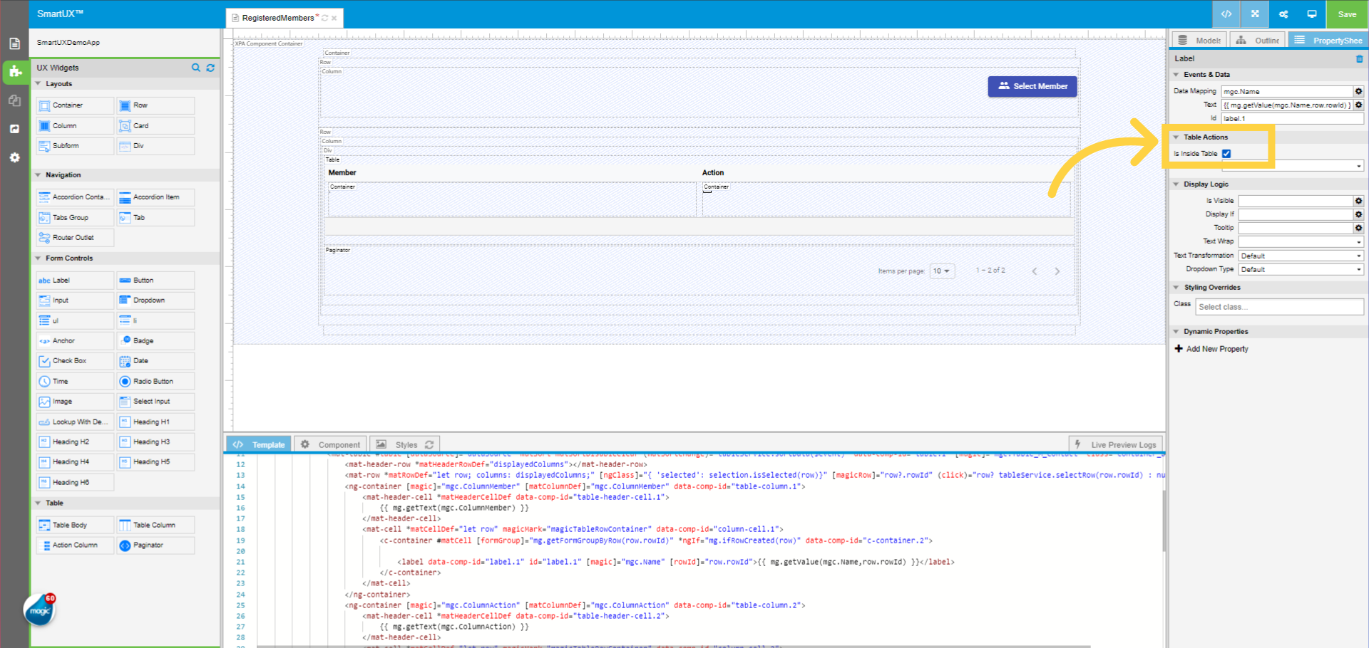
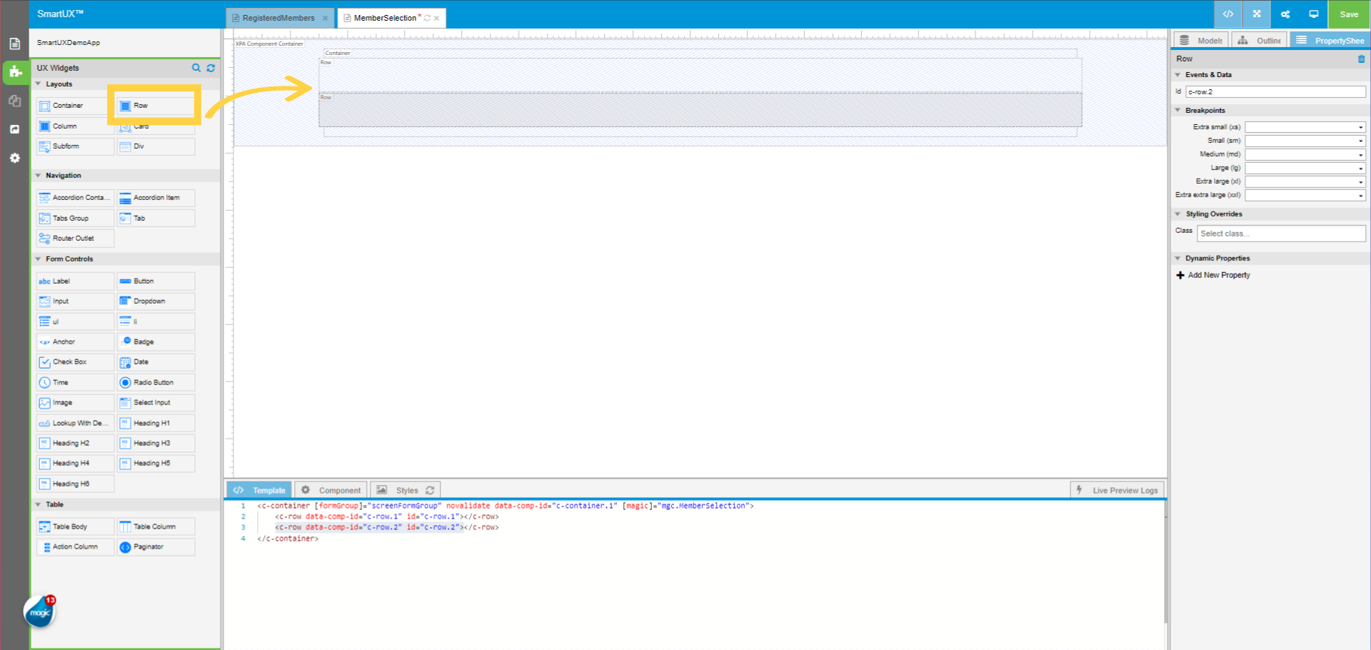
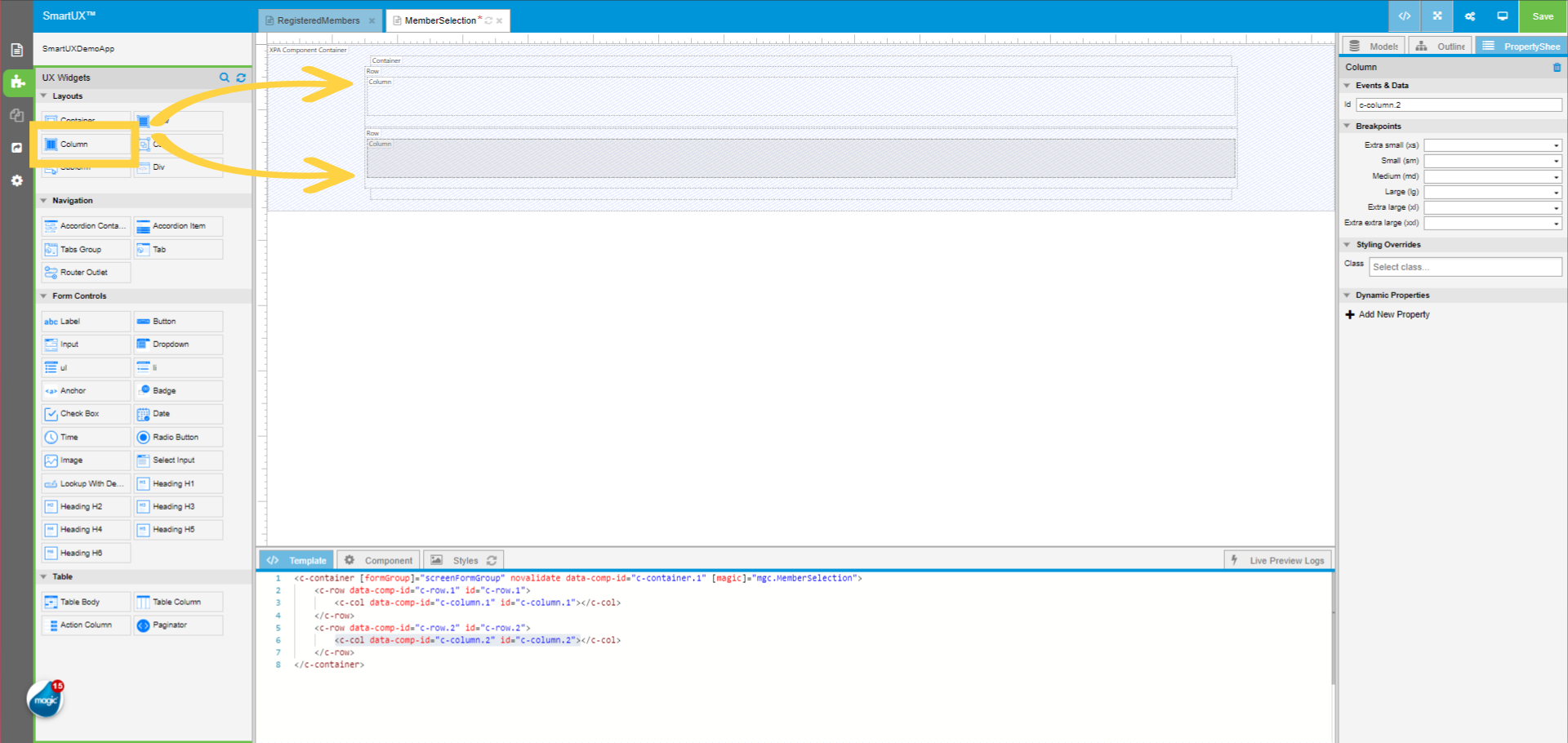
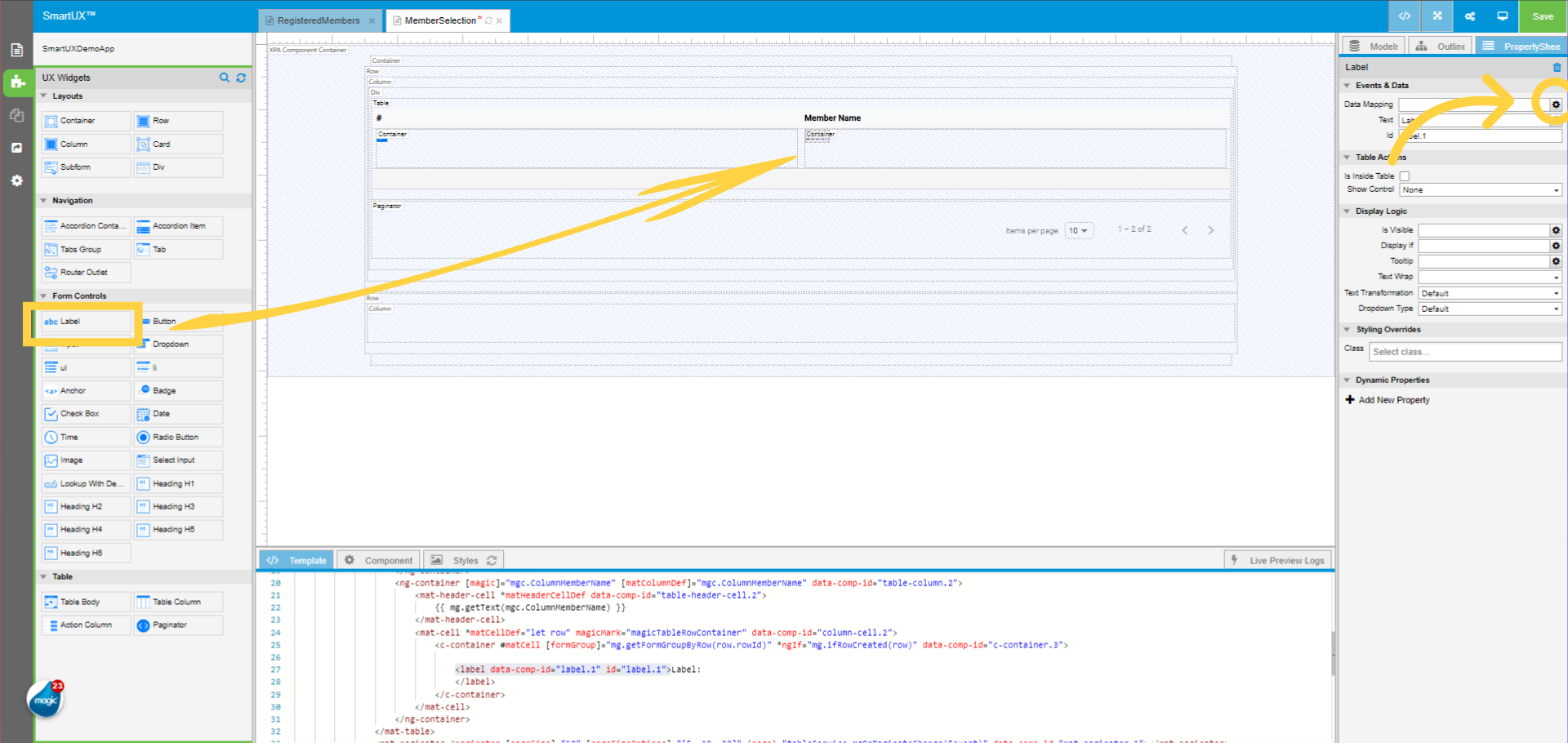
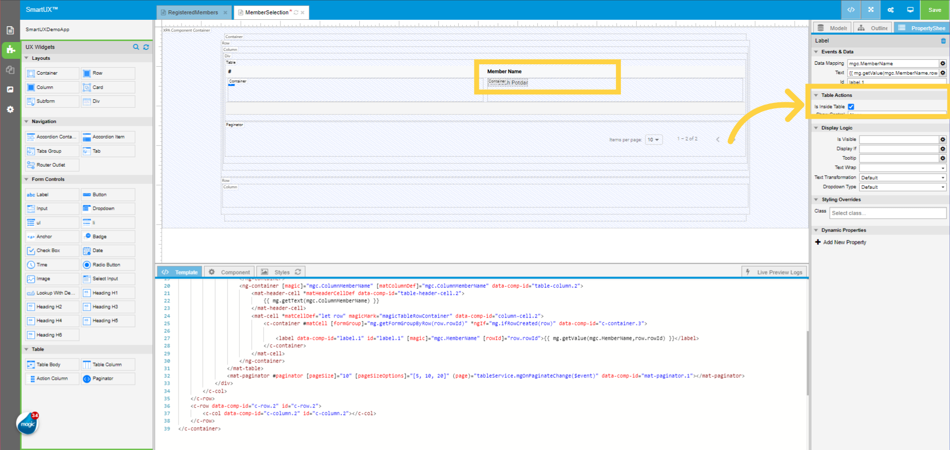
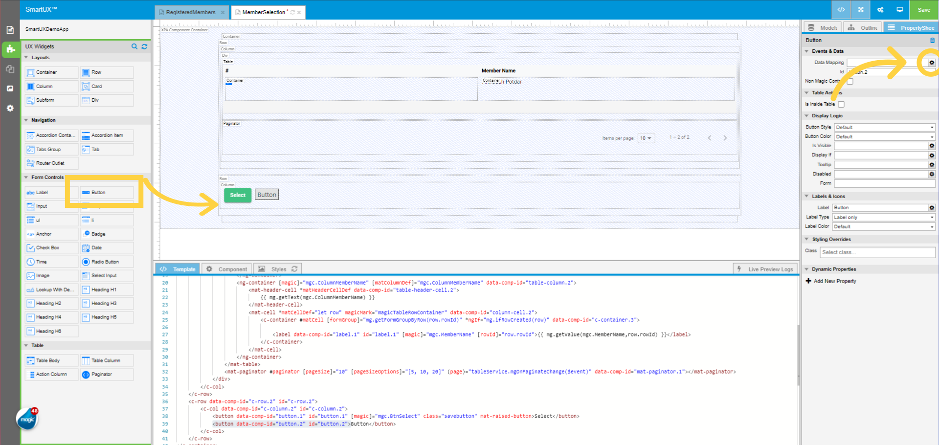
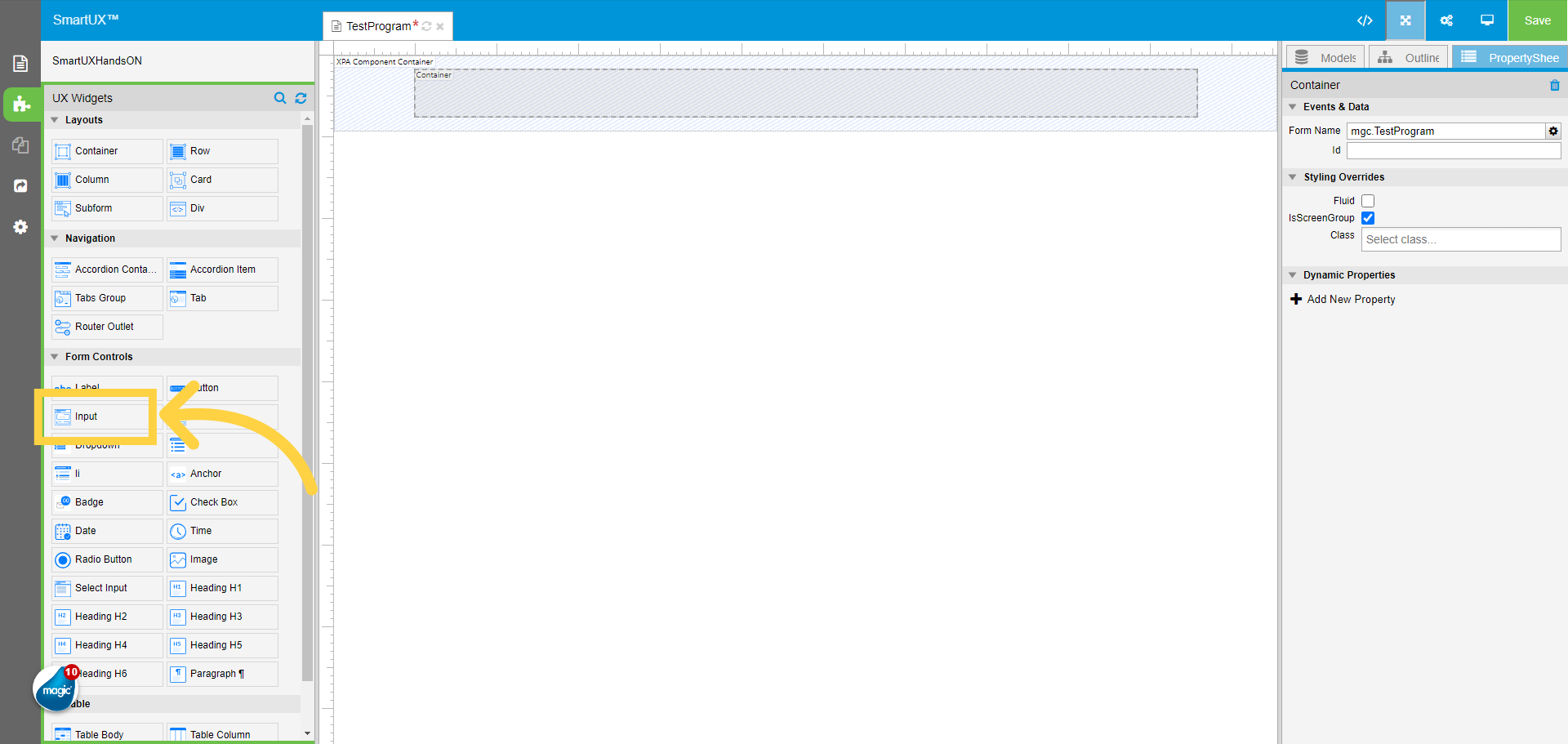
11. Drag and drop the Input widget inside the container
Drag and drop the input widget inside the Container widget on Canvas.
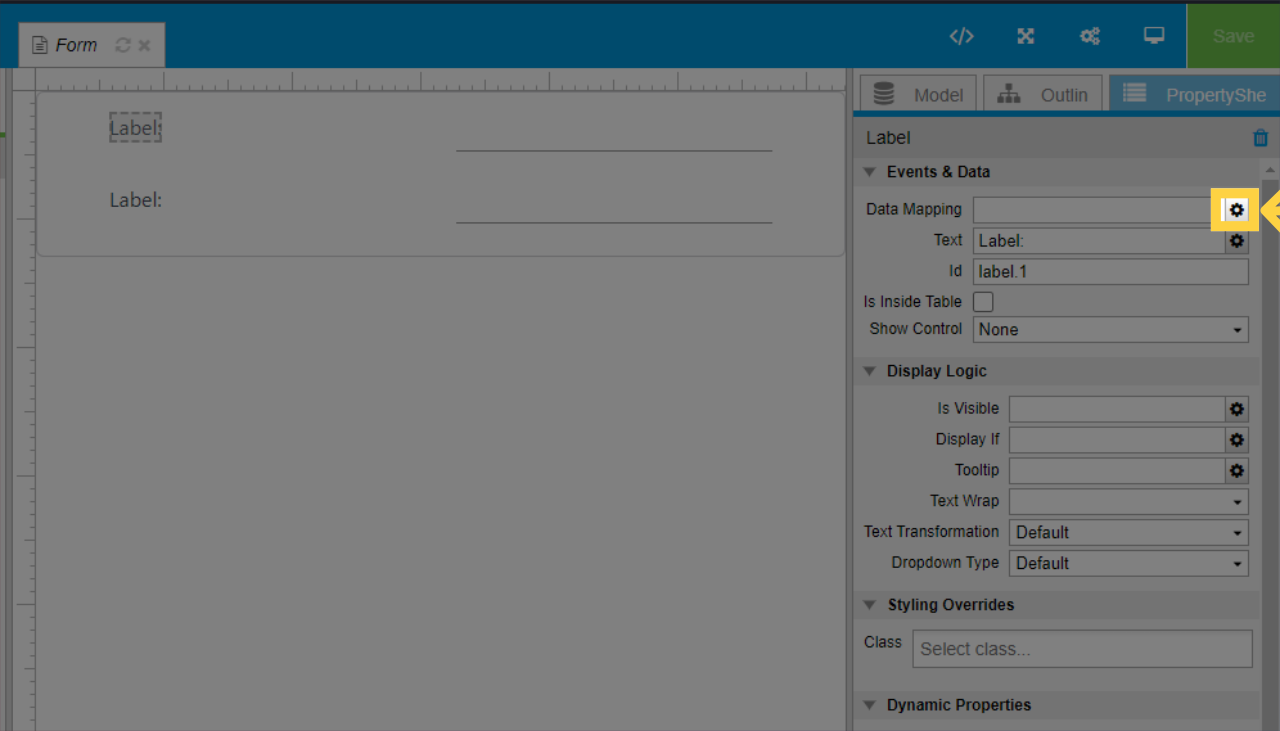
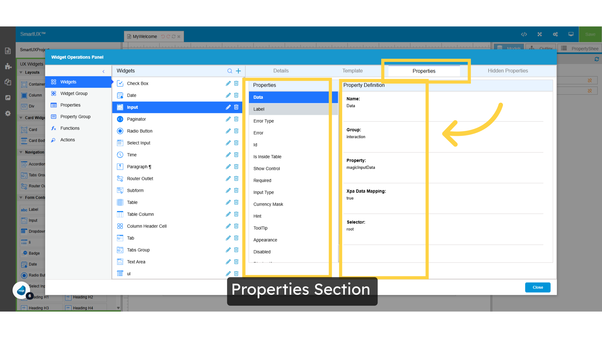
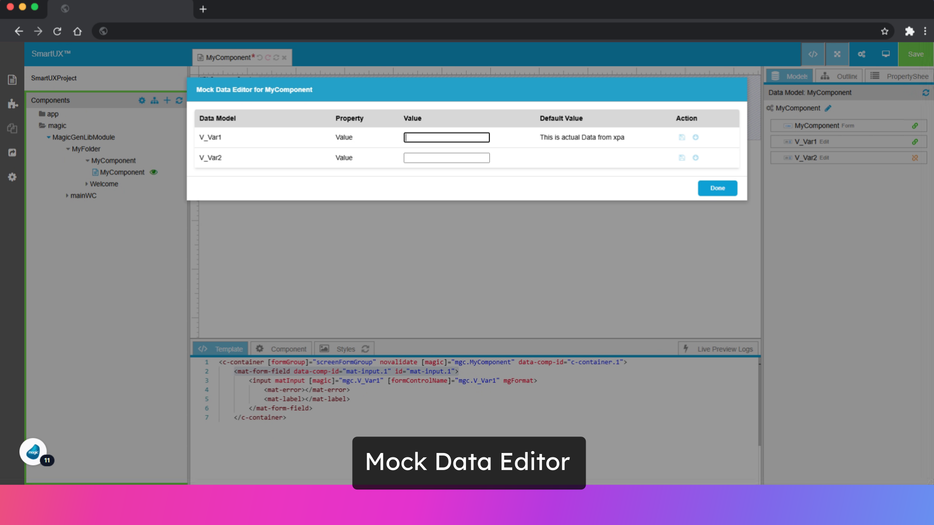
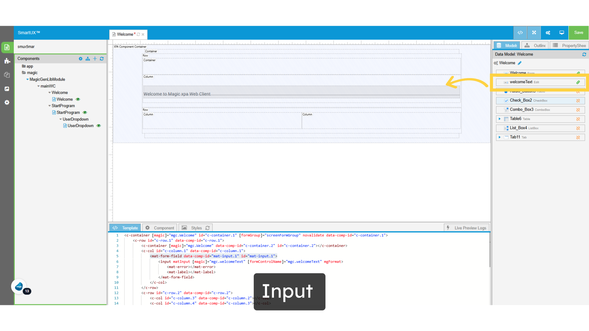
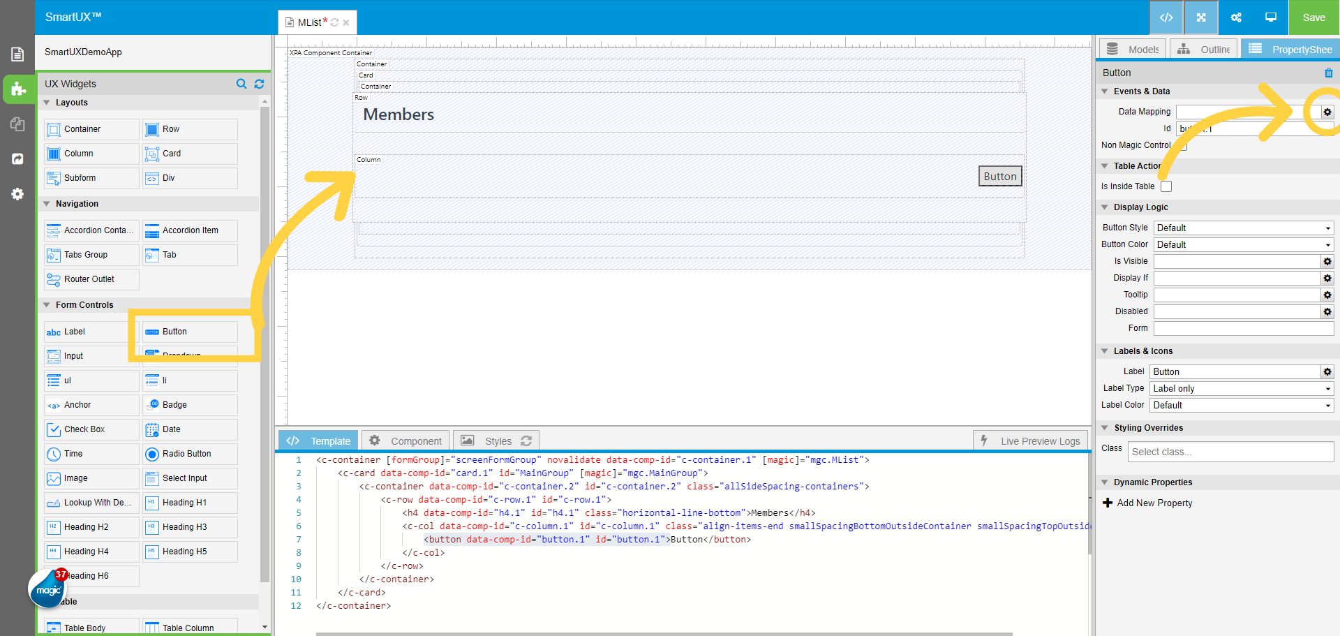
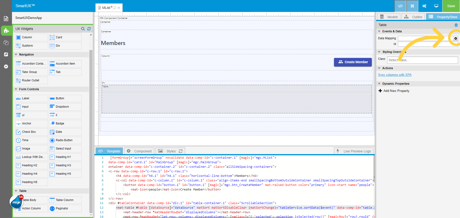
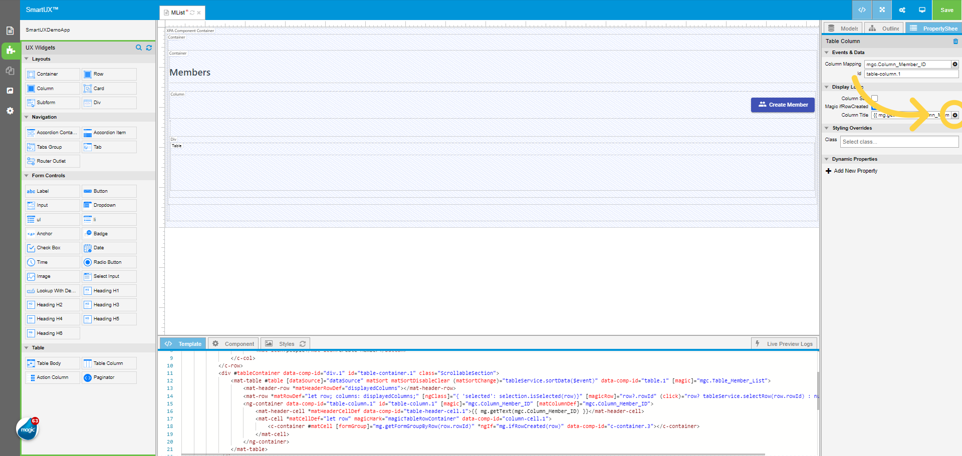
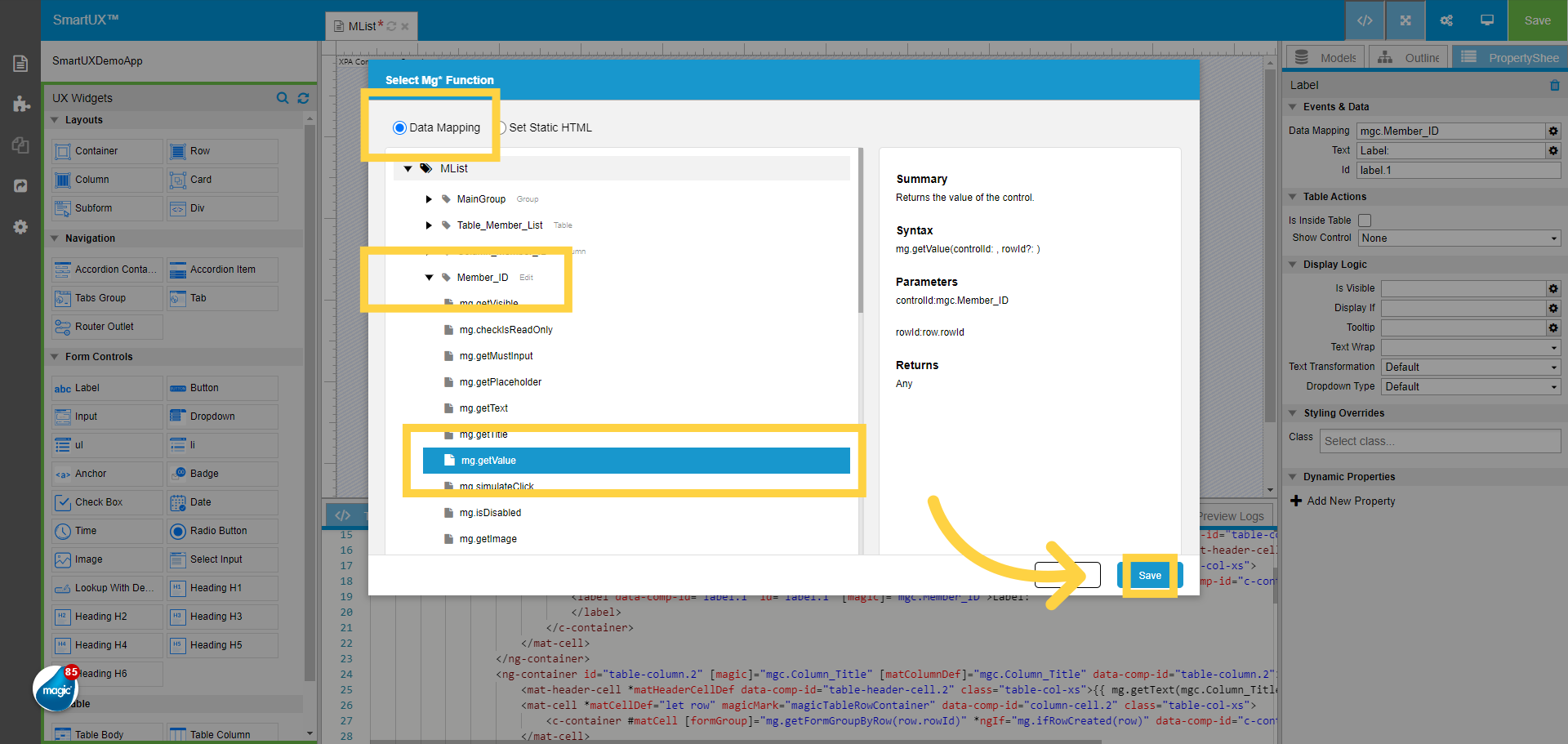
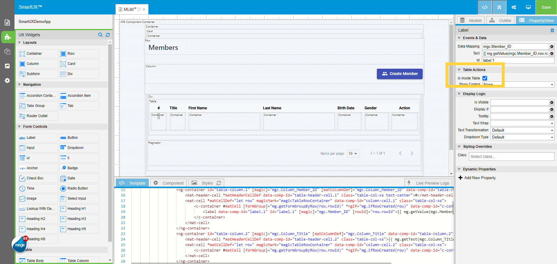
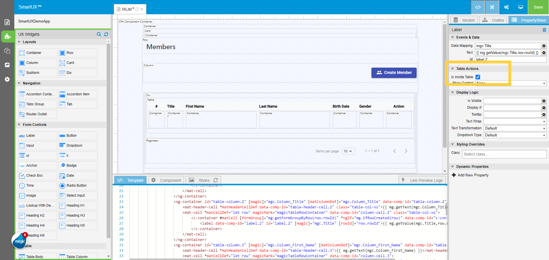
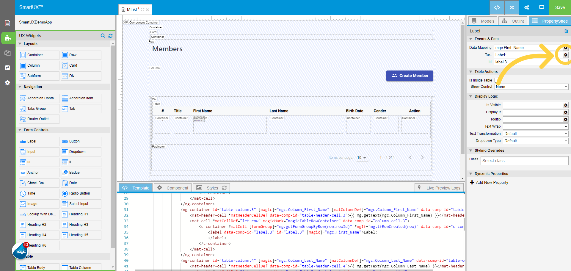
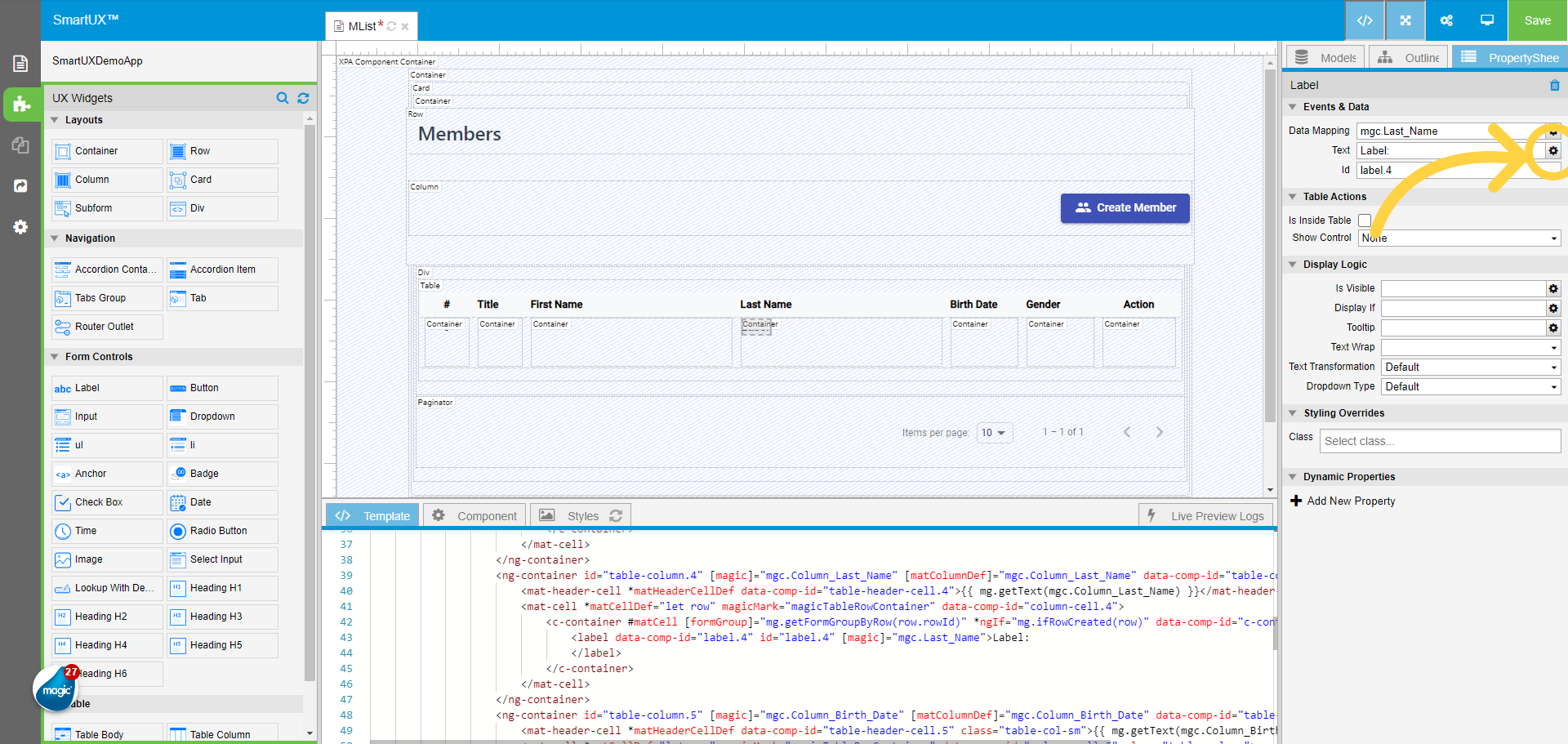
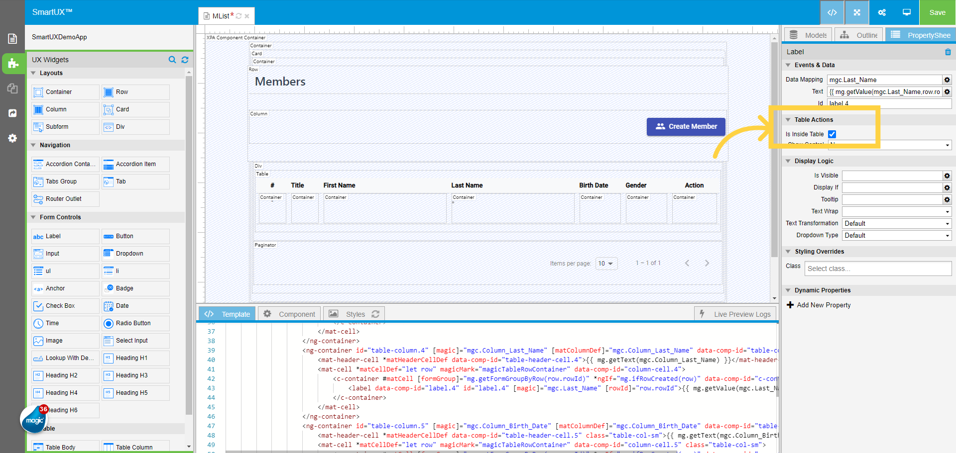
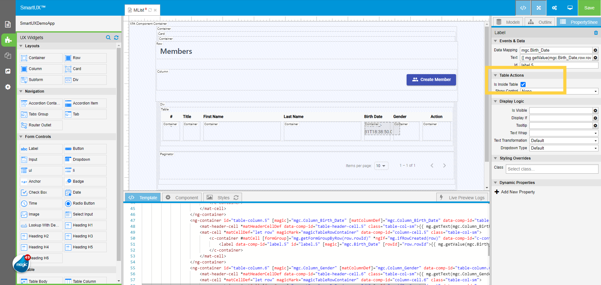
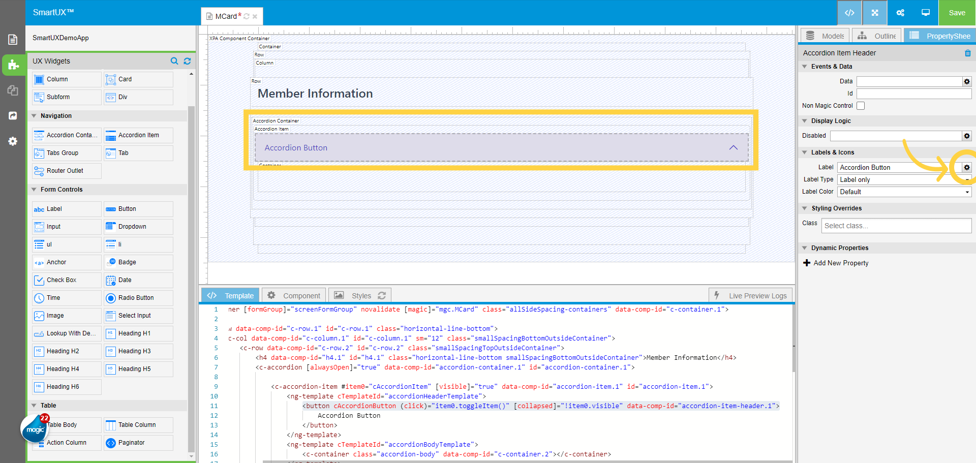
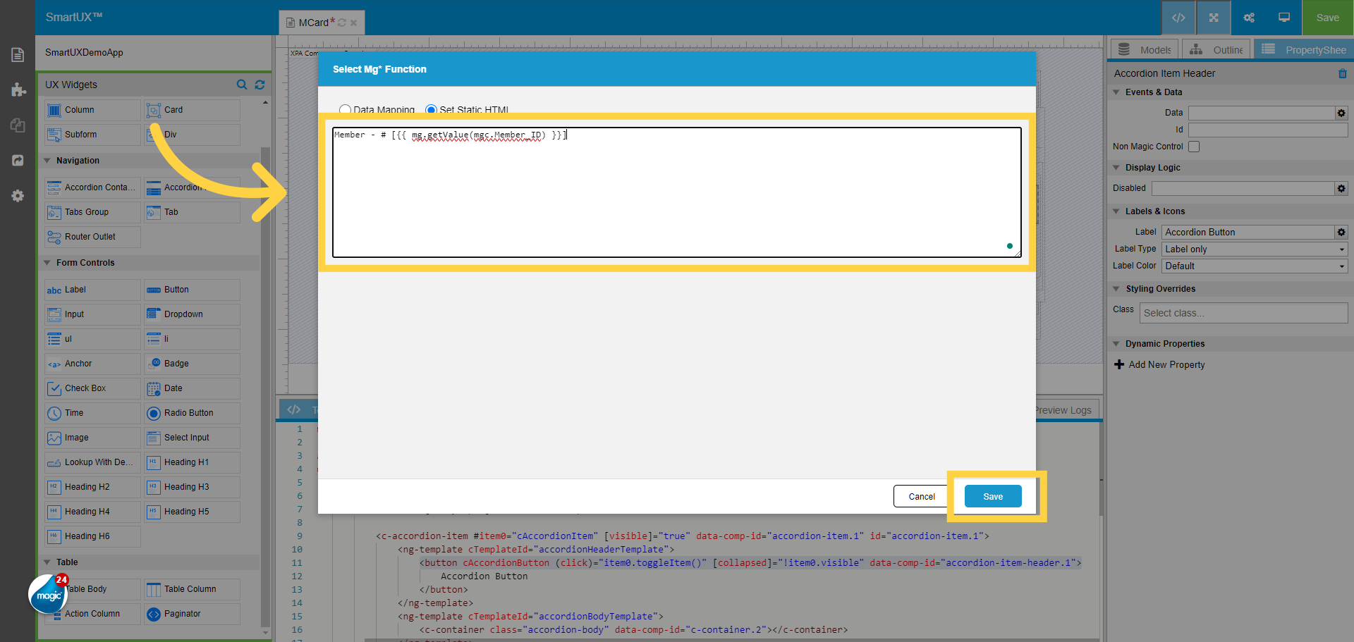
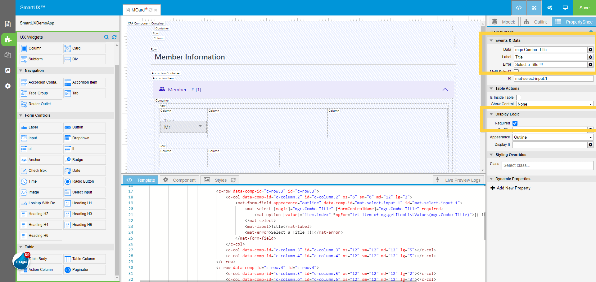
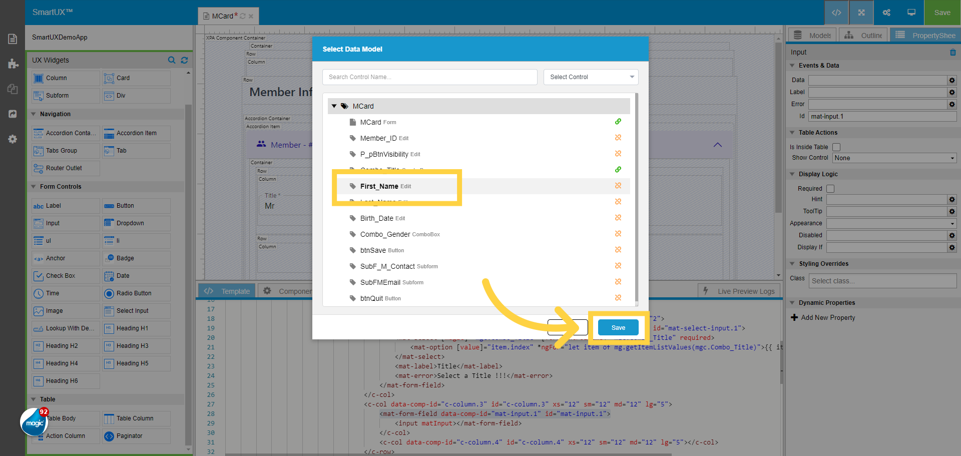
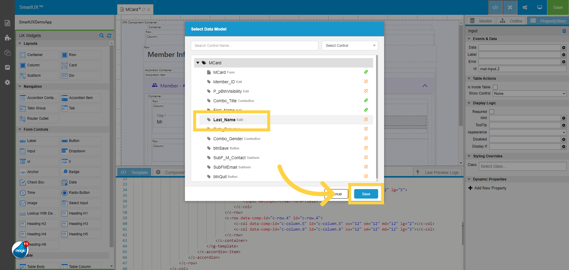
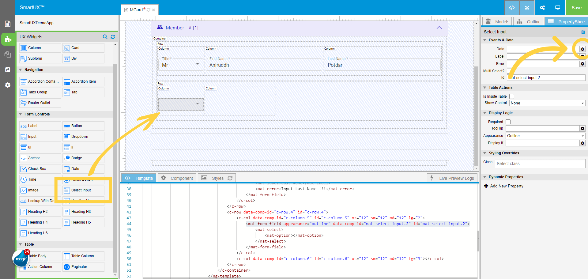
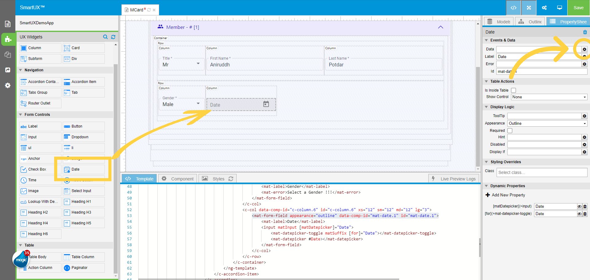
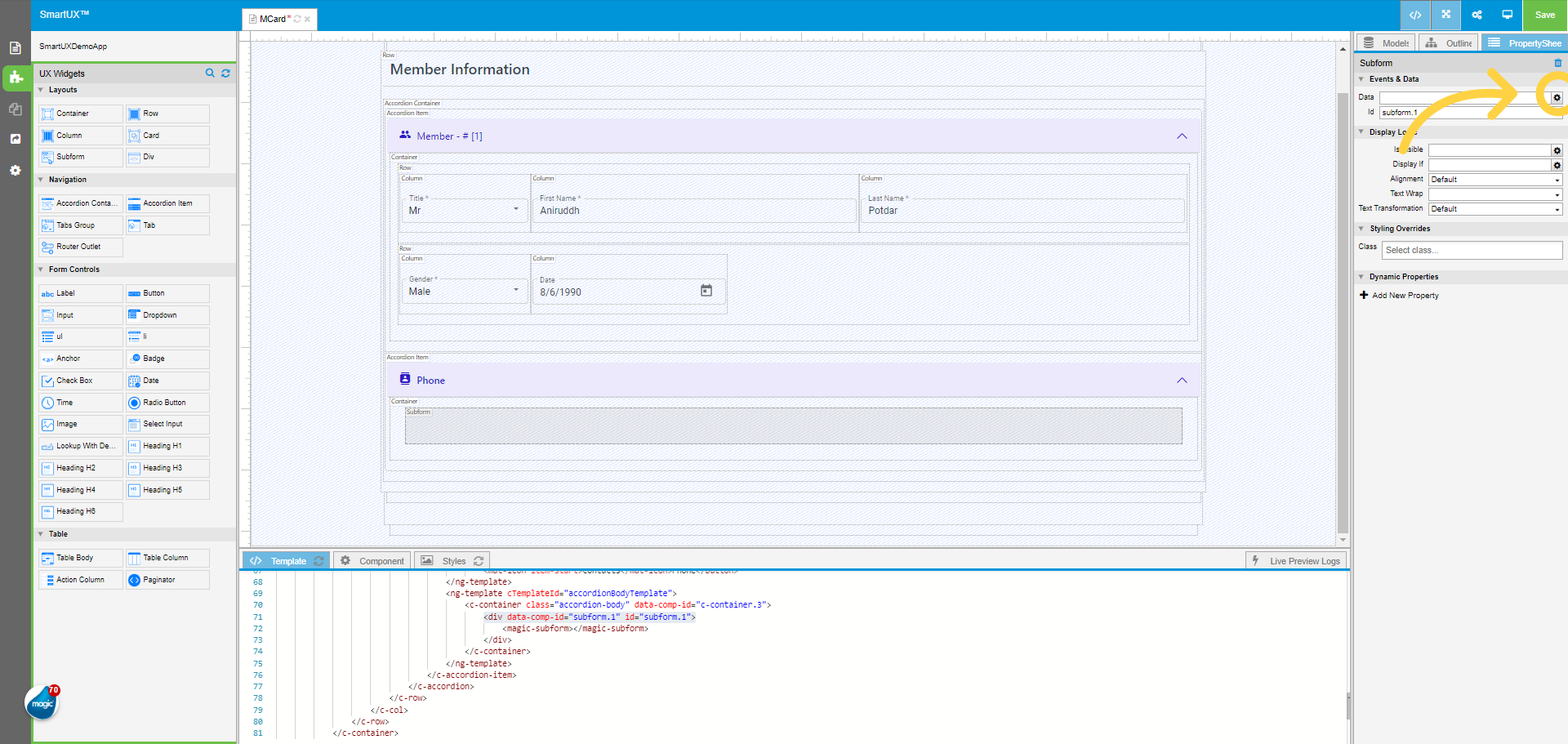
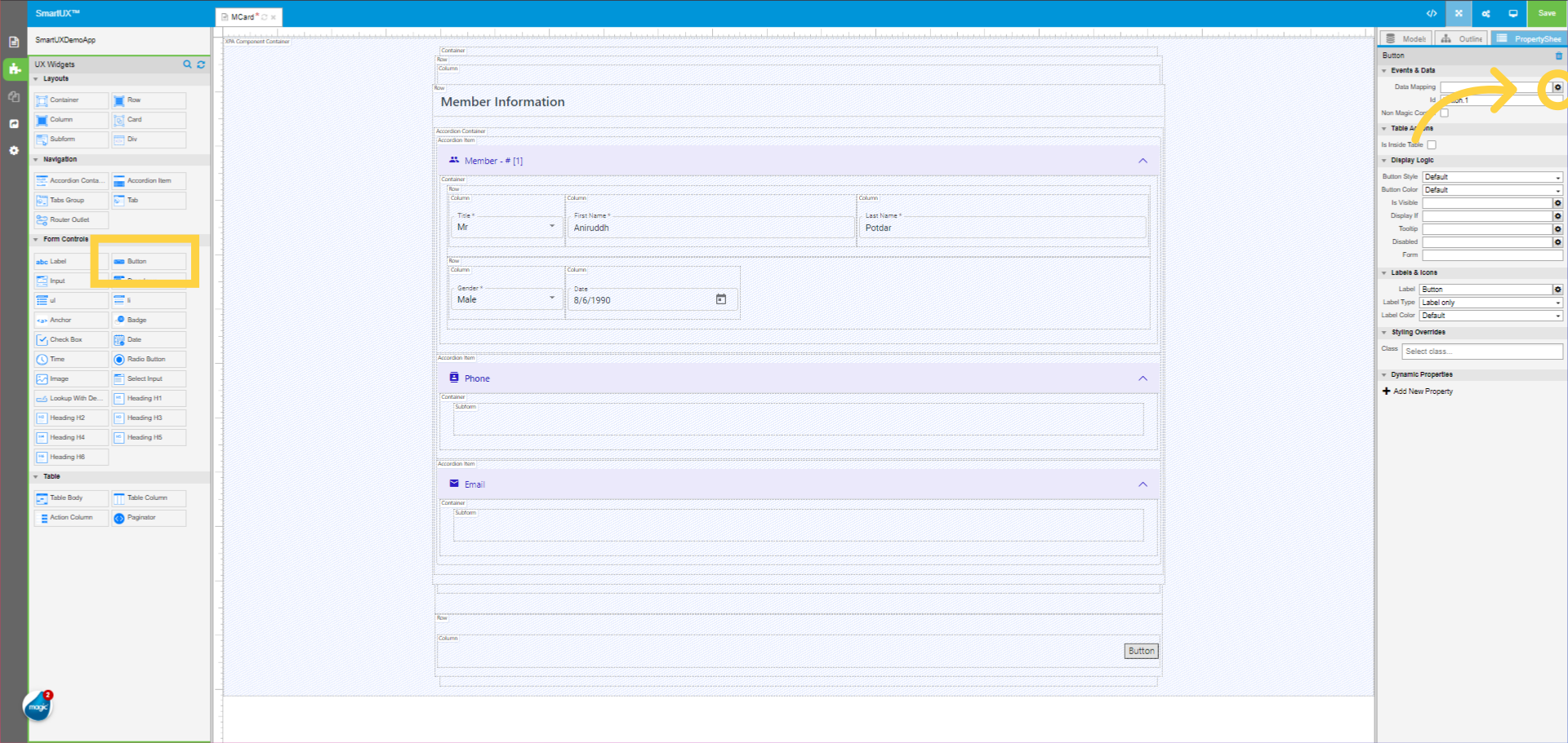
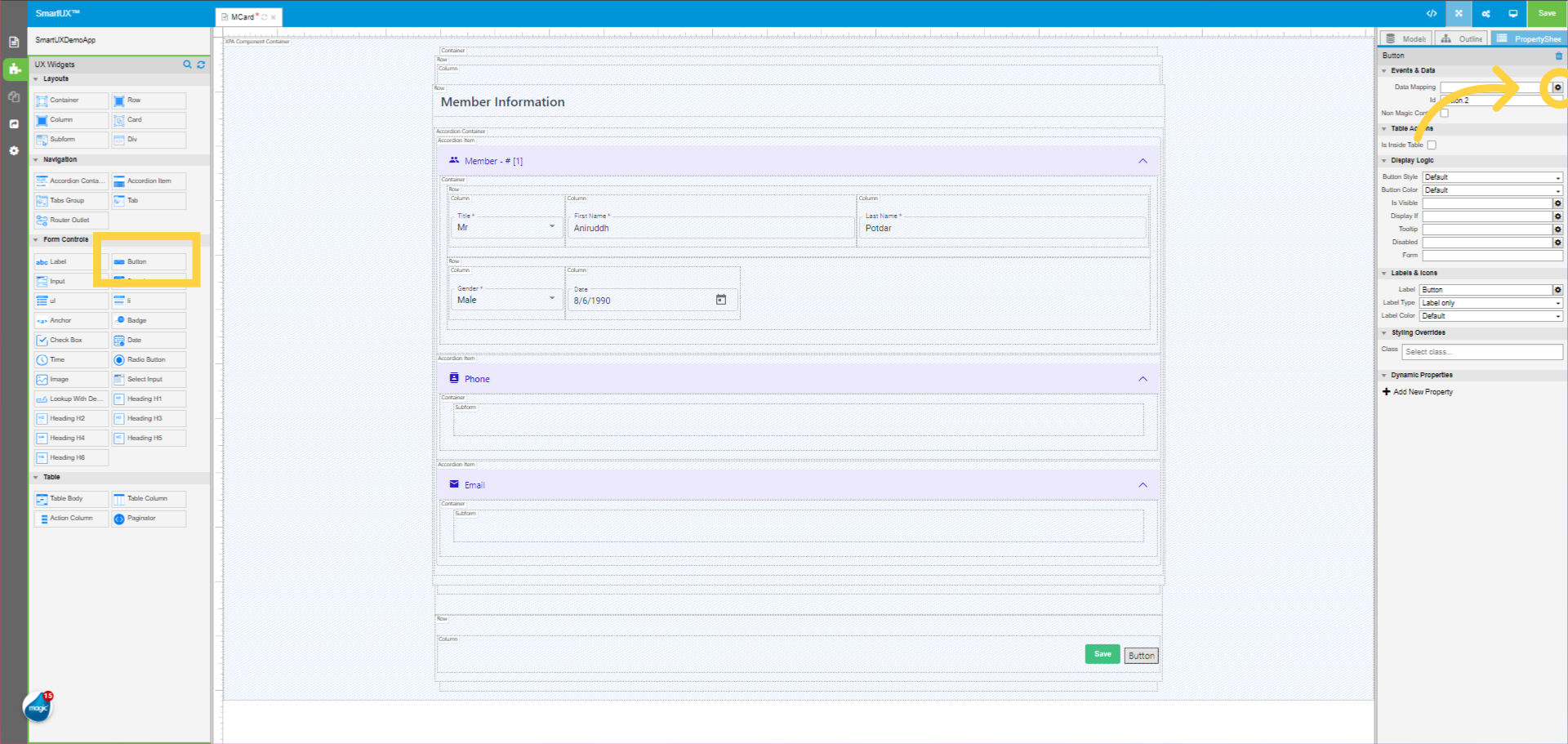
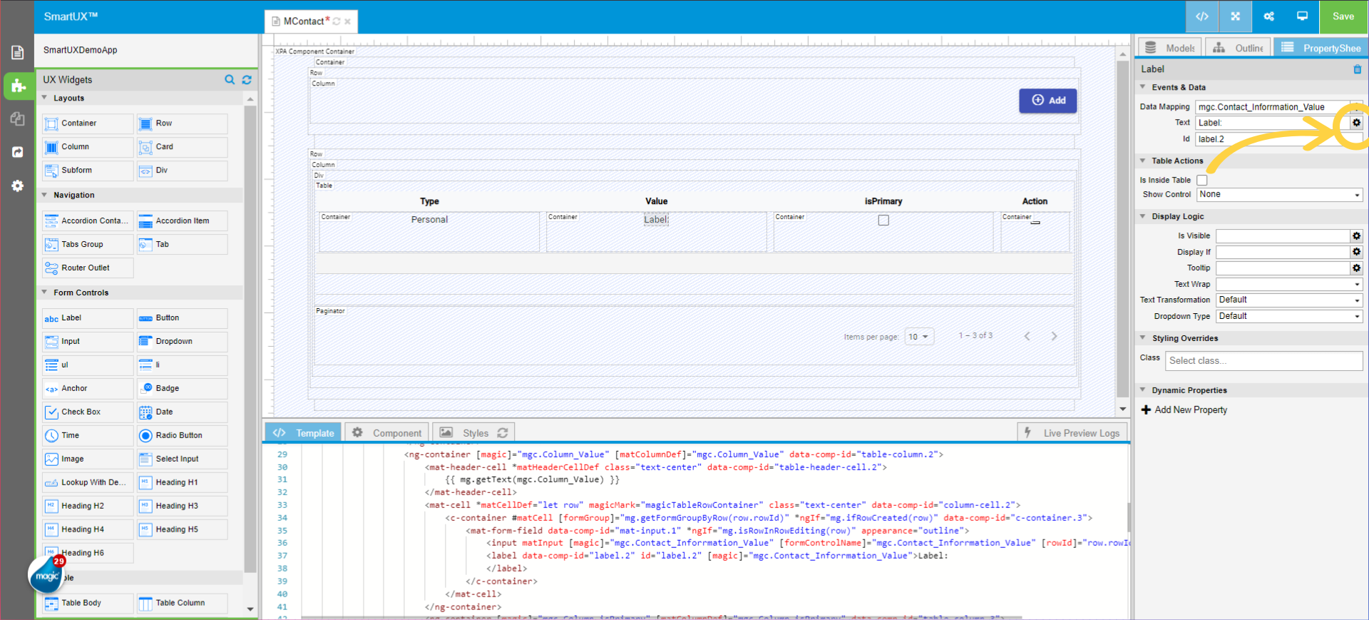
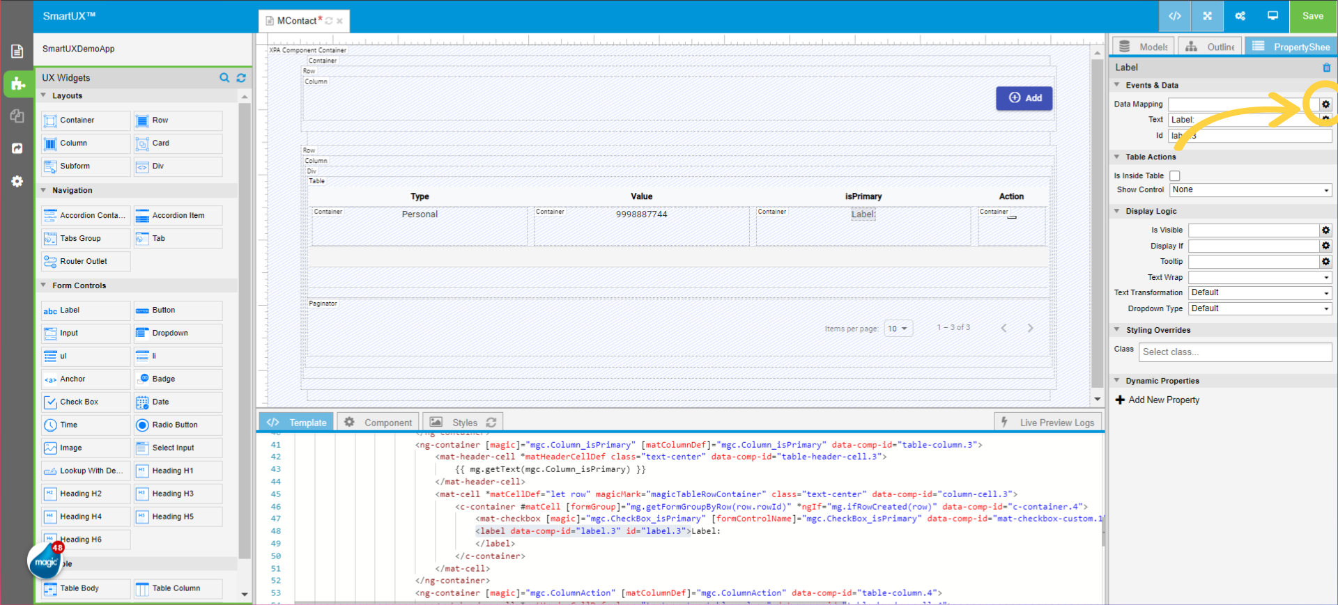
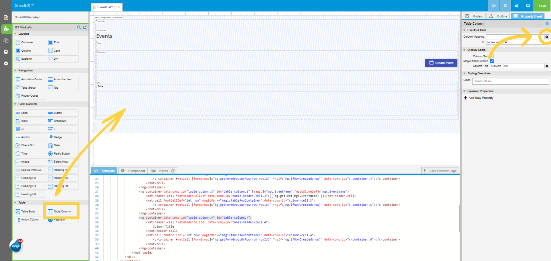
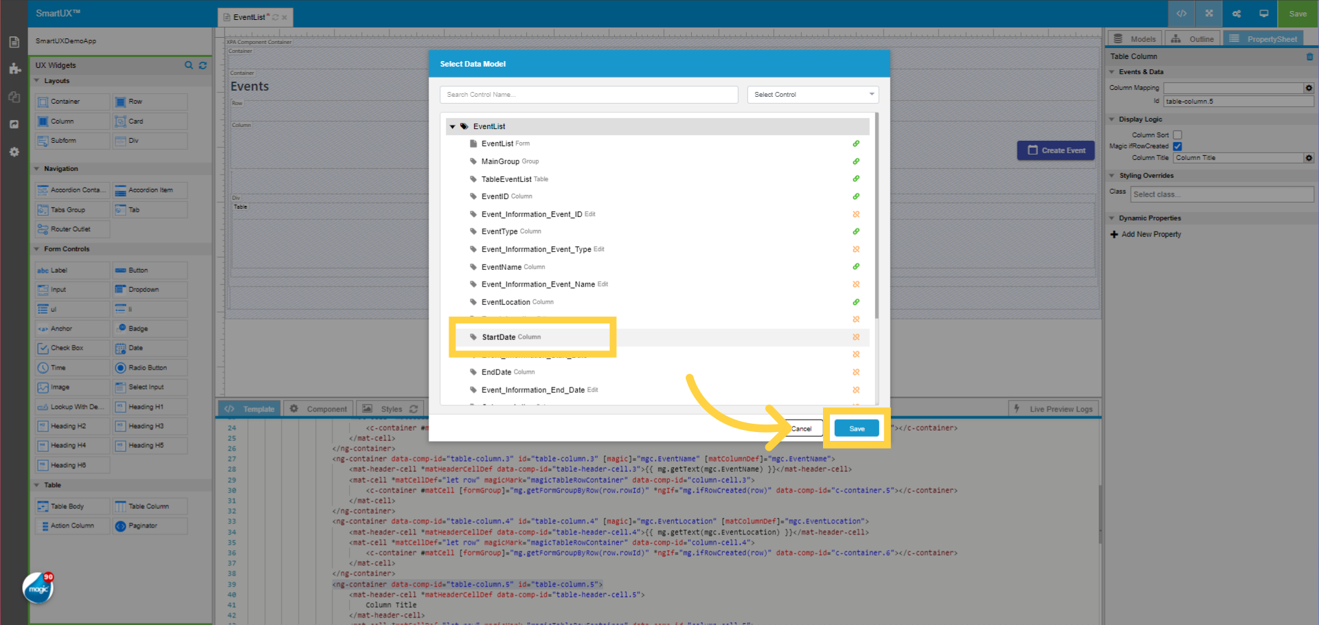
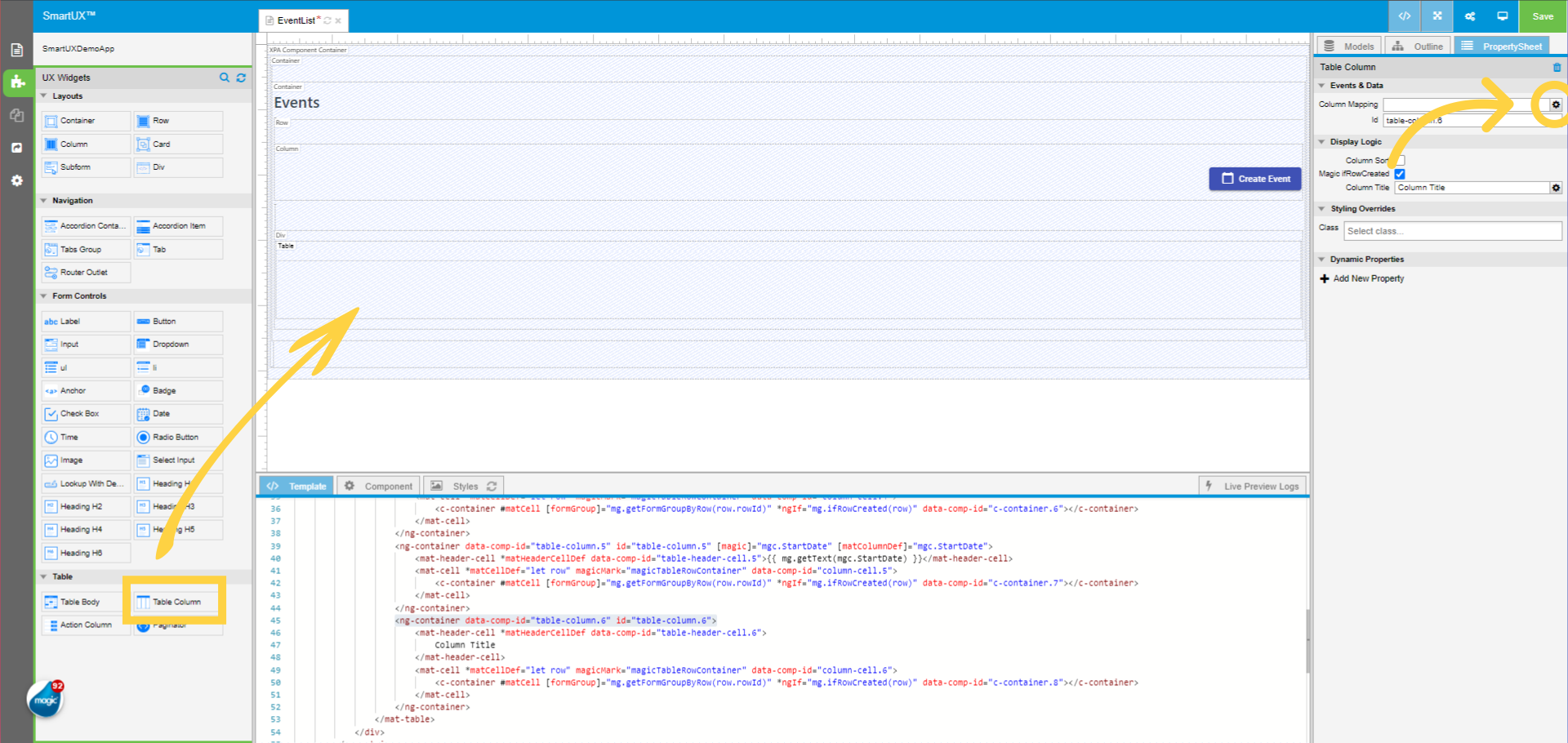
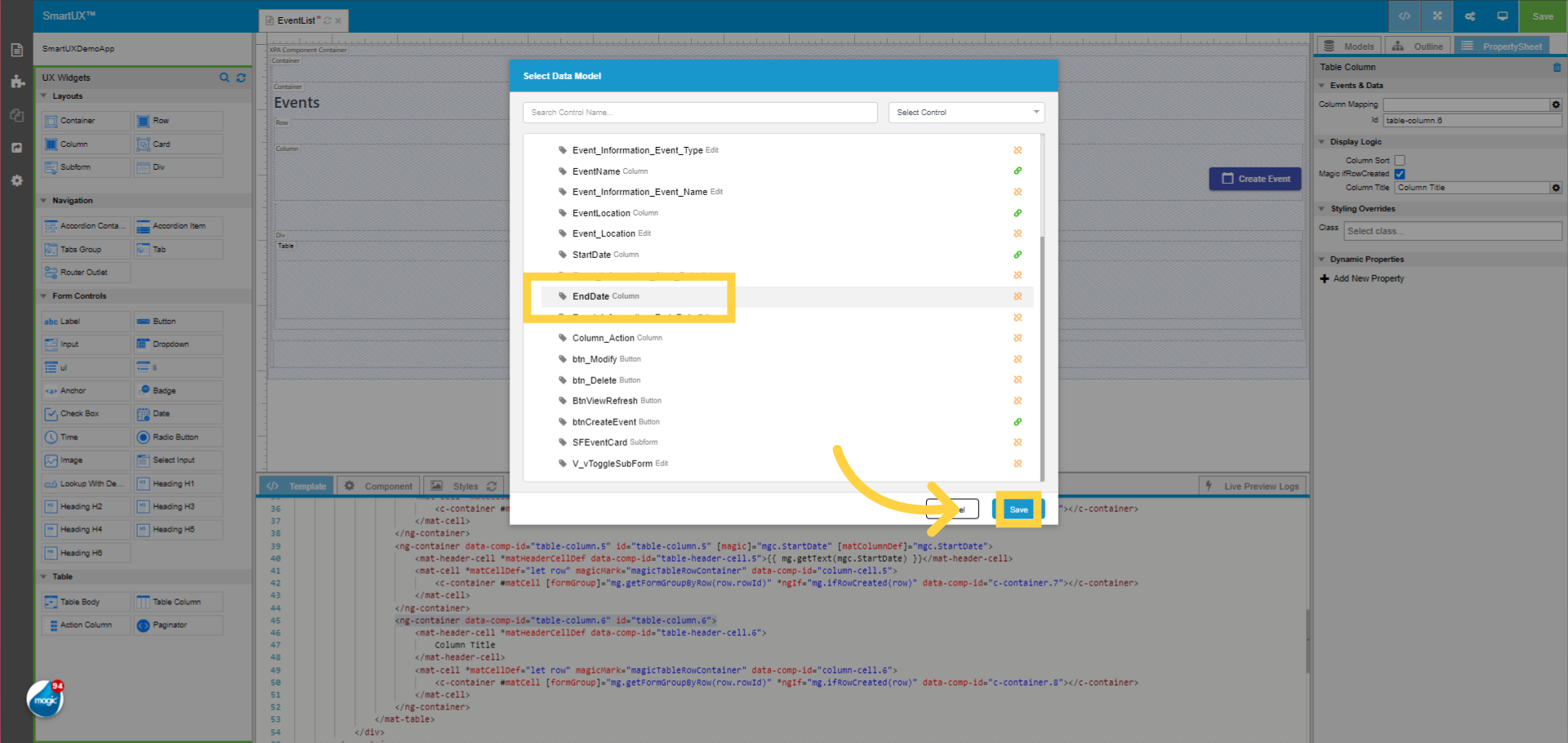
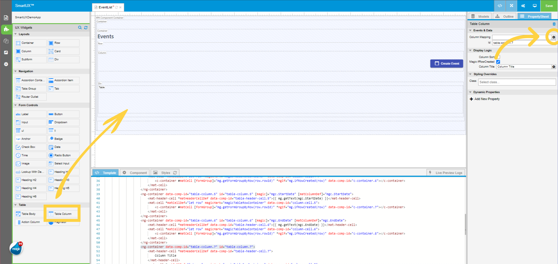
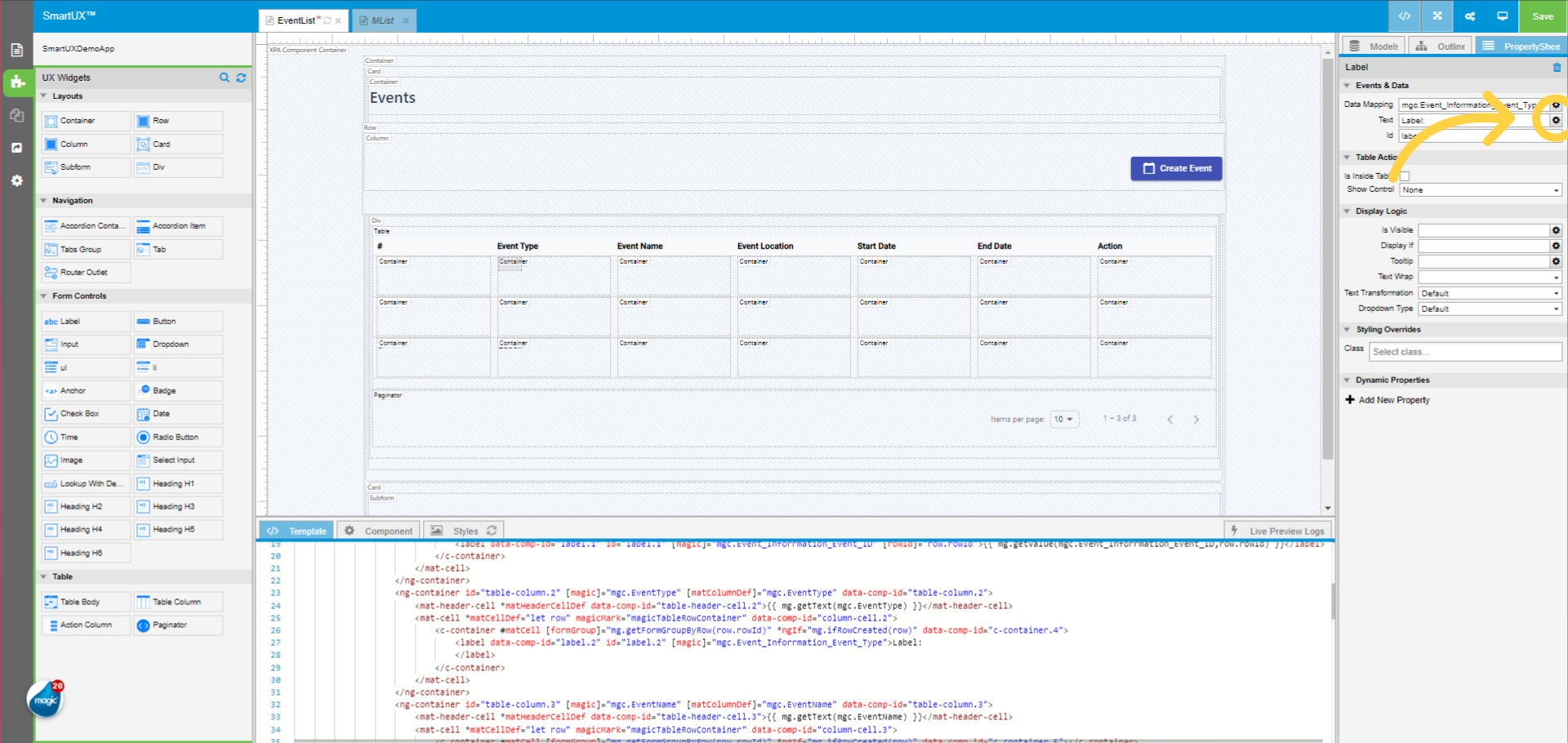
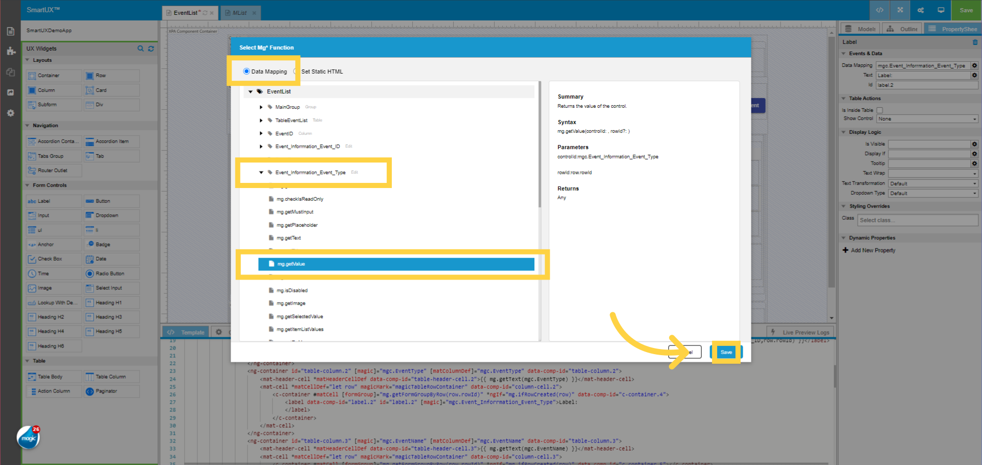
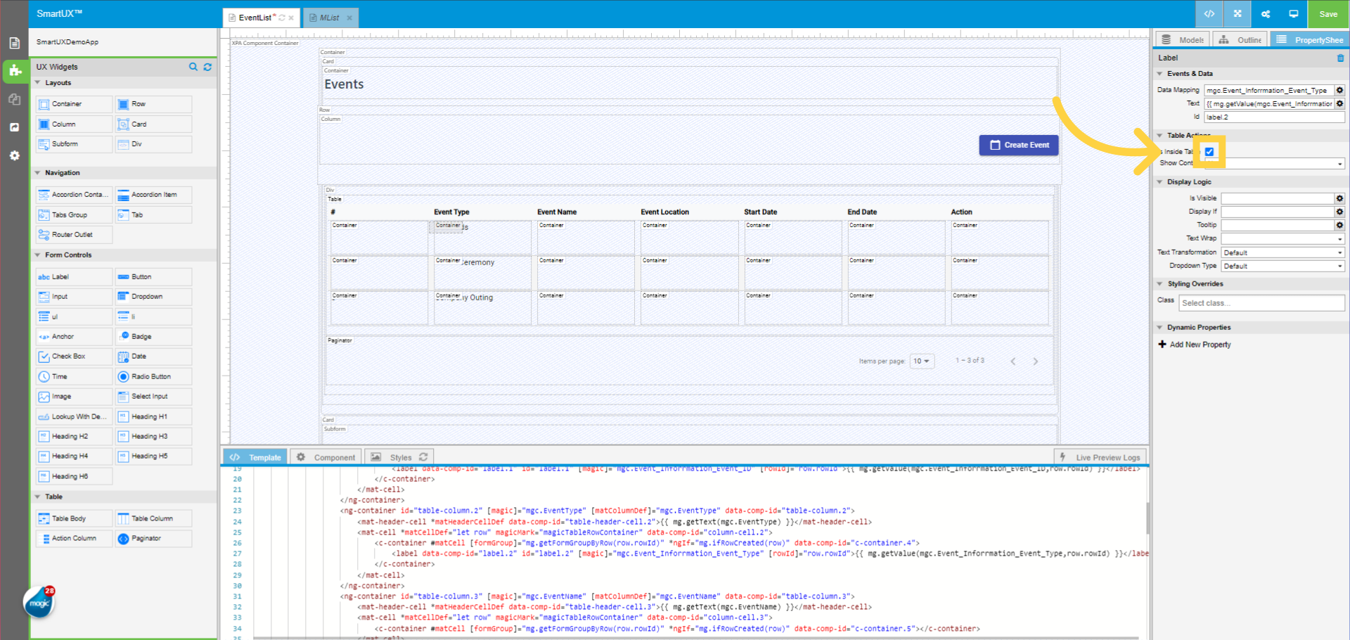
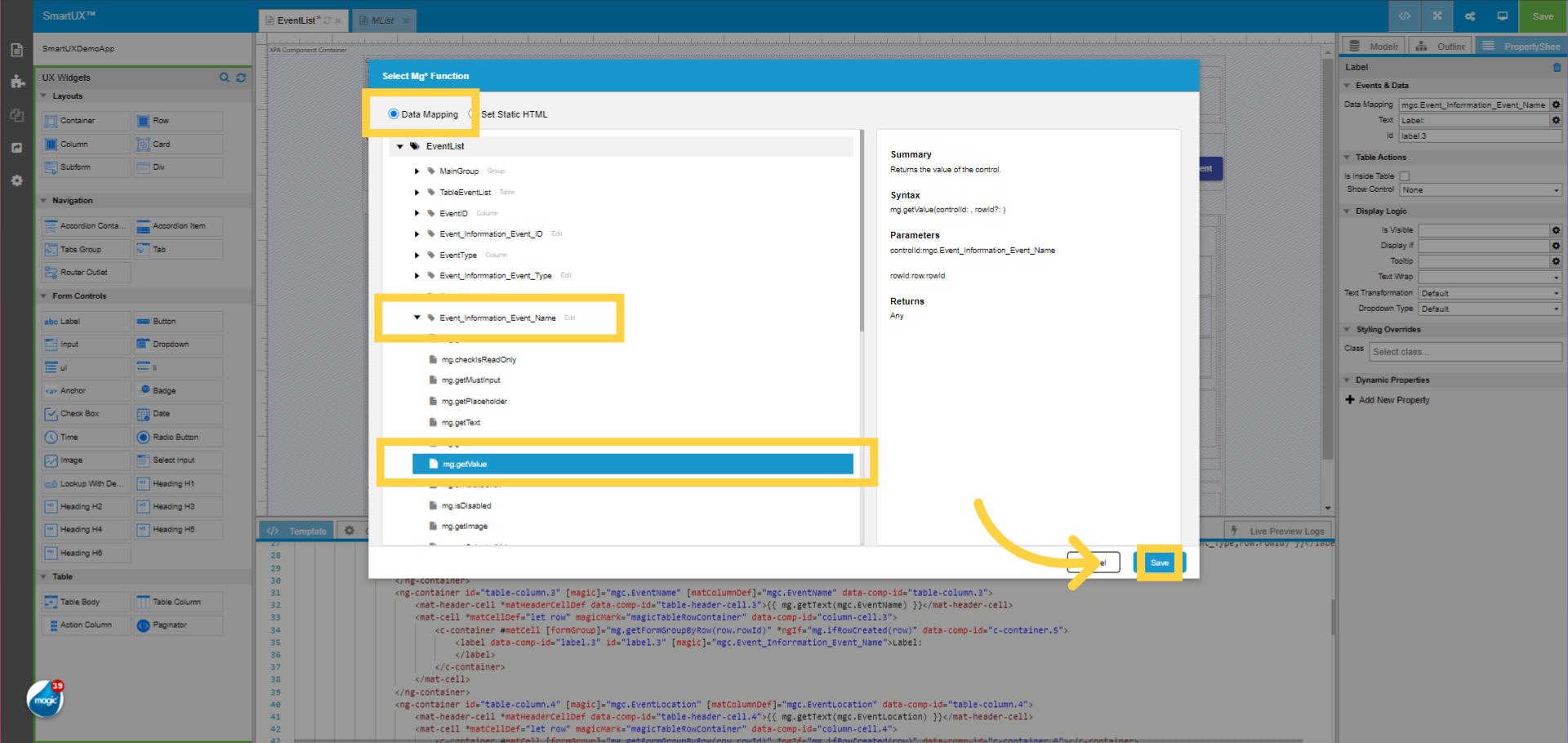
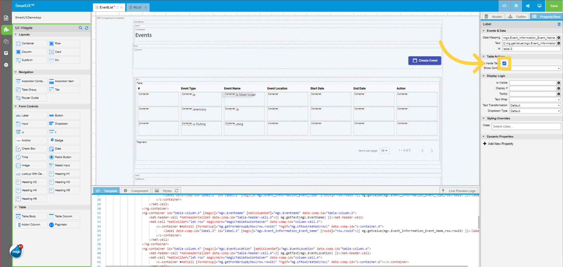
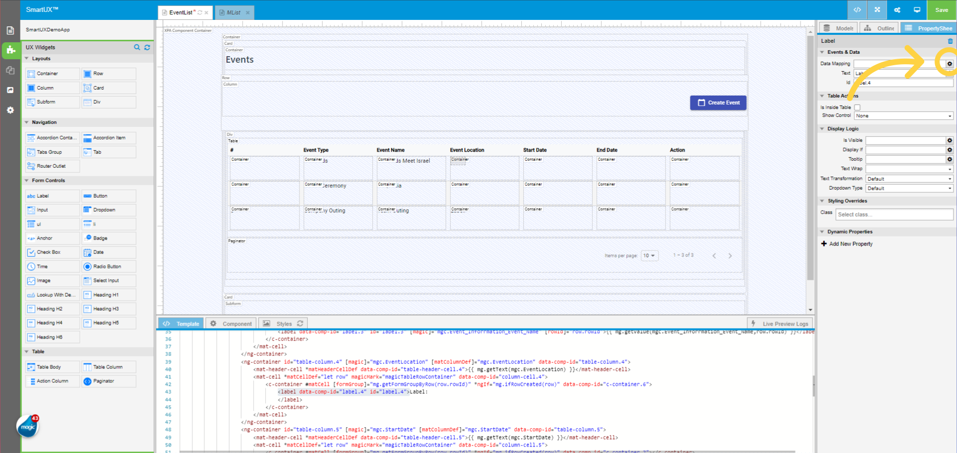
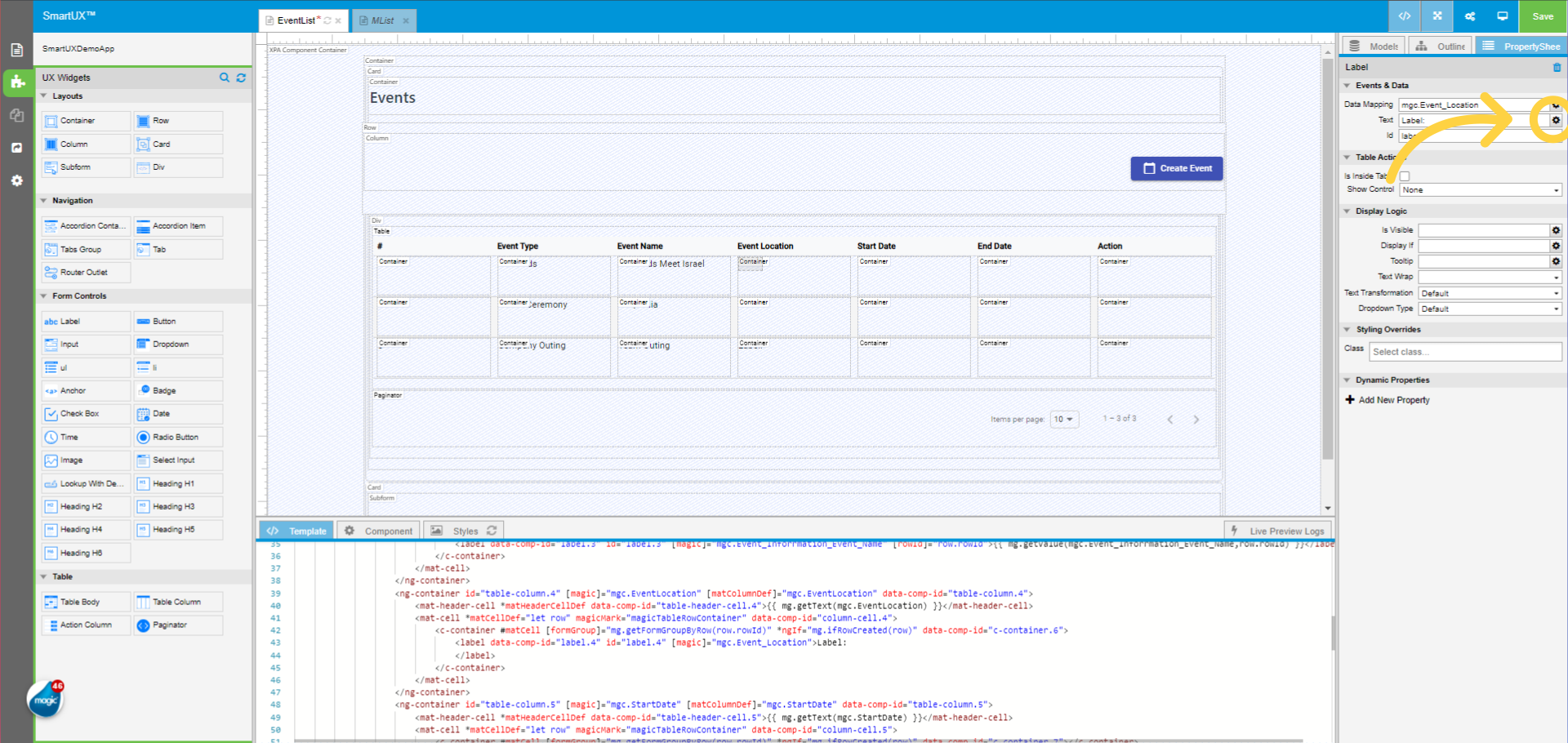
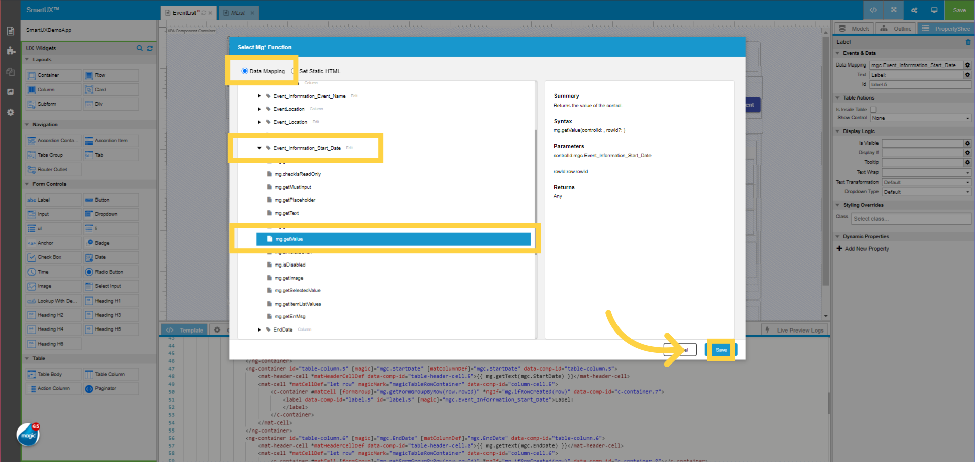
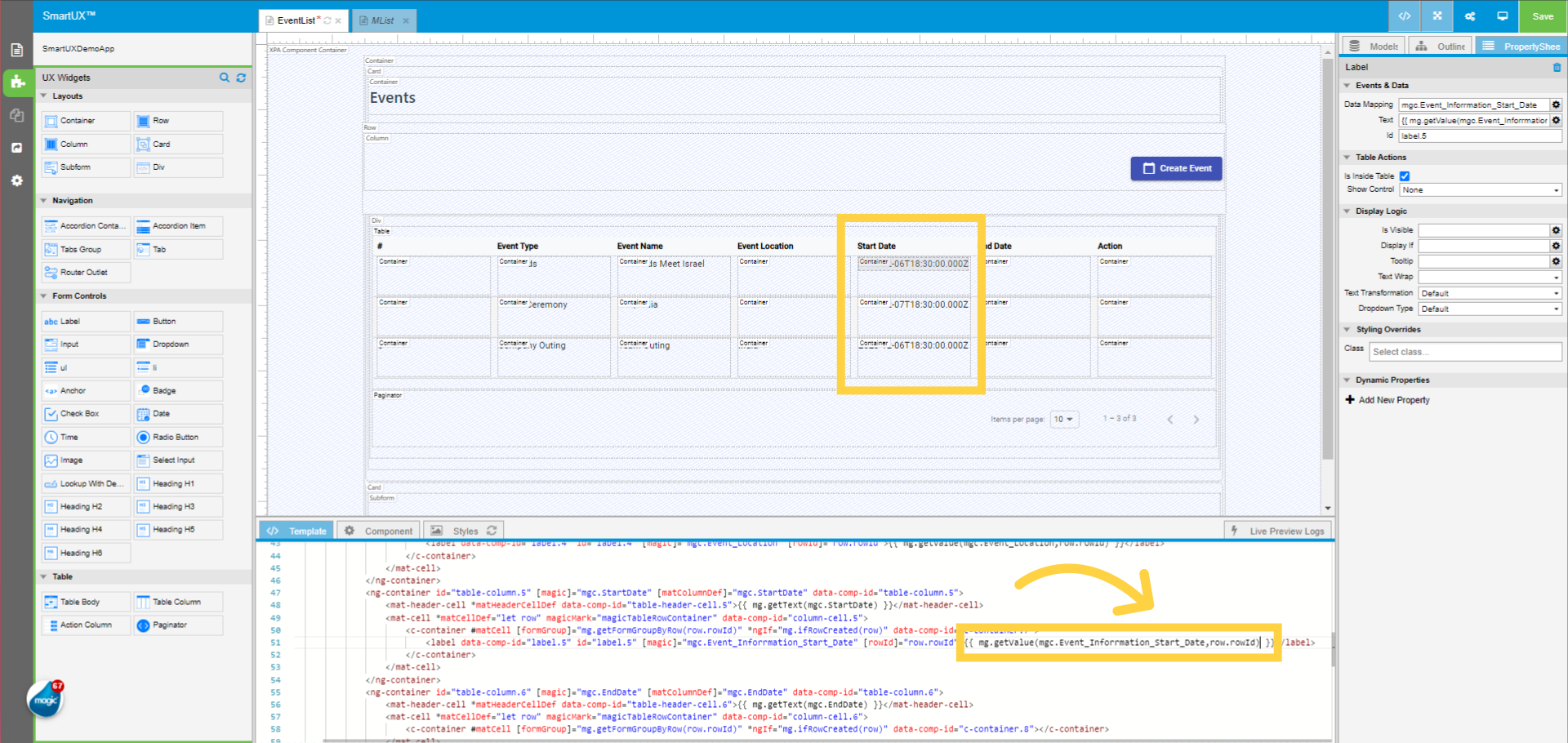
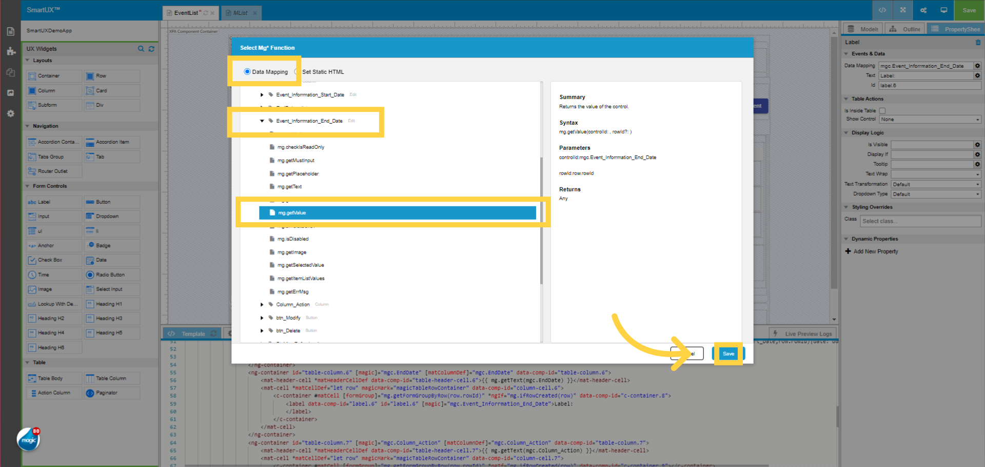
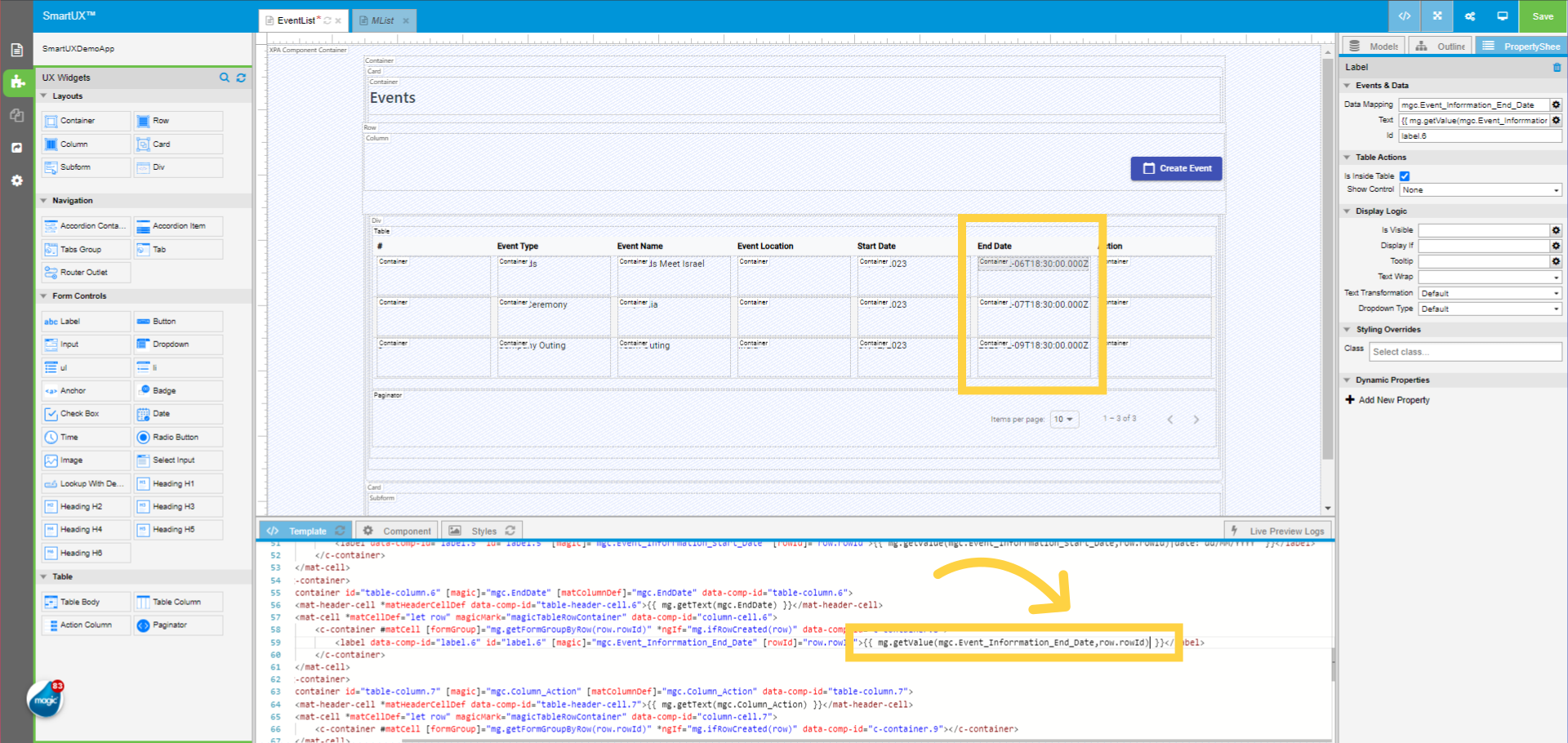
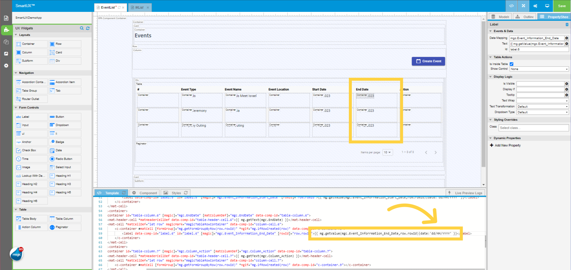
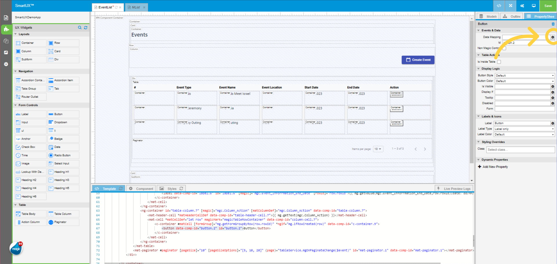
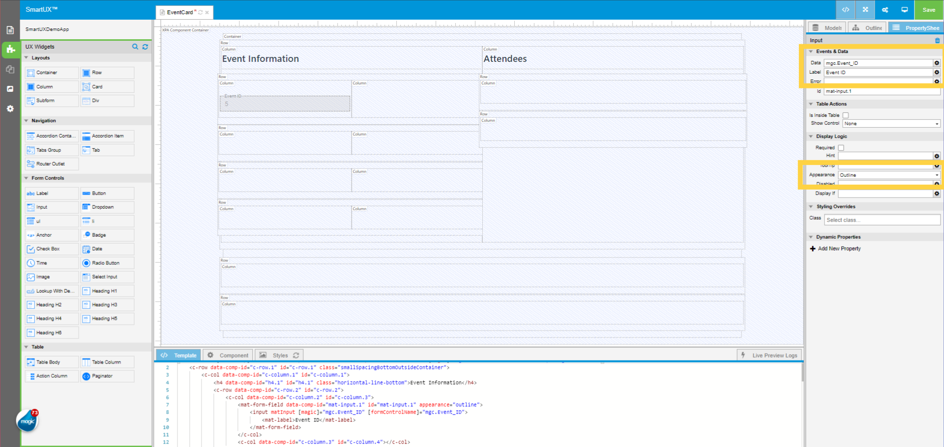
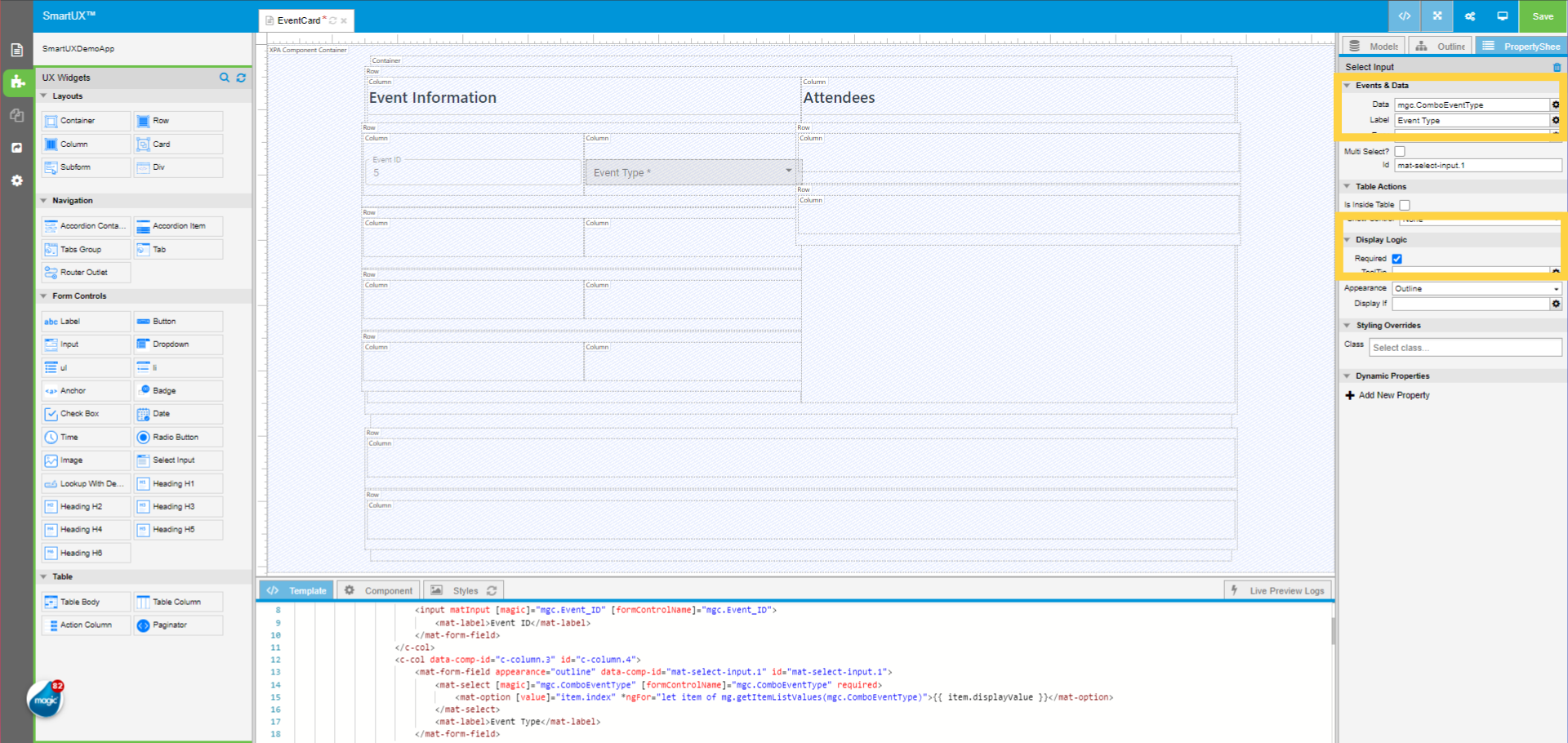
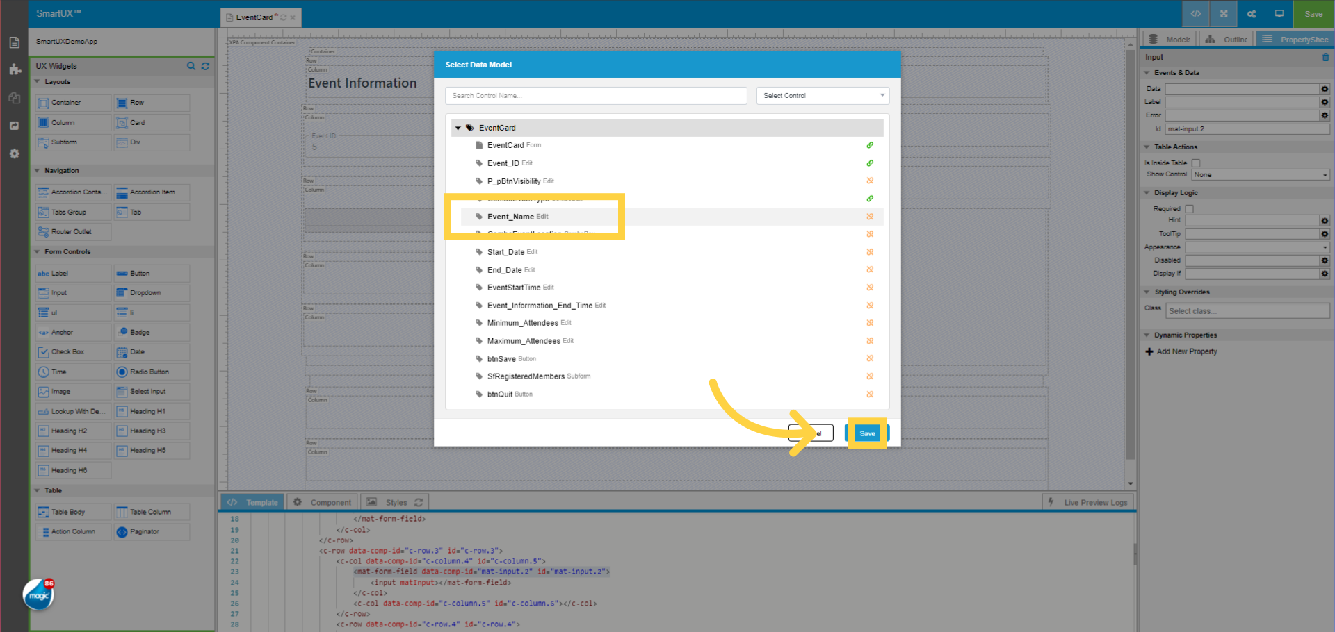
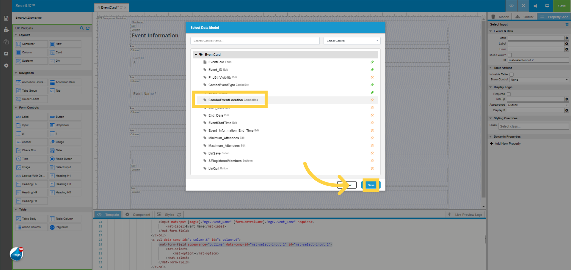
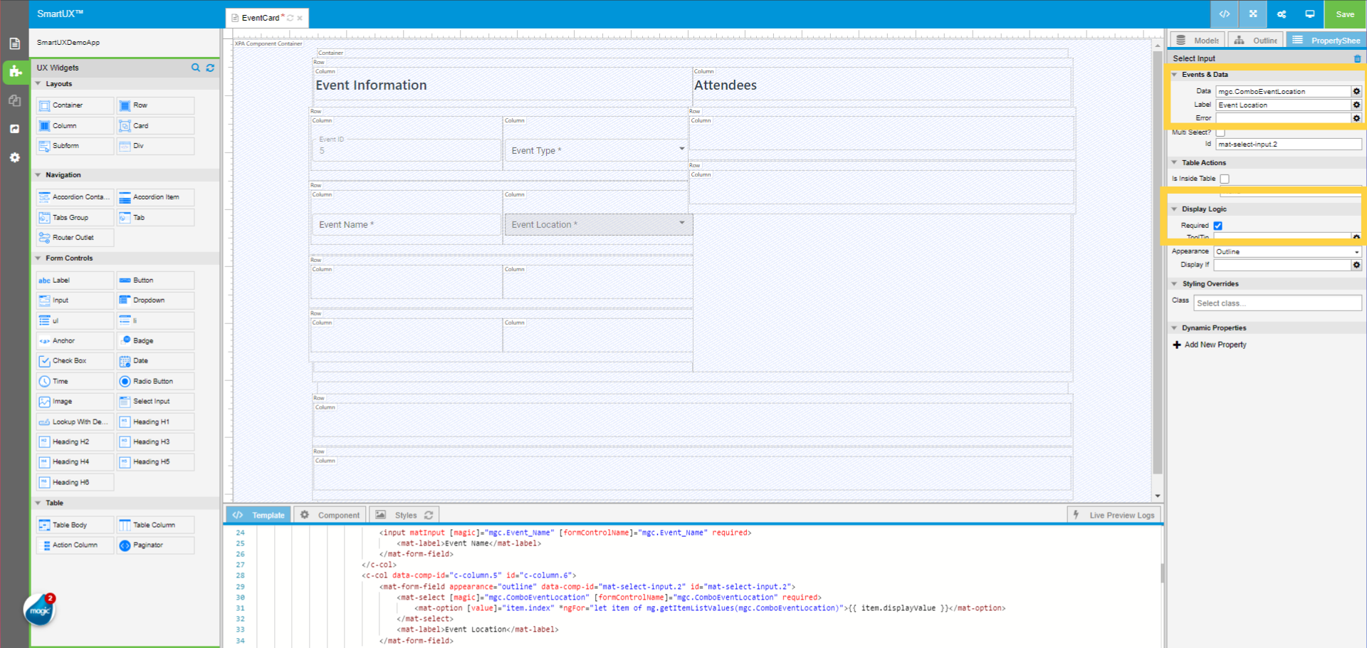
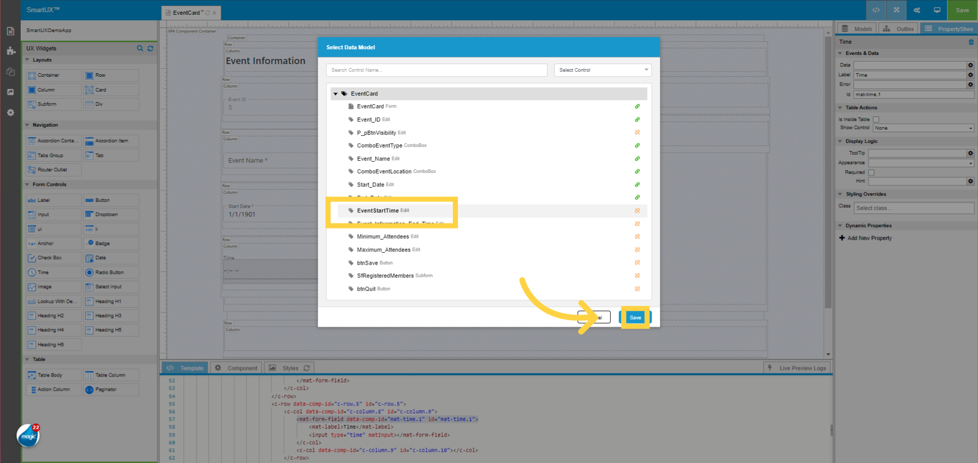
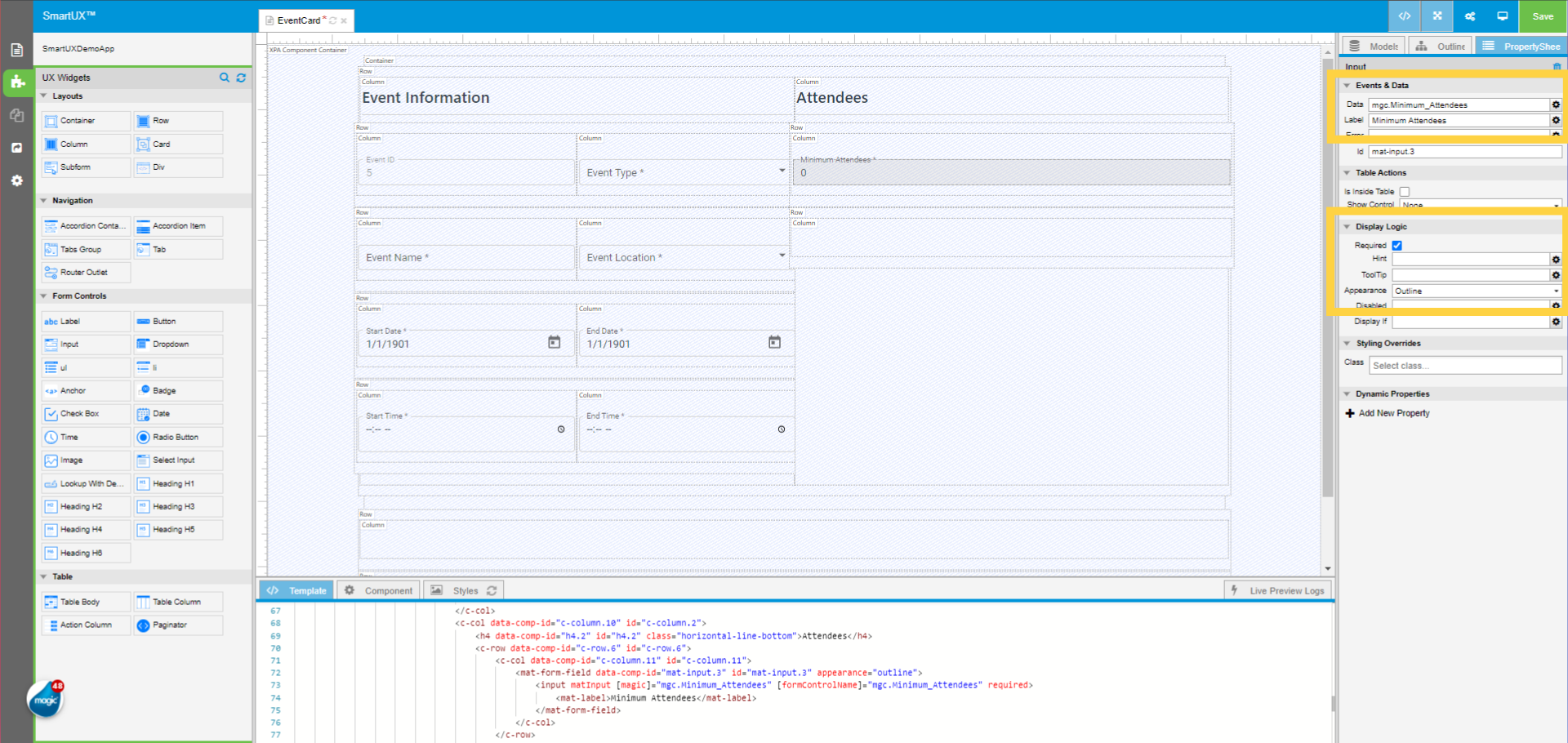
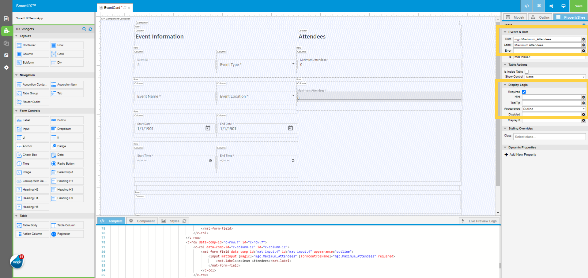
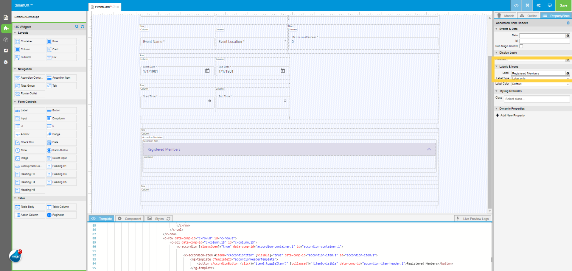
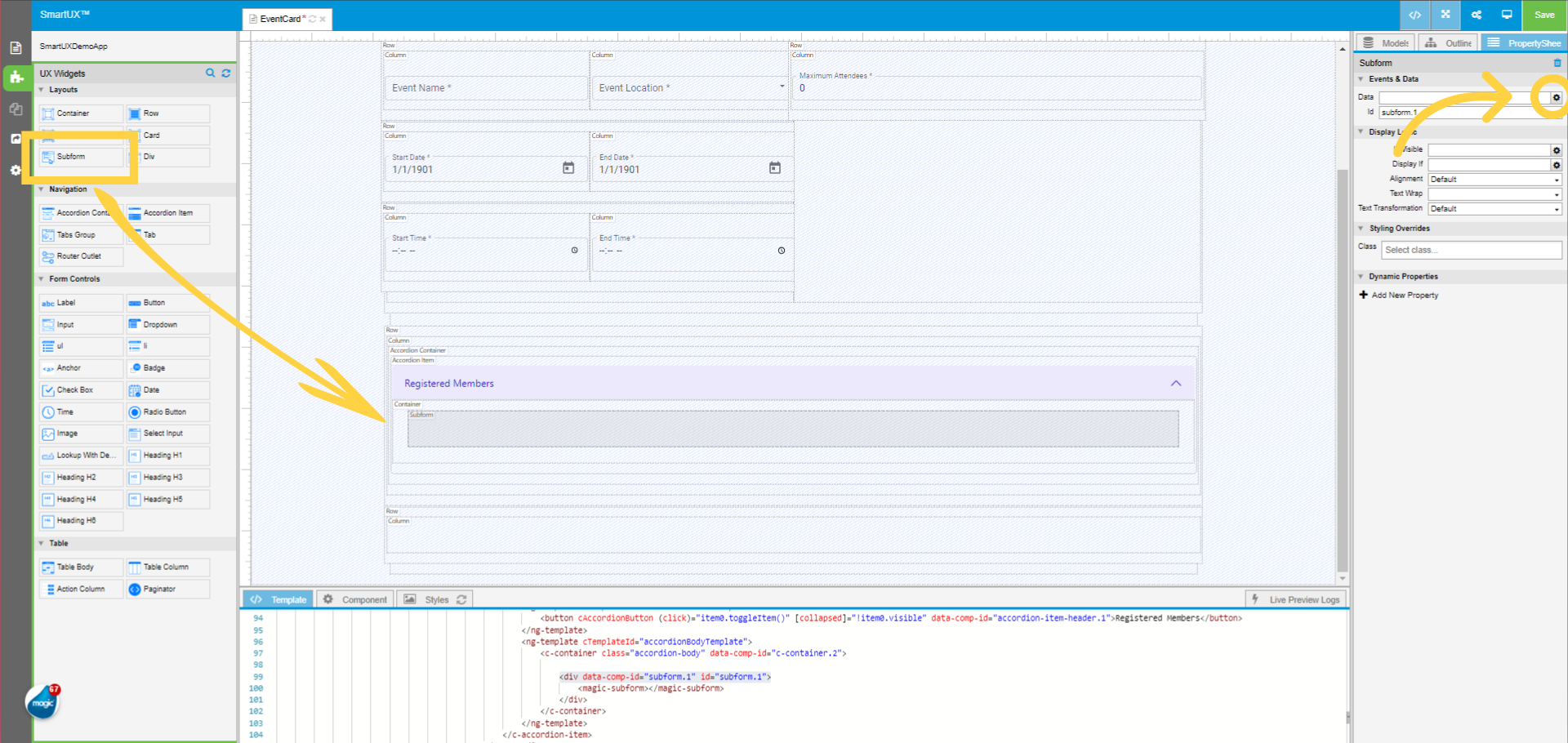
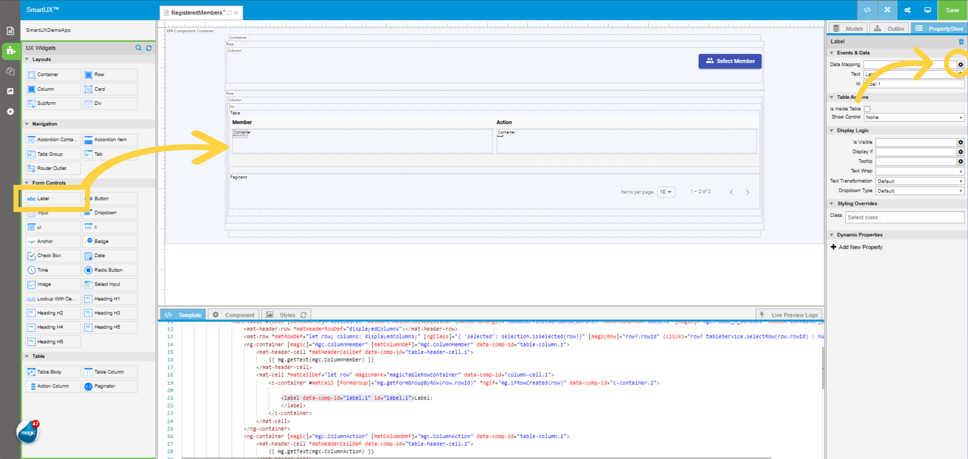
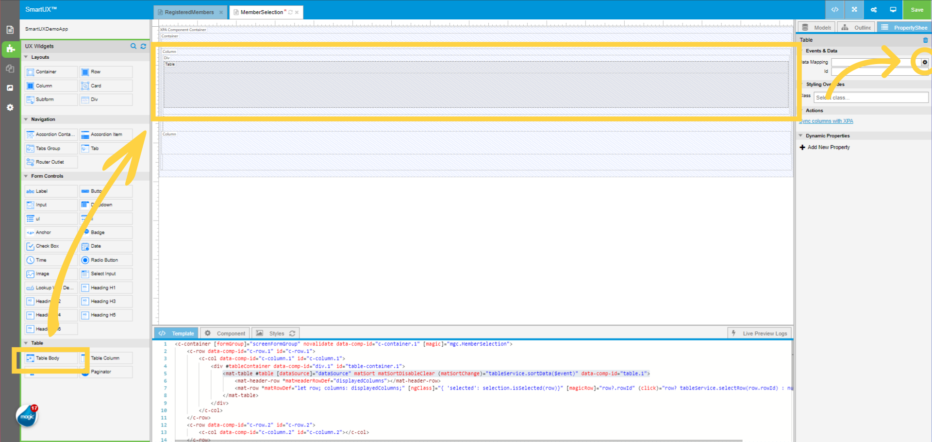
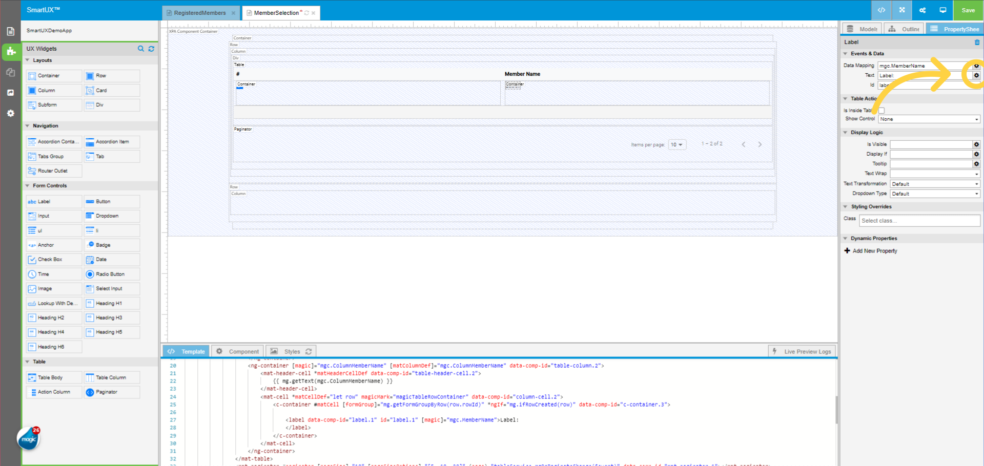
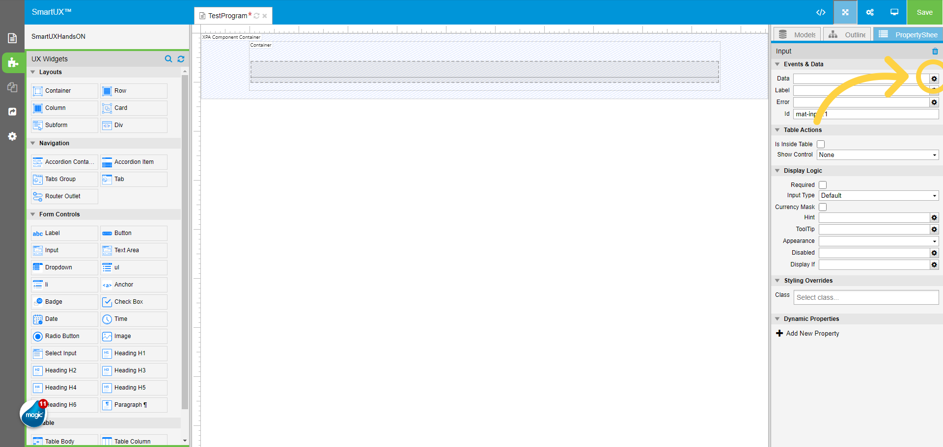
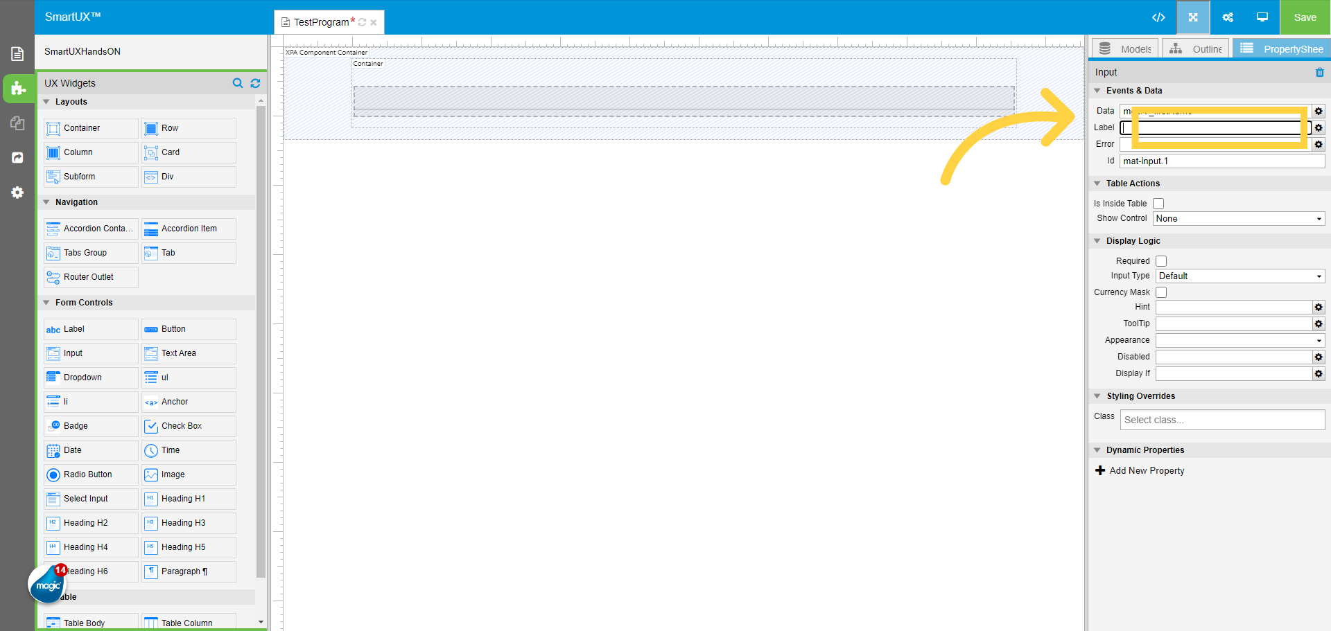
12. Data Mapping for the Input widget
On the Input widget property sheet map the Data using the gear icon.
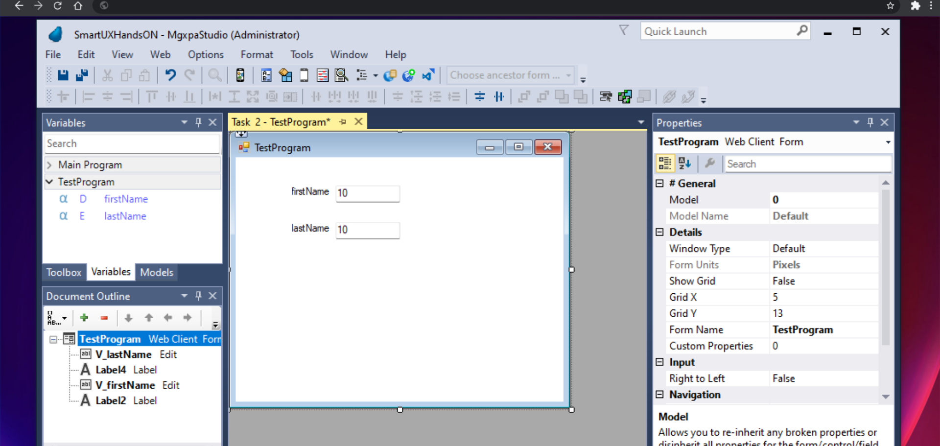
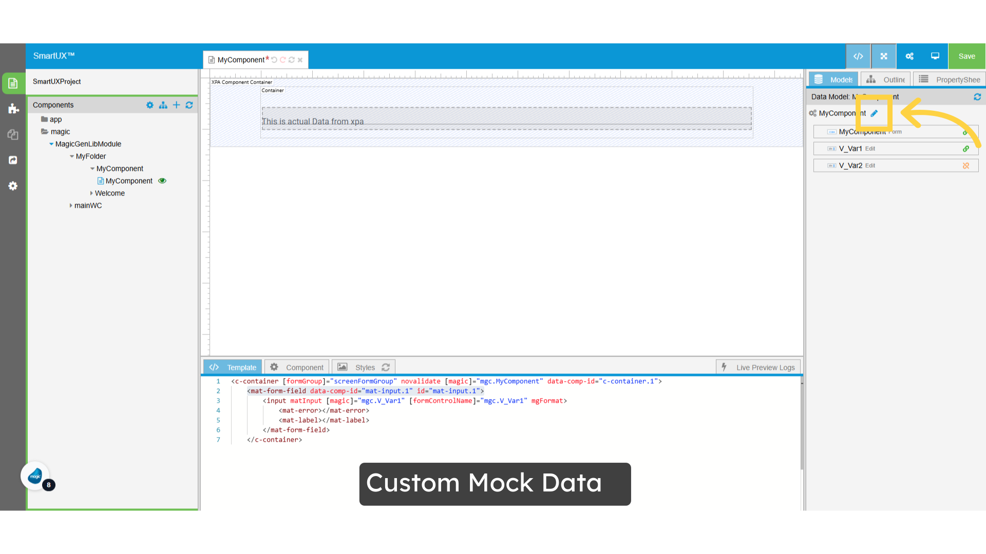
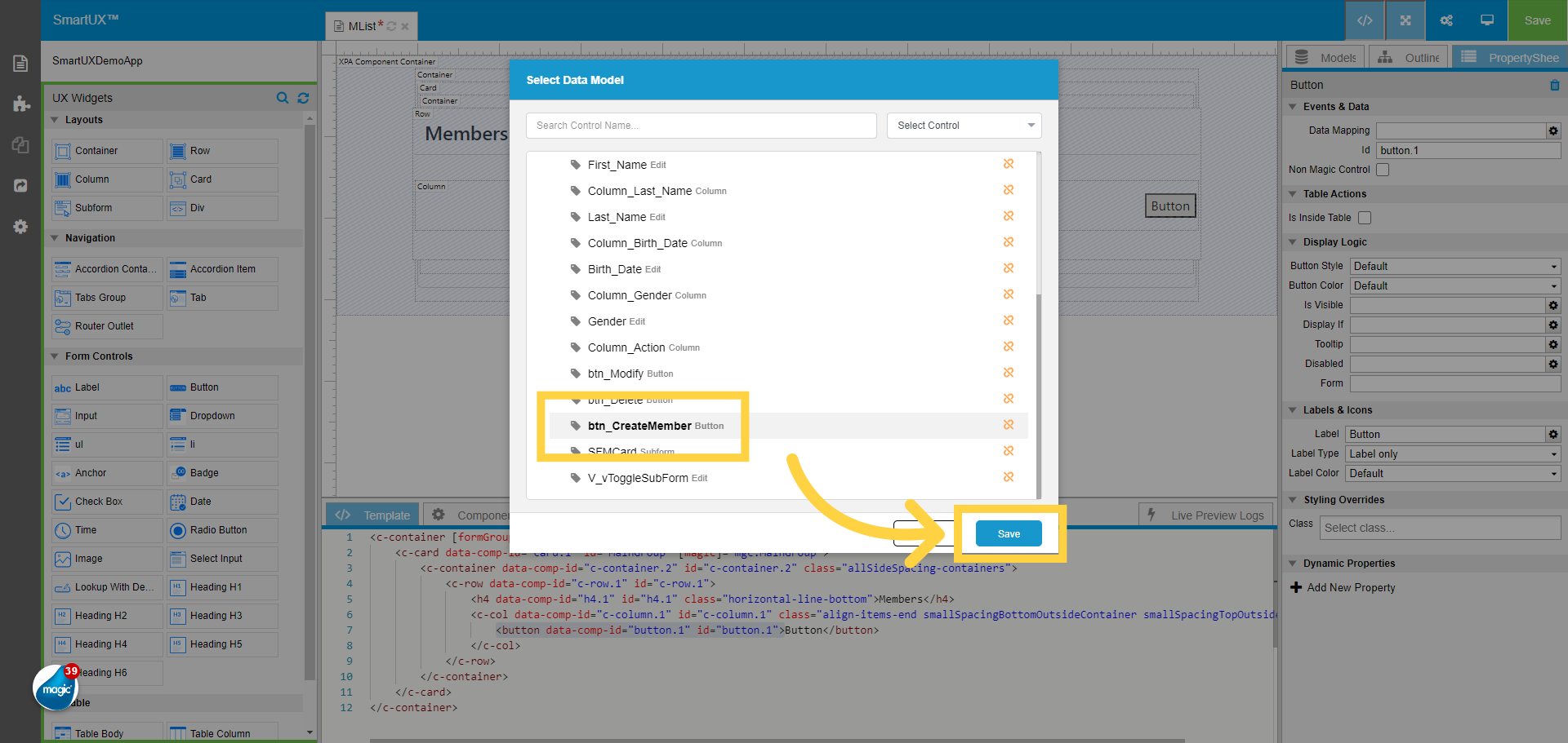
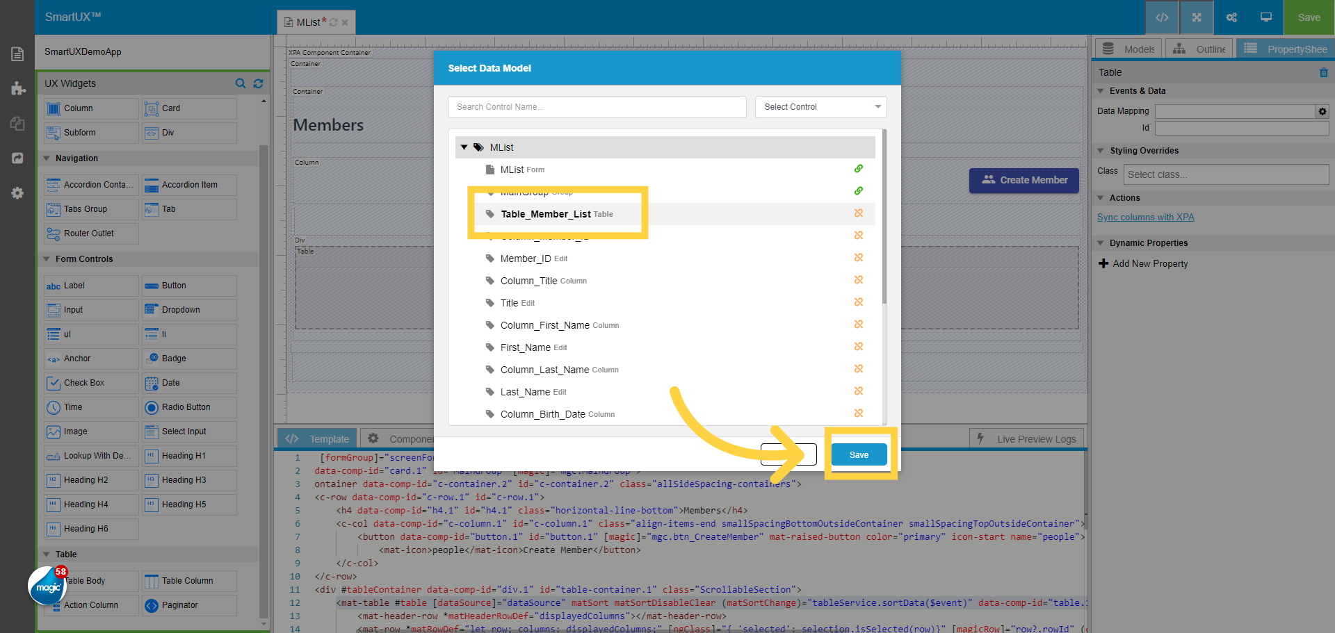
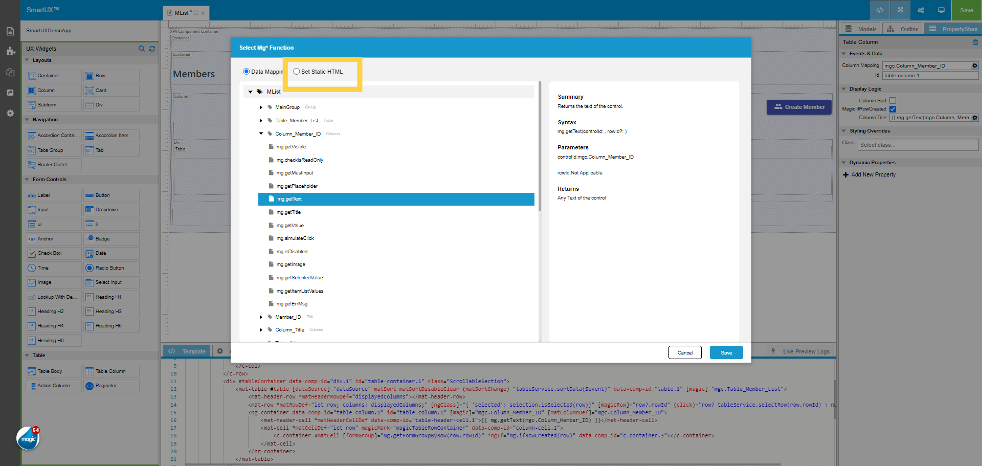
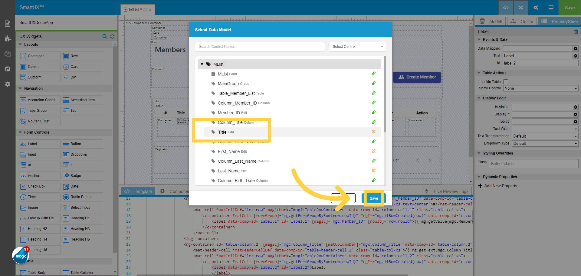
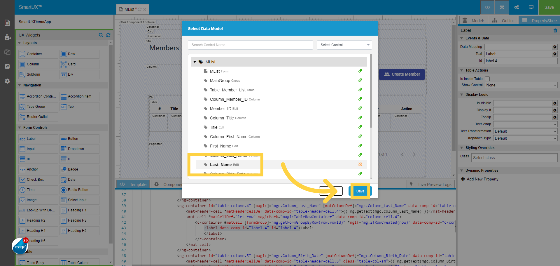
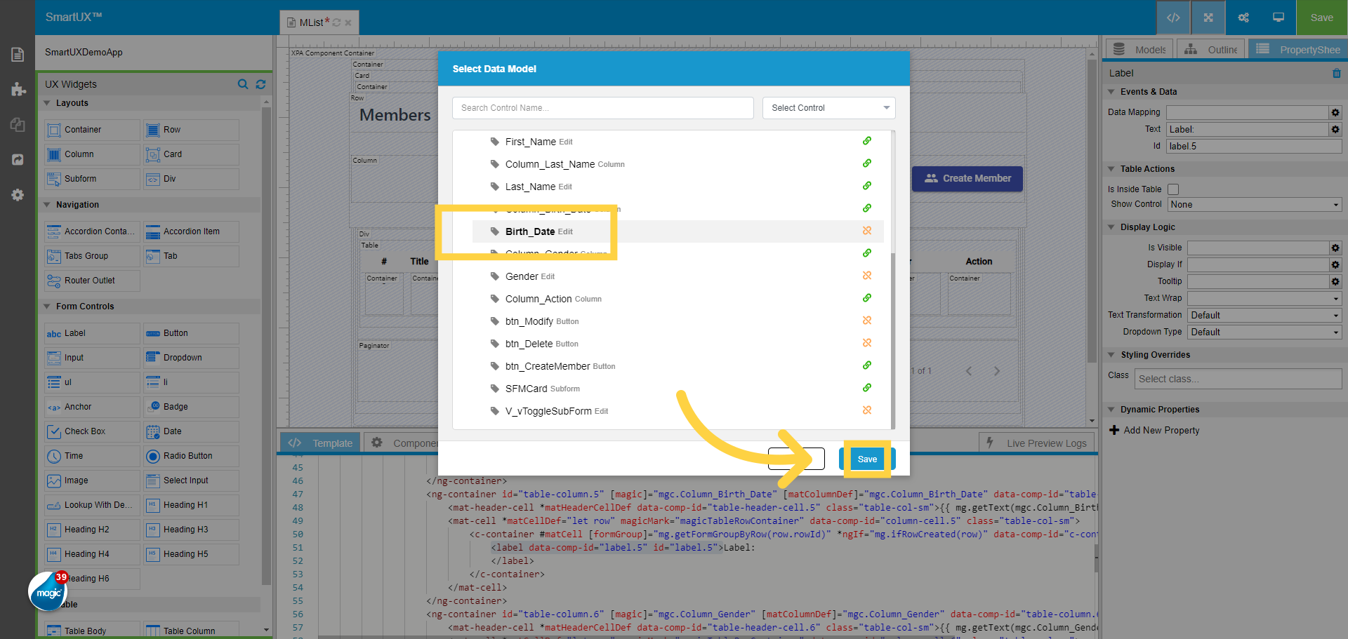
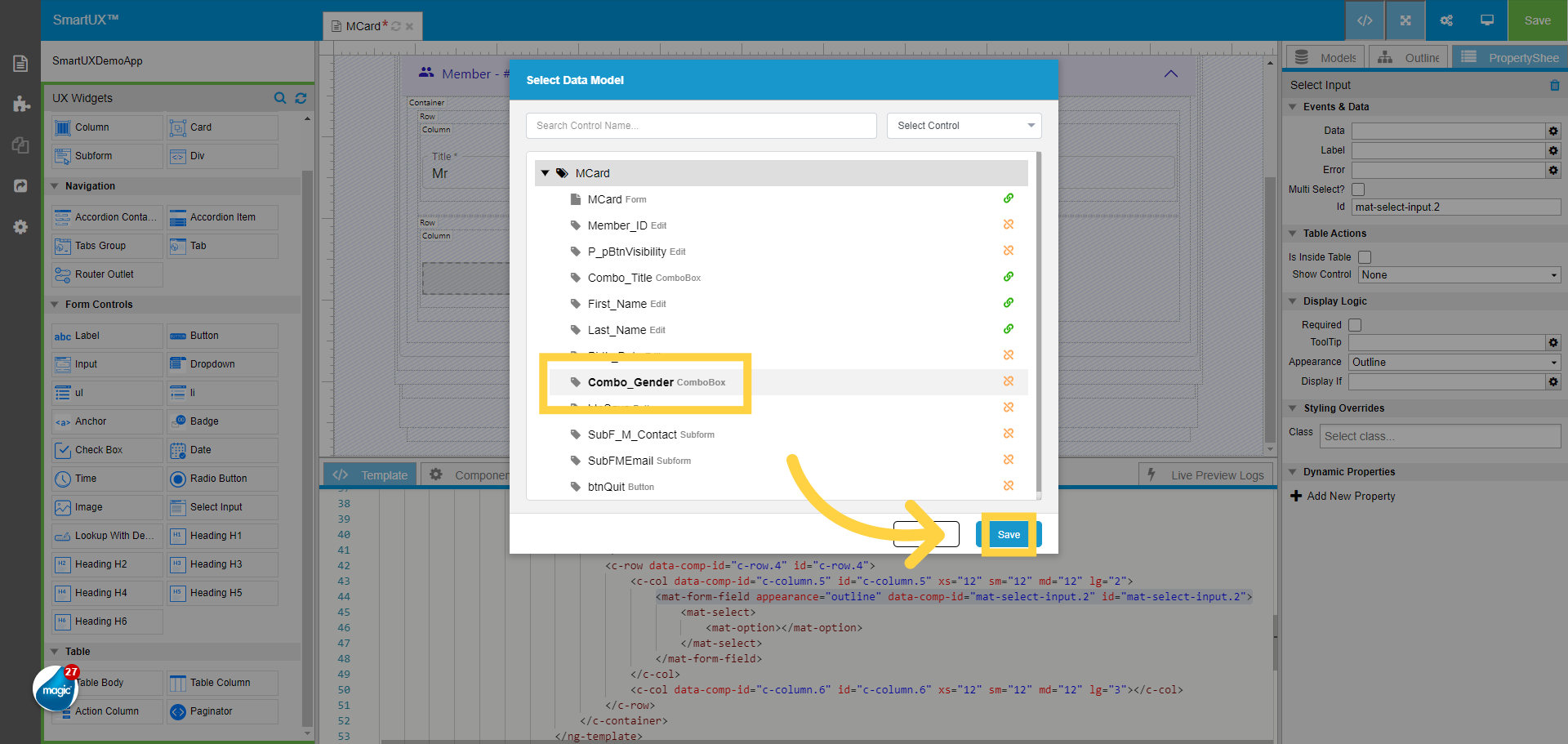
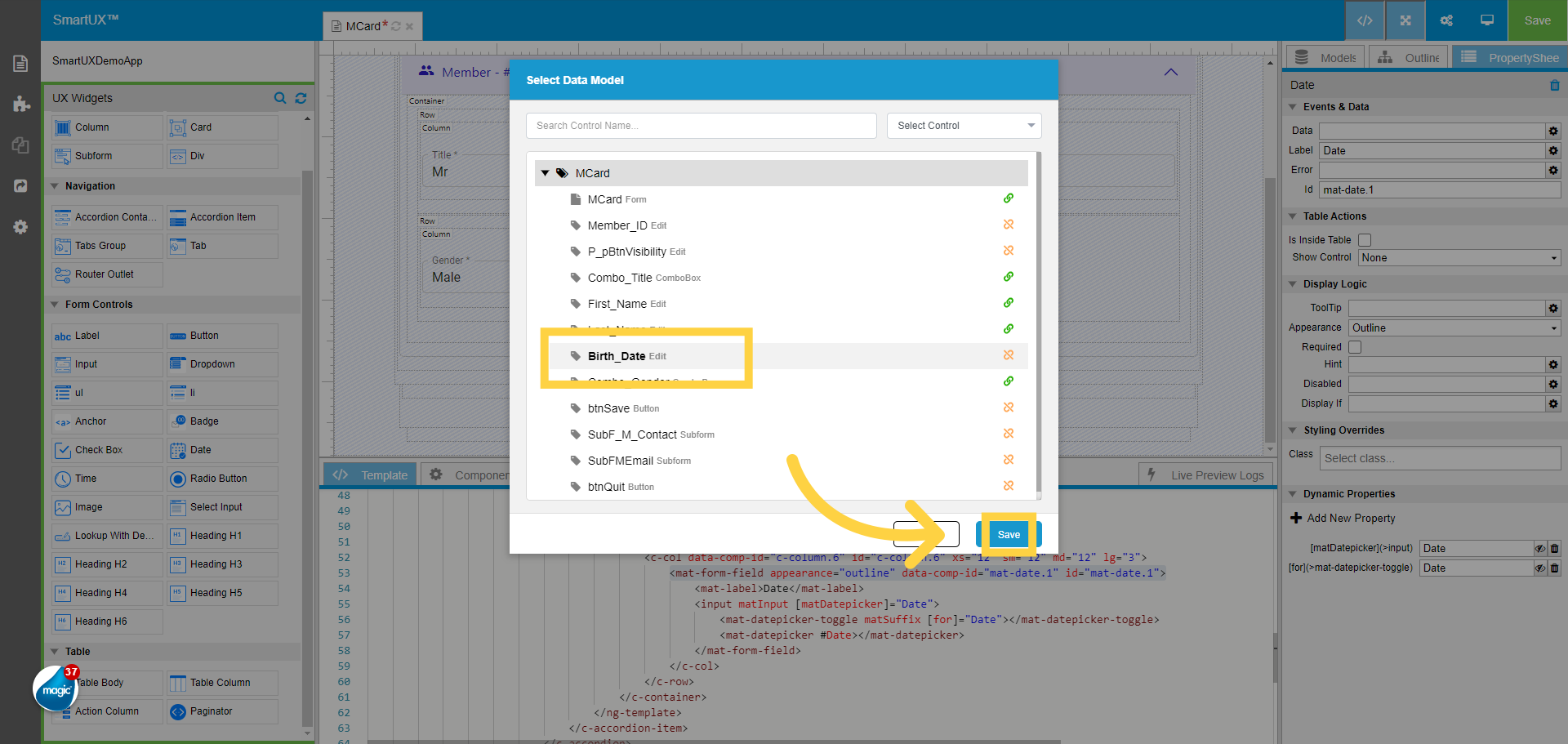
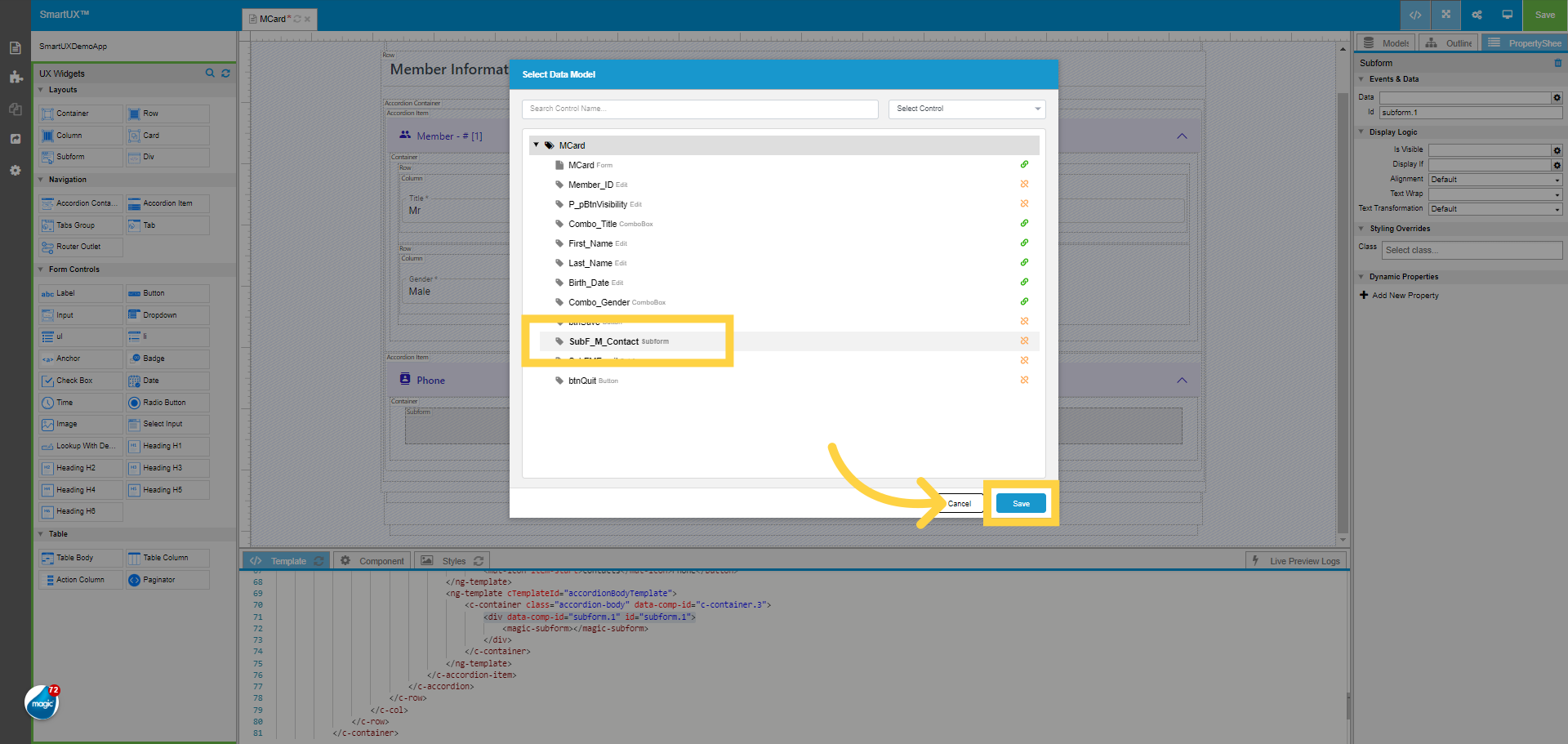
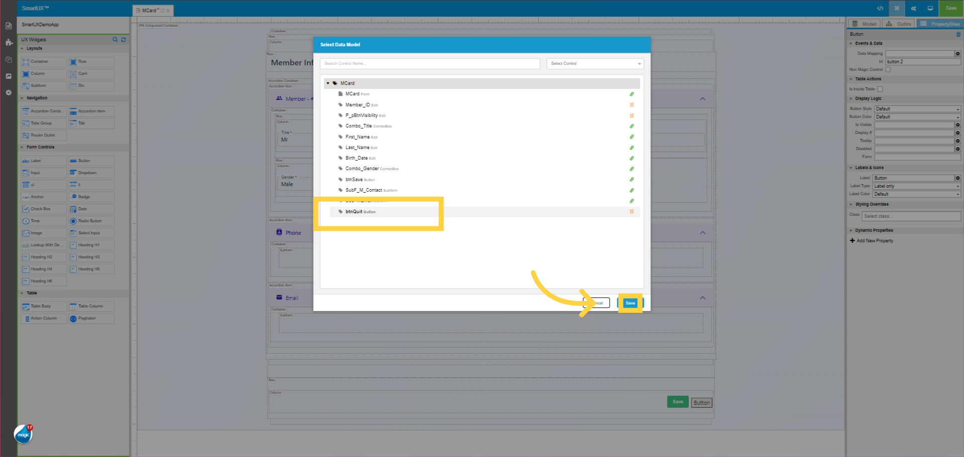
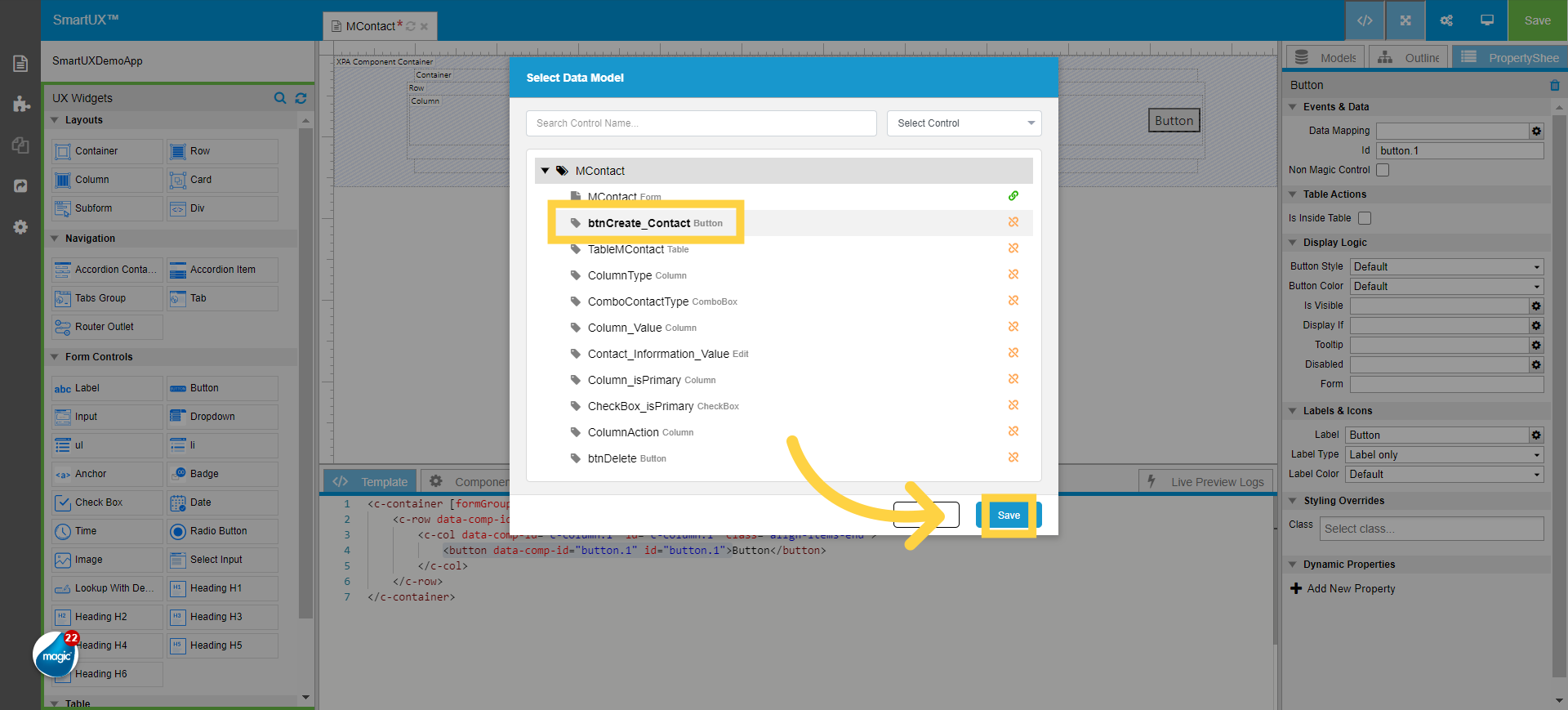
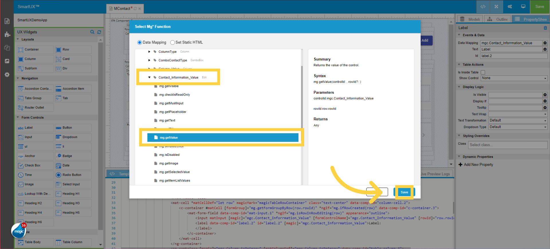
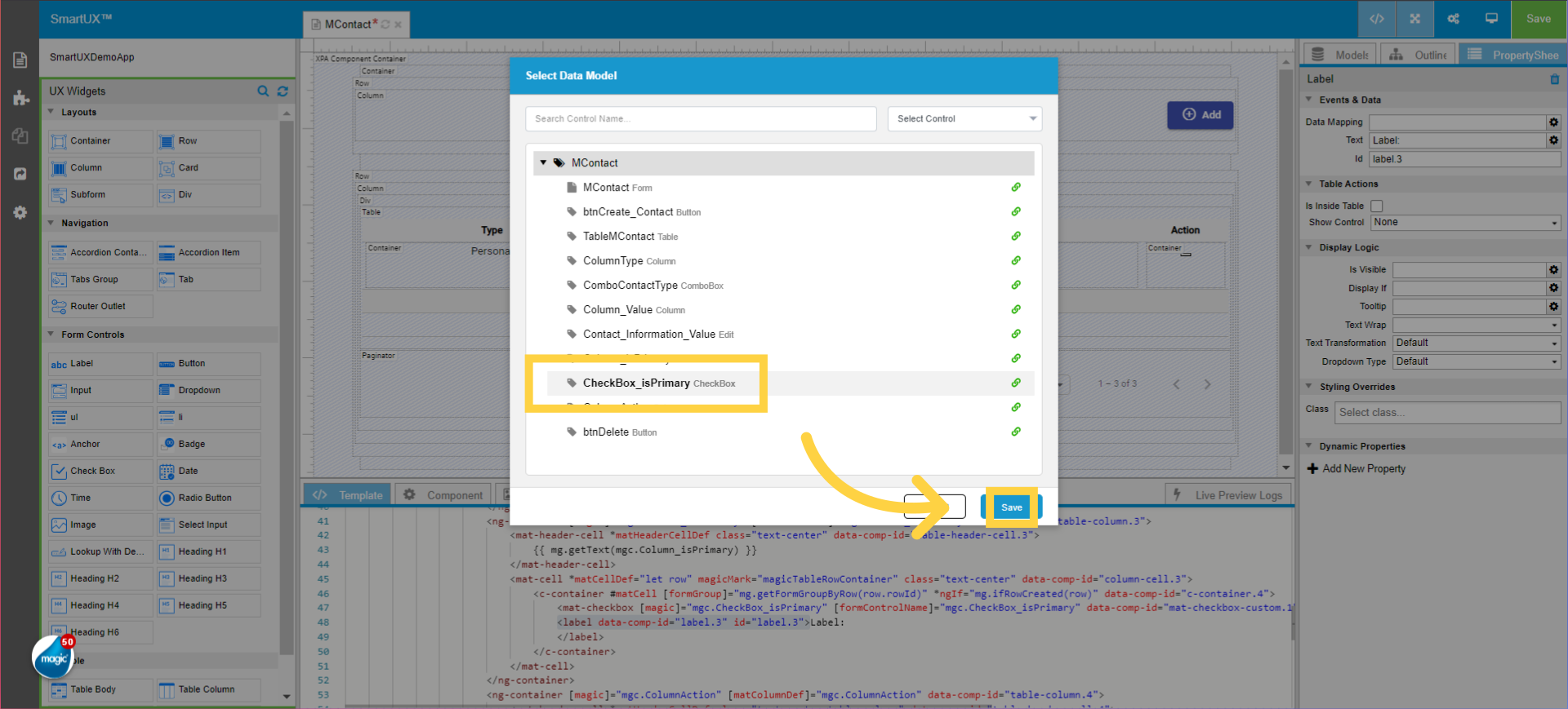
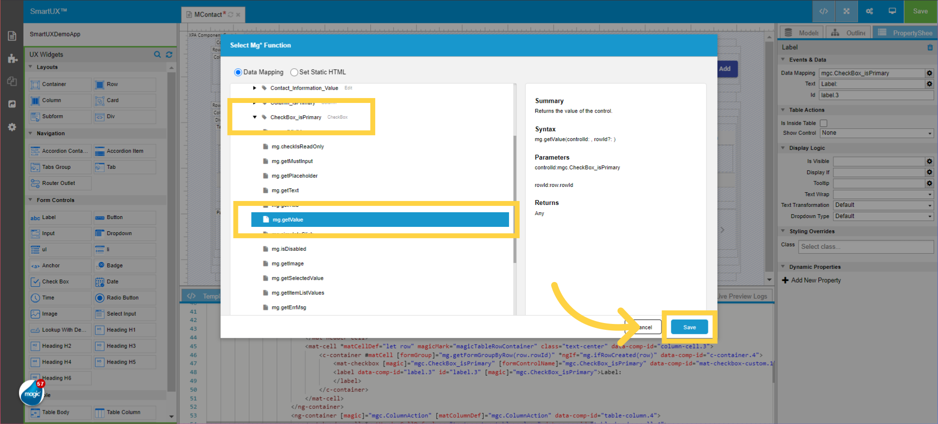
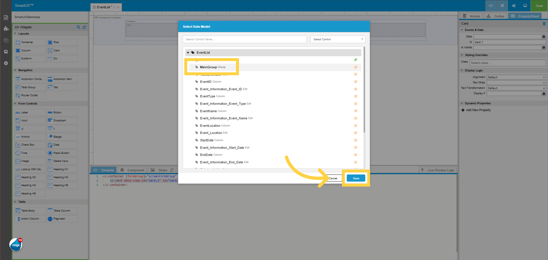
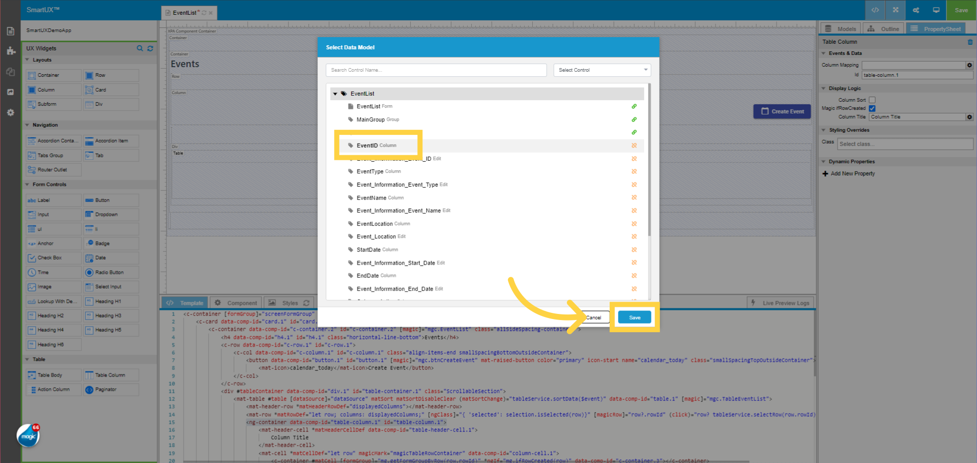
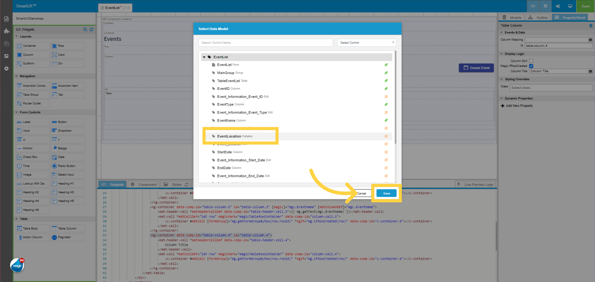
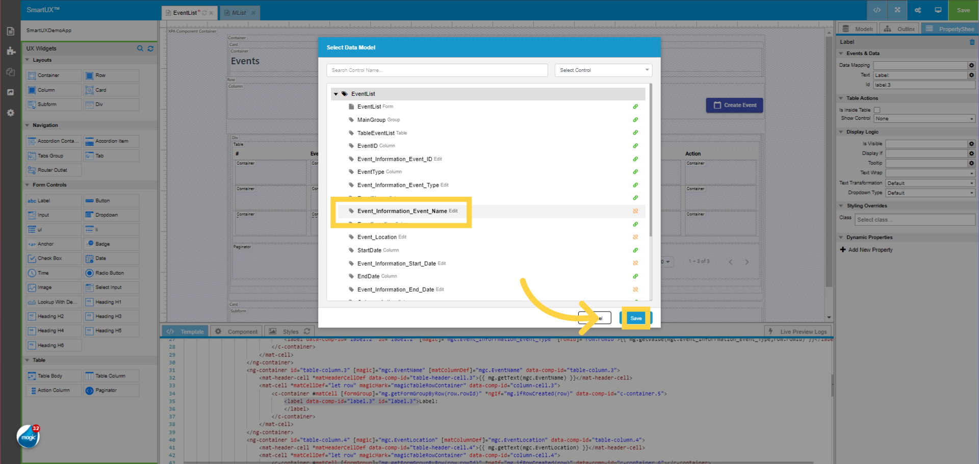
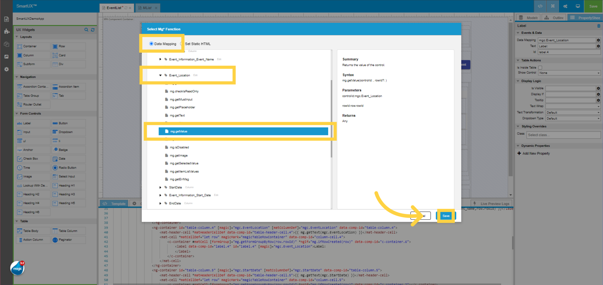
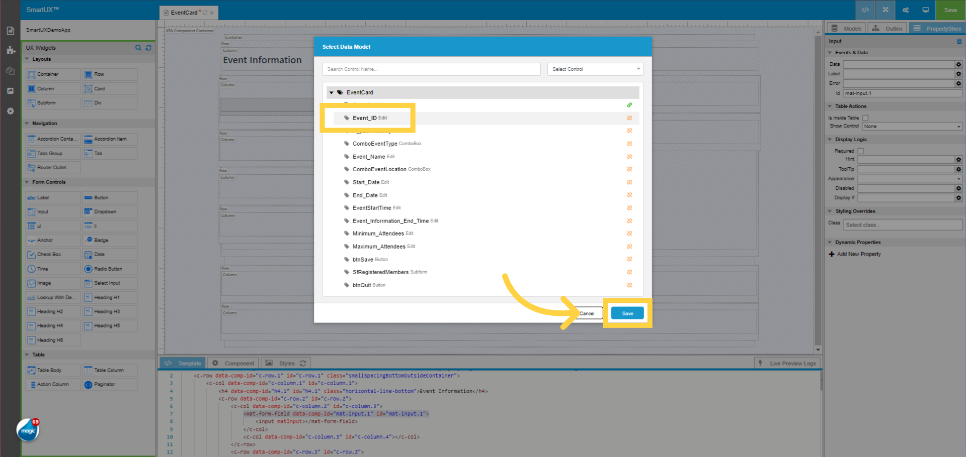
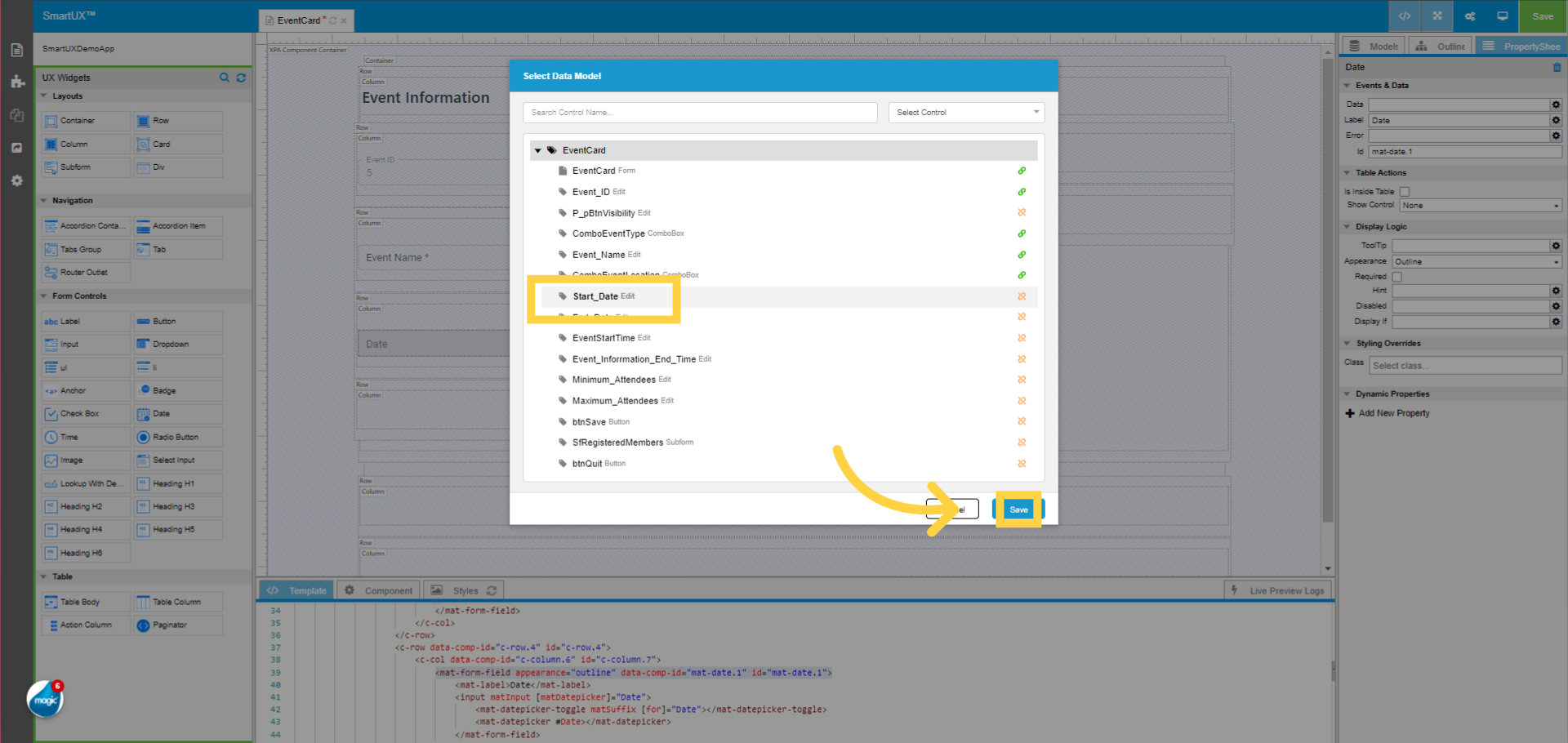
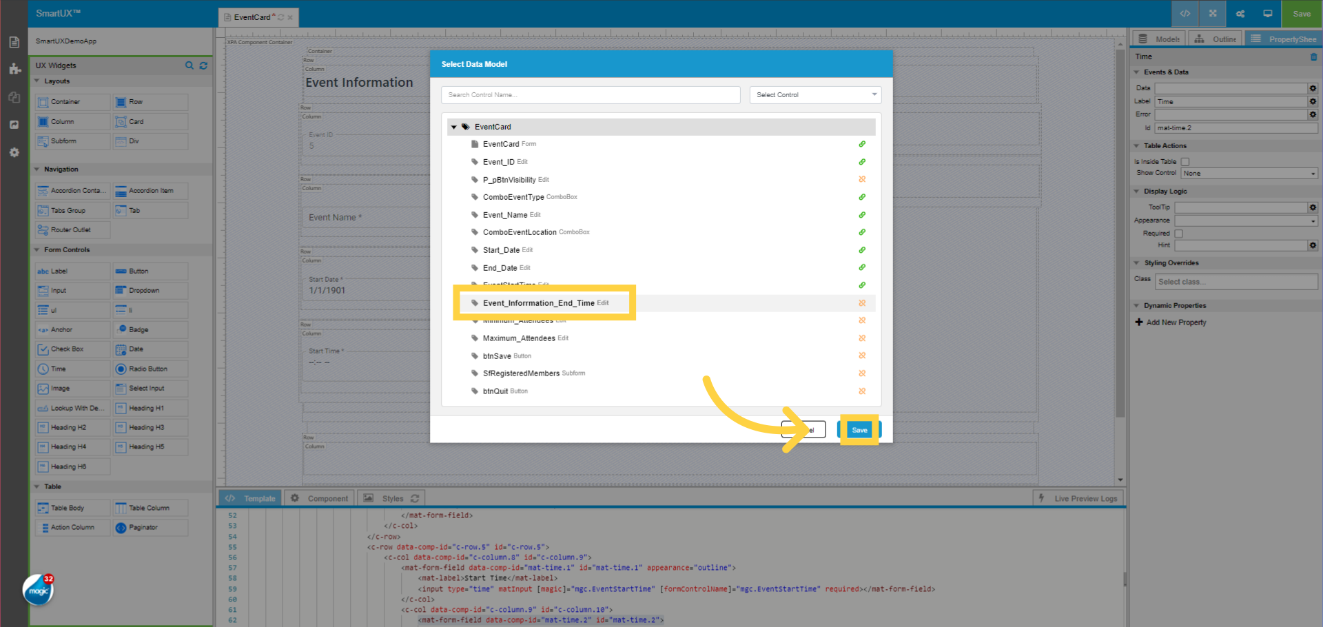
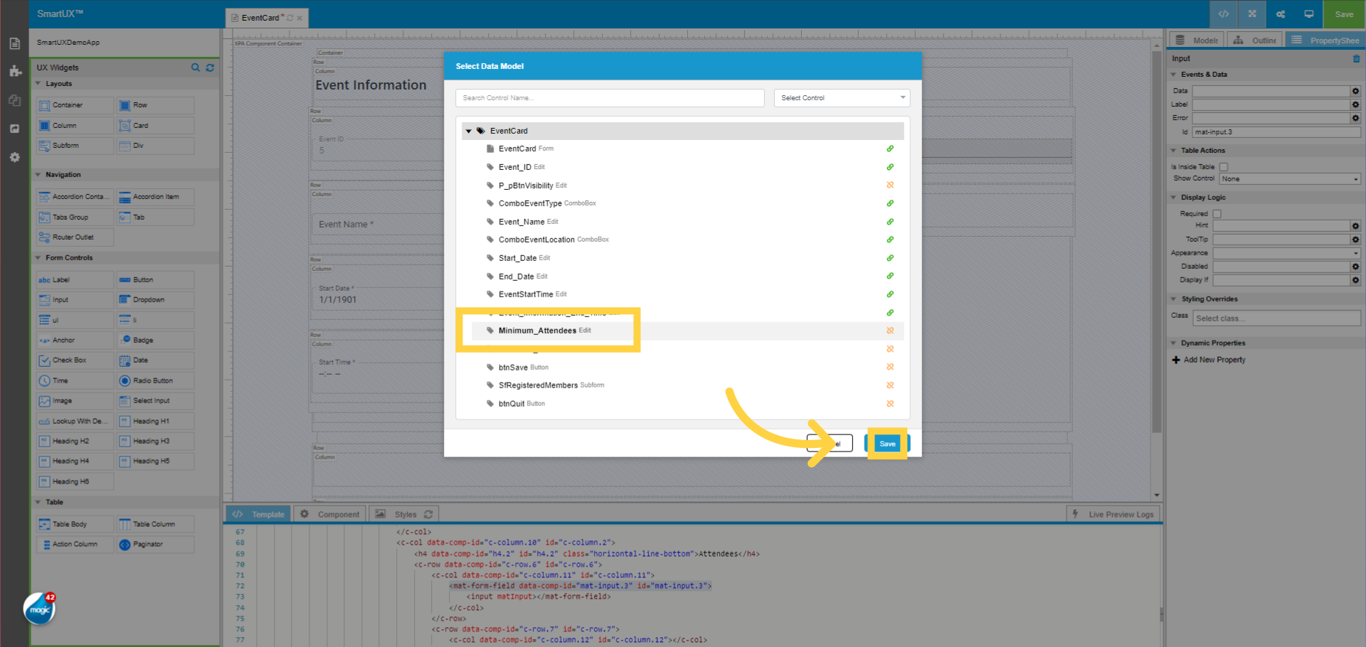
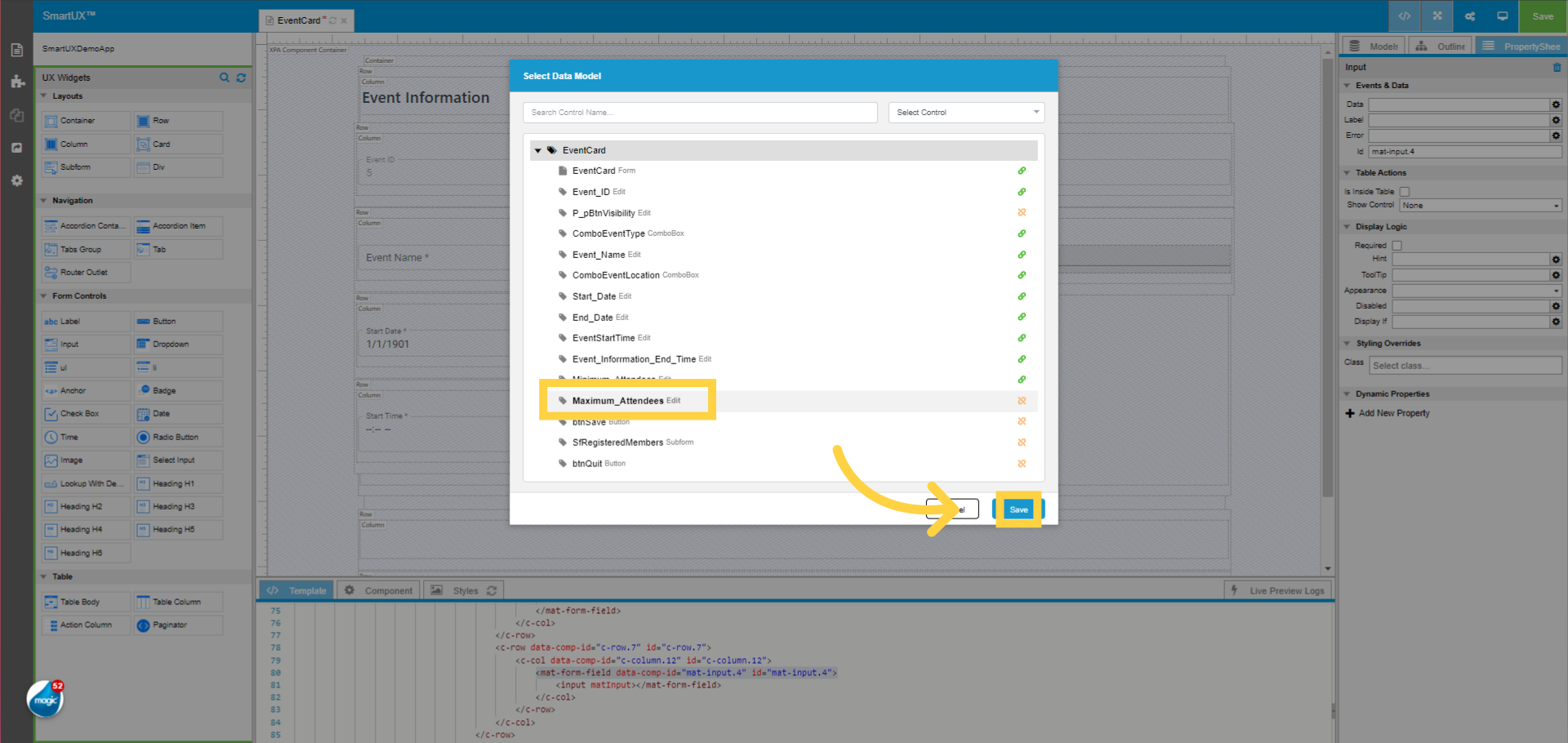
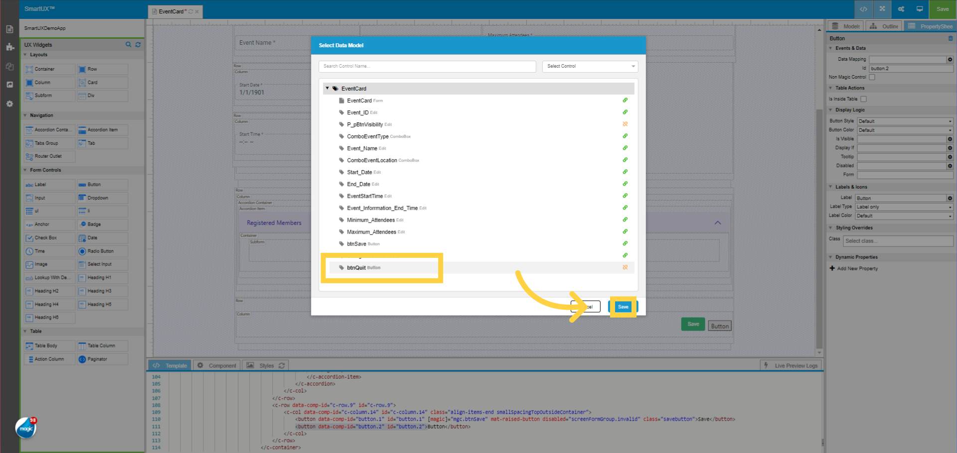
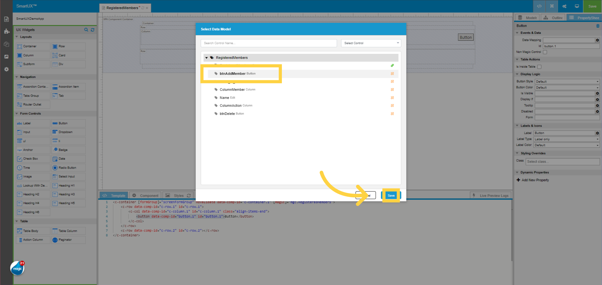
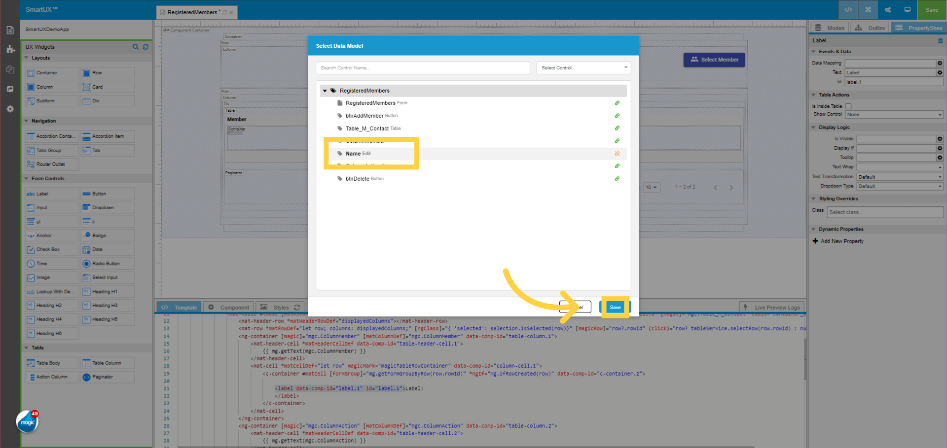
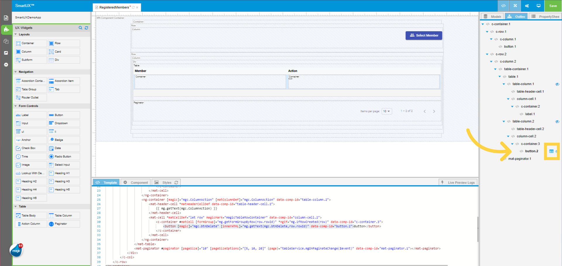
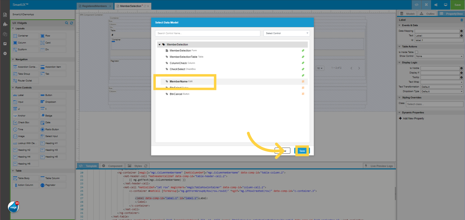
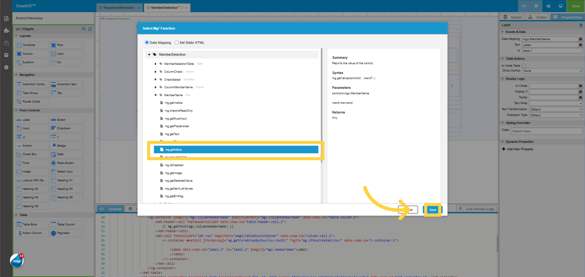
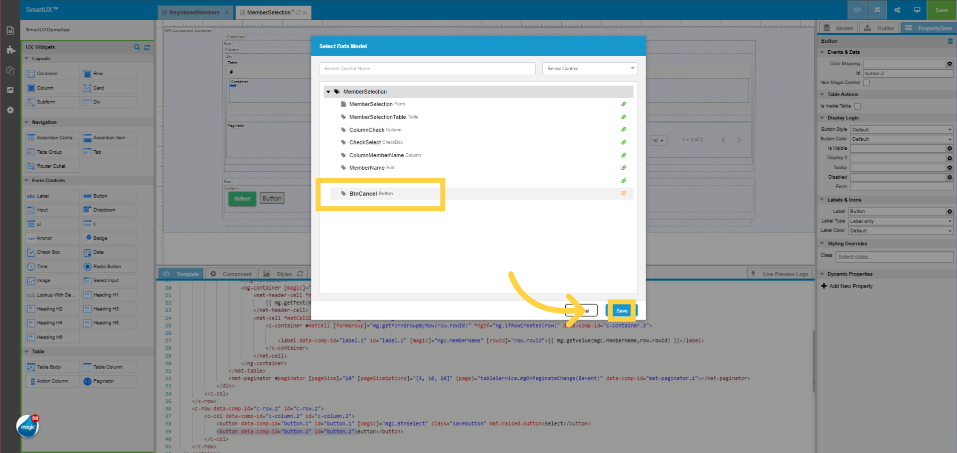
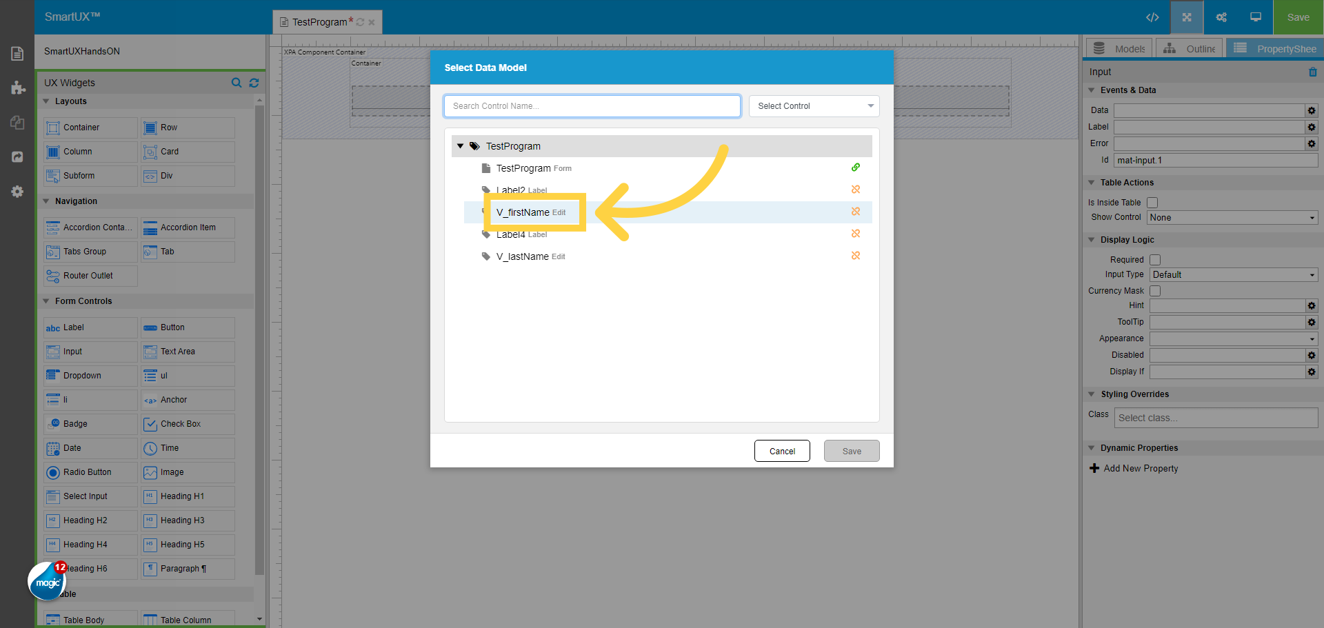
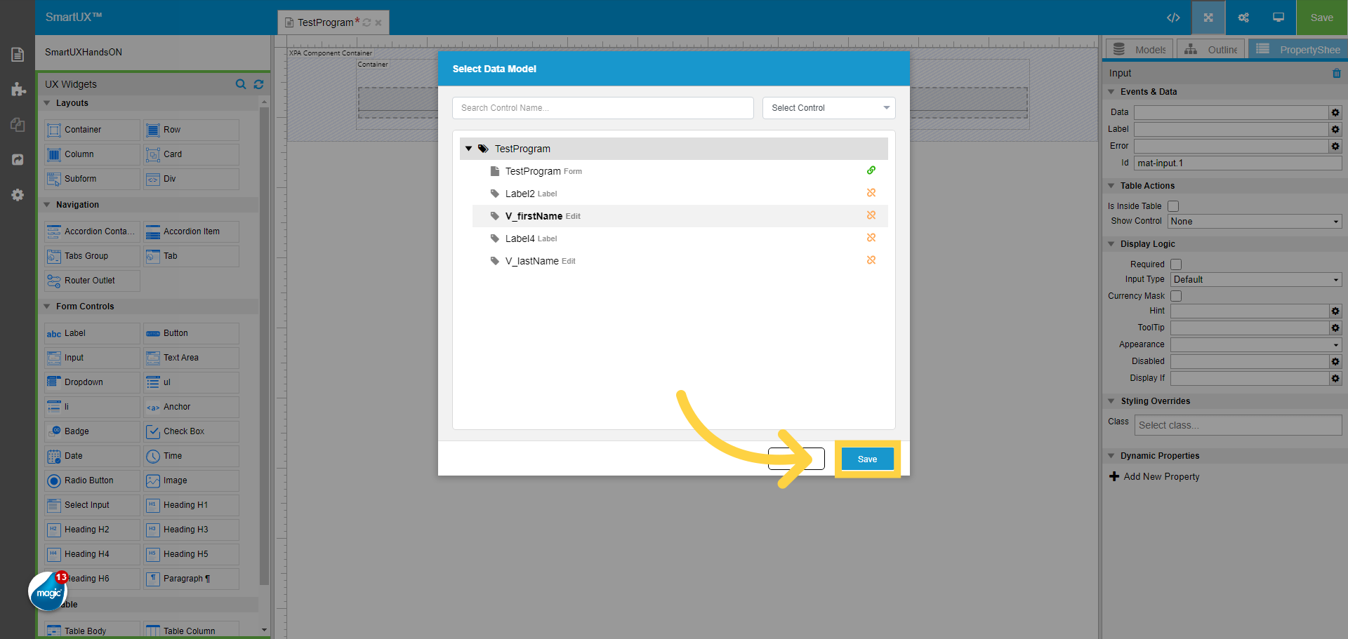
13. Click “V_firstName”
Select the Edit control name from the model list here the “V_firstName”.
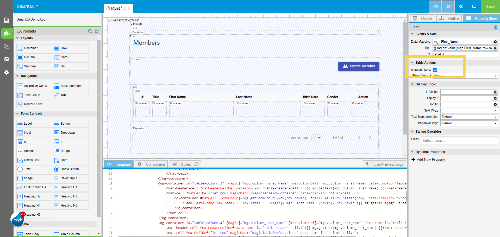
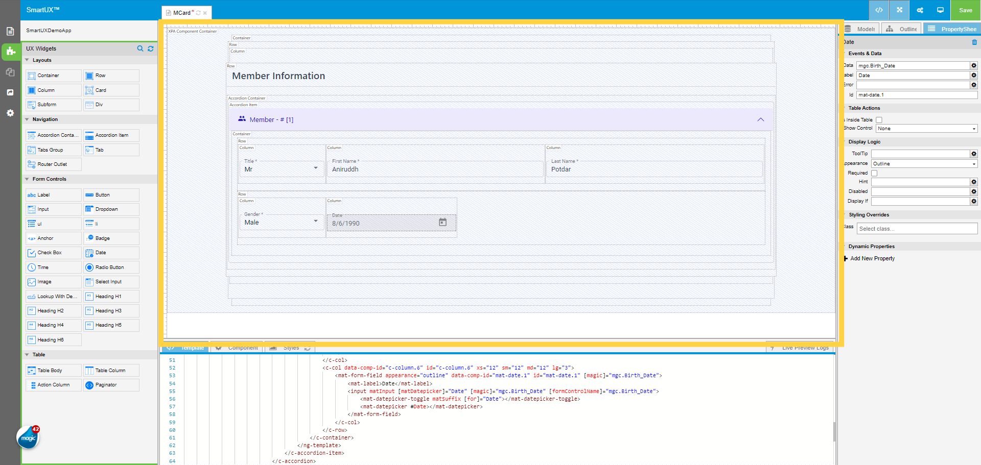
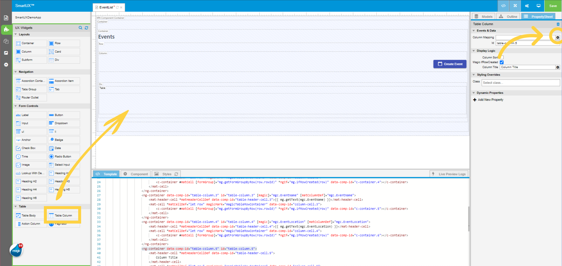
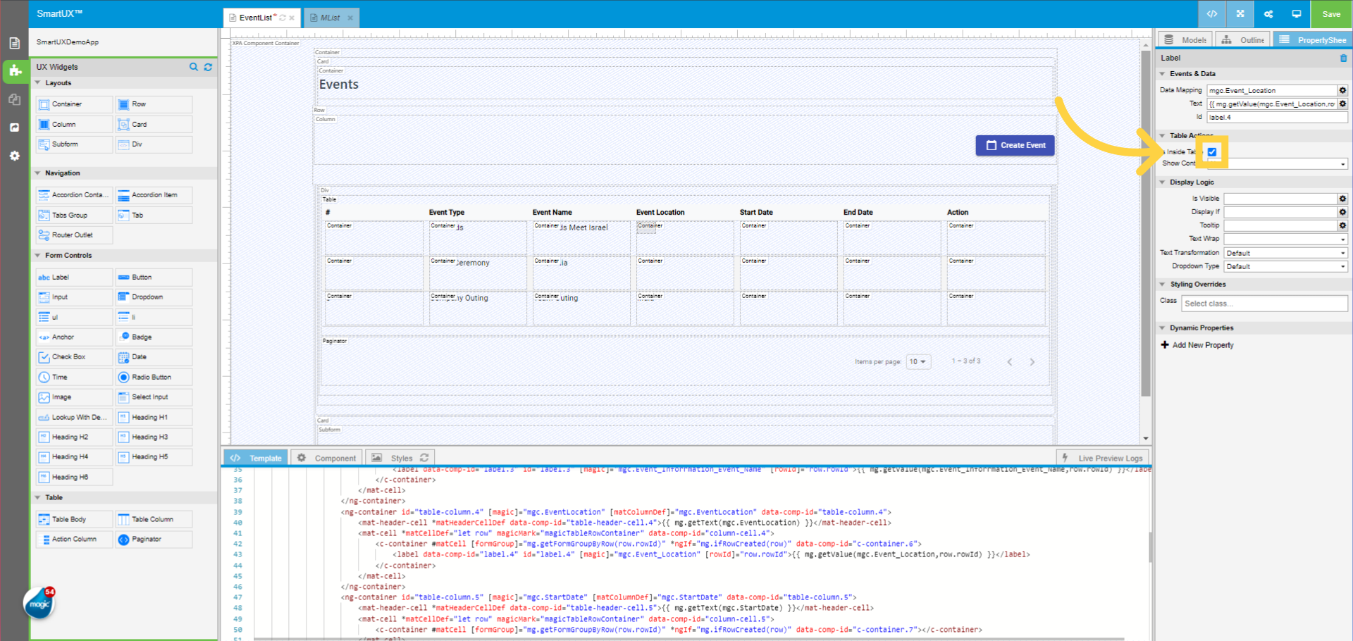
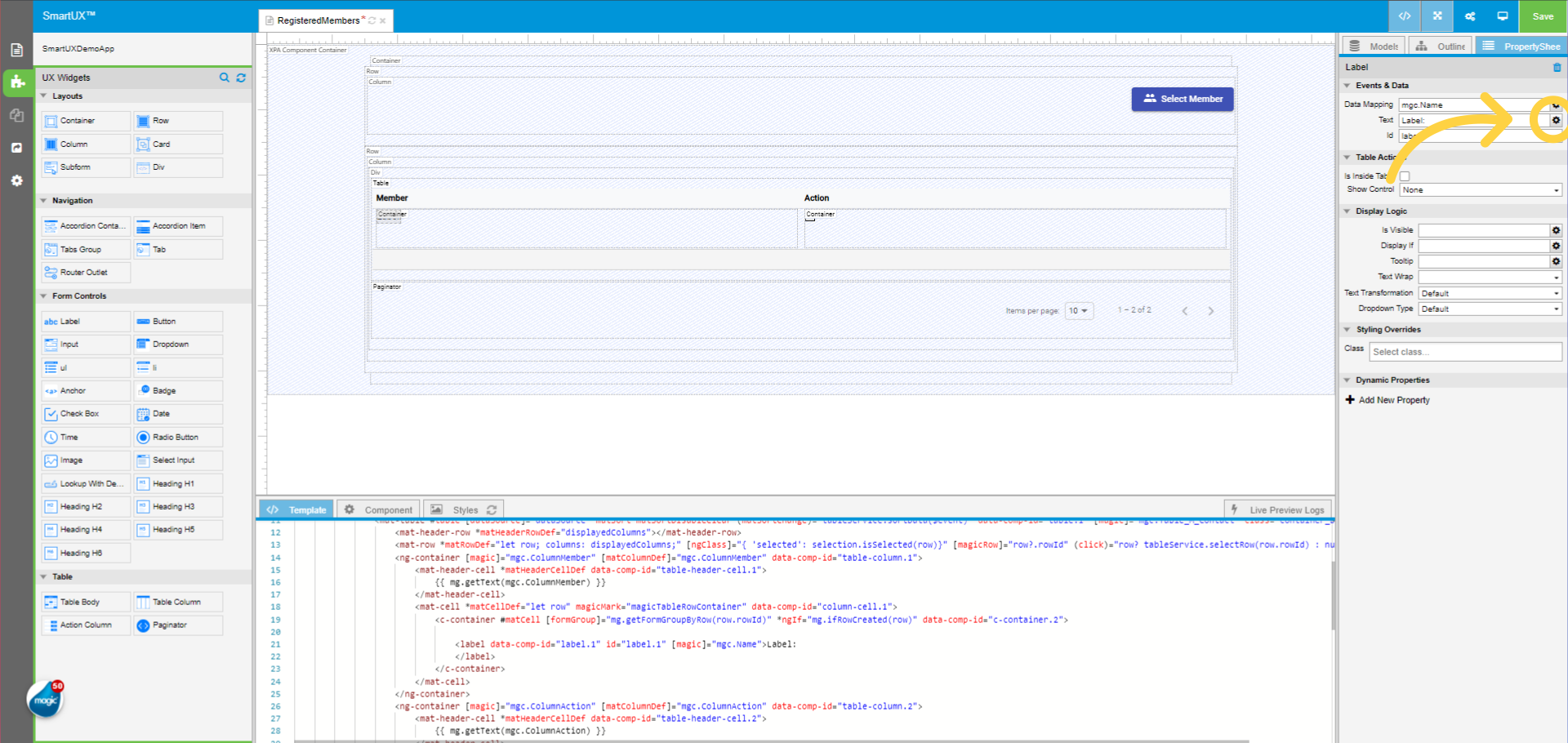
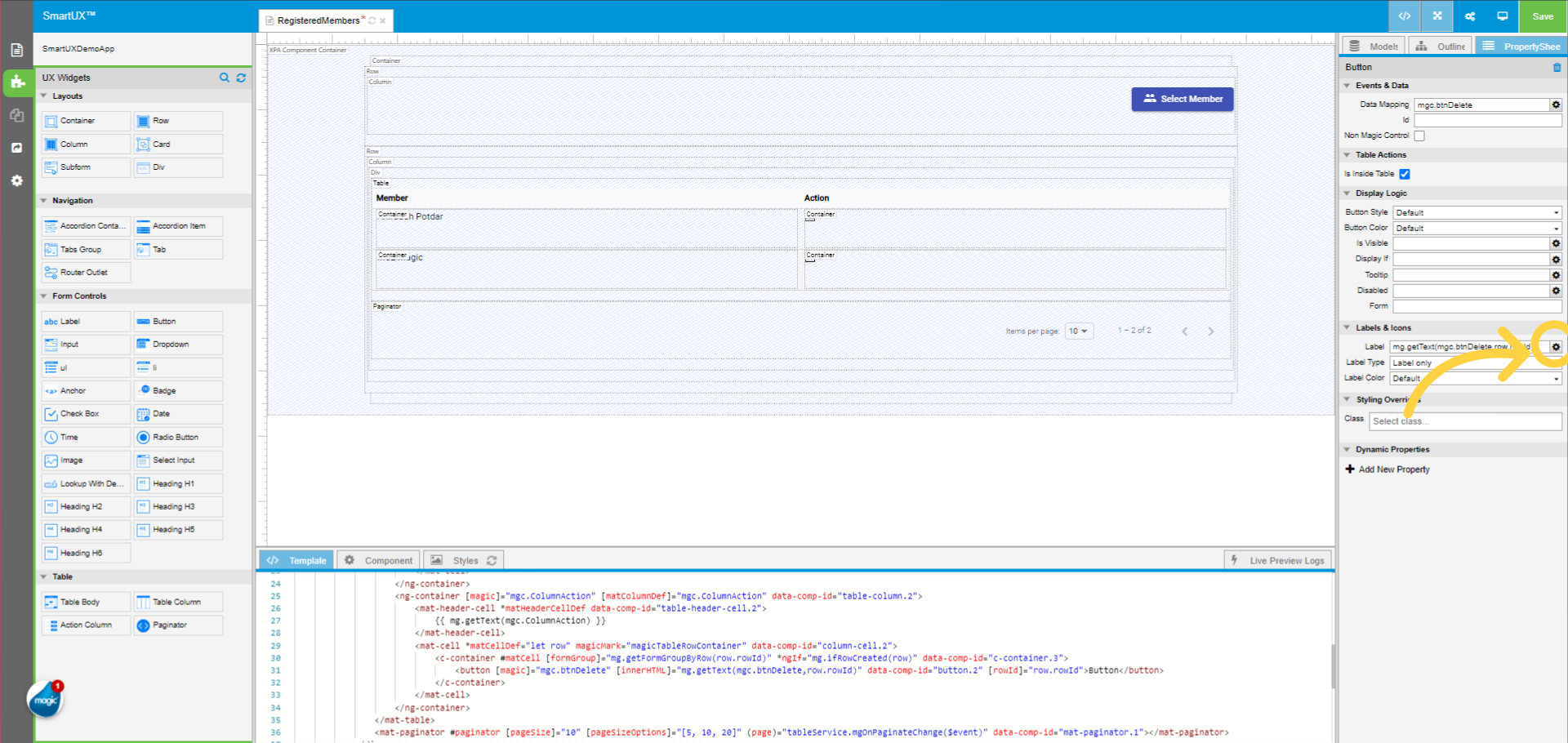
14. Save the selected Model
Click Save to Save the selected model.
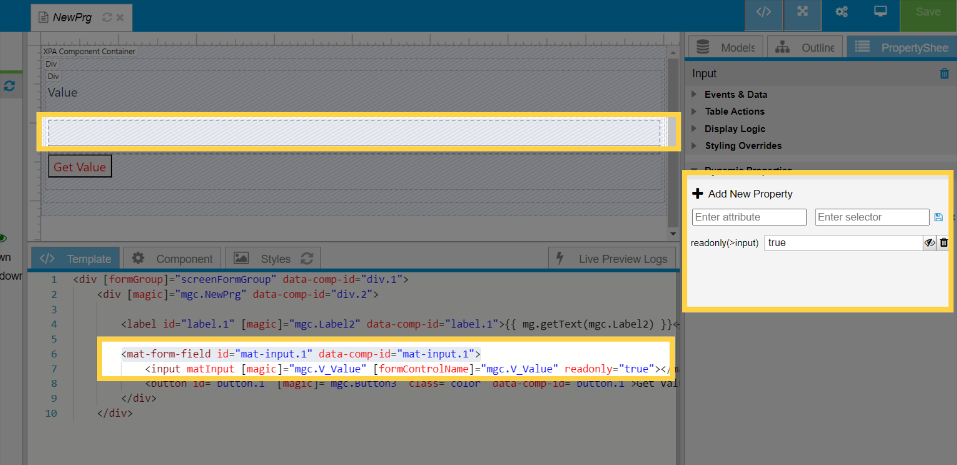
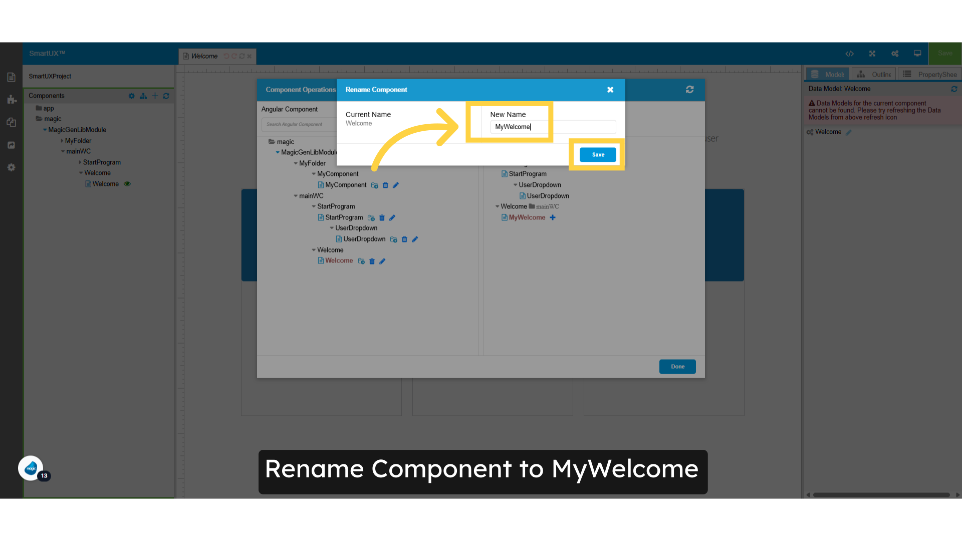
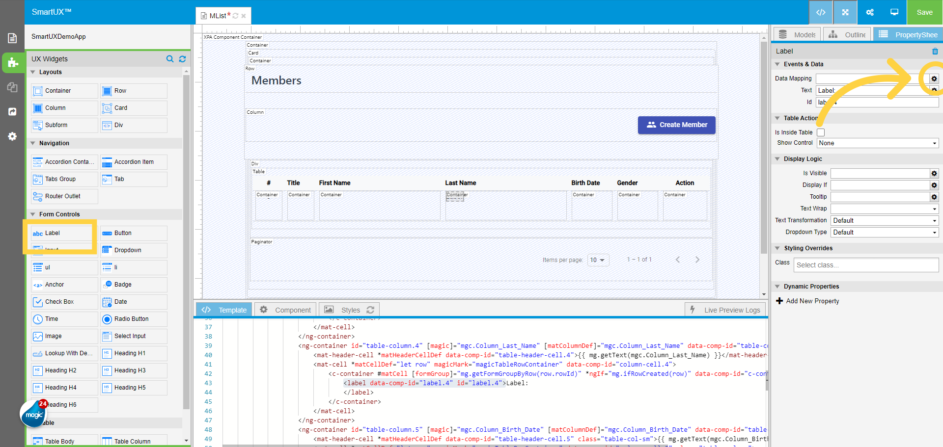
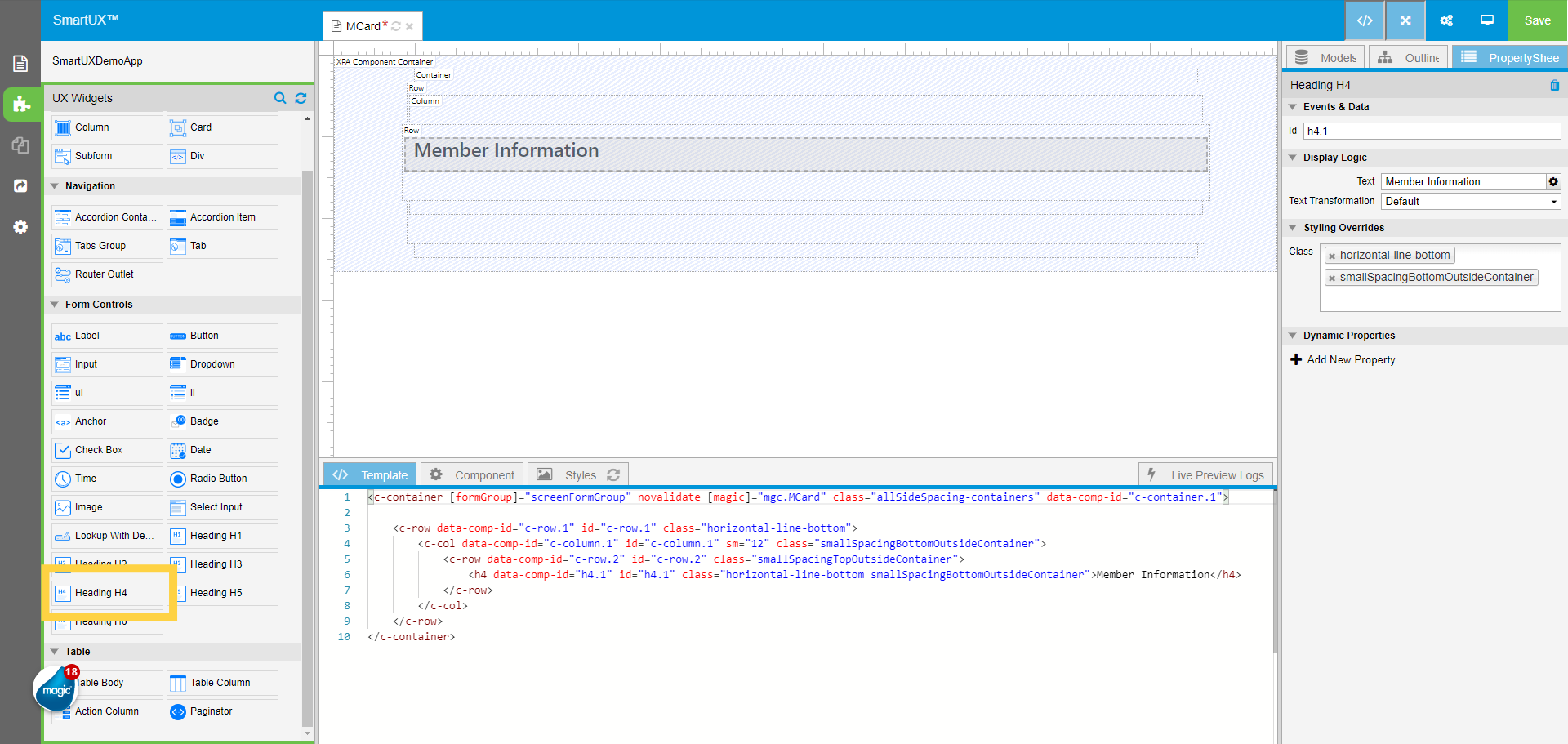
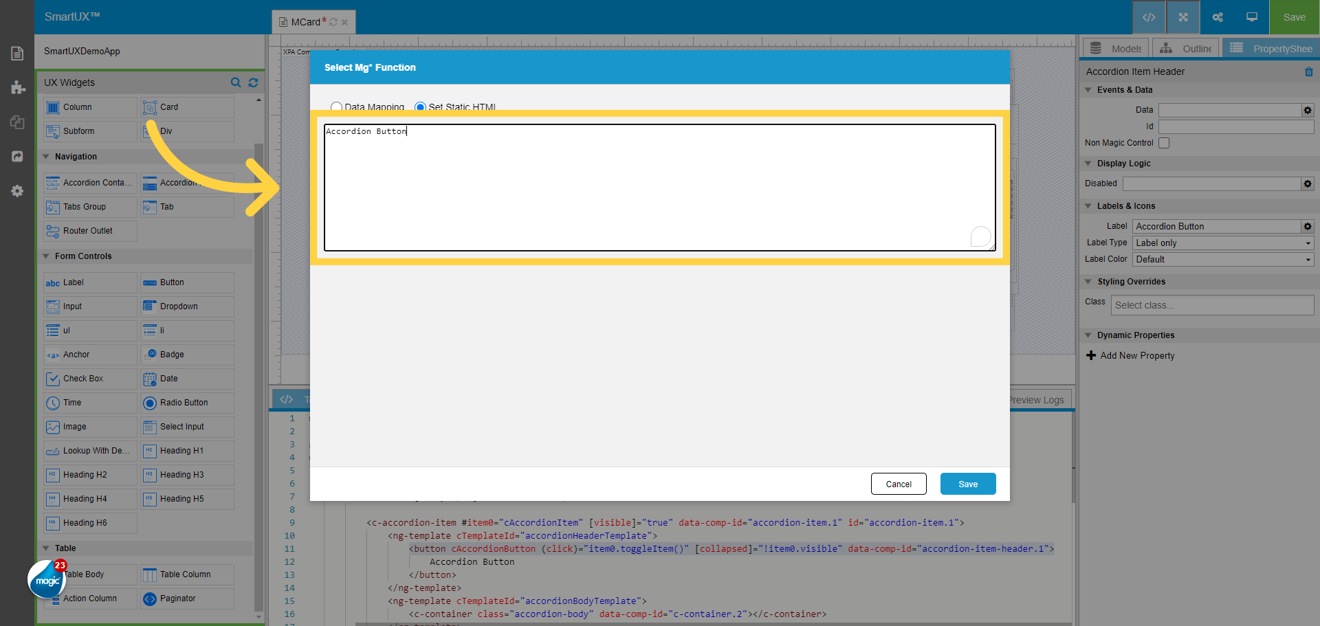
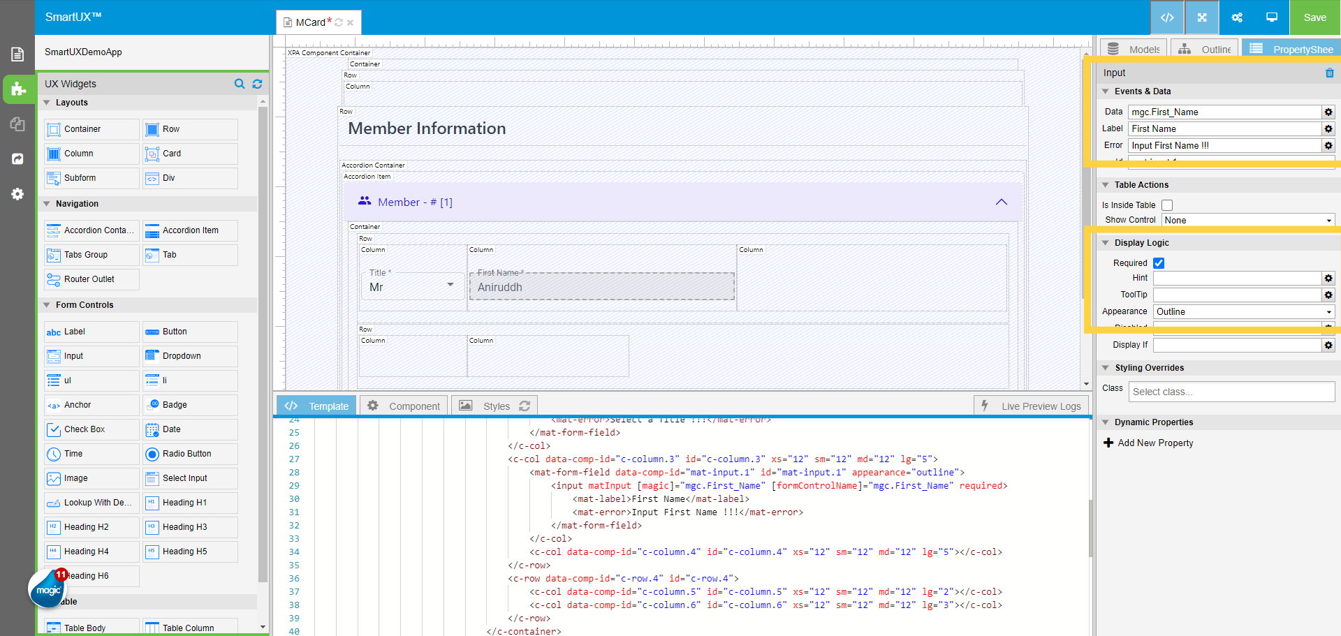
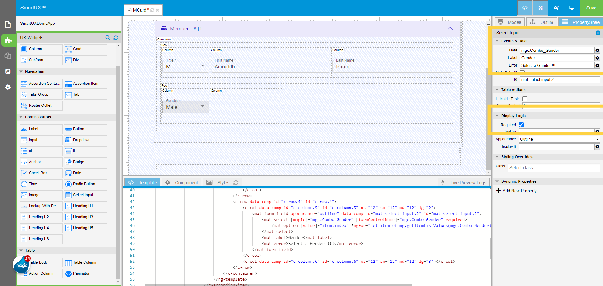
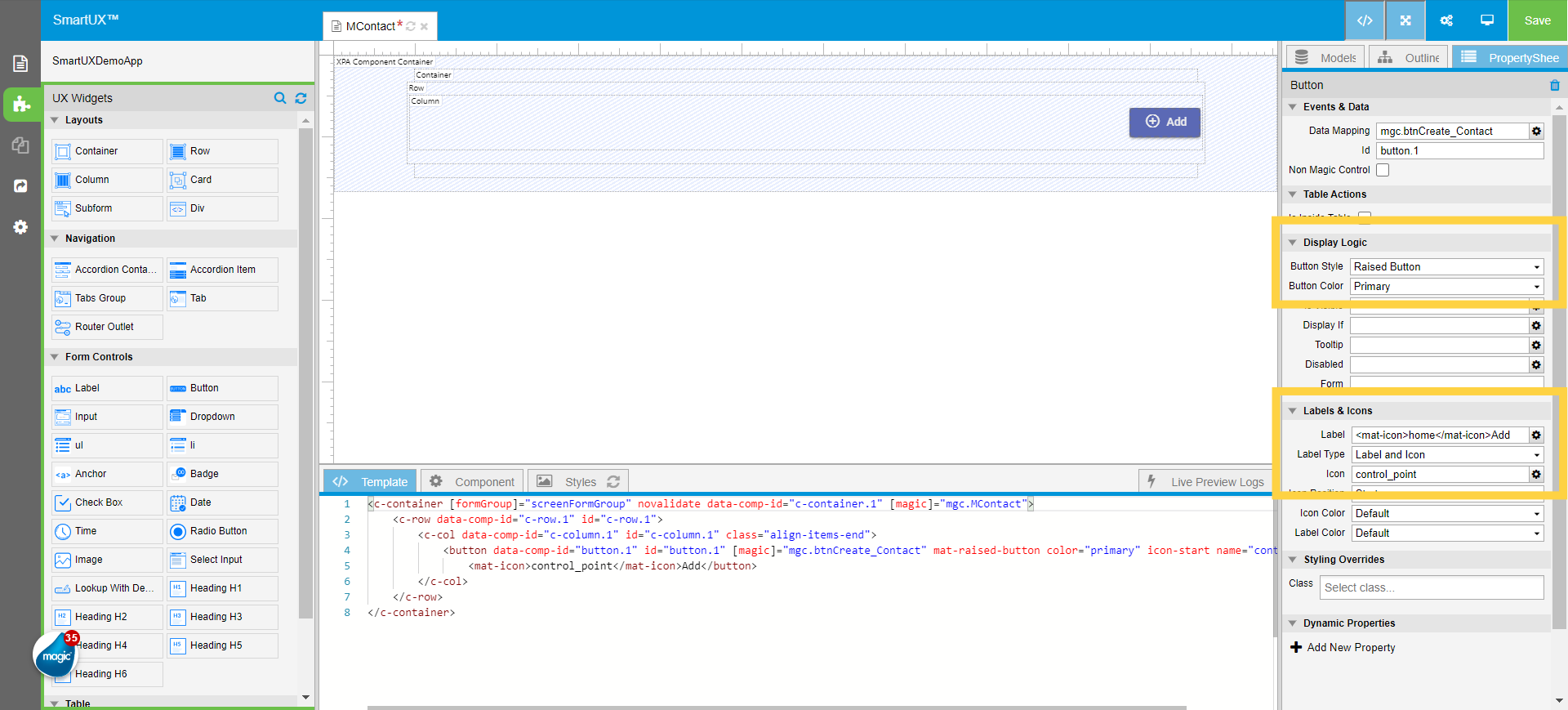
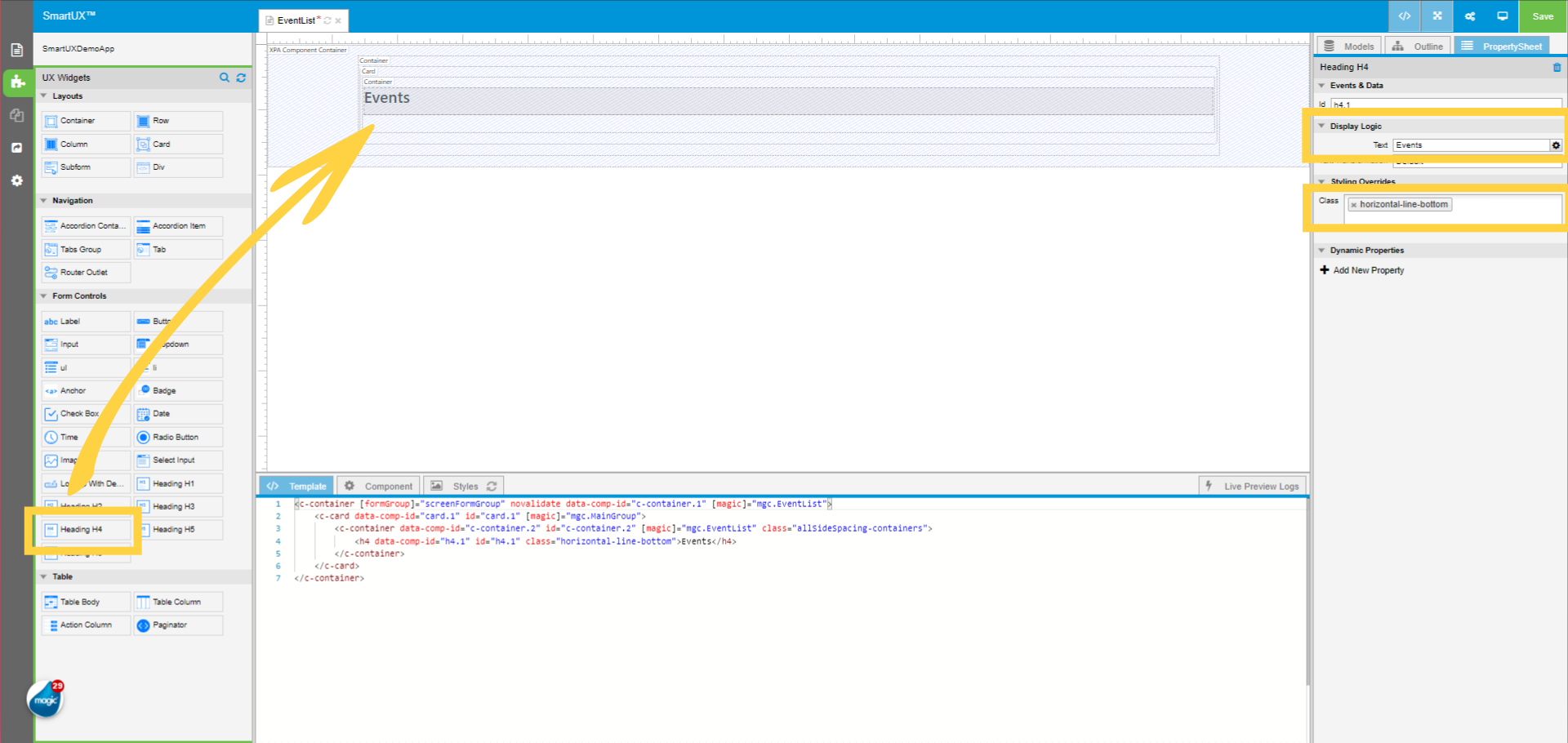
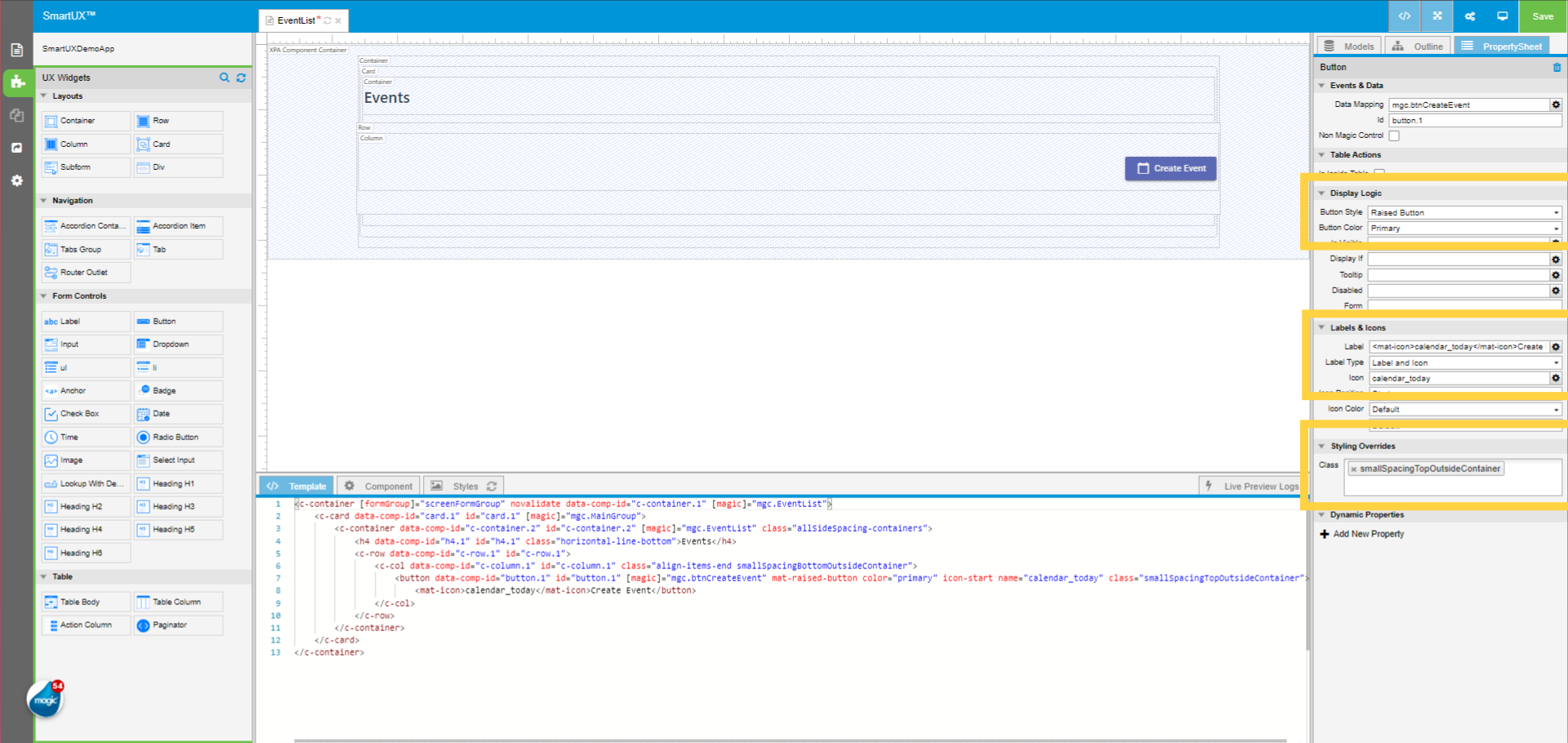
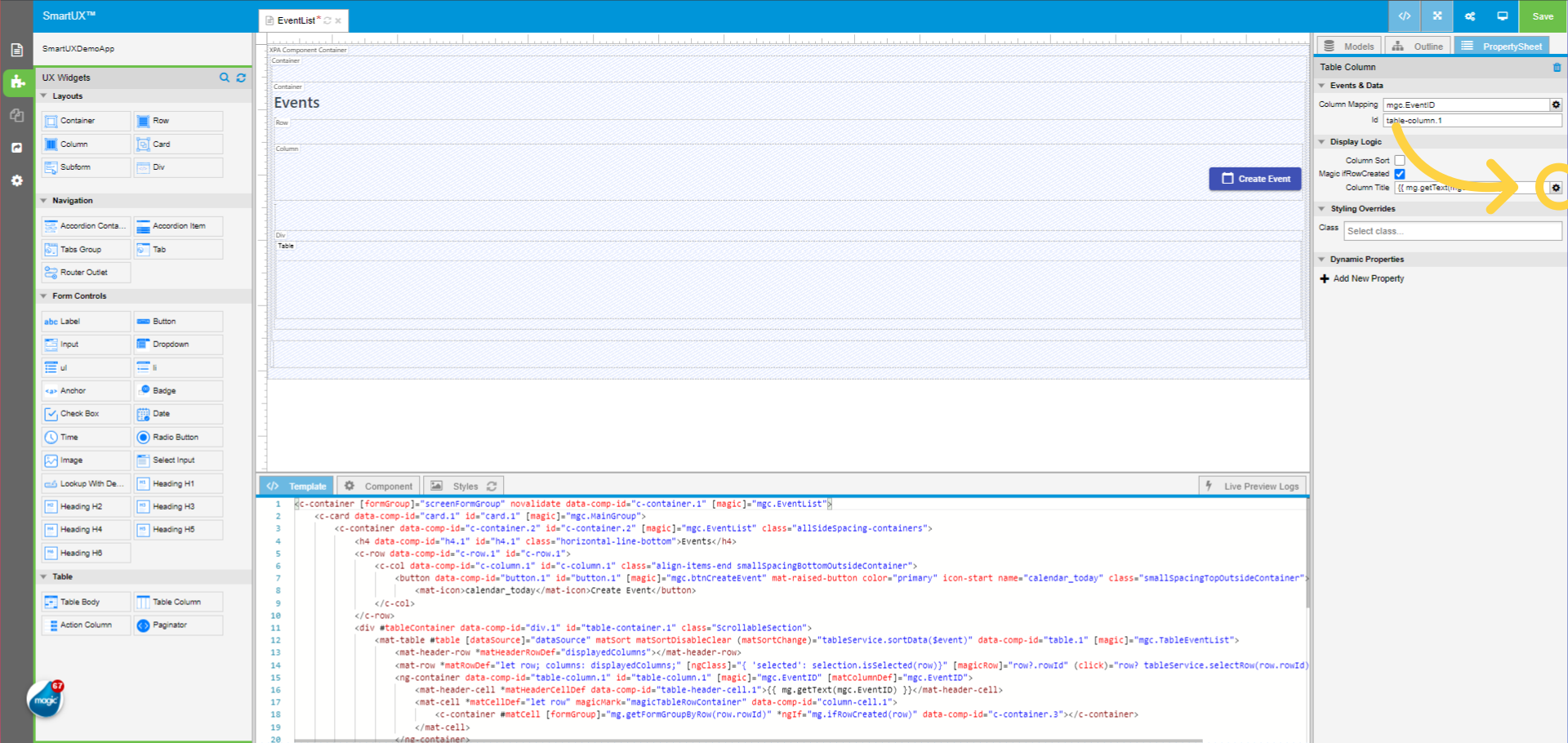
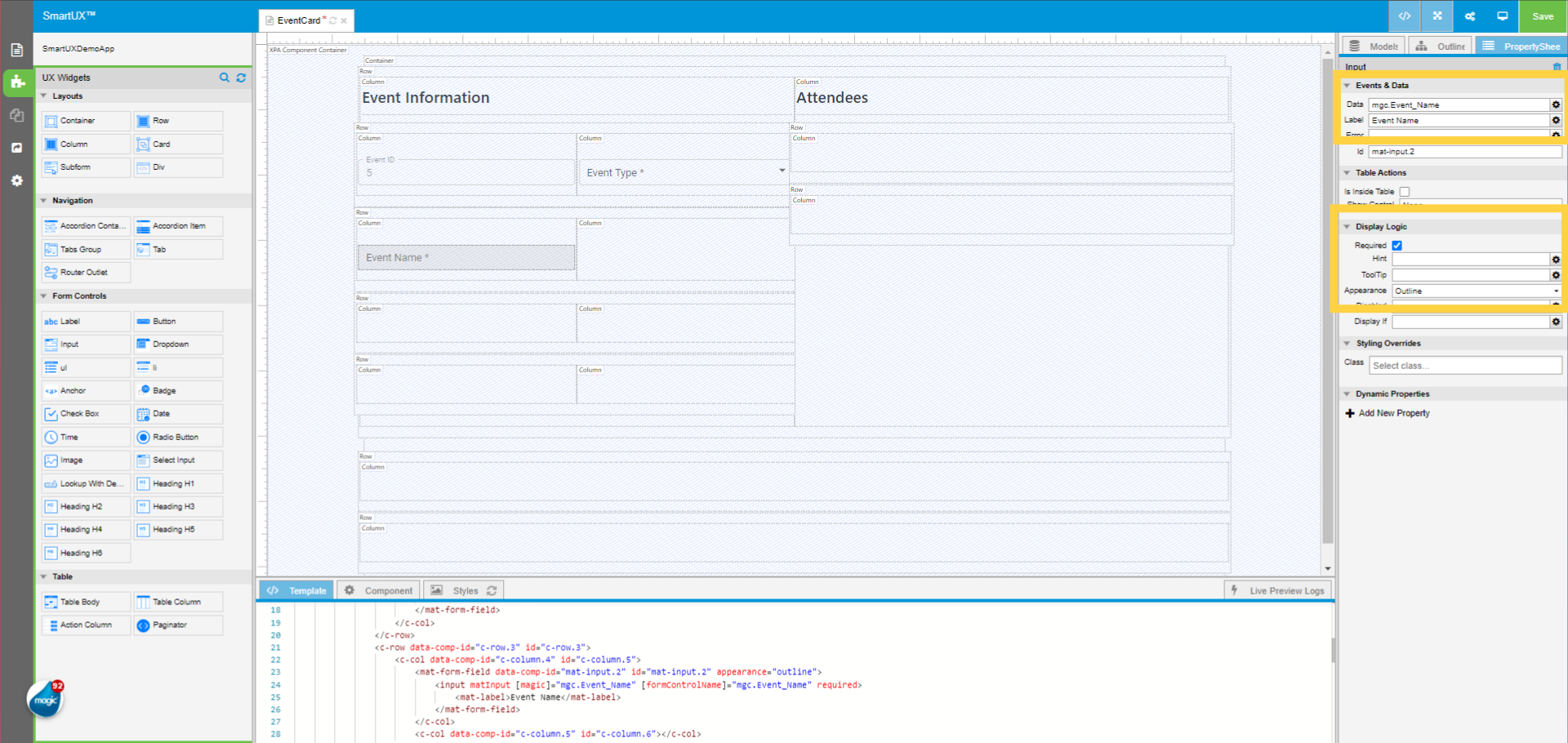
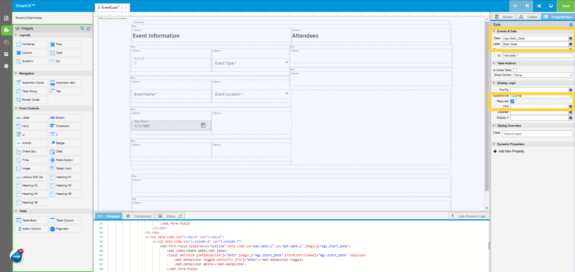
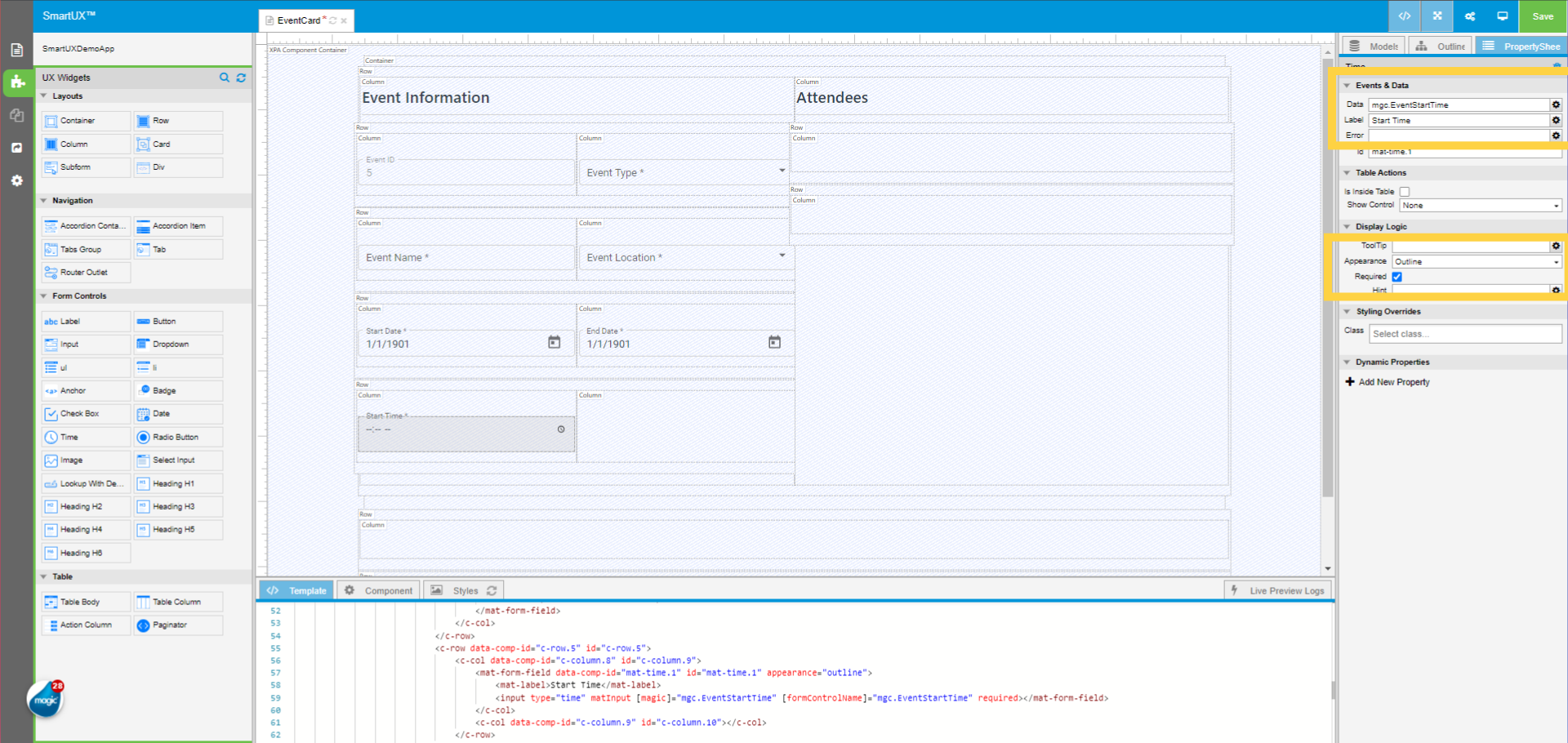
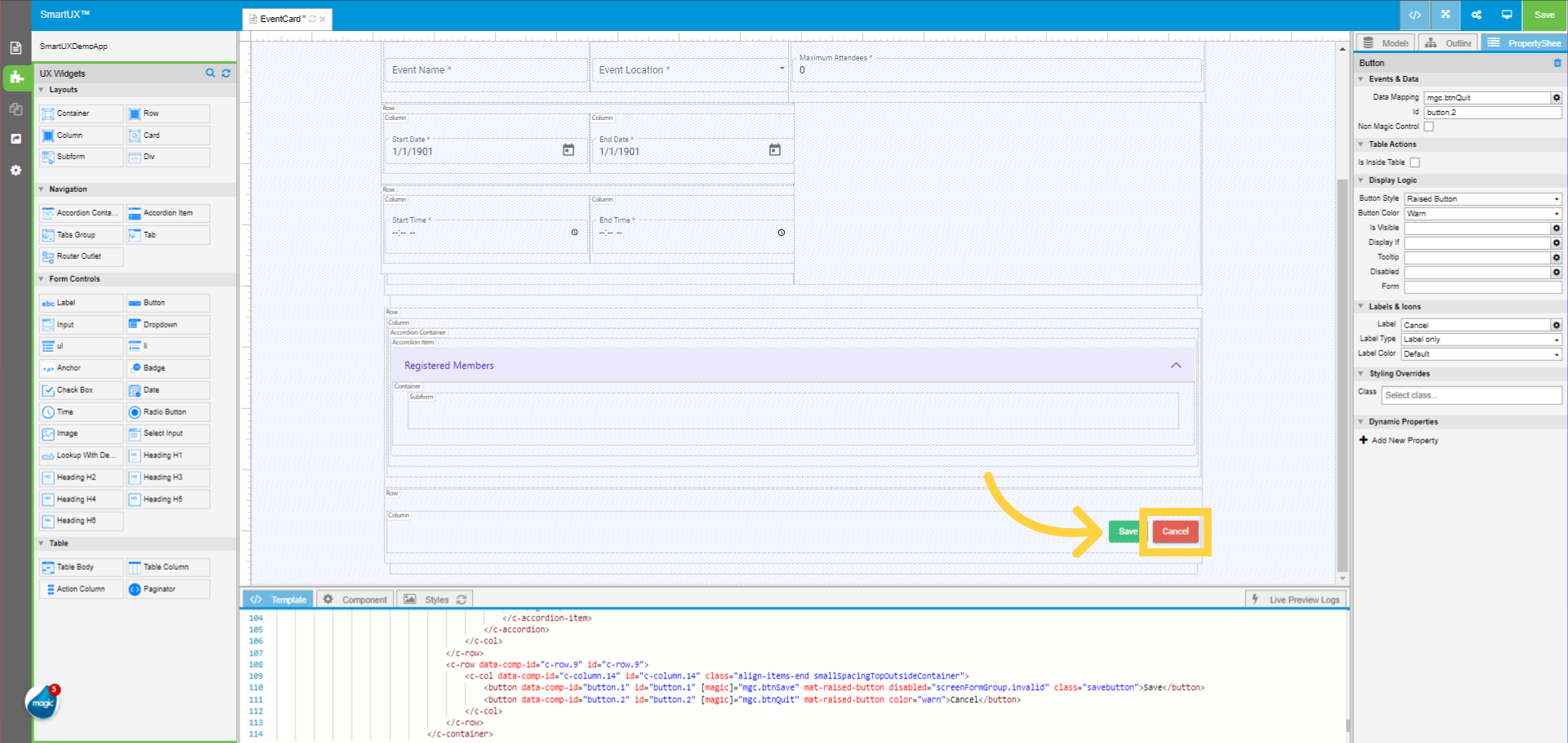
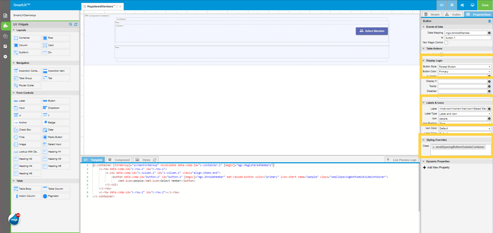
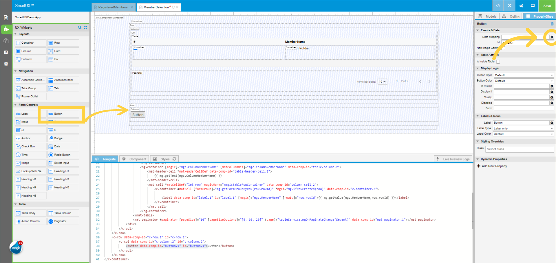
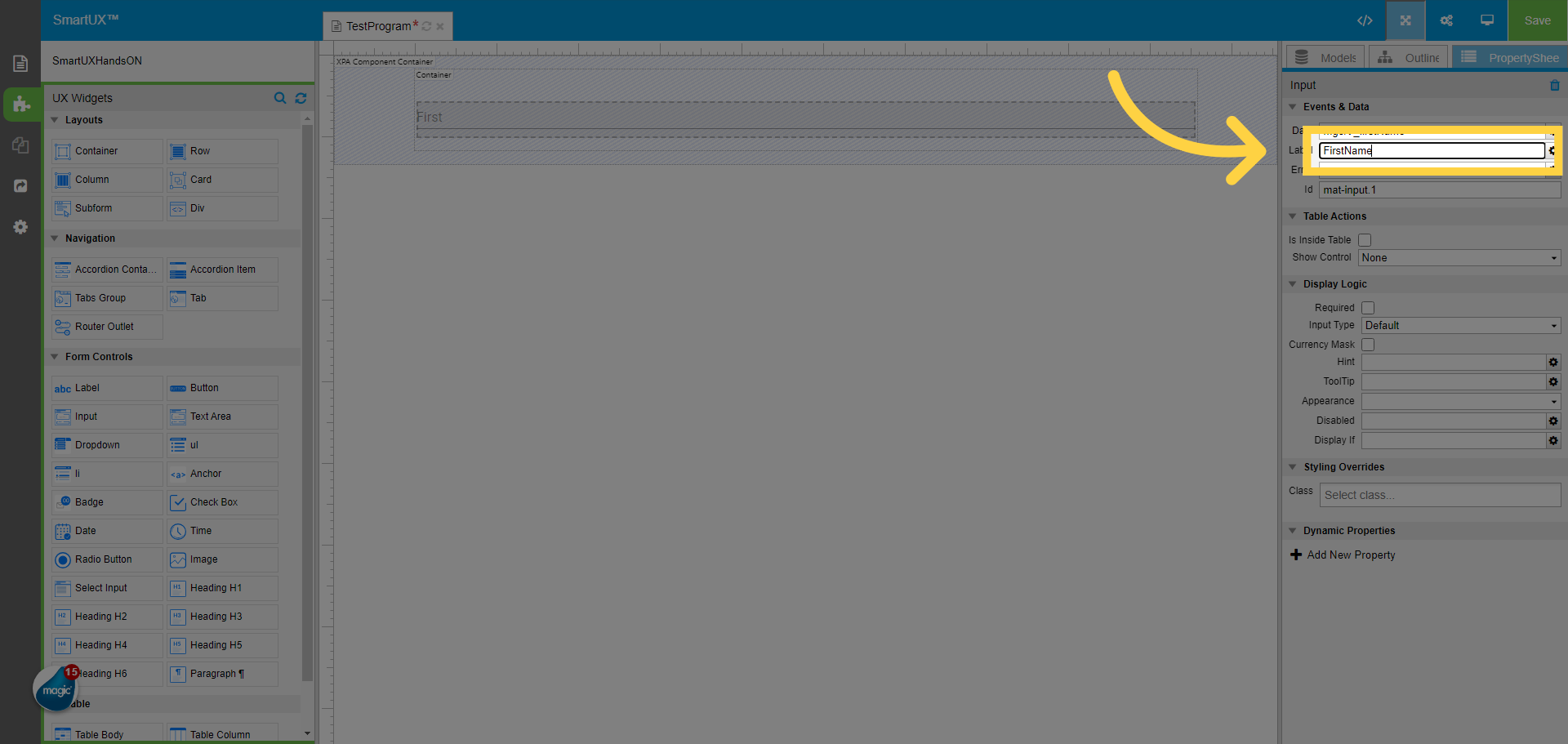
15. Type in the label for the Input Widget
Type in the label for the Input Widget.
16. Fill “FirstName”
Here we Fill in the label as “FirstName”.
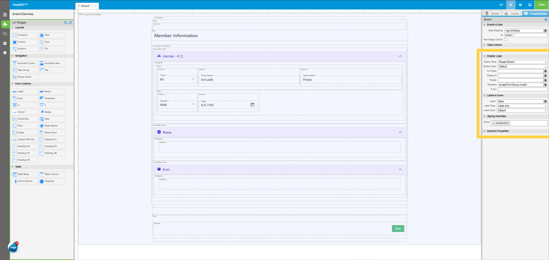
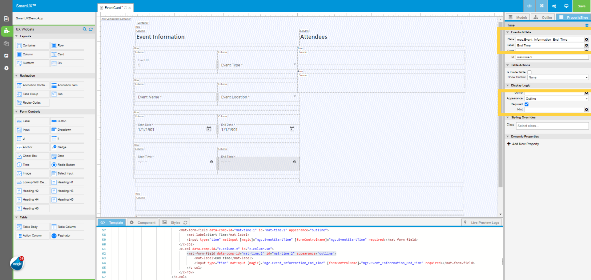
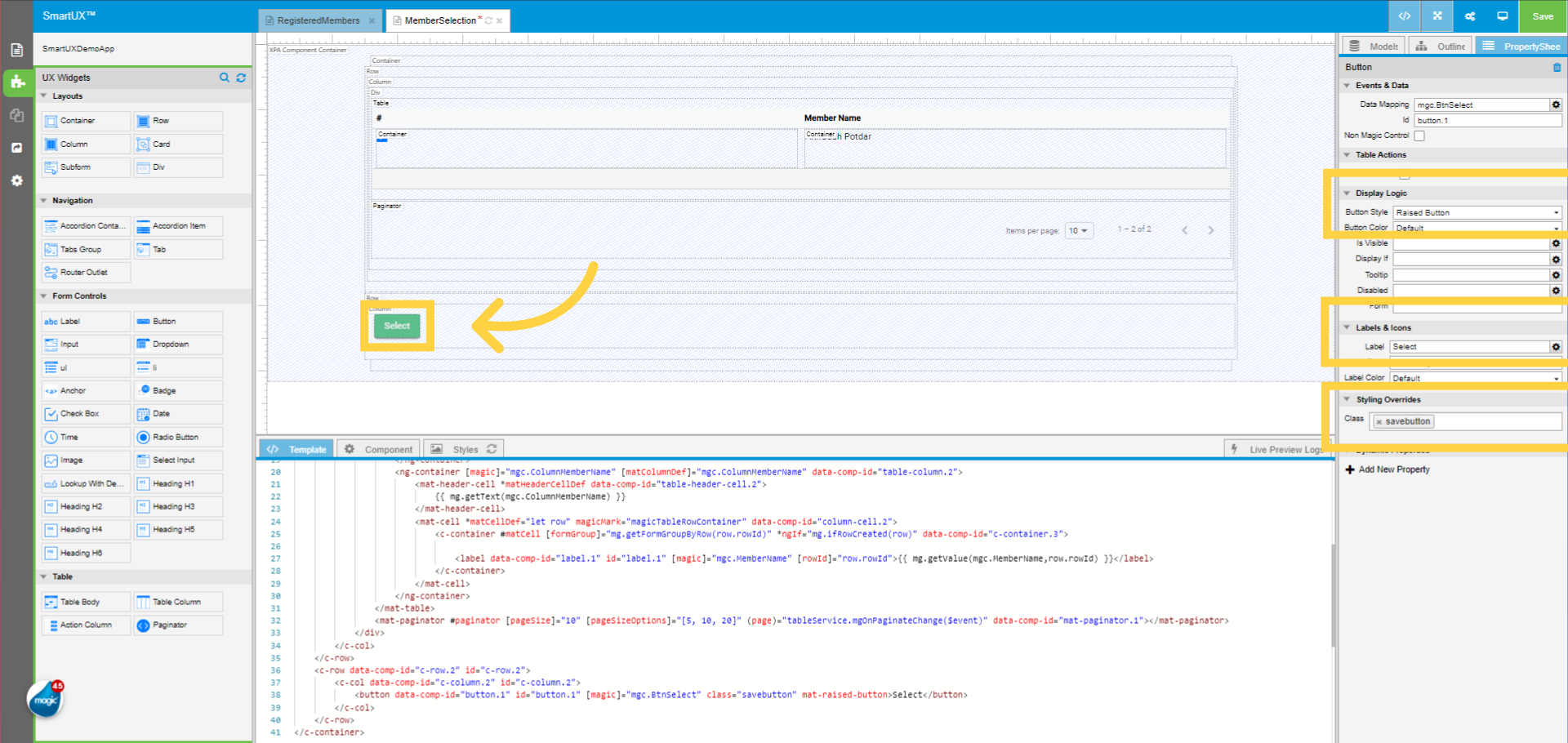
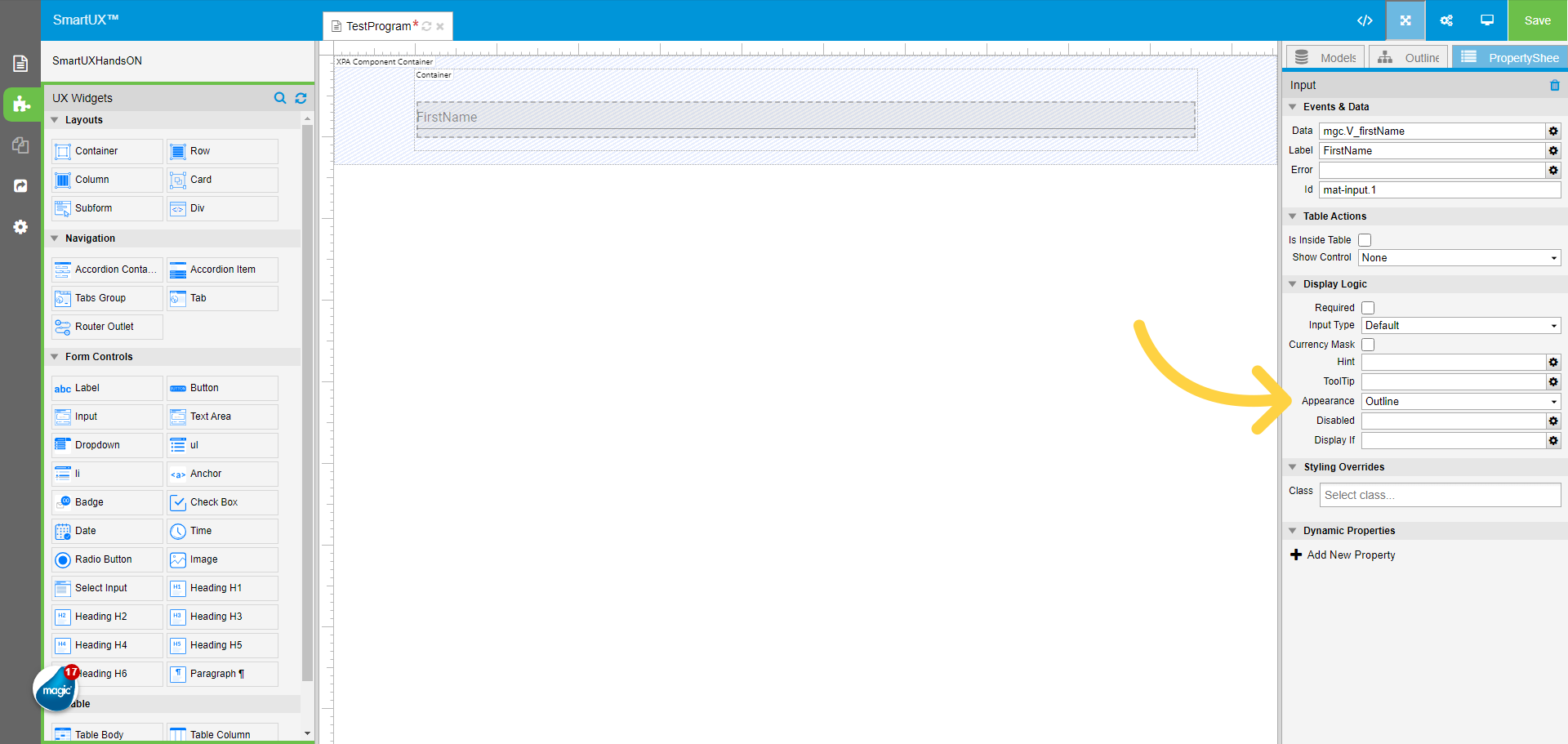
17. Changing the Appearance property to “Outline”
Changing the Appearance property to “Outline”.
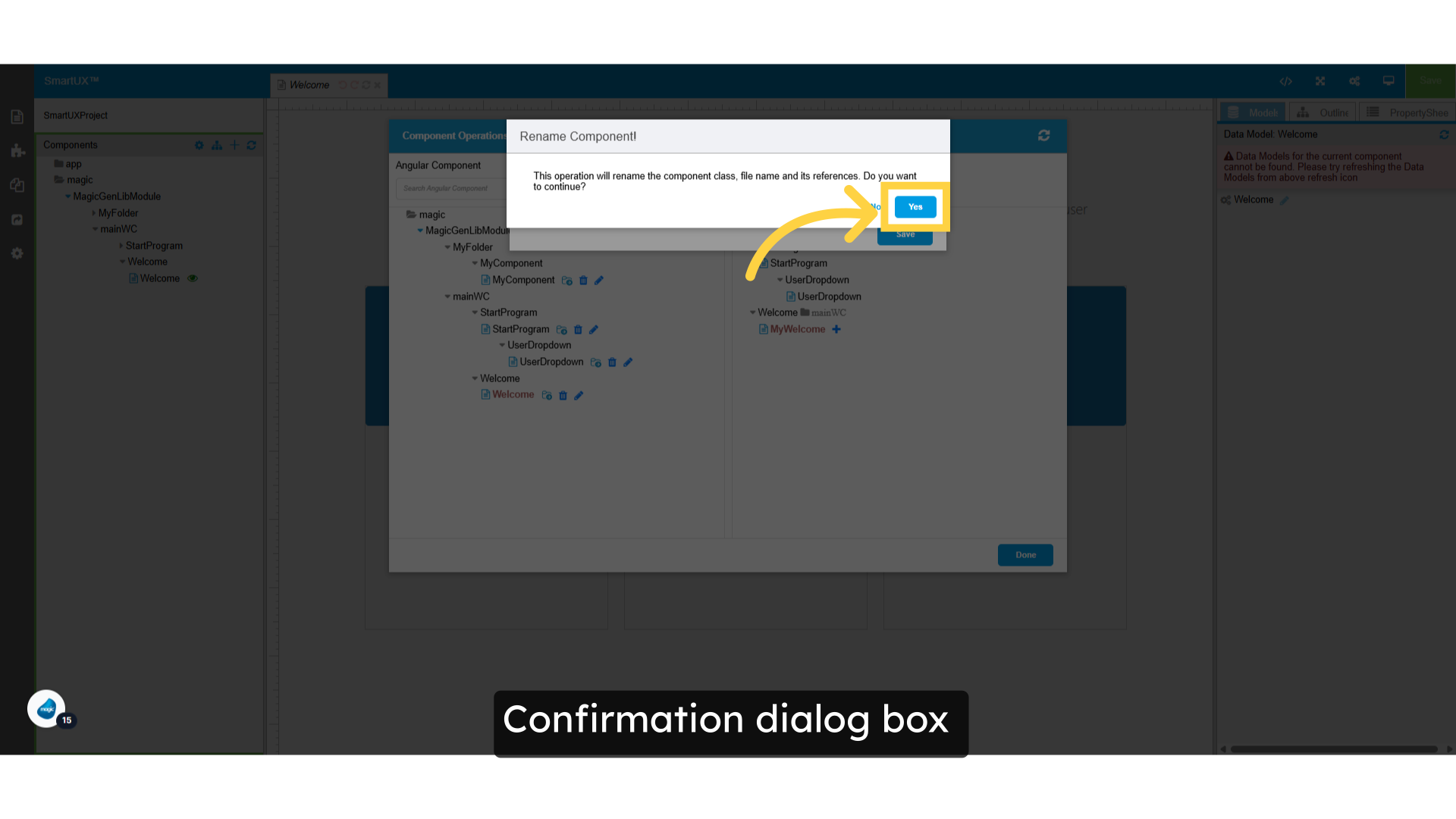
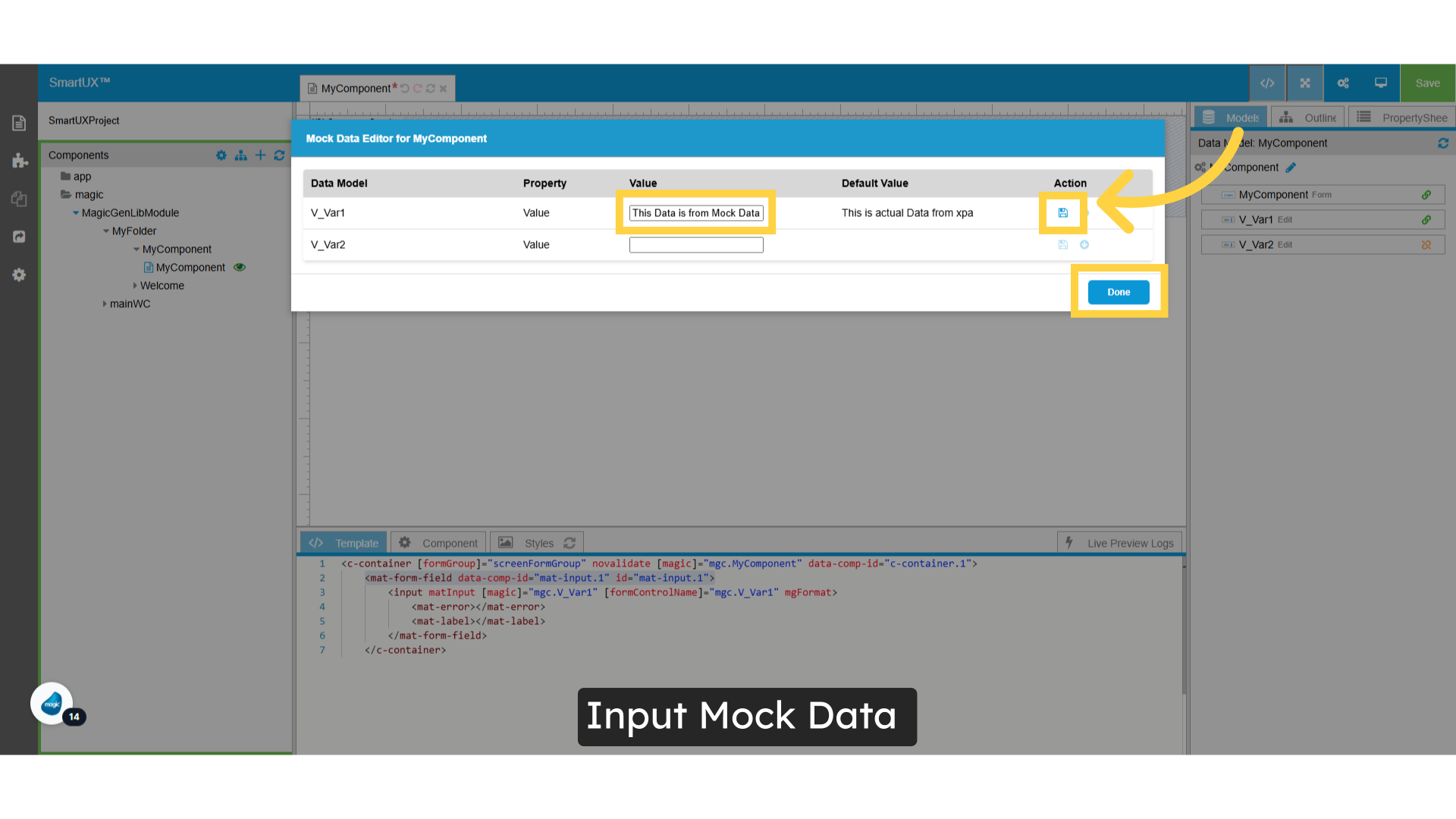
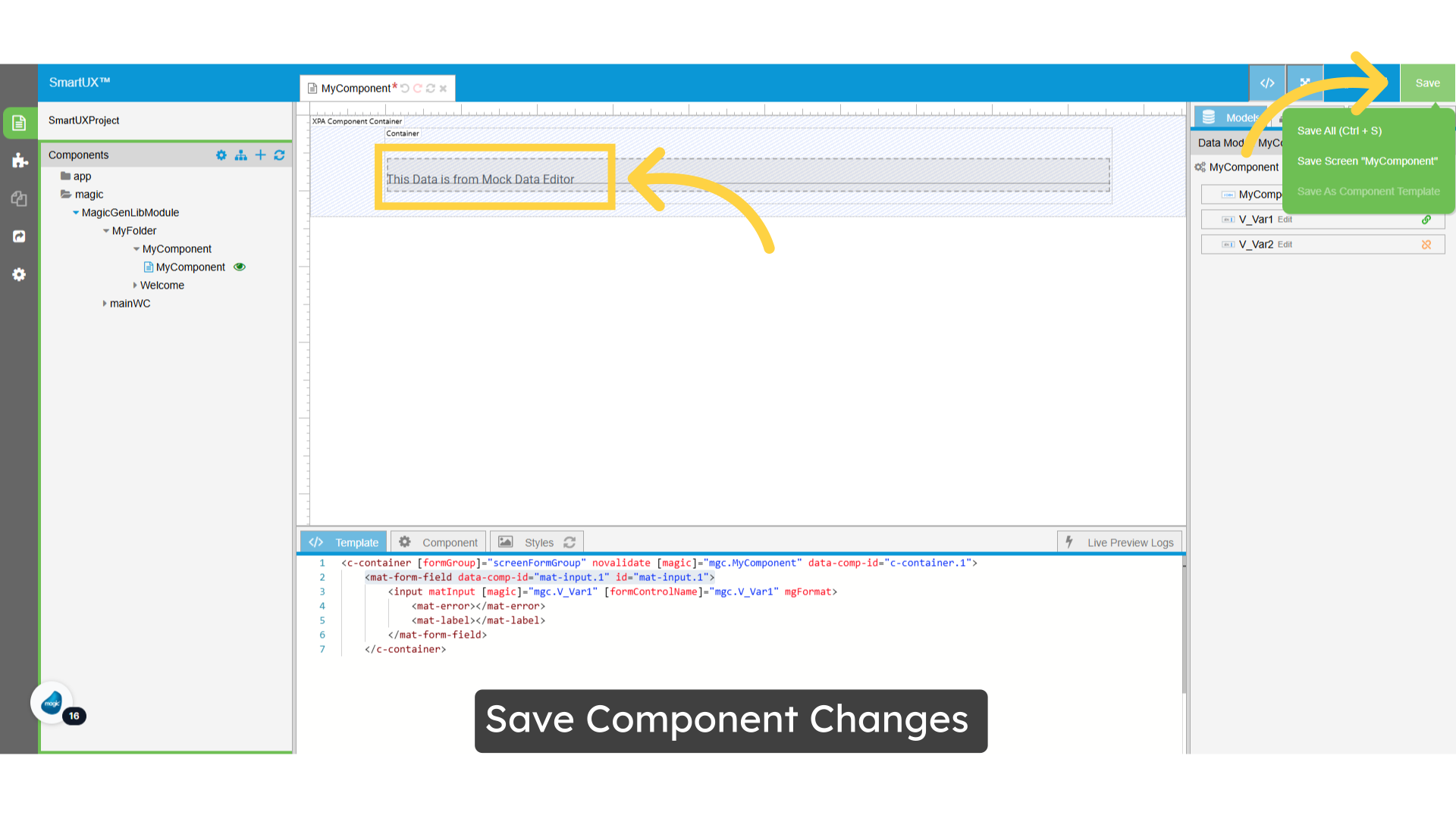
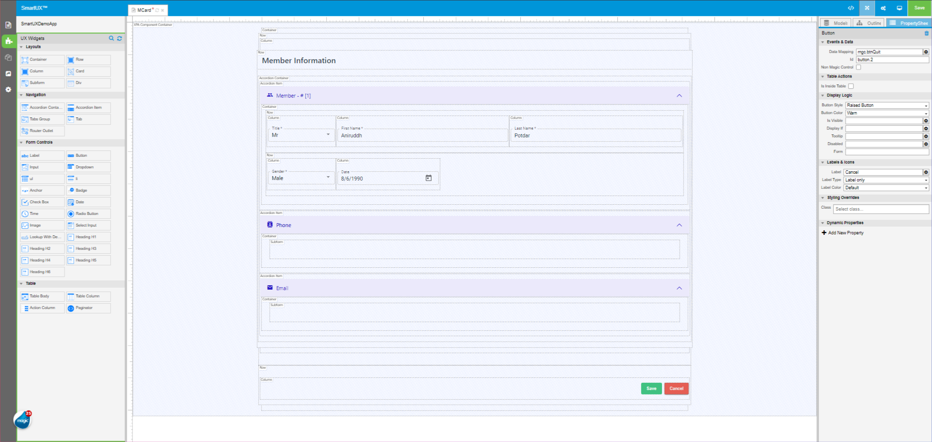
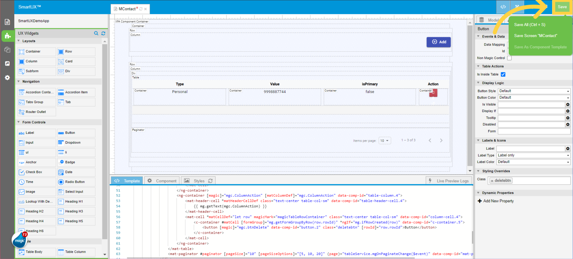
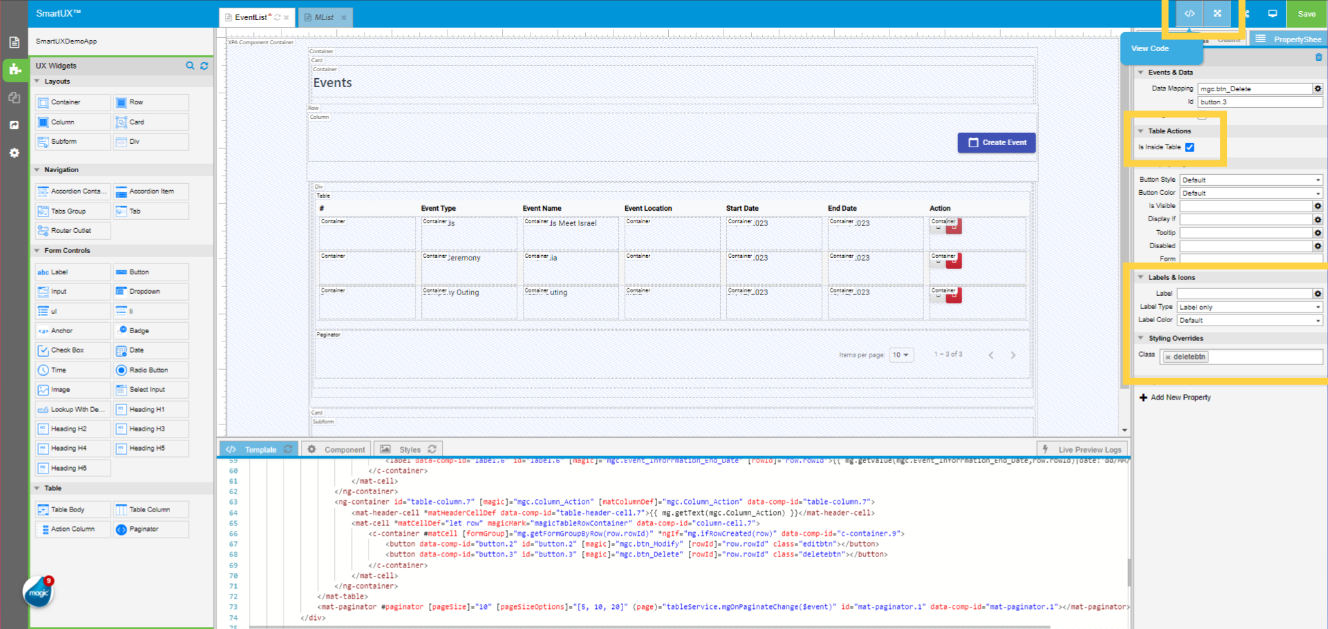
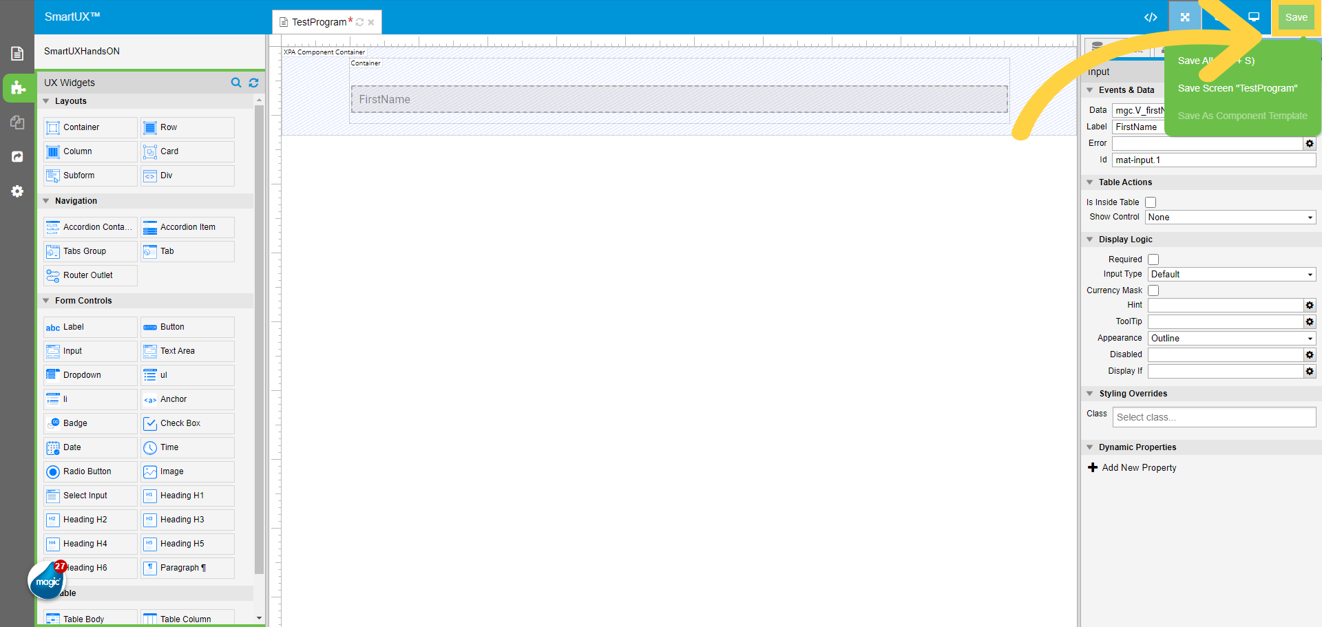
18. Click “Save” to save the changes
To save the changes Click on the Save button on the top right corner.
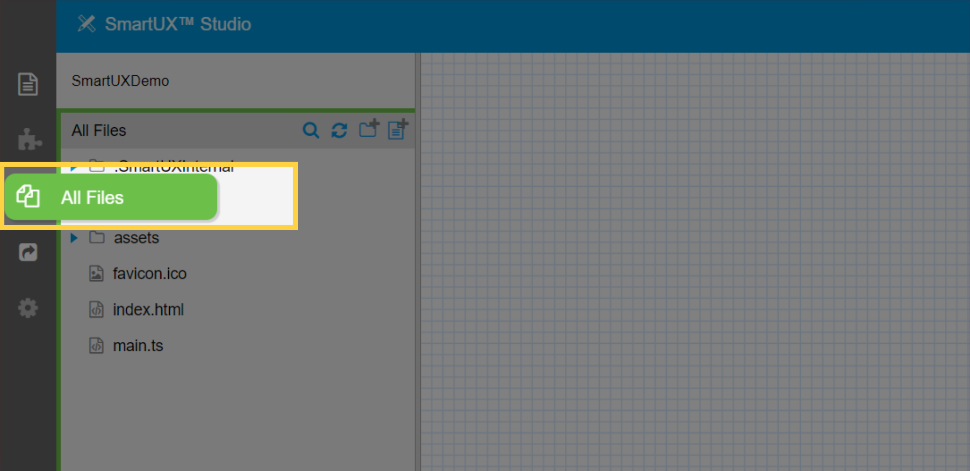
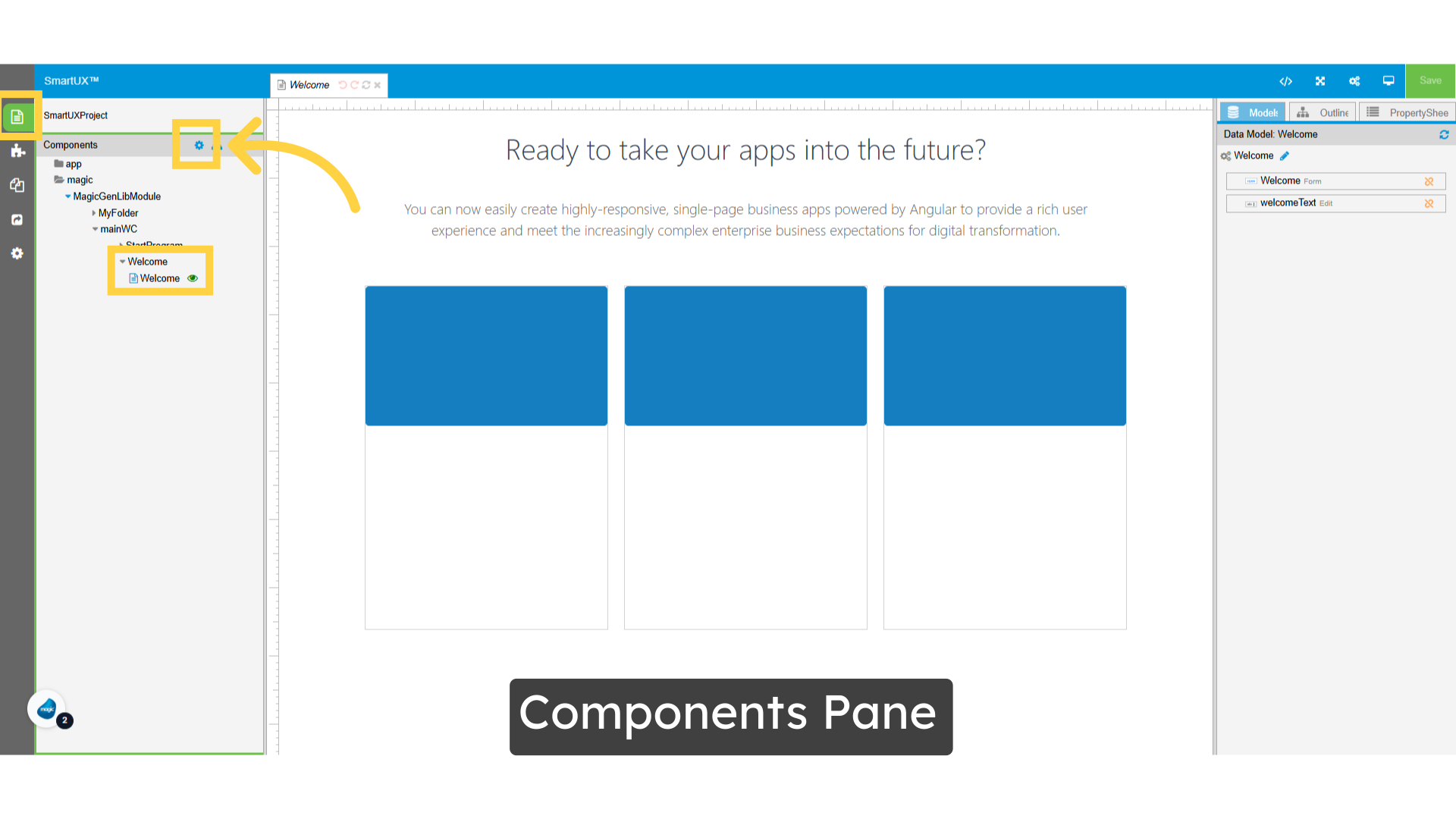
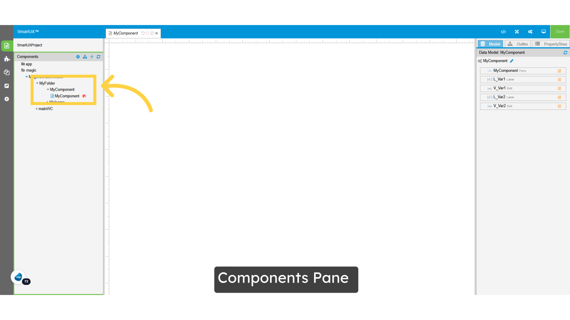
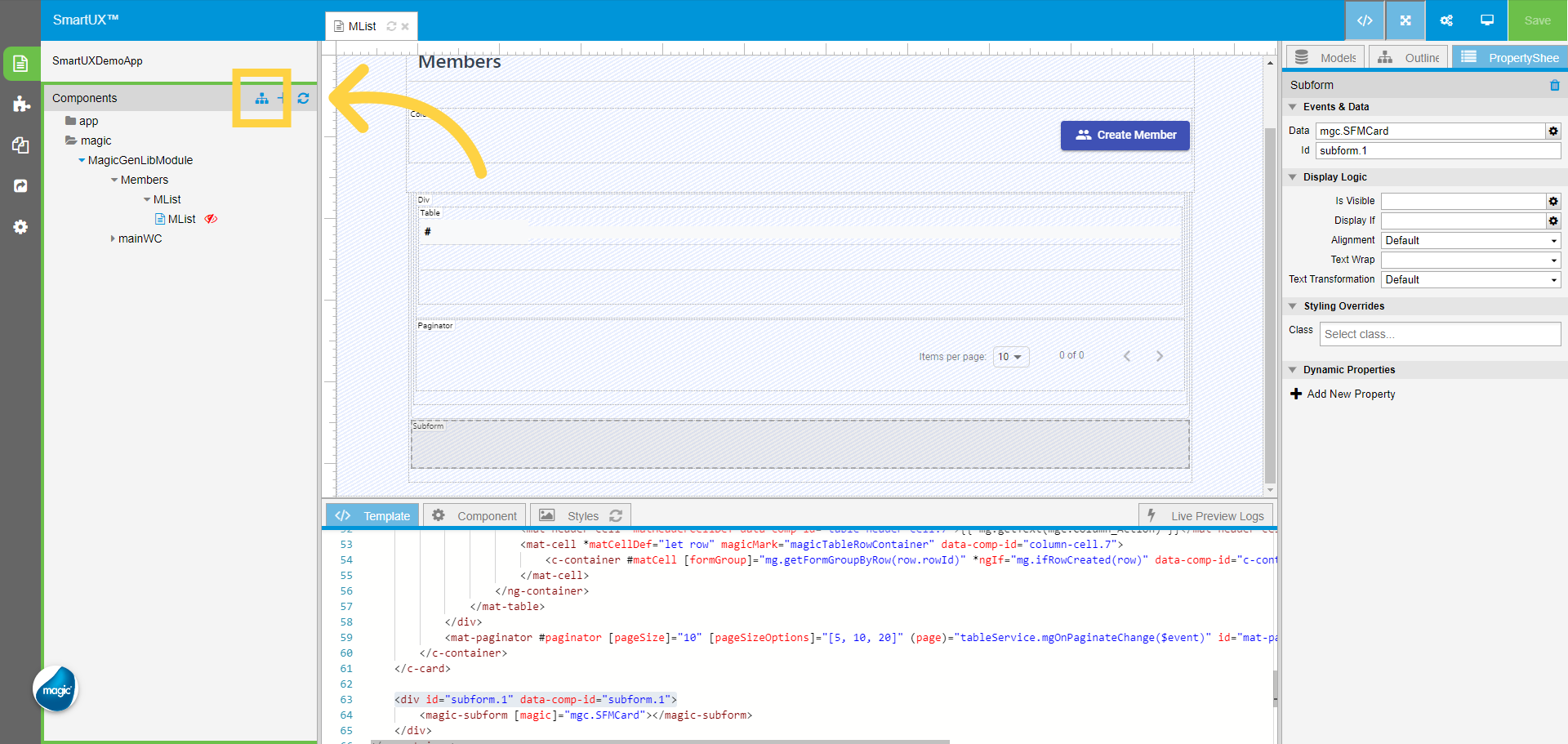
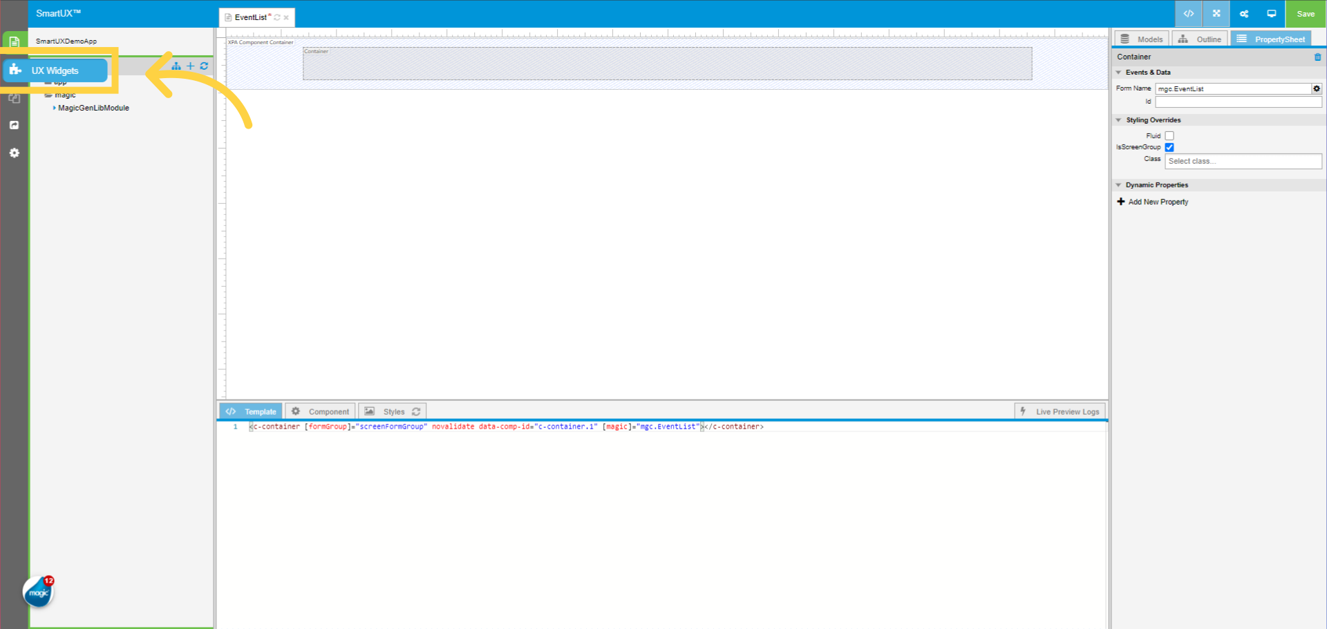
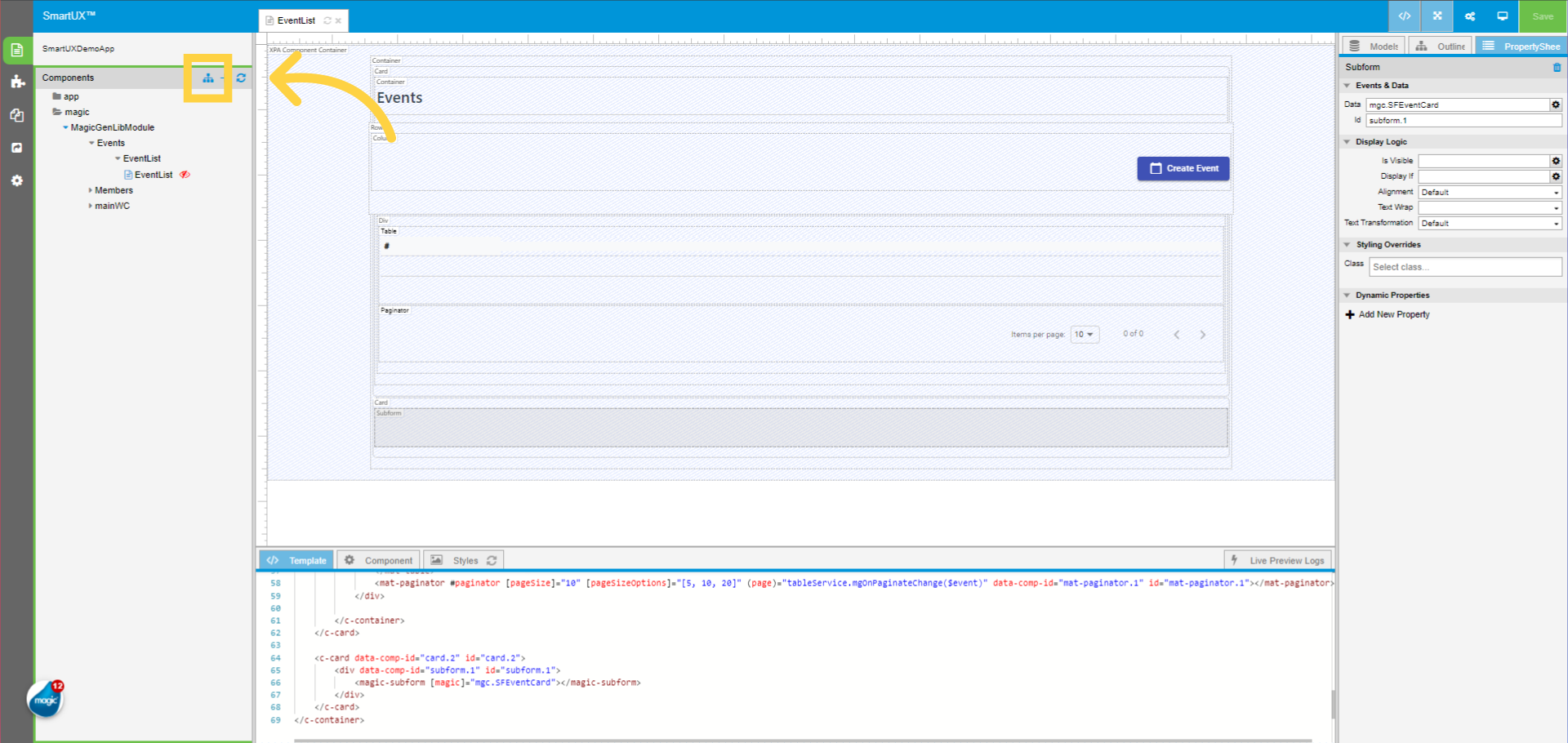
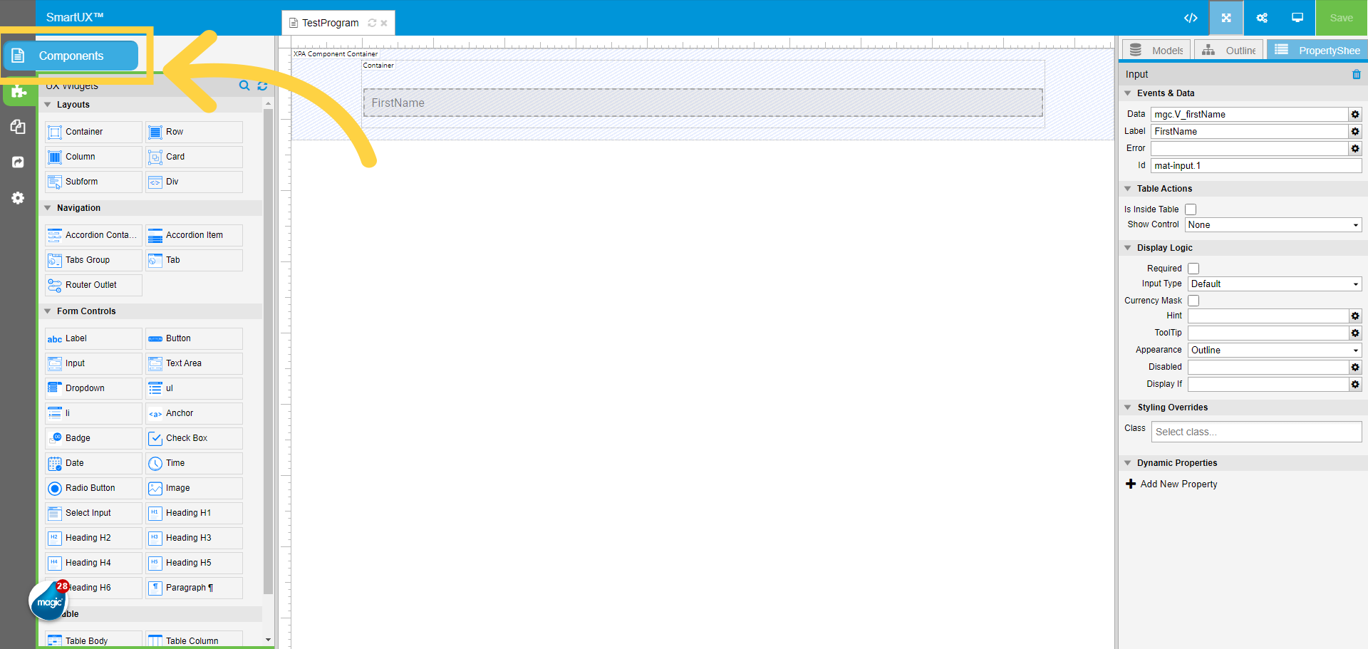
19. Switch to Components pane
Now switch to the Components pane.
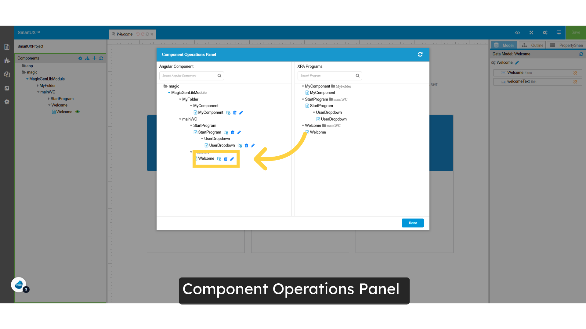
20. Click on Configure Route
Click on Configure Route to add the route for the components.

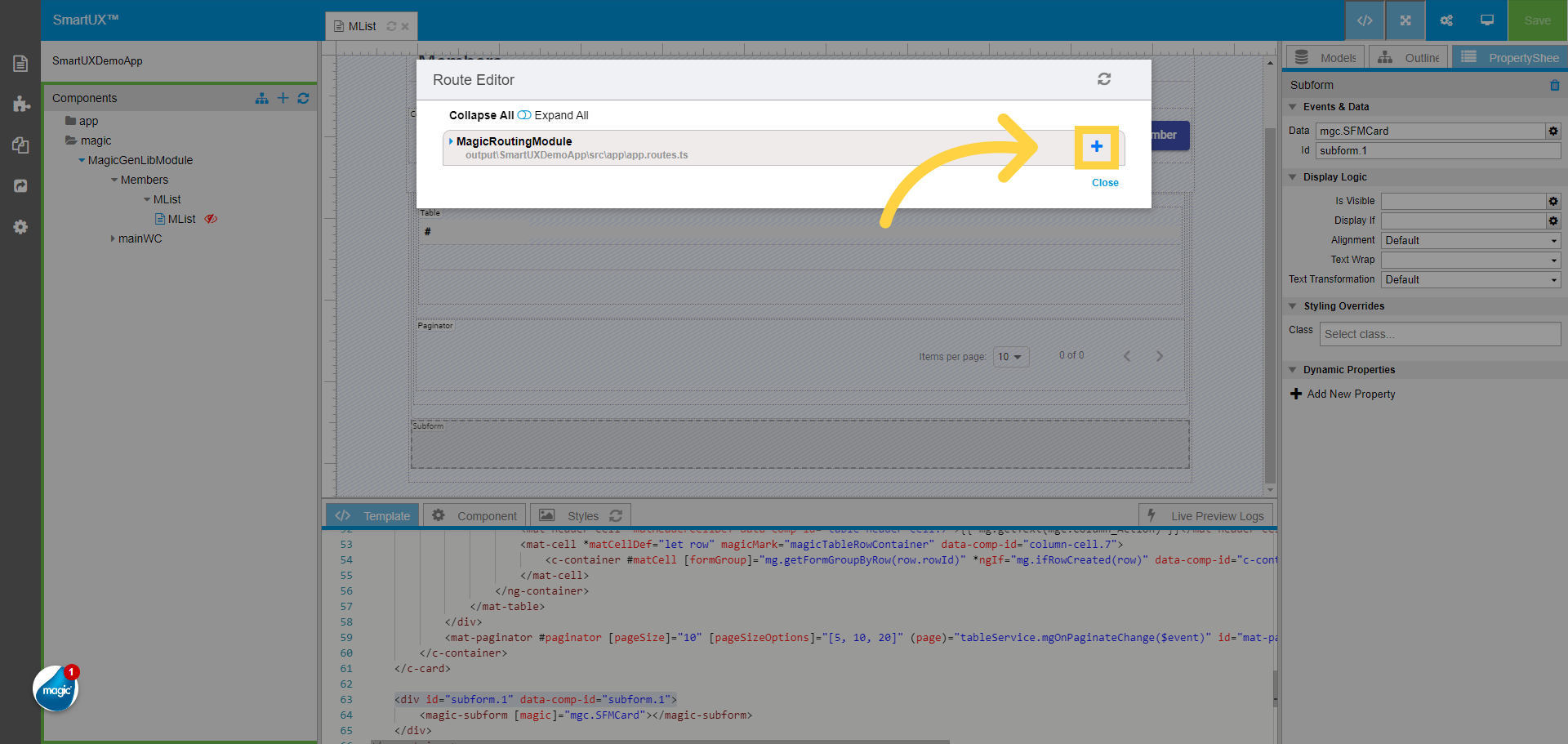
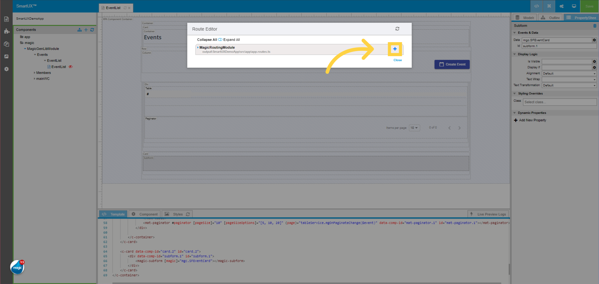
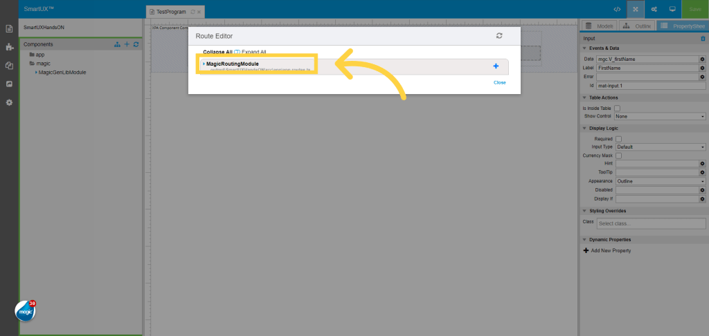
21. Click “MagicRoutingModule”
The Configure Route opens a Route Editor, Navigate to the “MagicRoutingModule” and expand it.
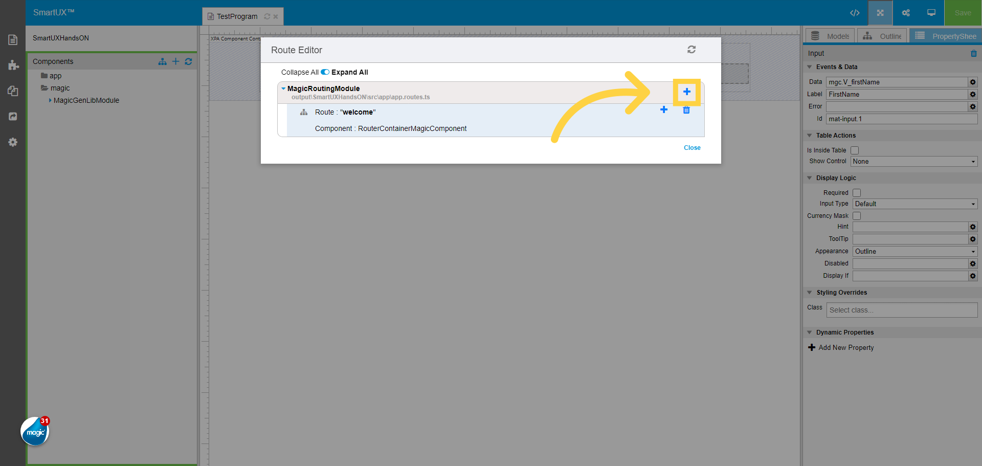
22. Click on the Add Route
Click on the Add Route button.
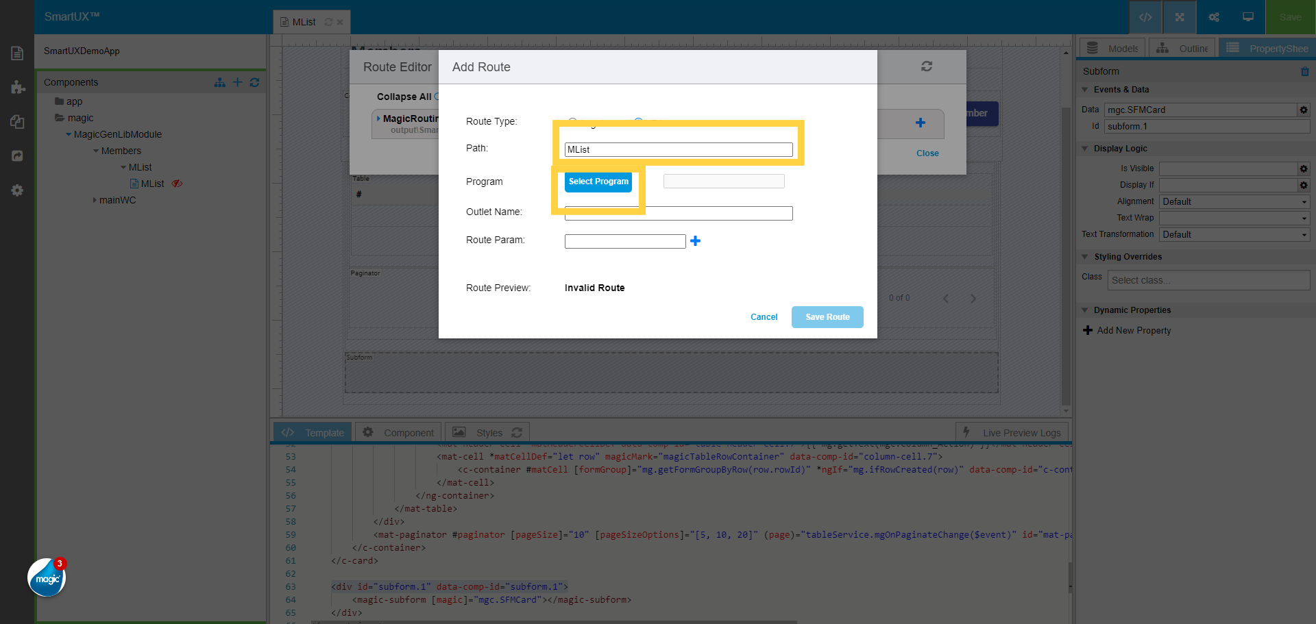
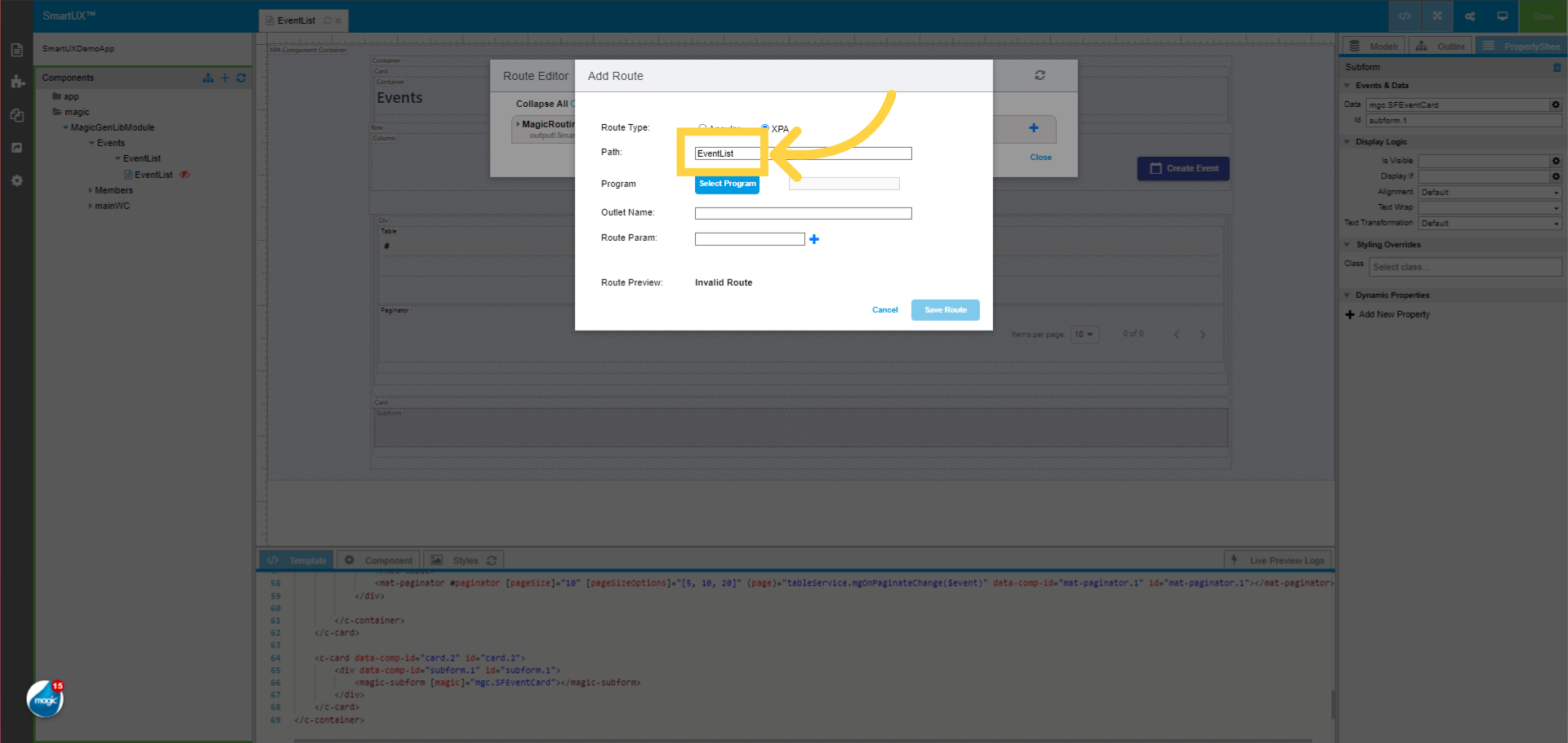
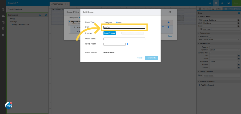
23. Provide the Route name in the Path field
Provide the Route name in the Path field.
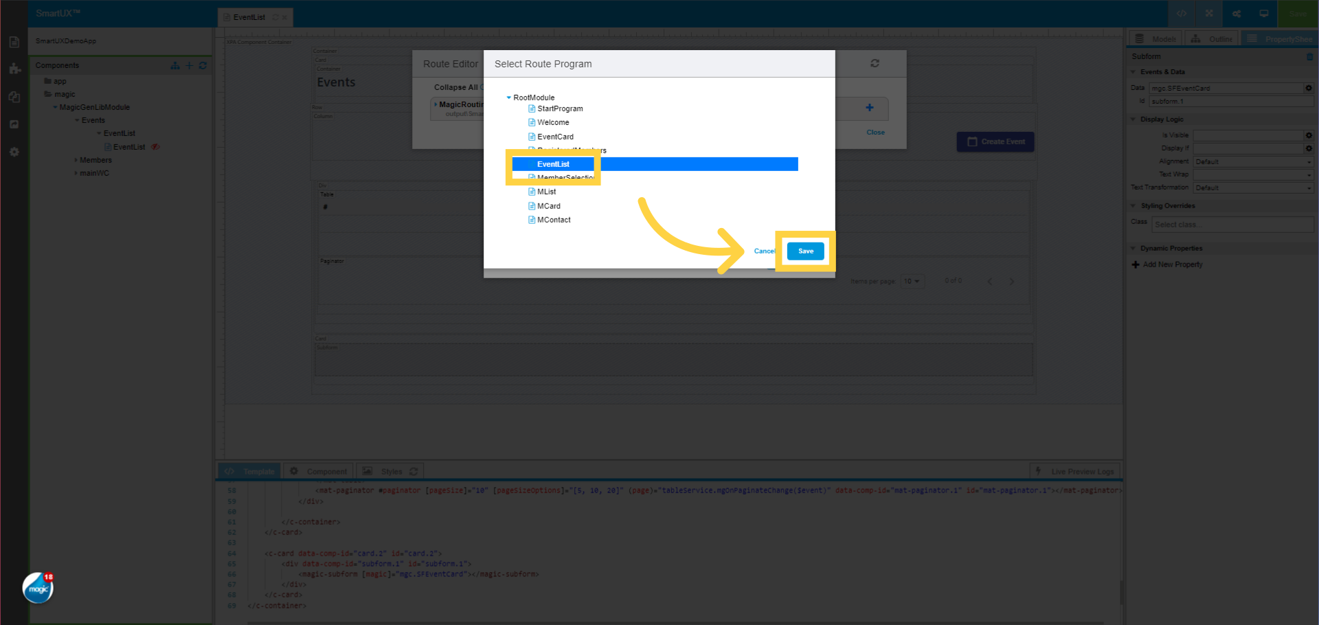
24. Click “Select Program”
Click on the Select Program button.

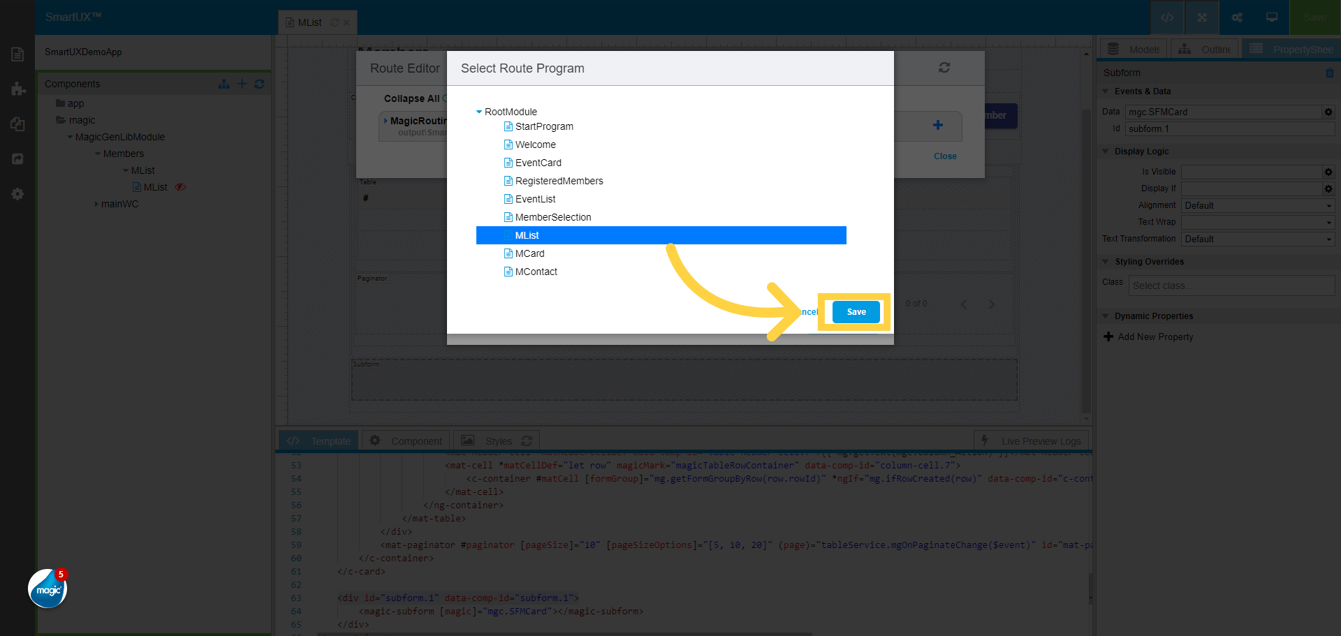
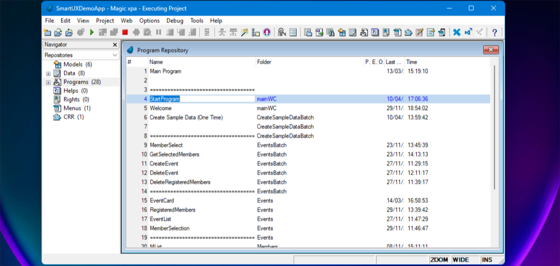
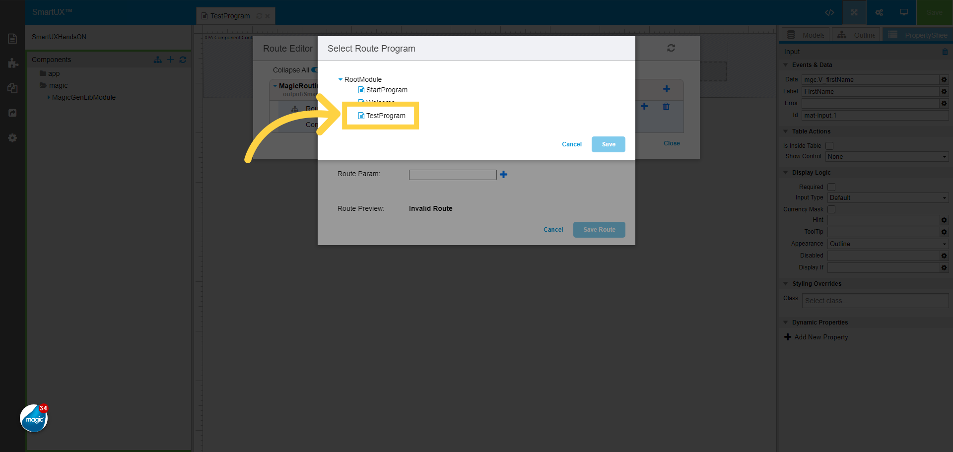
25. Select the Route Program from the Route Module list
Select the Route Program from the Route Module list
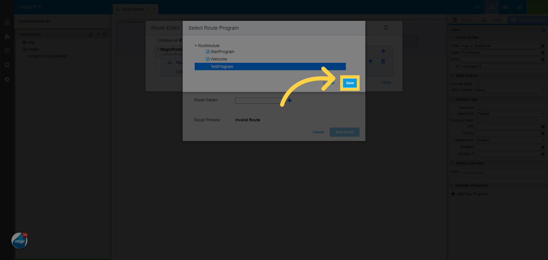
26. Click “Save” to save the Route Module
Click “Save” to save the Route Module.
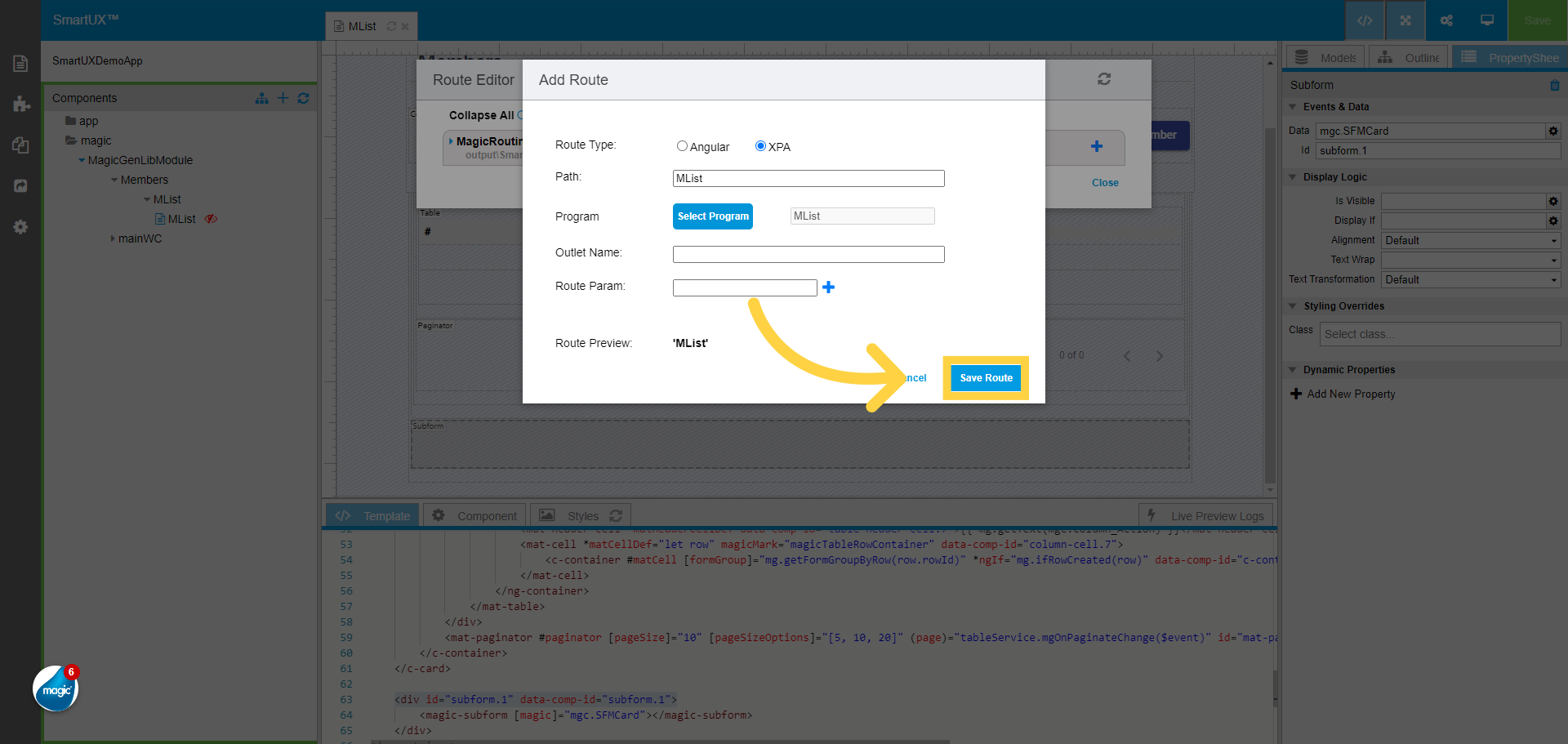
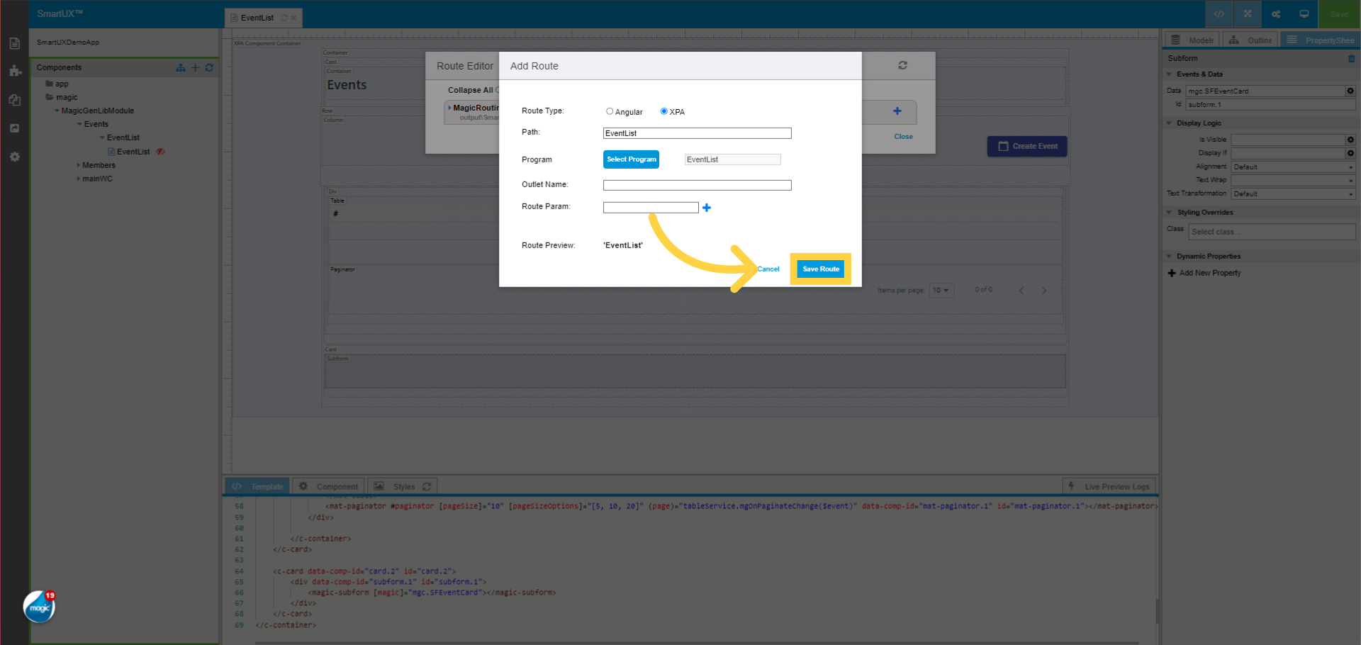
27. Click on the “Save Route” button
Click on the “Save Route” button to save the added route.

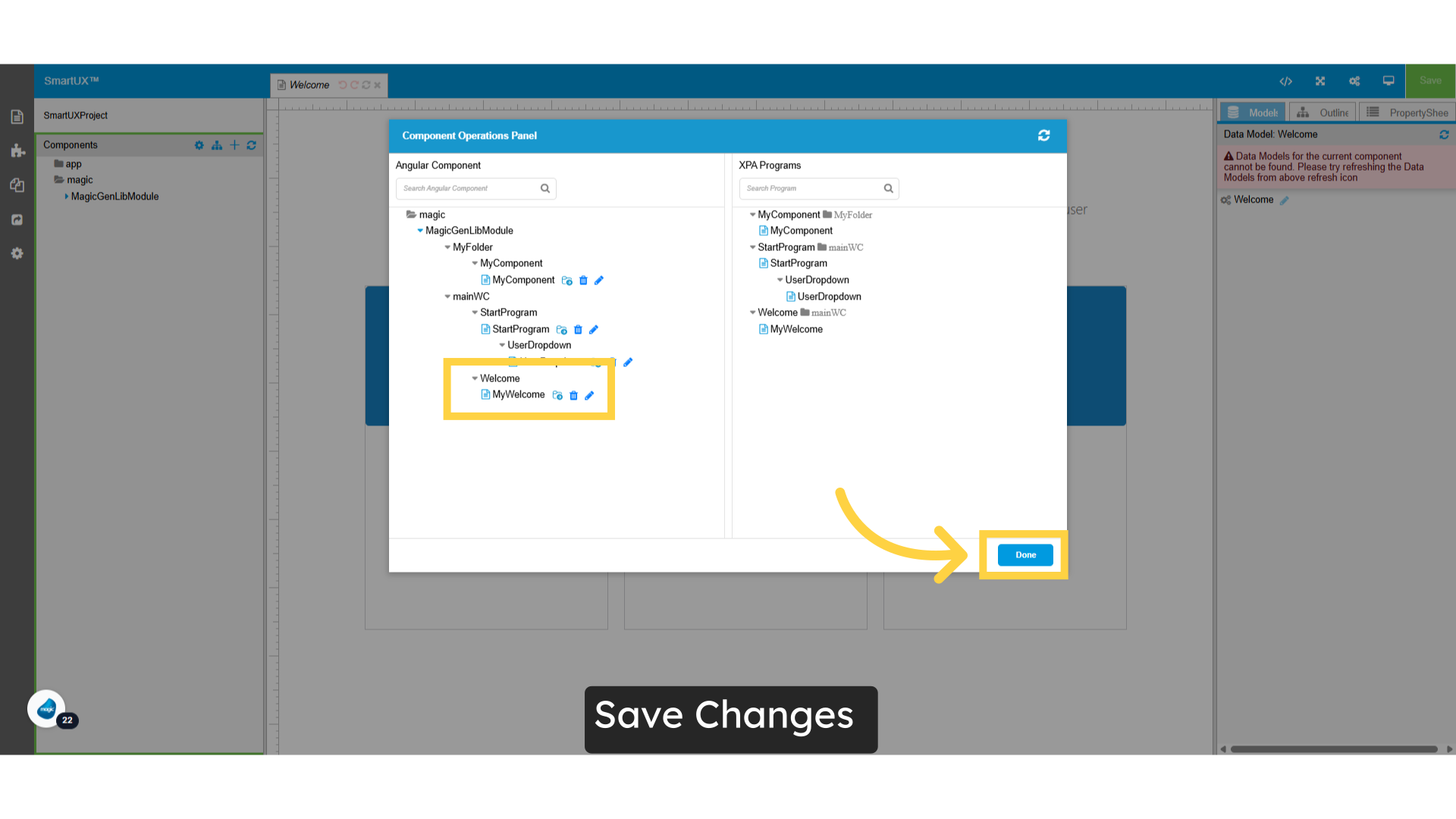
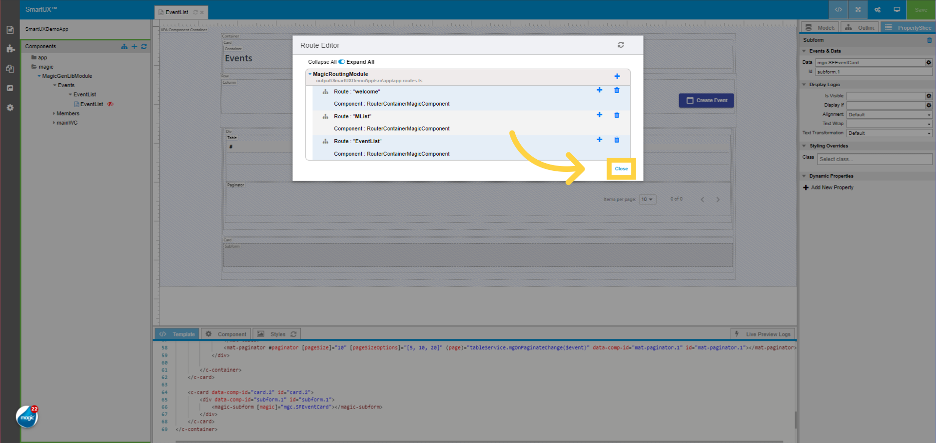
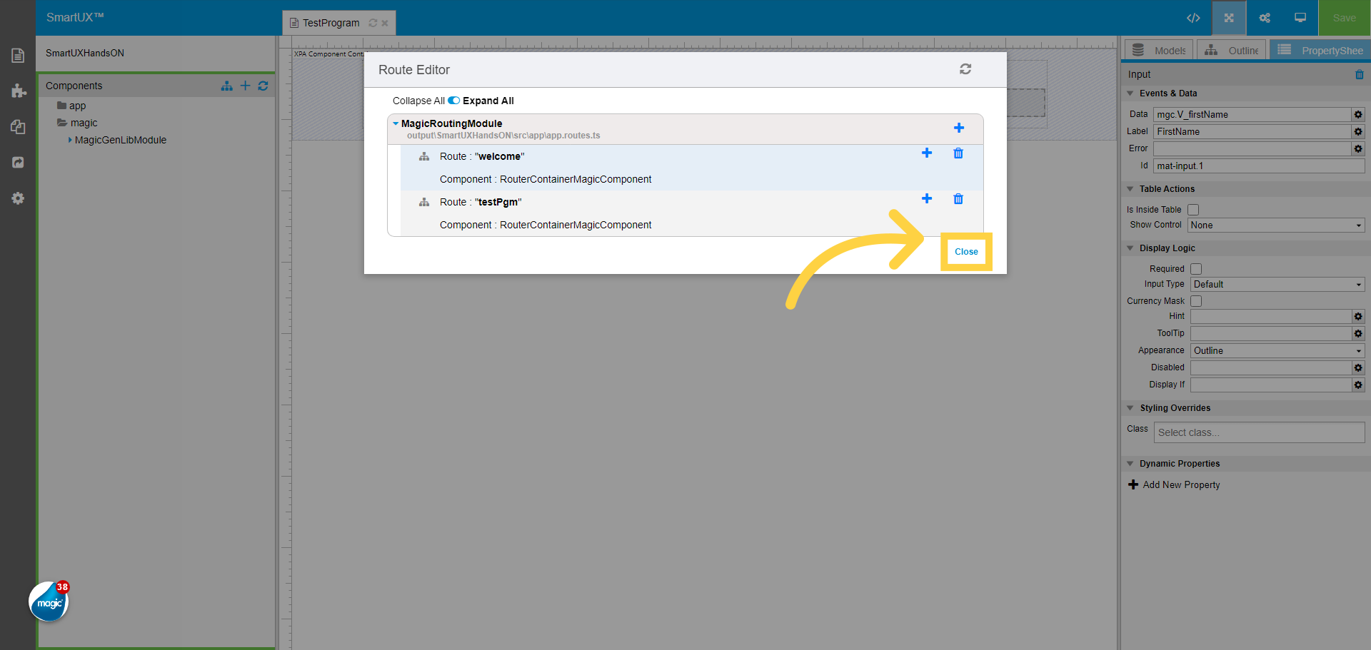
28. Close the Route Editor
Click on the Close button to Close the Route Editor.
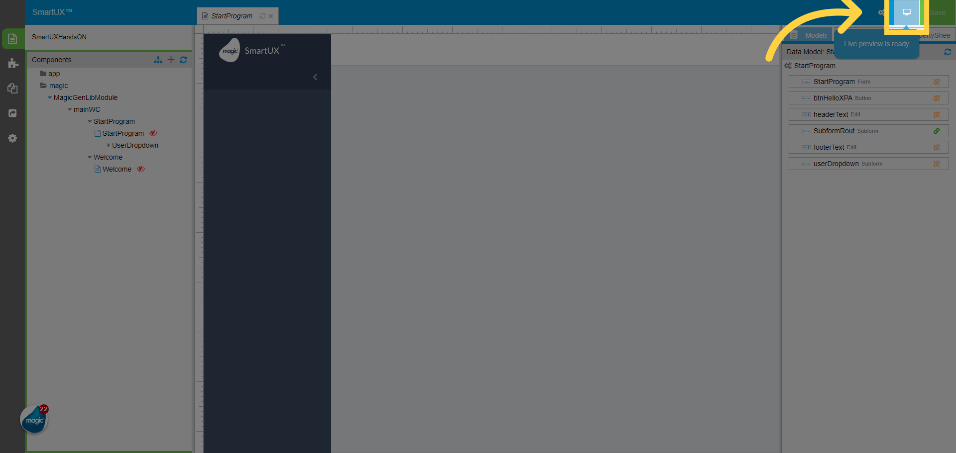
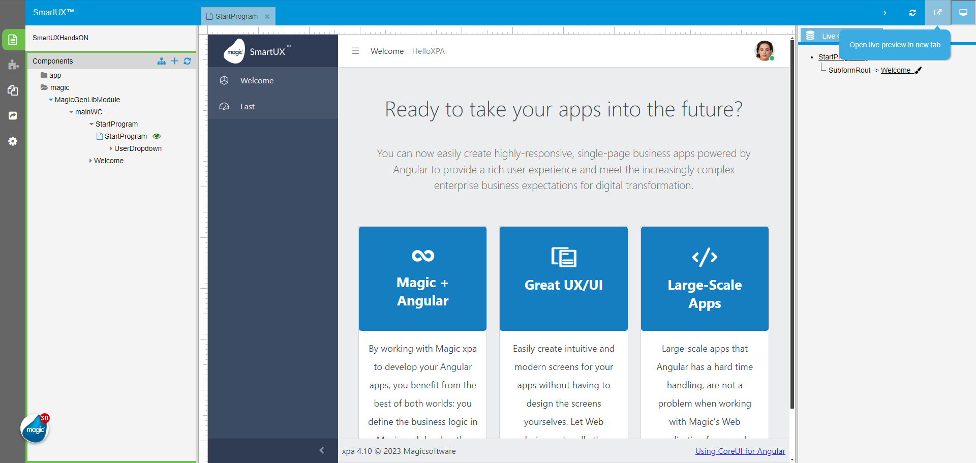
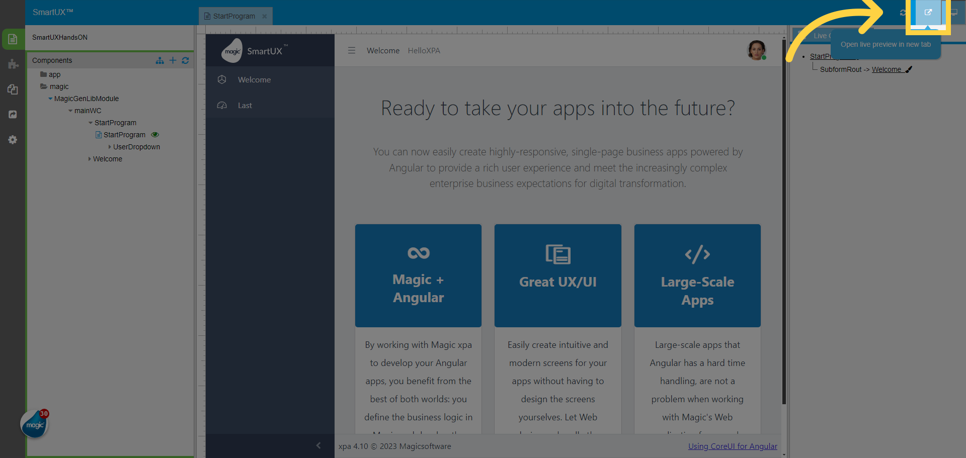
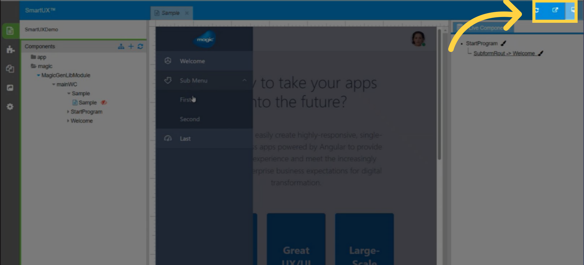
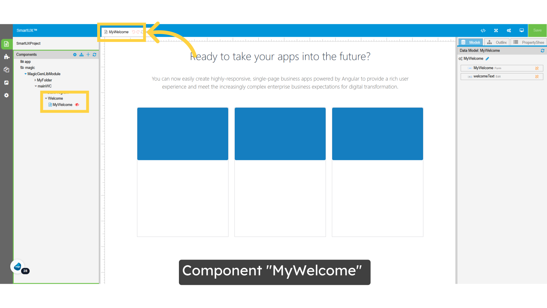
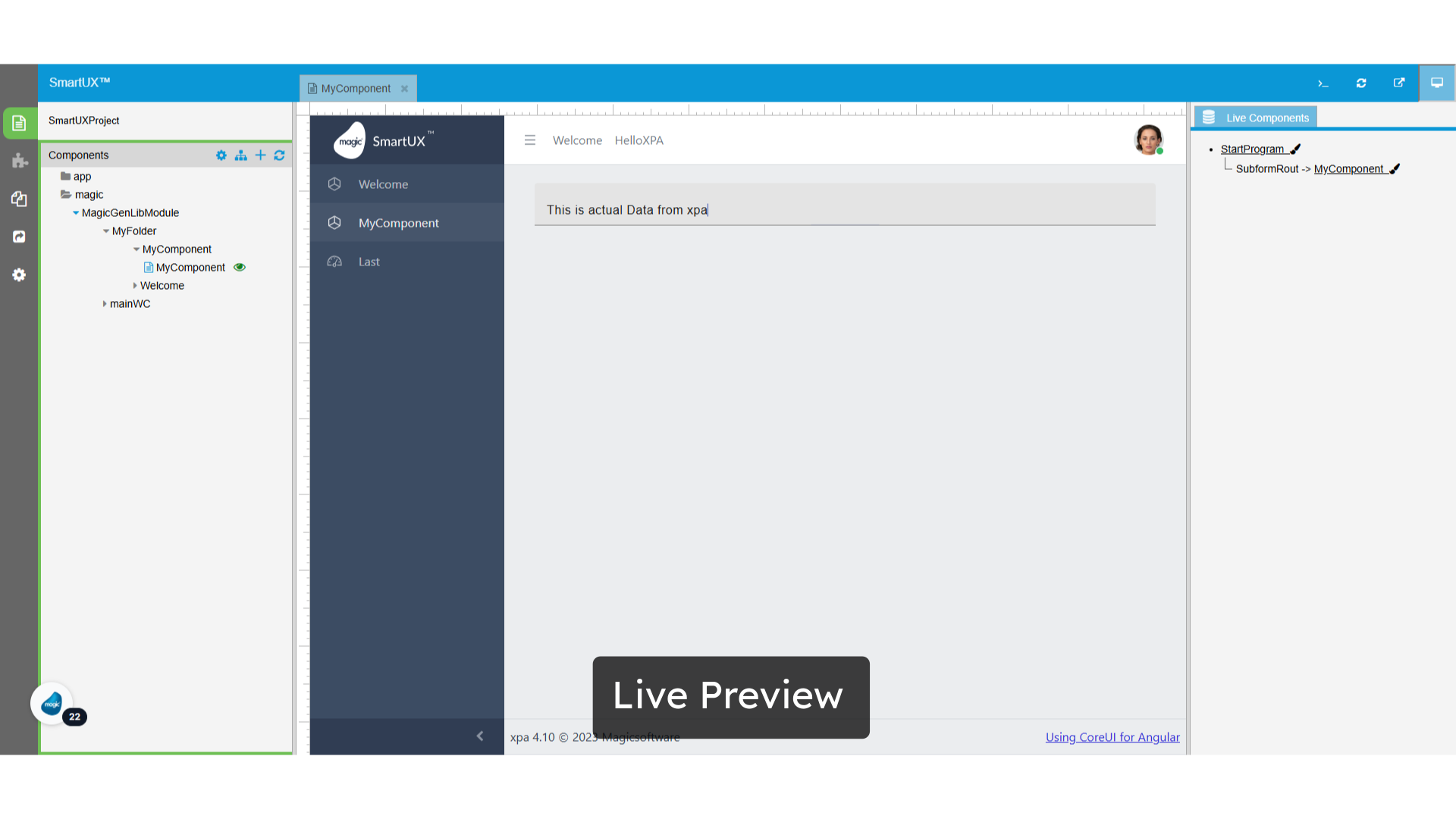
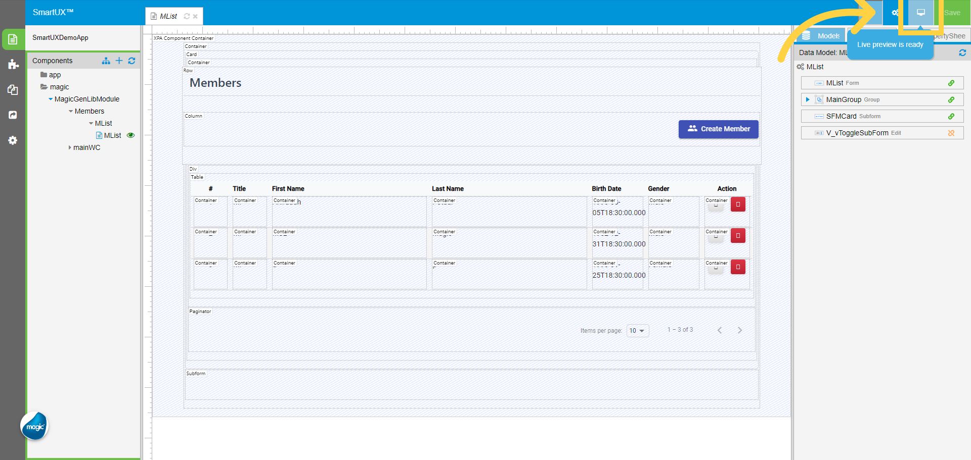
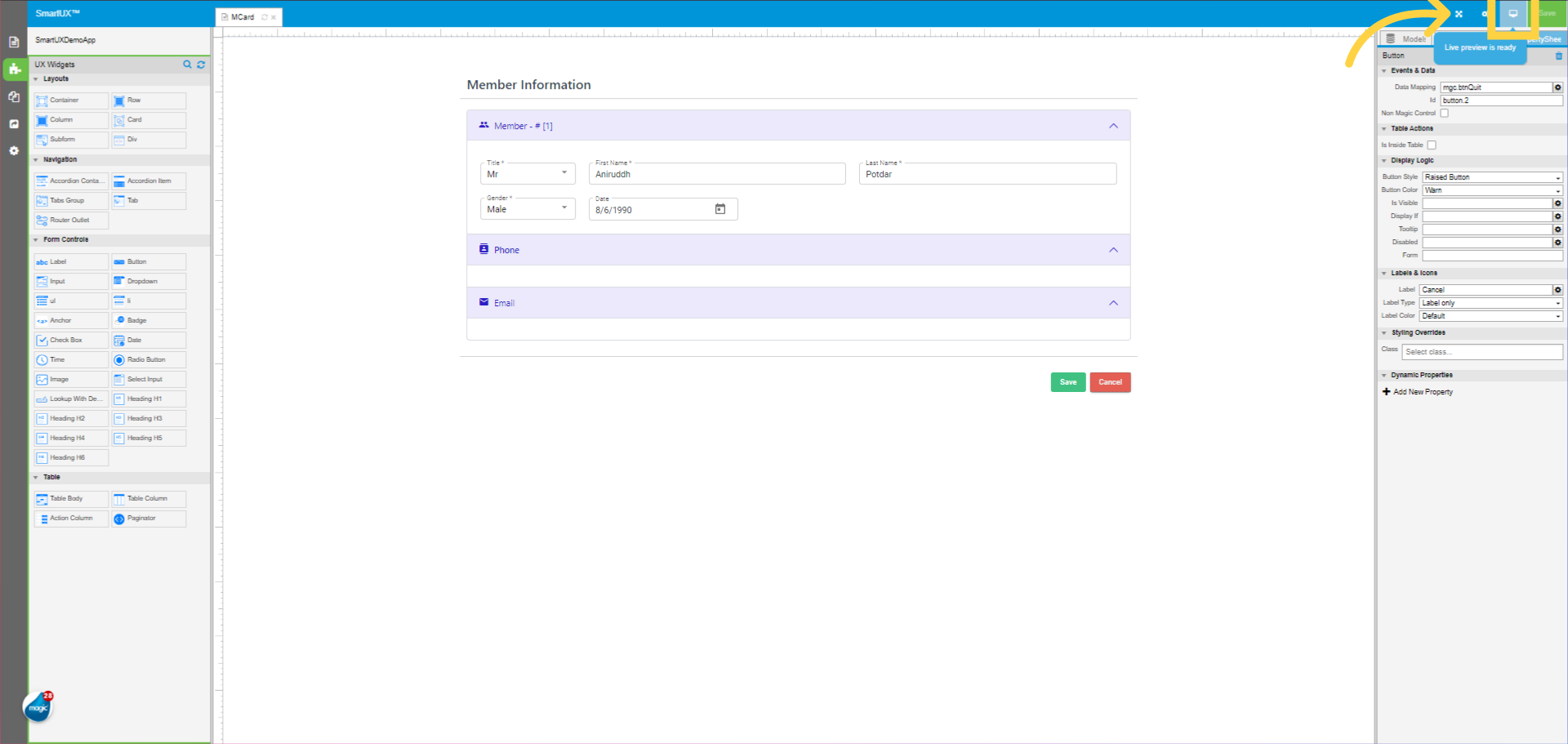
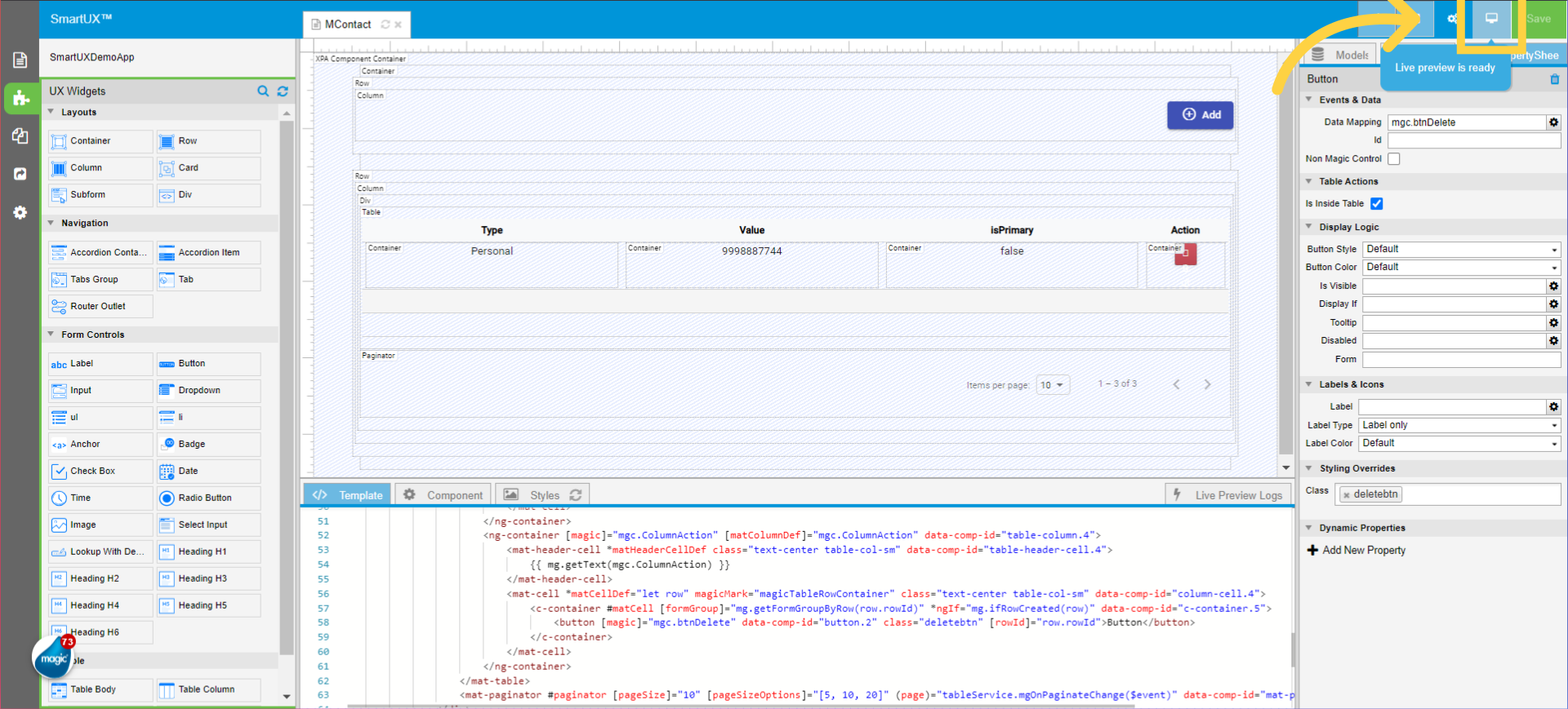
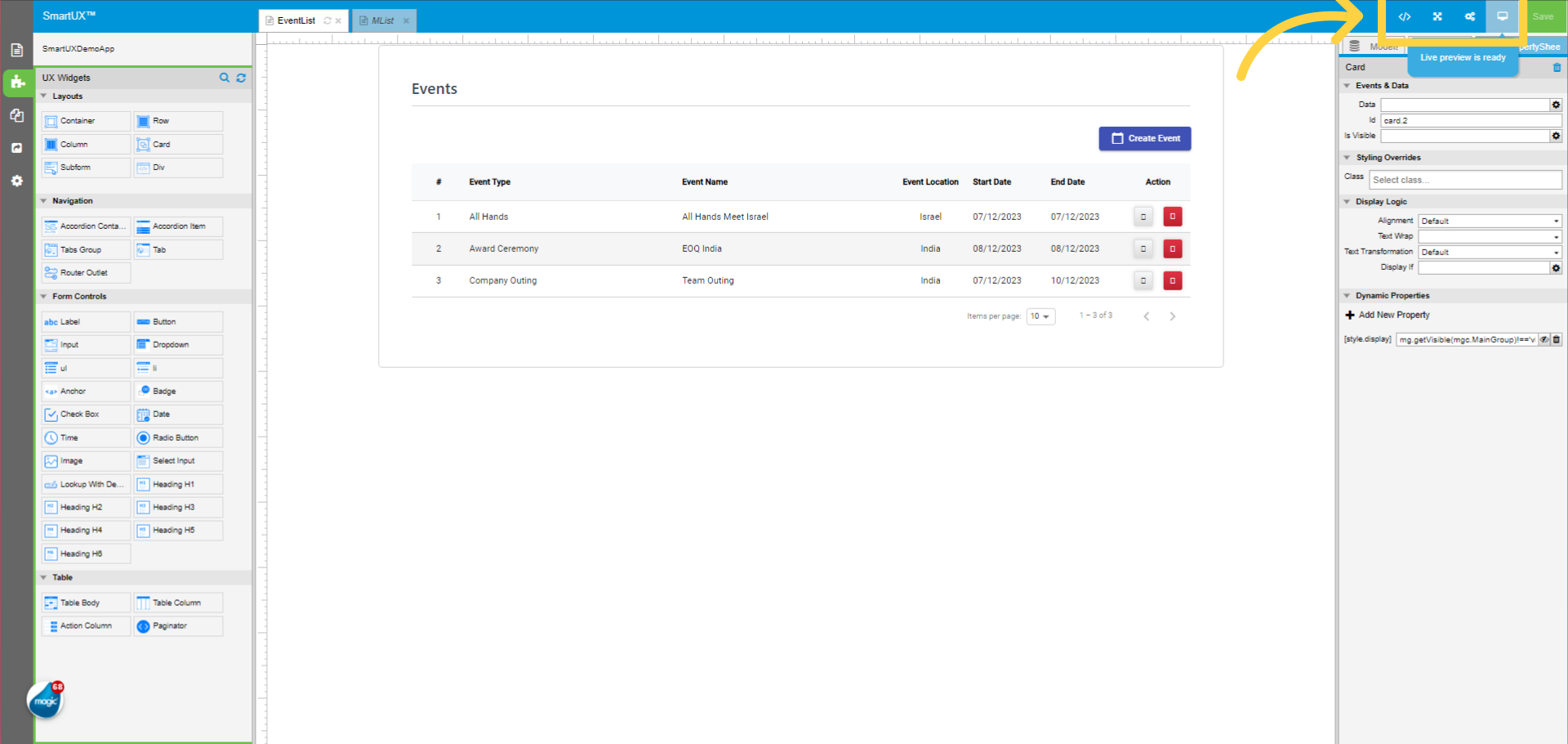
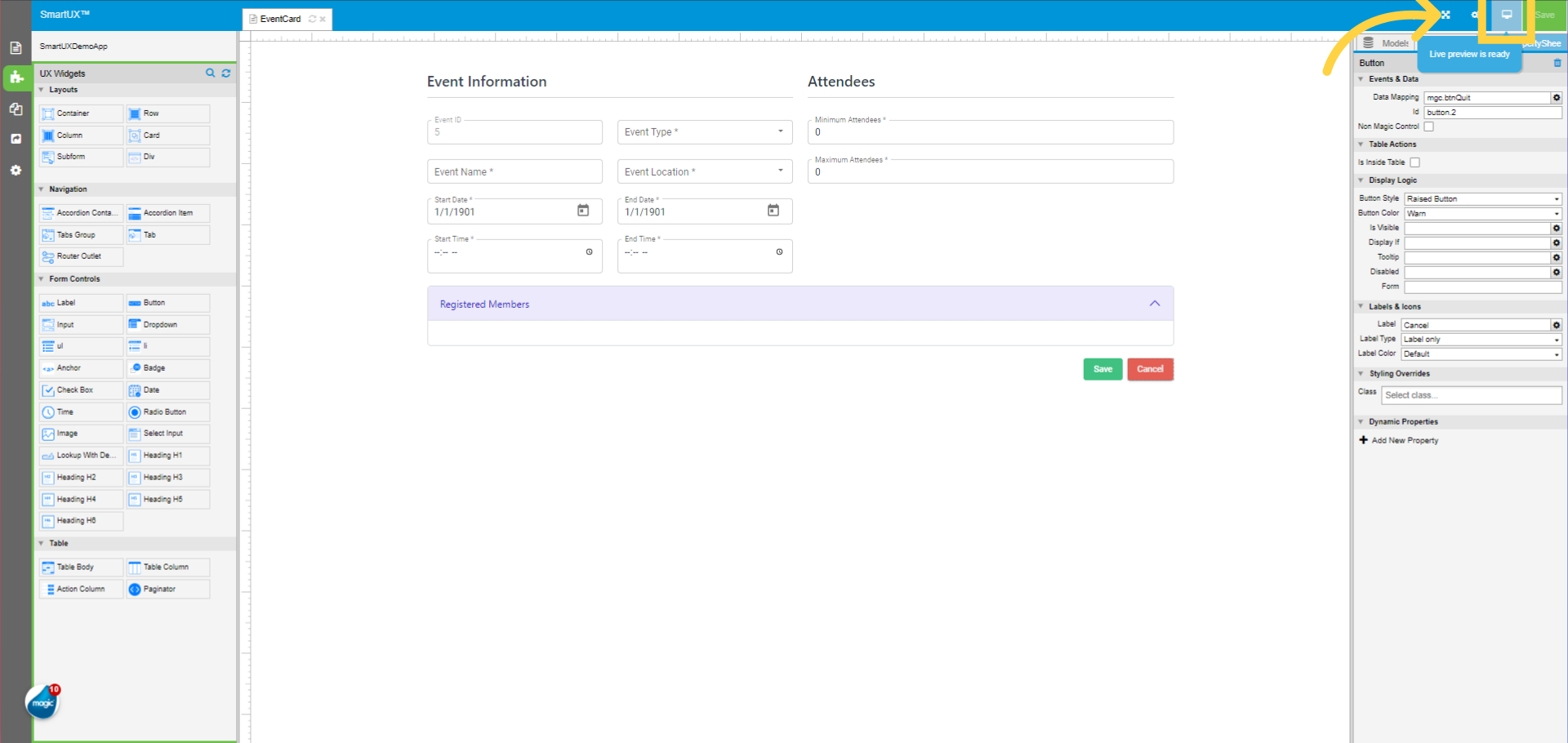
29. Enter in Live Preview
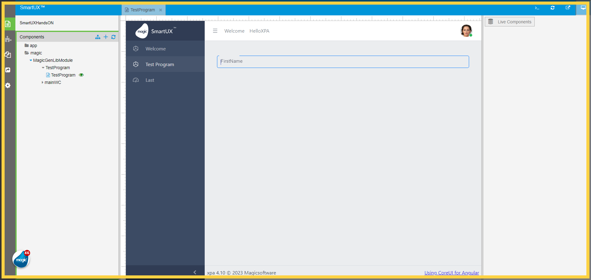
Now we are all set to enter in Live Preview.
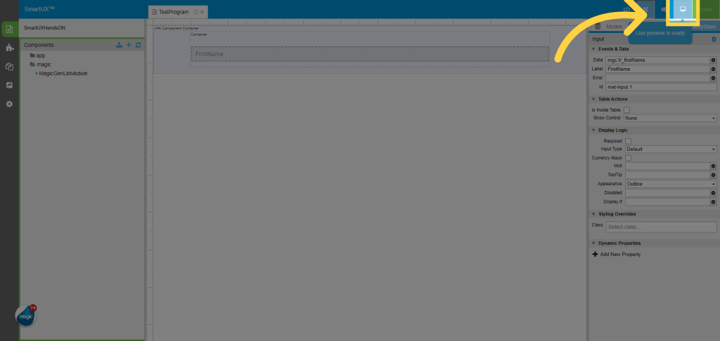
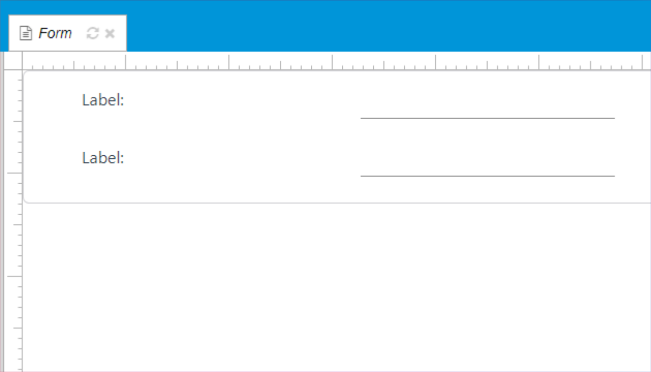
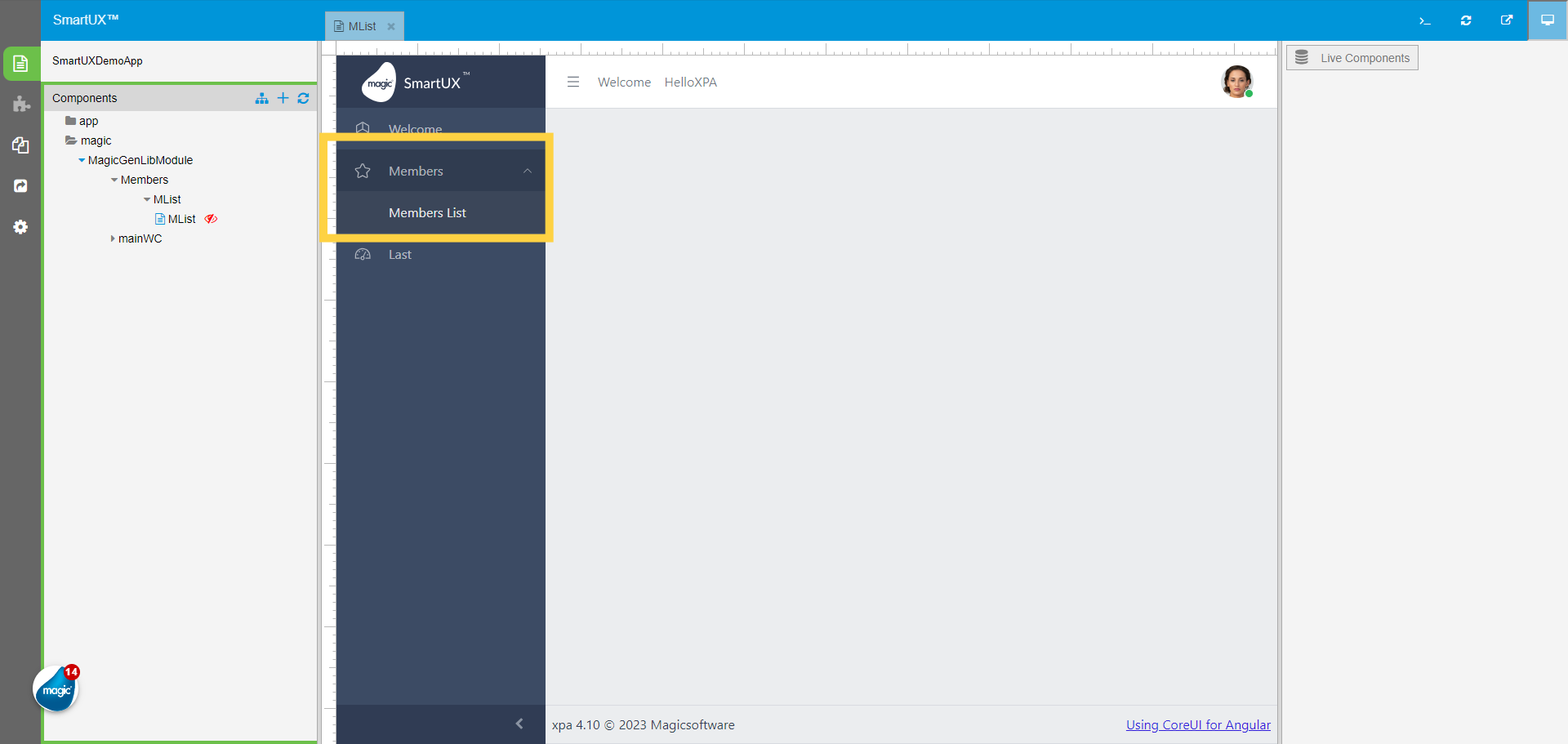
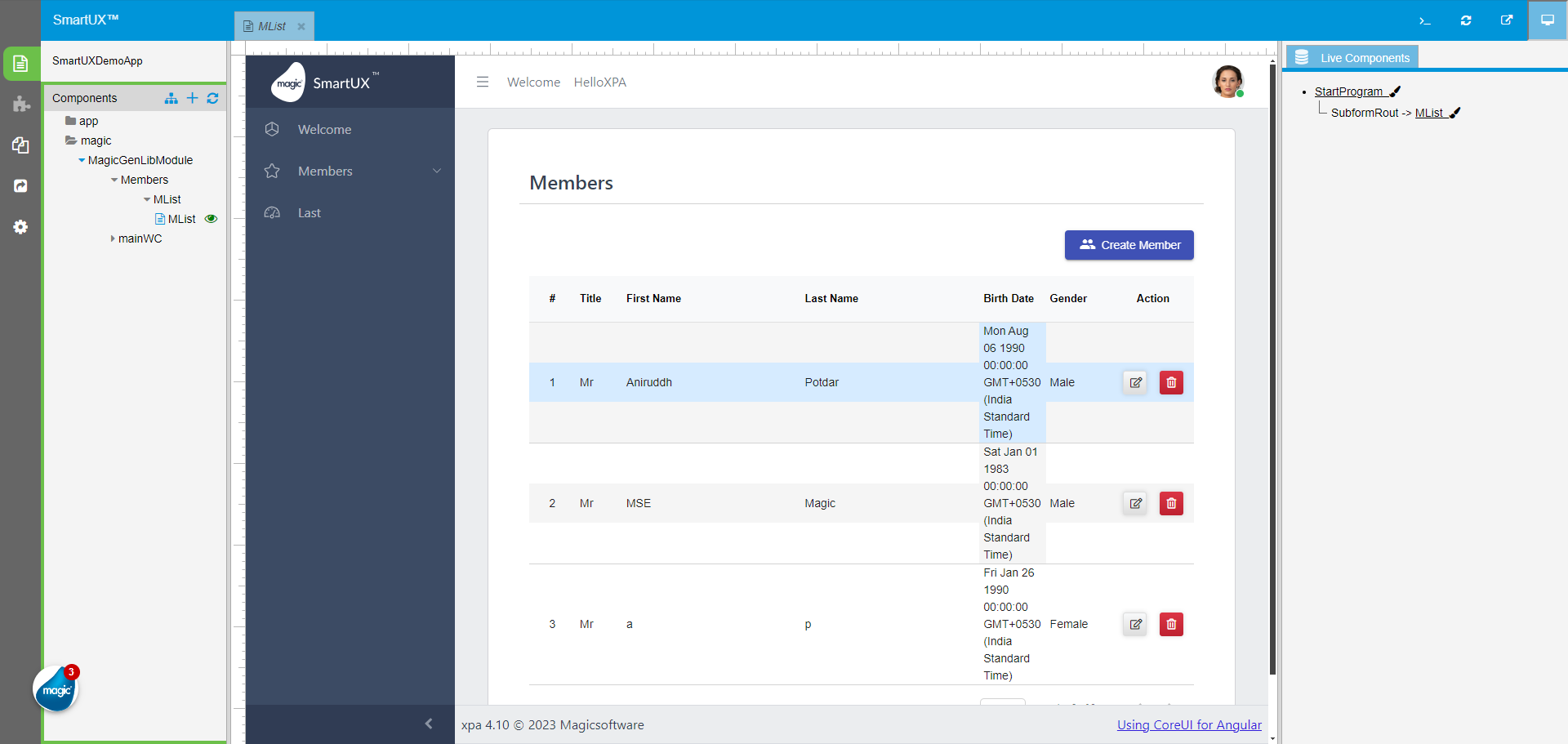
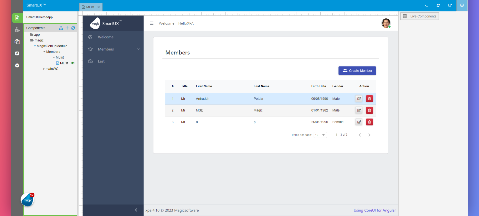
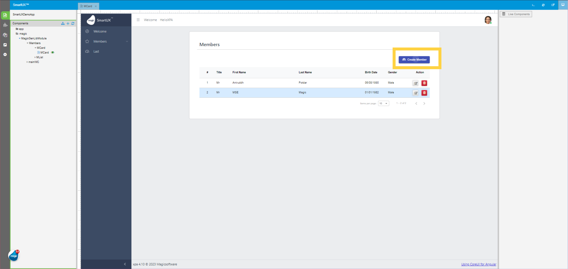
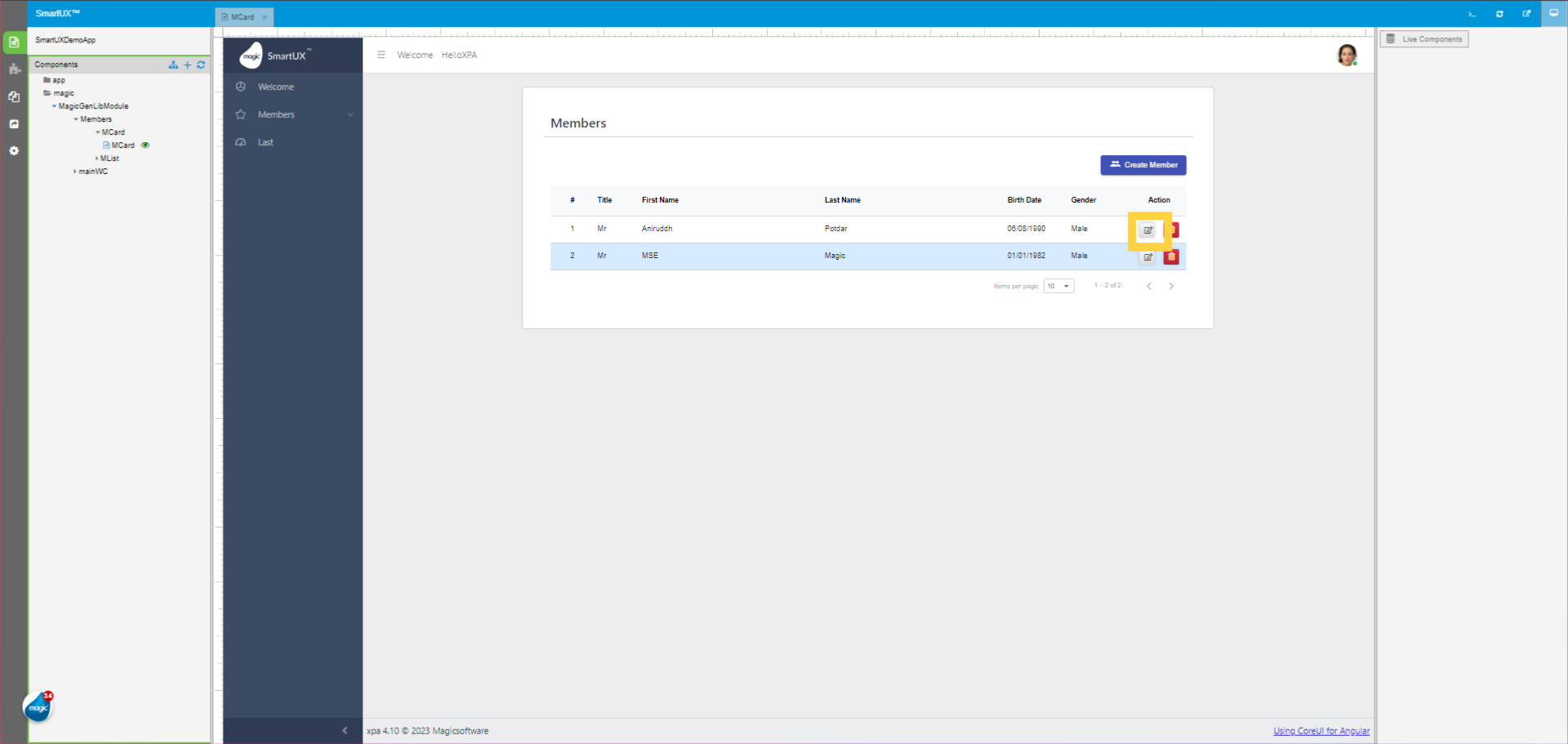
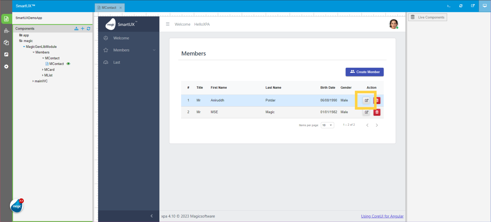
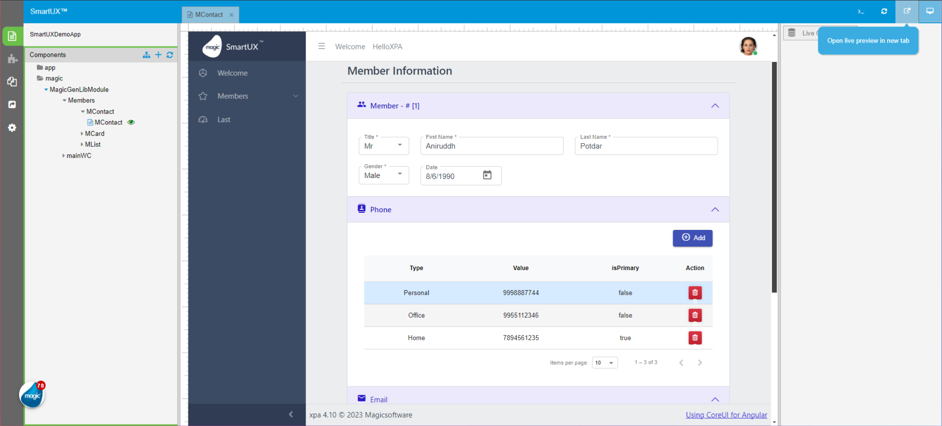
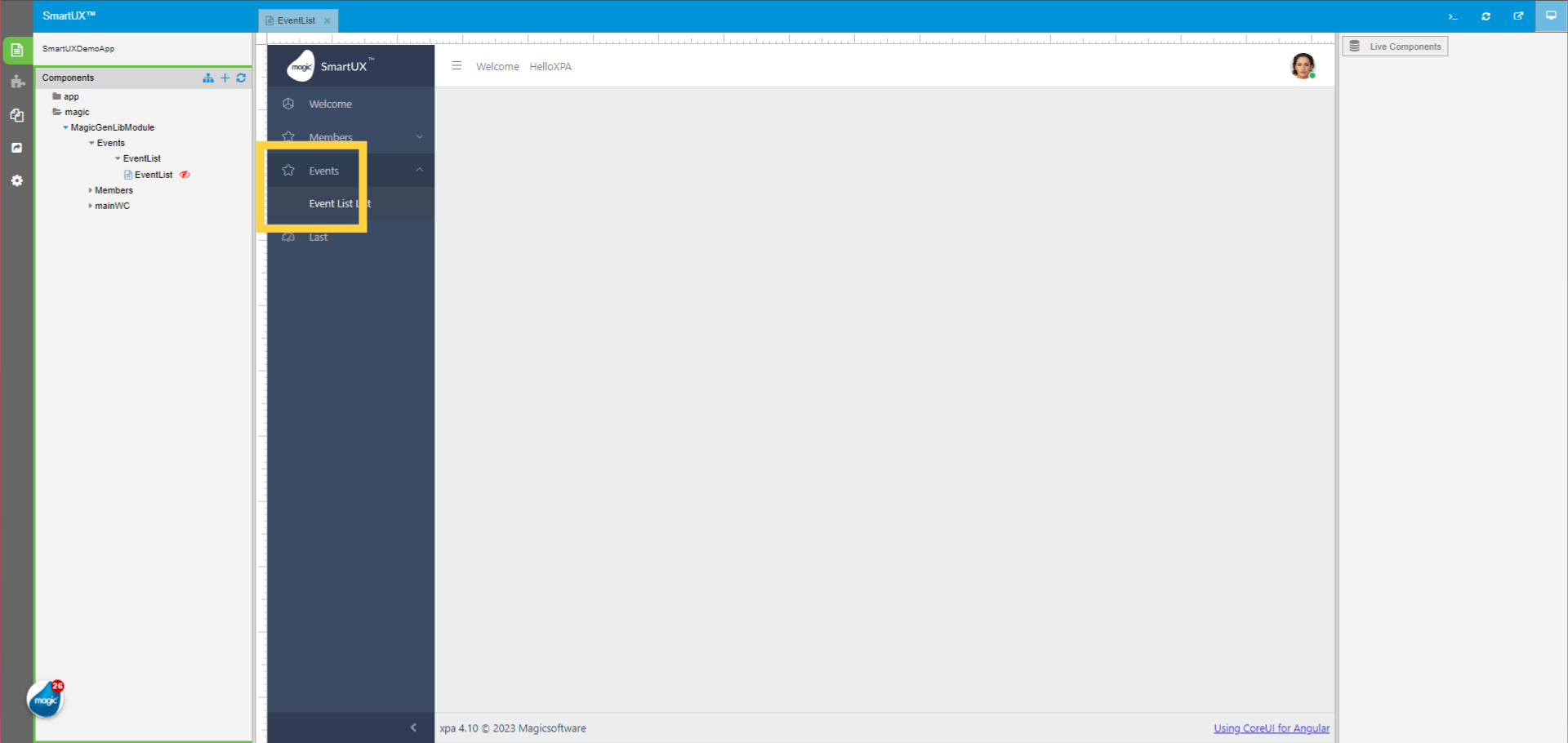
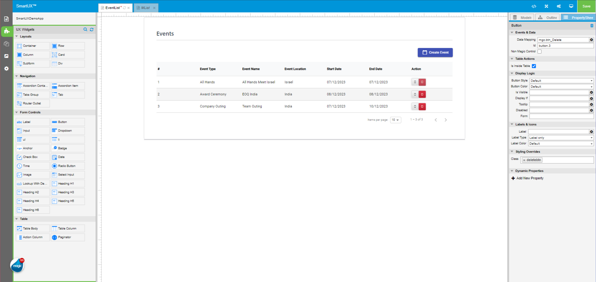
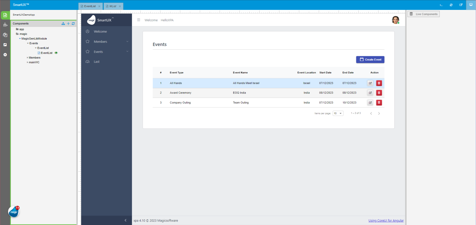
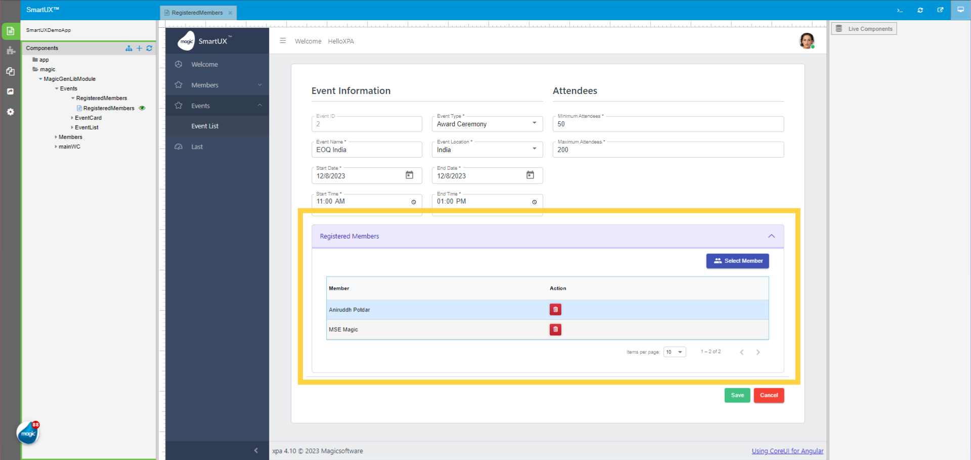
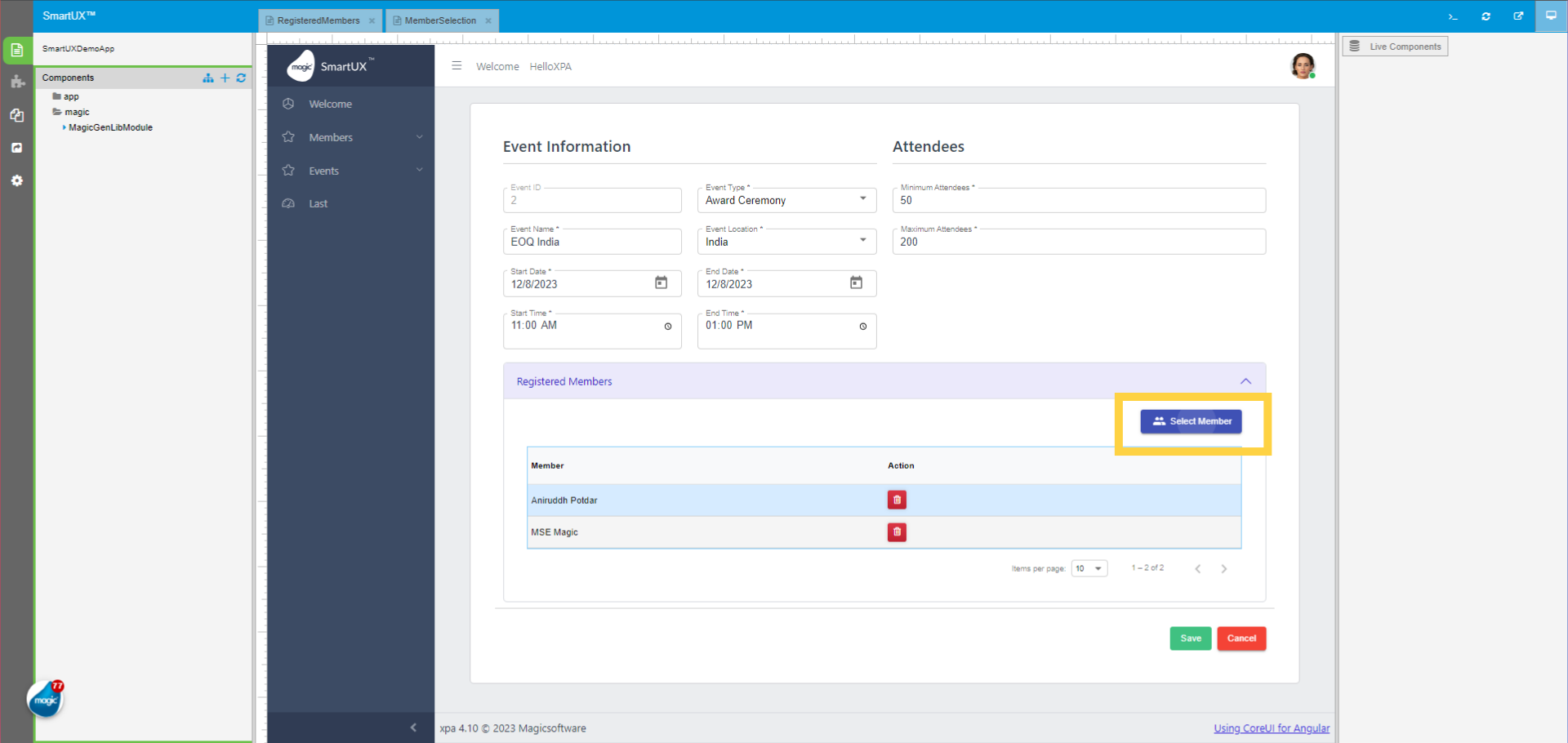
30. The Live Preview
Once you enter in Live Preview, The Live Preview will look like this. Here we see the Test Program is added to the Sidebar navigation of Full Menu Application Template. Click on the Test Program.
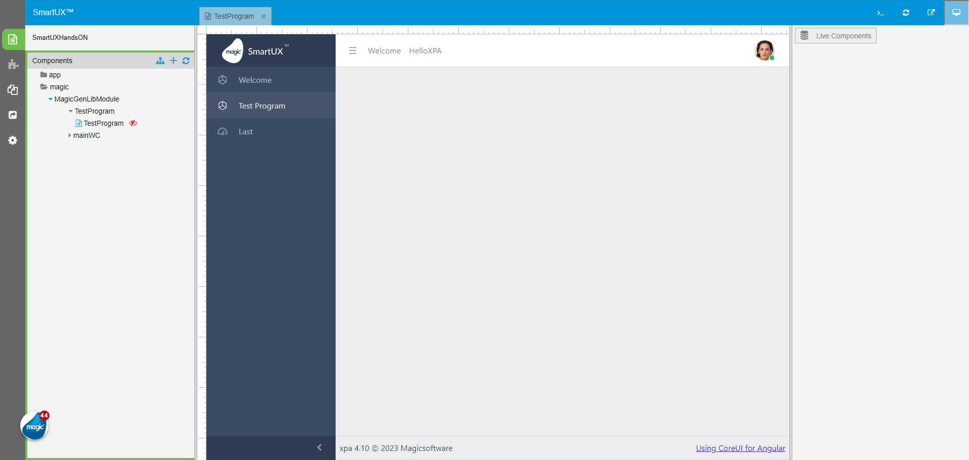
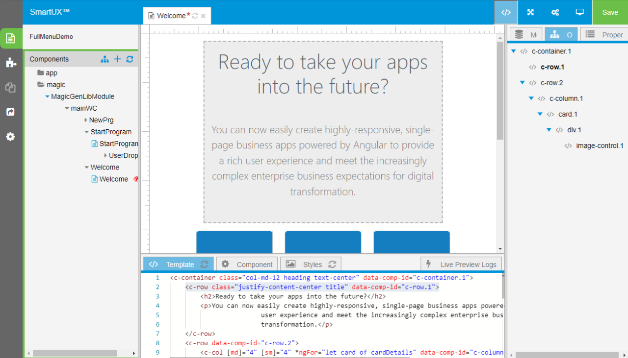
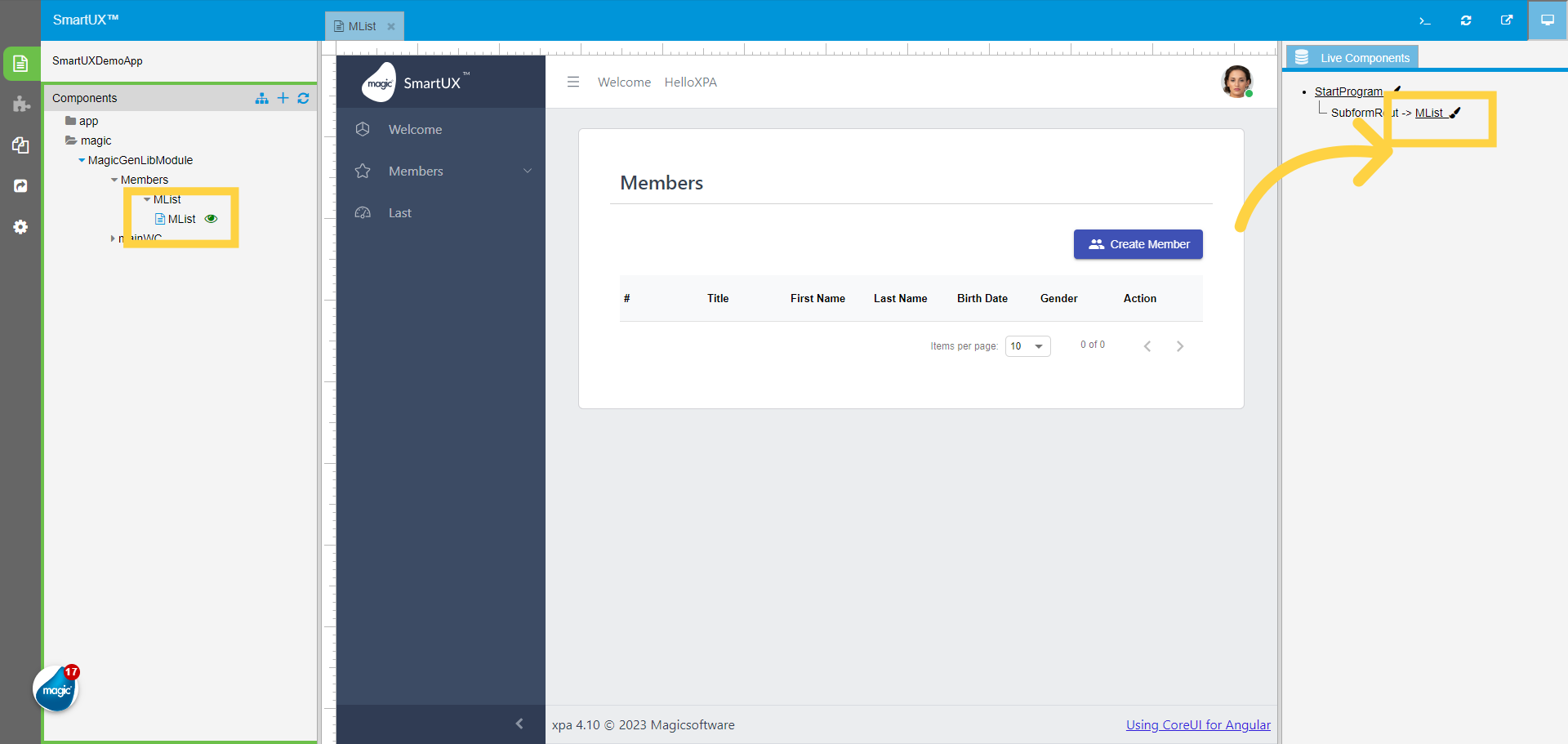
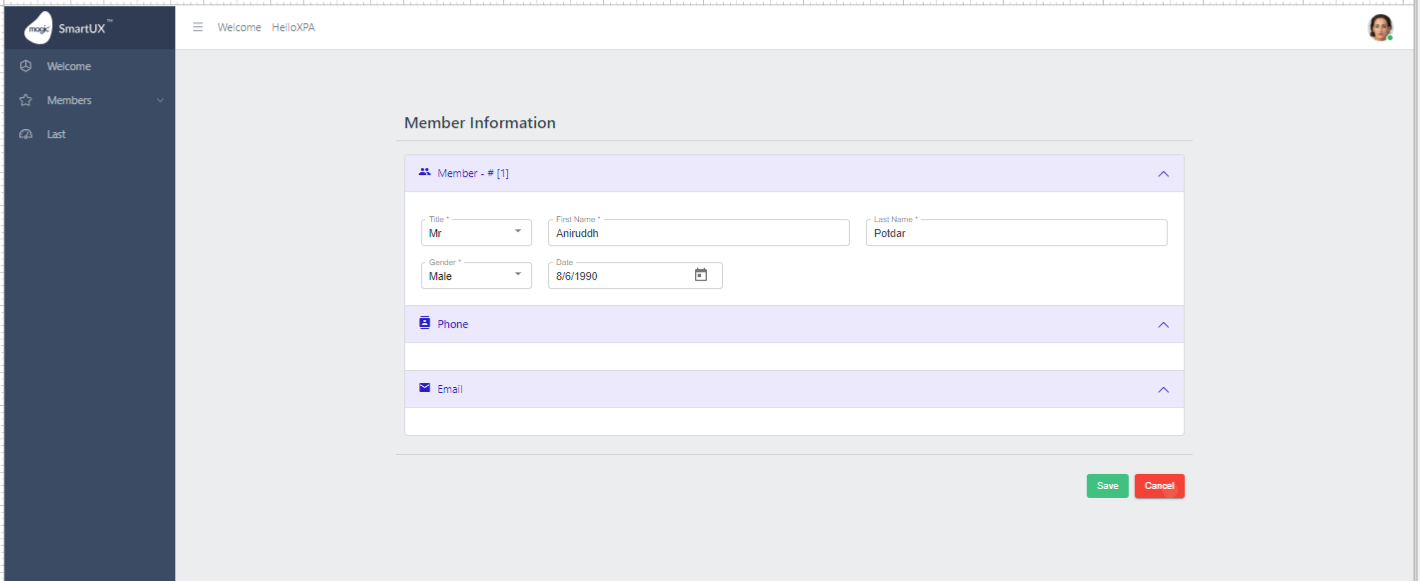
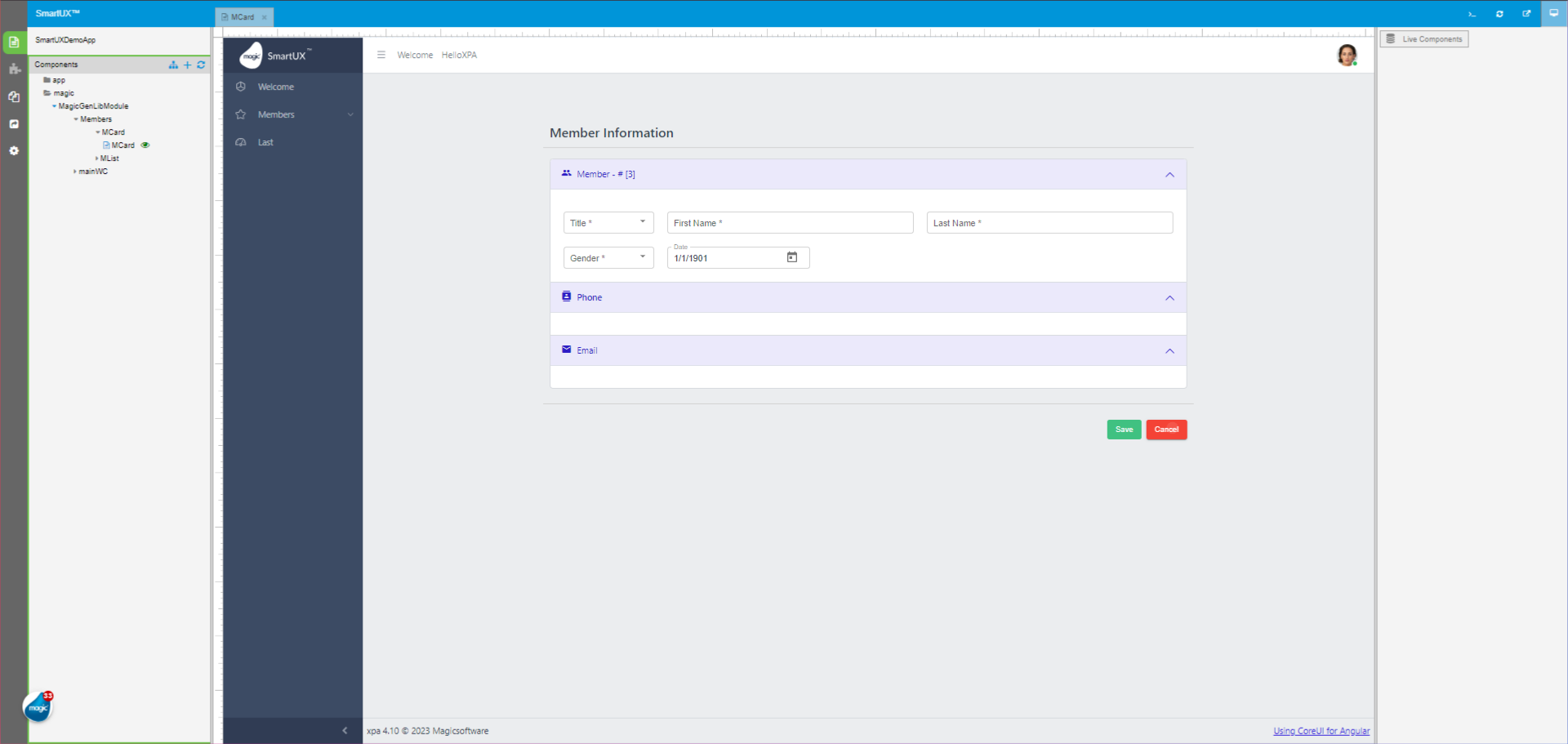
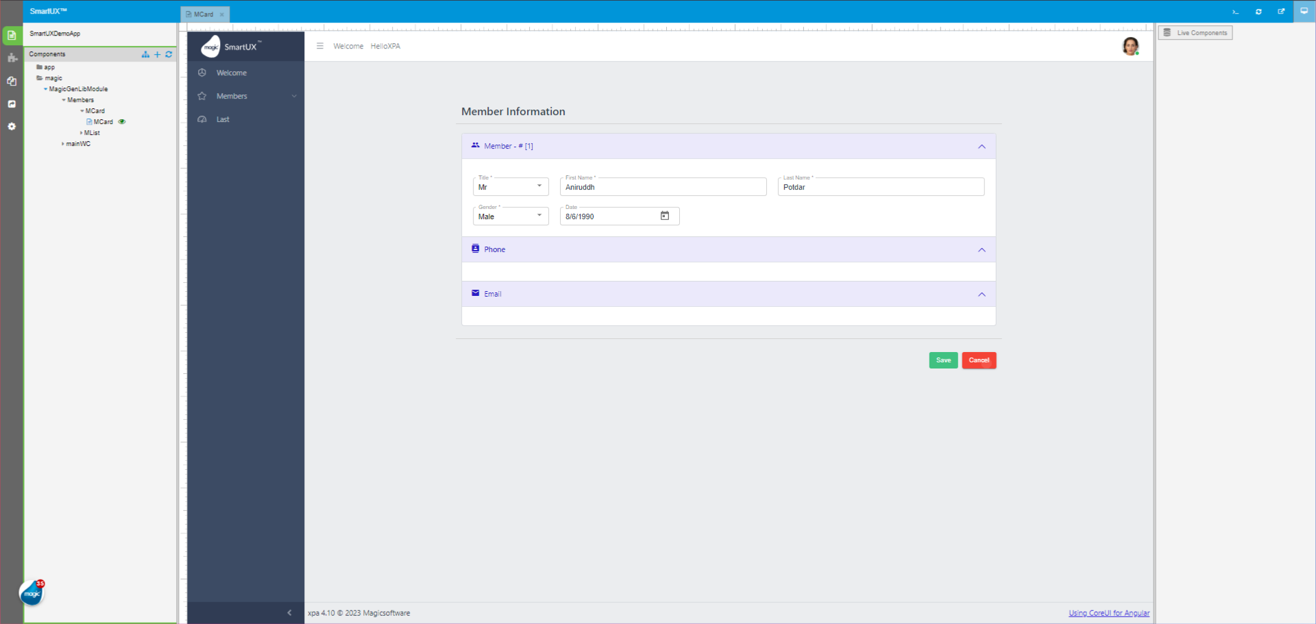
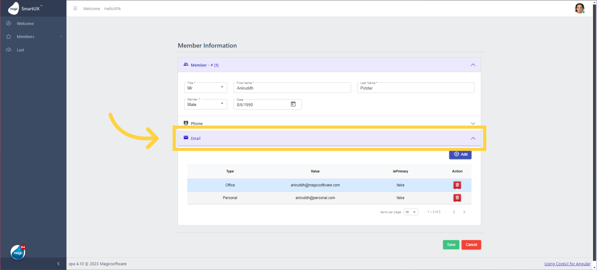
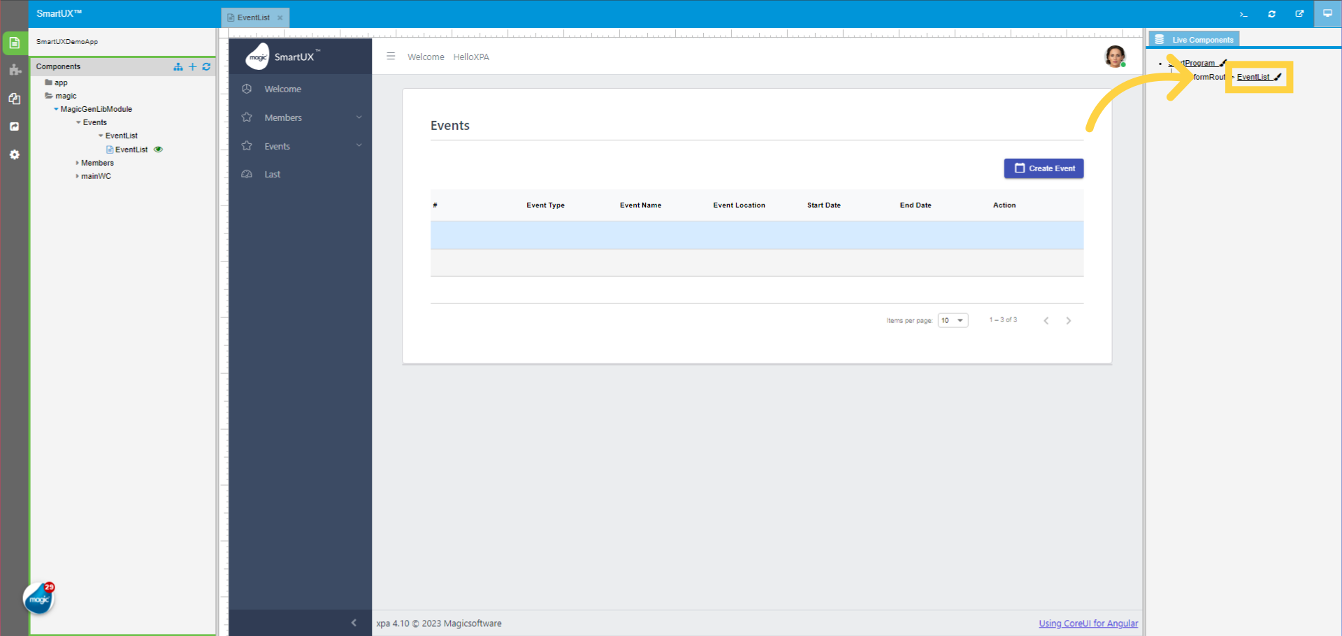
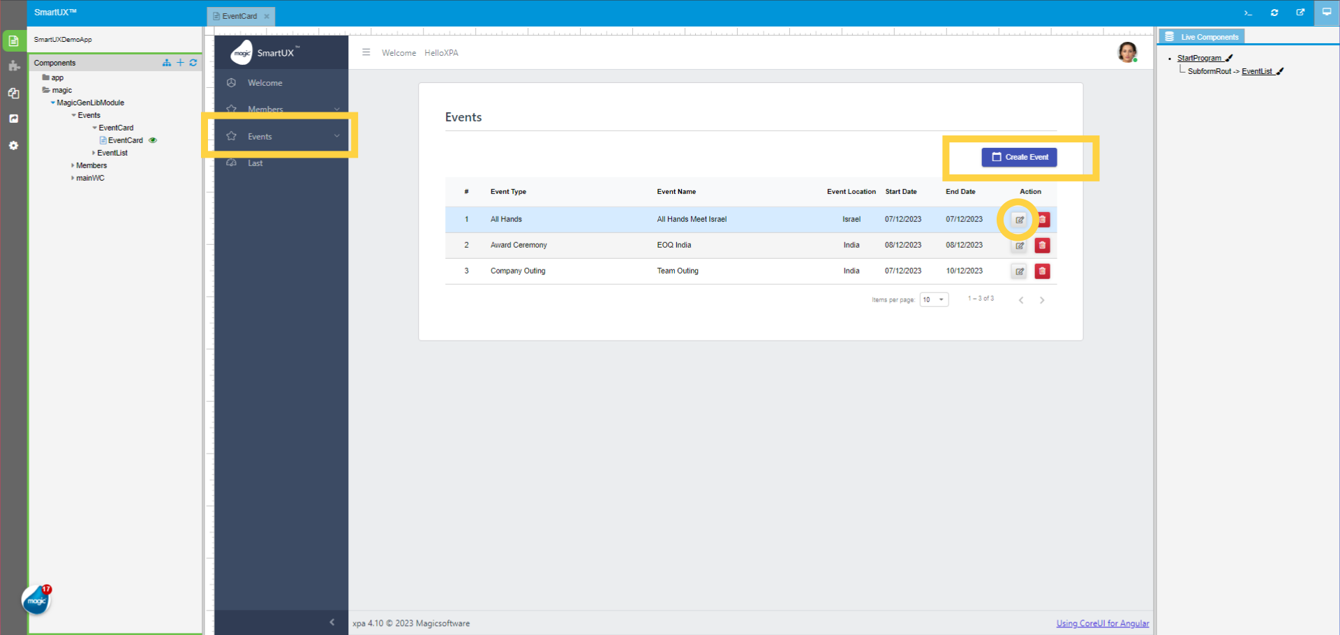
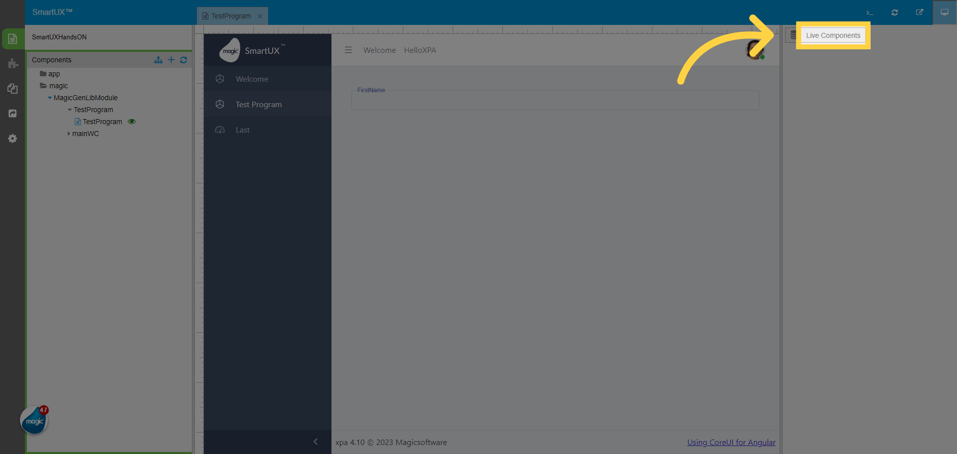
31. Test Program Live Preview
Here you can see the Test Program we created by following the previous lesson.
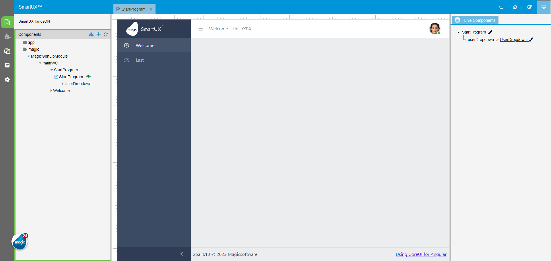
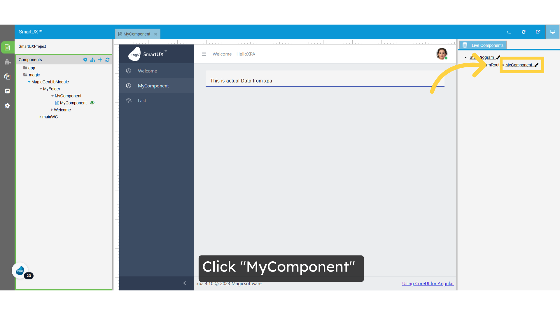
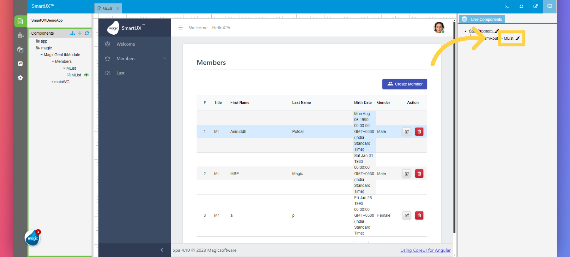
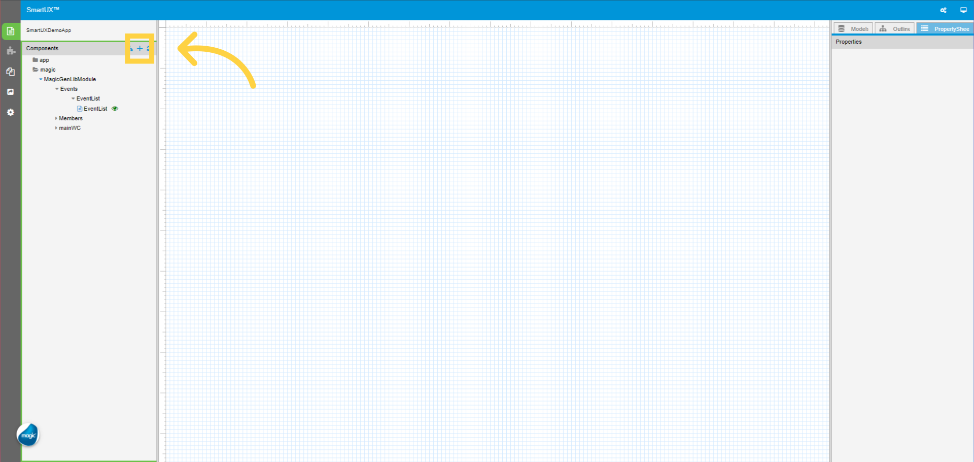
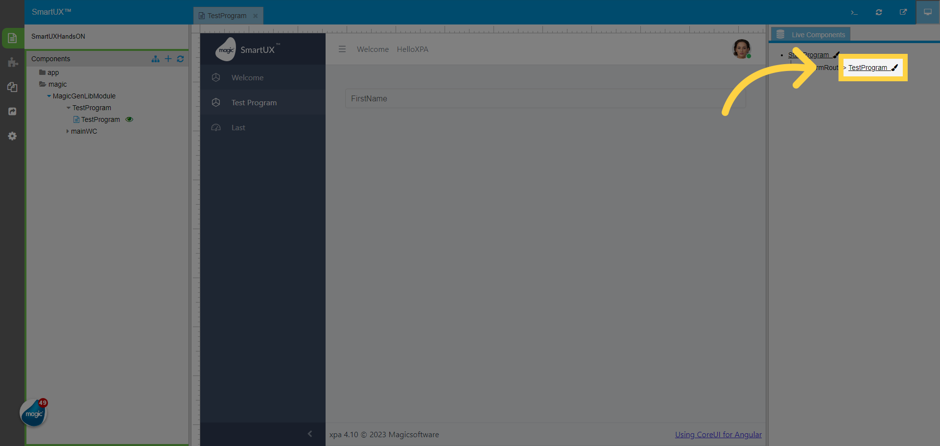
32. Click “Live Components”
Navigate to the “Live Components” section.
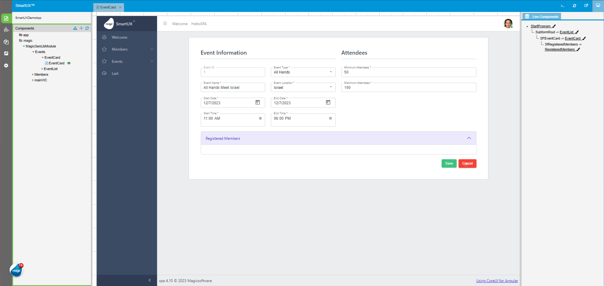
33. To get out of Live Preview Click “TestProgram”
To get out of Live Preview Click on the “TestProgram” from the Live components tree.
The guide covered adding components, designing routes, and saving changes in SmartUX.
By following the engaging instructions provided, users can efficiently navigate the application and enhance their training experience.


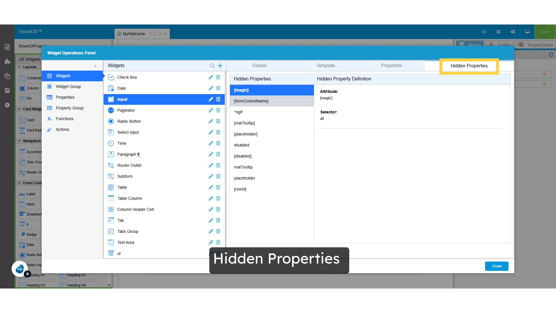
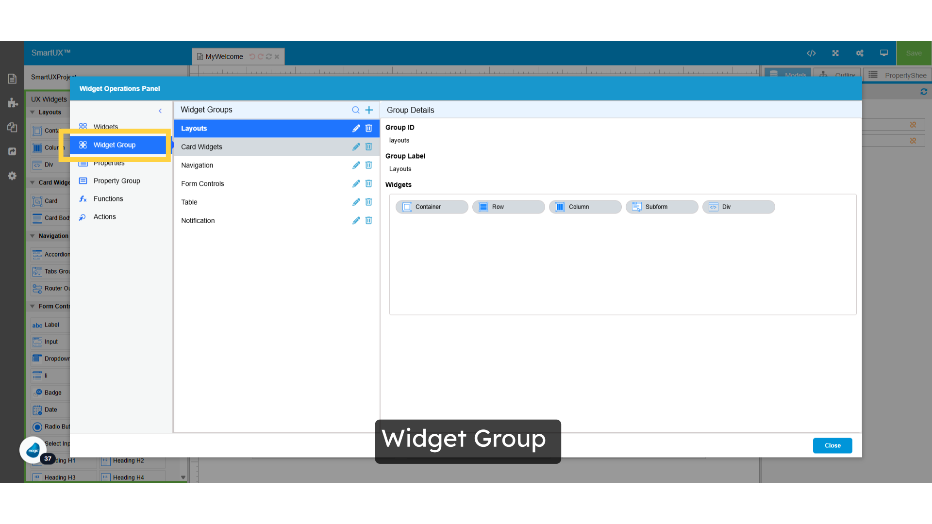
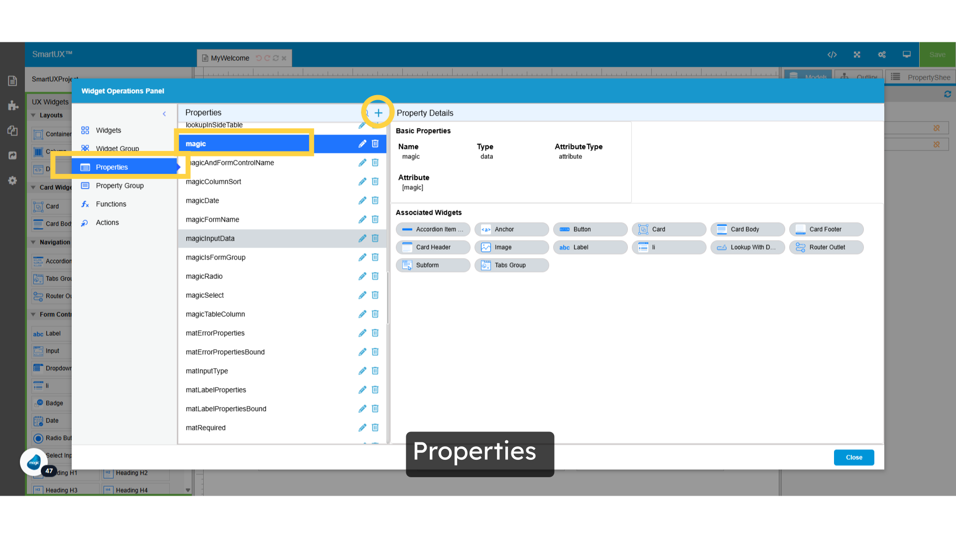
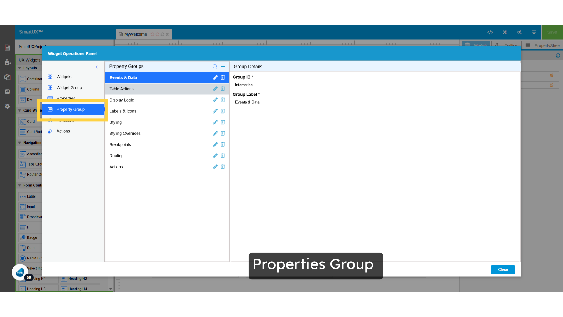